Understanding a stock chart – valuable knowledge for beginner traders

In this article i’m going to help you with understanding a stock chart, and share some tips which may help beginner traders navigate the chart’s features. This will take the beginner trader through the basic foundation of what appears on the chart, normally by default.

Understanding a stock chart – price movements

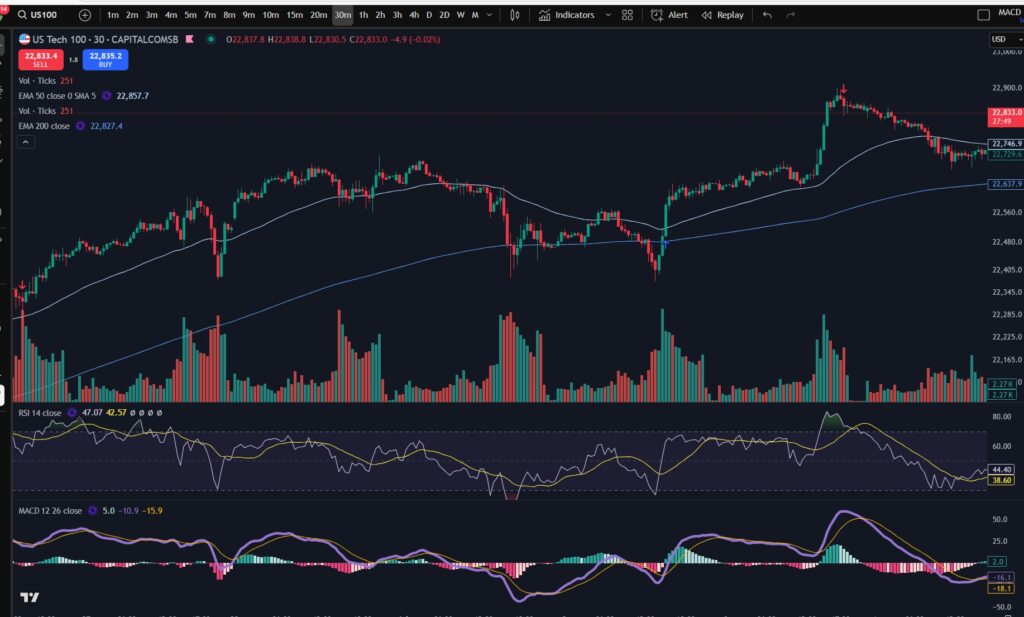
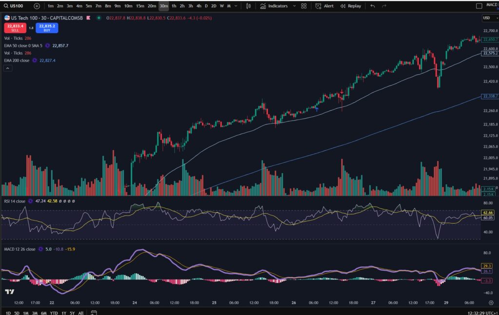
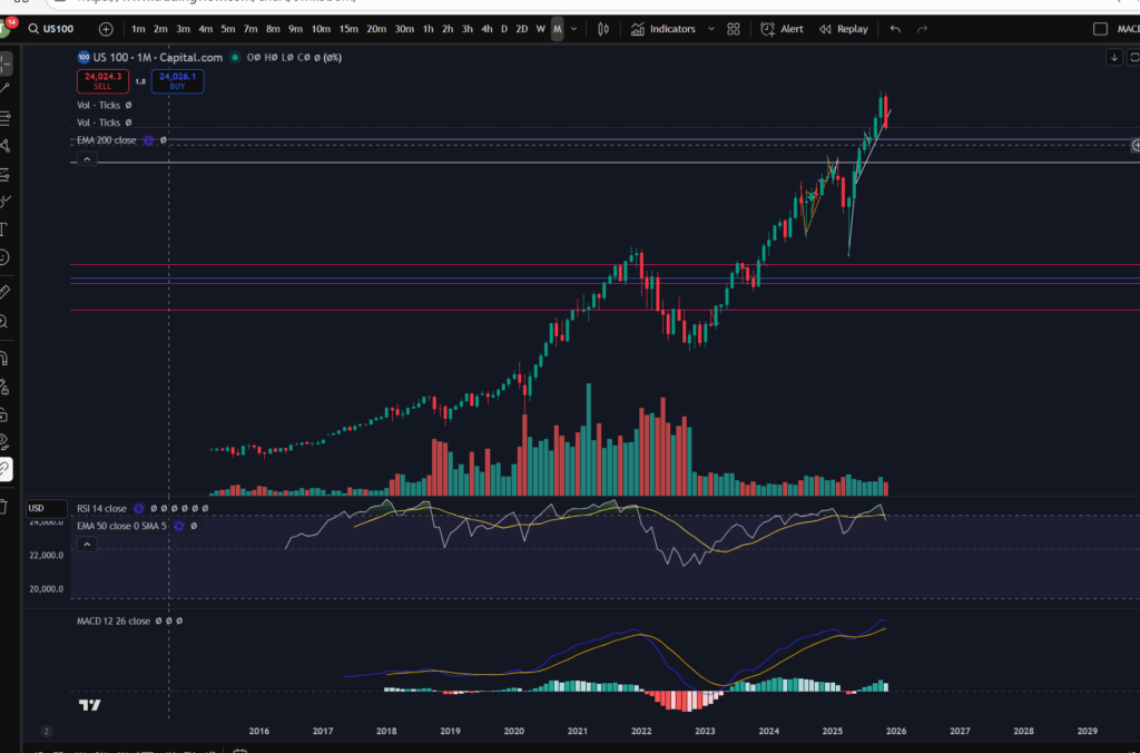
The default position you will likely find when you first look at any stock chart is that the ‘price’ movements are shown with ‘Candlesticks’. This is key to understanding a stock chart. Let’s take a look…

Understanding a stock chart

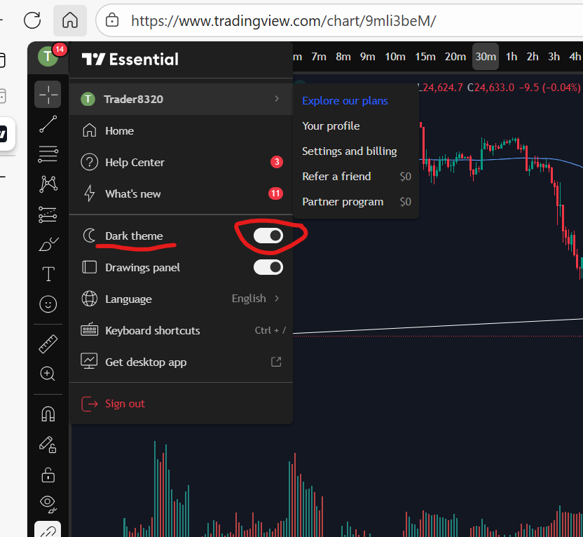
If you would like a discount to the ‘Trading View’ software which I use and highly recommend, please click the button below:

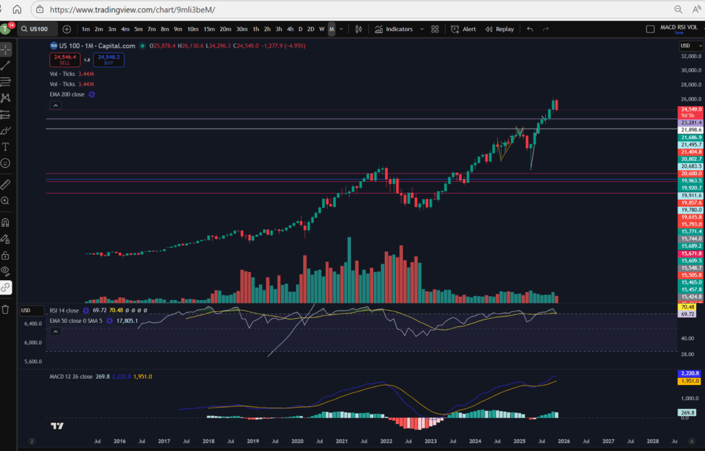
Each green or red candlestick shape you see on the chart, represents the price movement within one interval of time. The interval is determined by the ‘time interval’ buttons selected on the chart. As you can see on the above screen shot, ‘M’ is highlighted in the ribbon at the top – what this means is that this is a ‘monthly chart’ – each candlestick represents the price movements within one month’s period. I’ve posted separate articles on understanding candlesticks, which you will find here:

Make more money with Japanese Candlesticks – an Introduction – Trader Pro

The basic premise of candlesticks is that if they are green, it means the price closed higher in the interval, and if they are red, the price closed lower within the interval.

You can also understand more about the pattern formations of these, here:

Japanese Candlesticks – Trader Pro

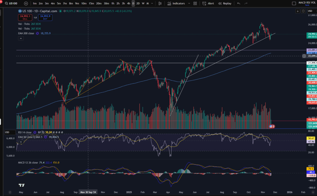
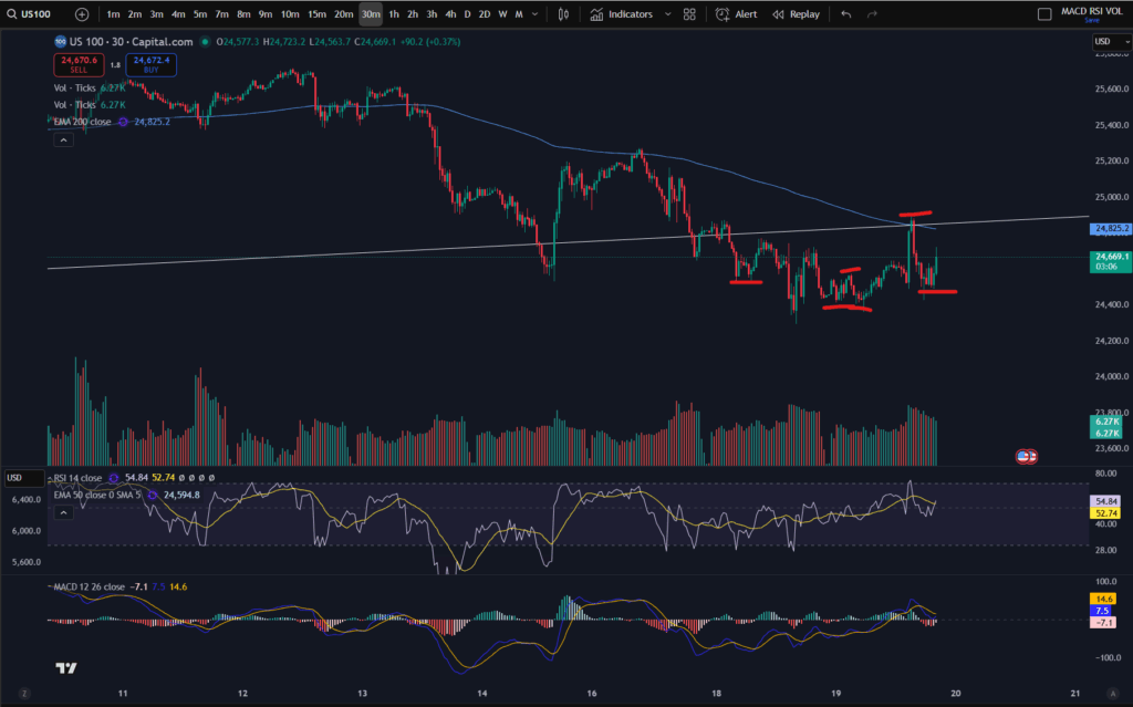
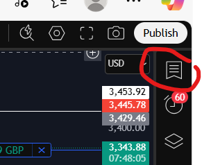
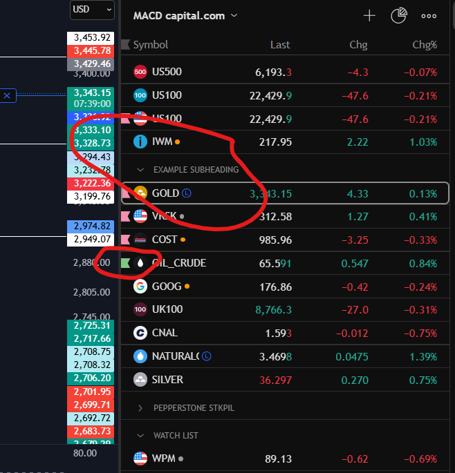
The price ‘level’ is normally displayed down the right hand side of the chart. You can see here, that the price range is 23,281 USD to 26,000 USD.

You will need to pay careful attention to which ‘price’ is being displayed… is it the price inclusive of the spread for example, or does it not include the spread? When I was a new trader, this used to catch me out – the stop loss would sometimes be triggered when the price seemingly did not go there on the chart!? It’s because the price displayed on the chart did not include the spread so the gap which was covered with the spread seemed like a mystery to me, and almost felt like broker manipulation. I understand more now.

If you check the settings in your chart carefully, you will find a setting to tell the chart to either include the spread, or not. Your wish with this, may change depending on what you are doing on the chart! If you are setting an order to ‘buy’ at a particular price, you may want to include the spread in the settings…

Understanding a stock chart – Time intervals

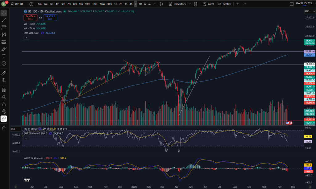
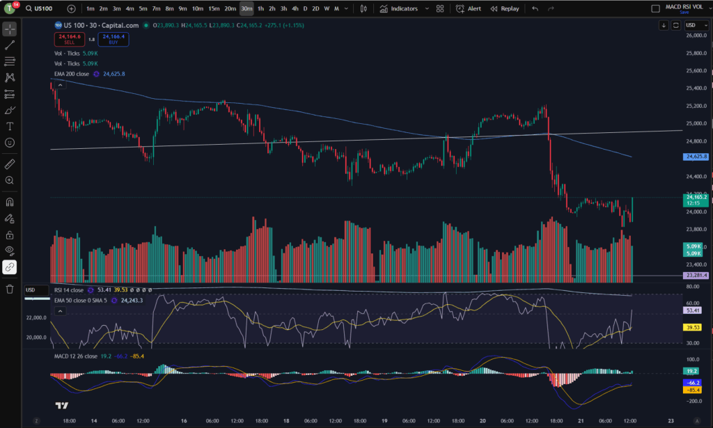
Each chart will have a couple of ribbons of time intervals – probably along the top and also the bottom. One of these ribbons allows you to select alternative time intervals to be displayed, as mentioned above. When these are clicked, you can toggle between for example, the ‘daily’ timeframe, and the 4 hour time frames. The daily timeframe will show you candlestick price movements, with each one representing the movement within one day, and the four hour will likewise, show you the movements for each four hours that have occurred. The other ribbon shows you the relevant tie that the price movements occurred – so you can see on the above chart, that the time spans from the year 2016 to 2029 (no candles formed yet as this is in the future at the time of writing this article).
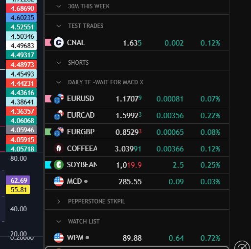
Deal tickets

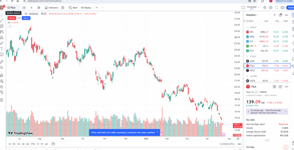
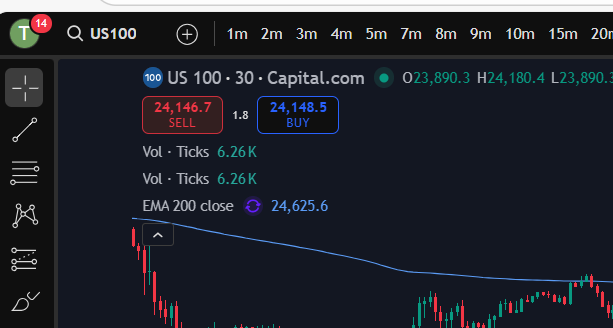
You can bring up a ‘deal ticket’ or ‘order ticket’ by clicking on the Buy or Sell buttons at the top of the screen. The value indicated on the button, is the buy or sell price and the ‘spread’ sits in between these values as below:

You do need to understand the spread, and I have linked another article below, which gives you an understanding of this:

Understanding the spread – Trader Pro

In short, the spread is the bit of price, in between the buy and sell values and it’s the ‘cut’ that the broker takes from the market.

The different types of deal tickets and orders you can place in the market, will be covered in another article.
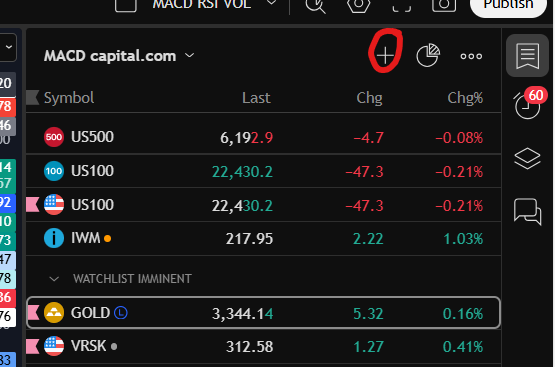
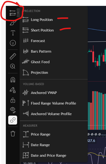
Toolbar

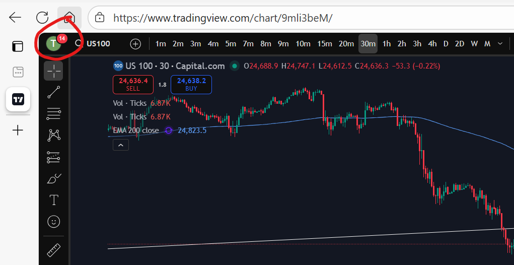
You will see somewhere on your chart, a toolbar with different symbols on it. On Trading View, this is down the left hand side of the screen:

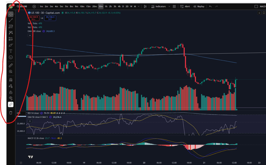
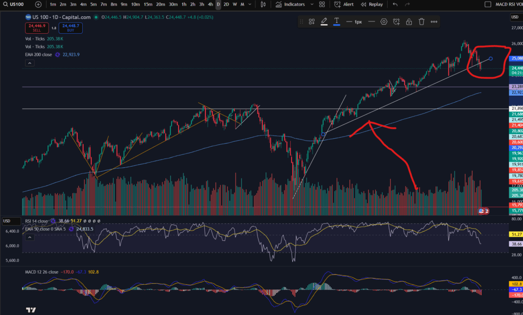
This gives you various different tools for drawing symbols and diagrams on your chart. You can draw ‘support and resistance’ lines including horizontal and diagonal ones. You can also measure price and time interval values with the ‘ruler’ shown. It’s got a zoom in/out function. You can make notes and keep them pinned to the chart indefinitely.

You can also plan trade set ups in terms of where you will enter, take profit or take a loss, with this icon:

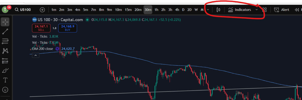
Technical indicators

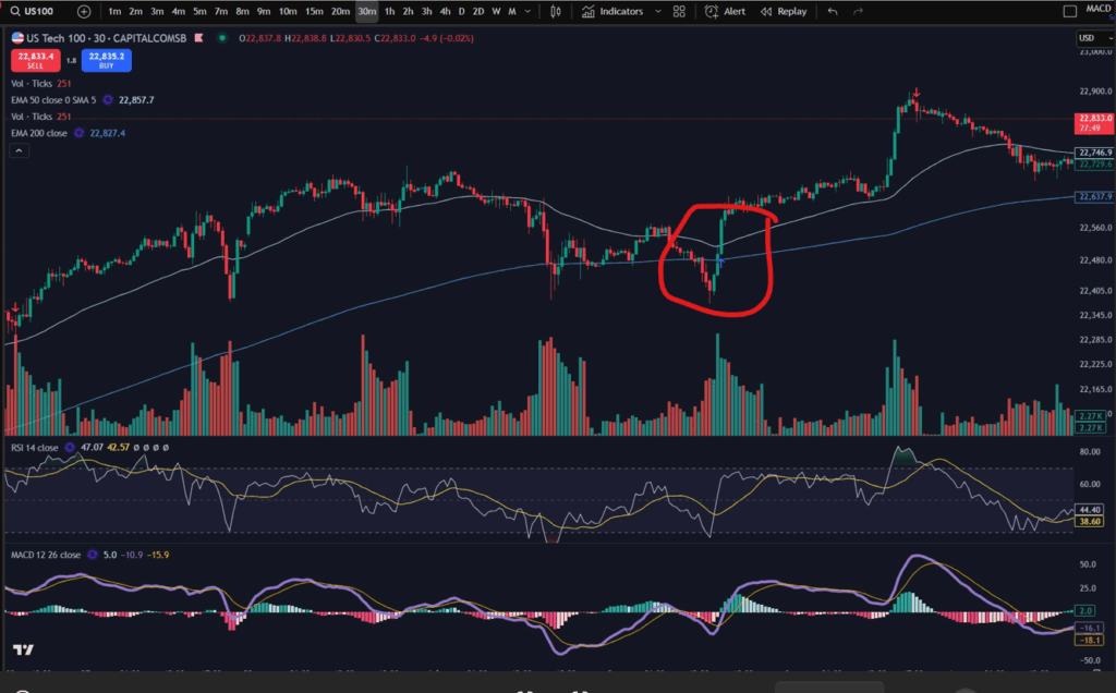
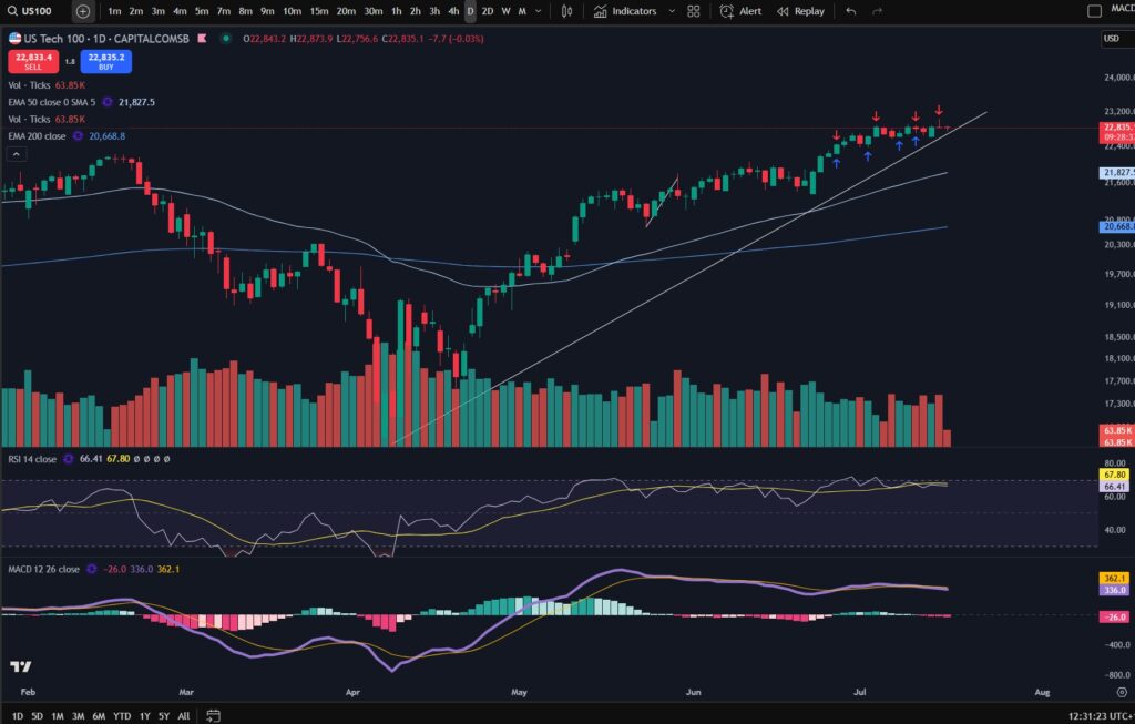
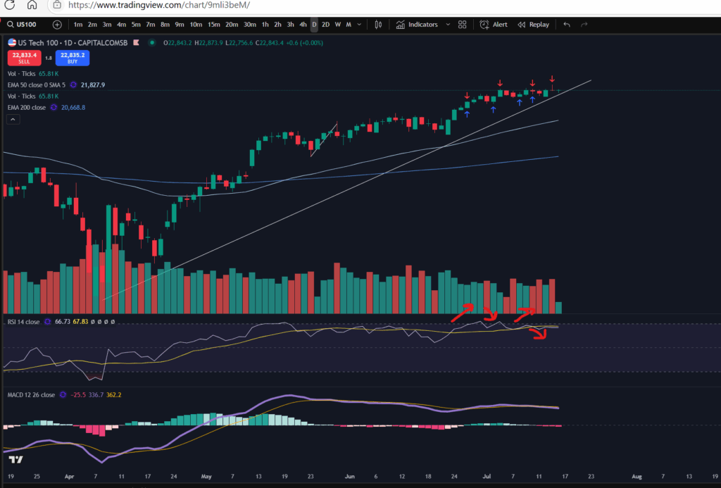
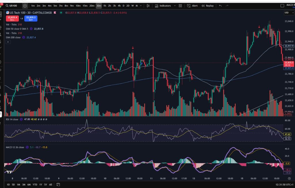
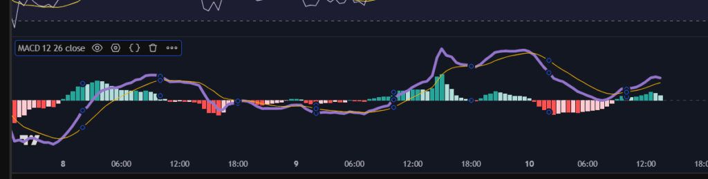
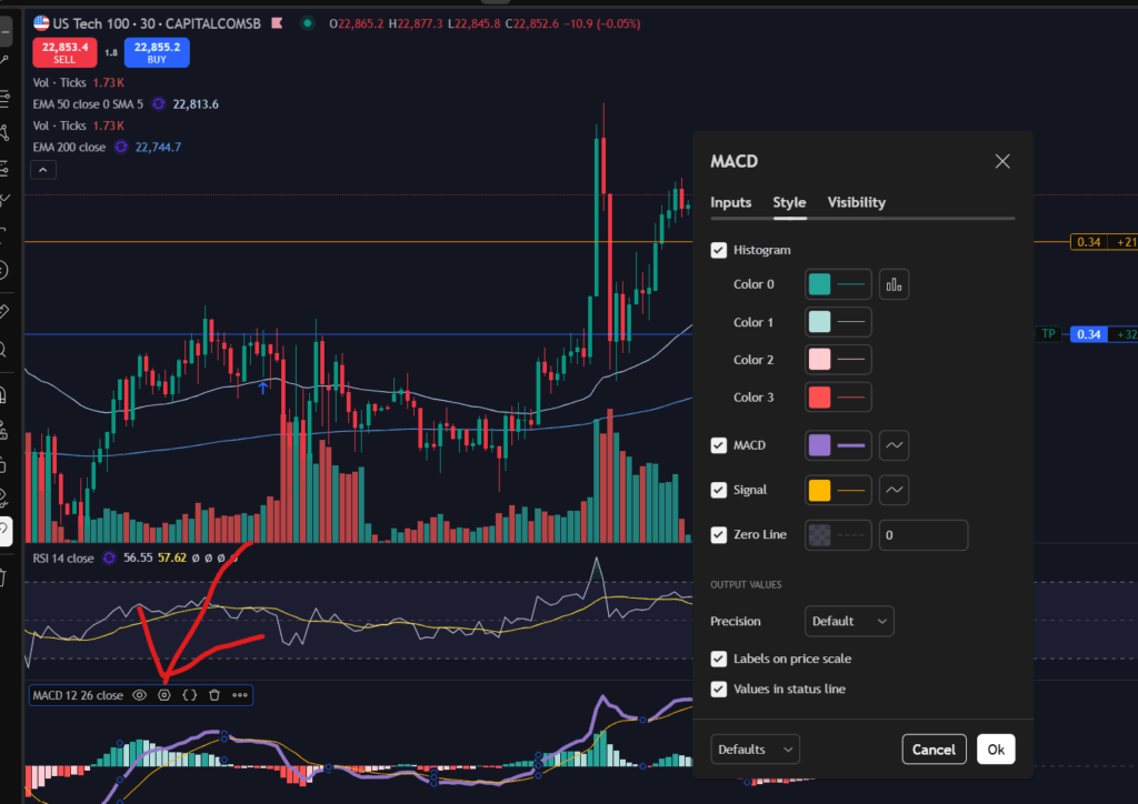
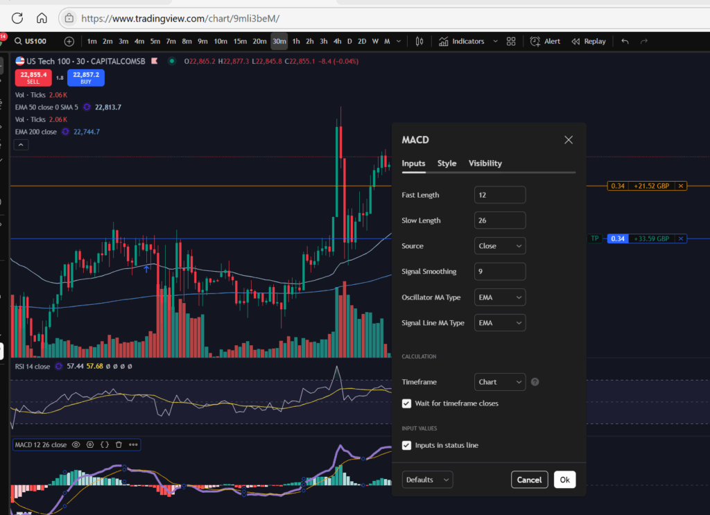
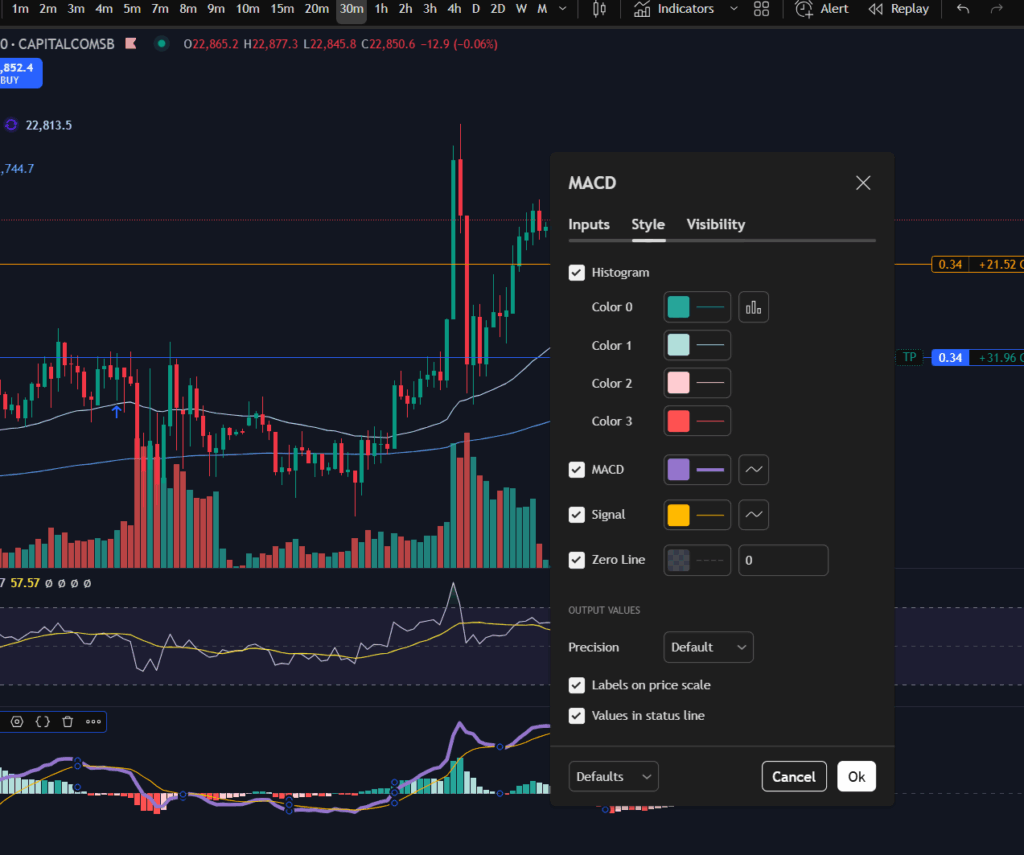
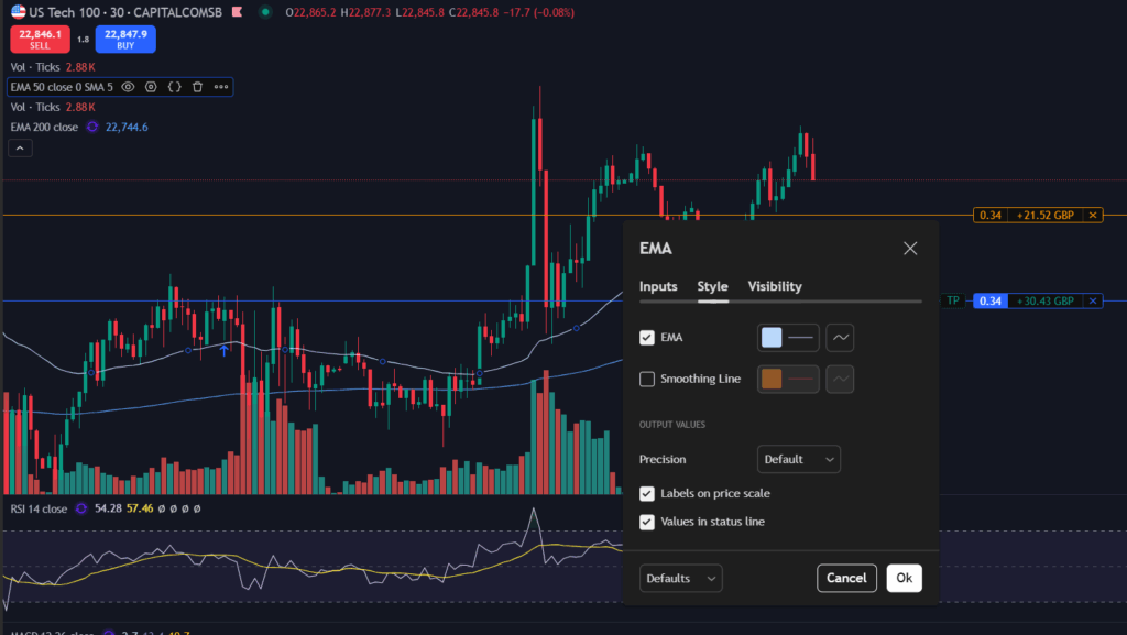
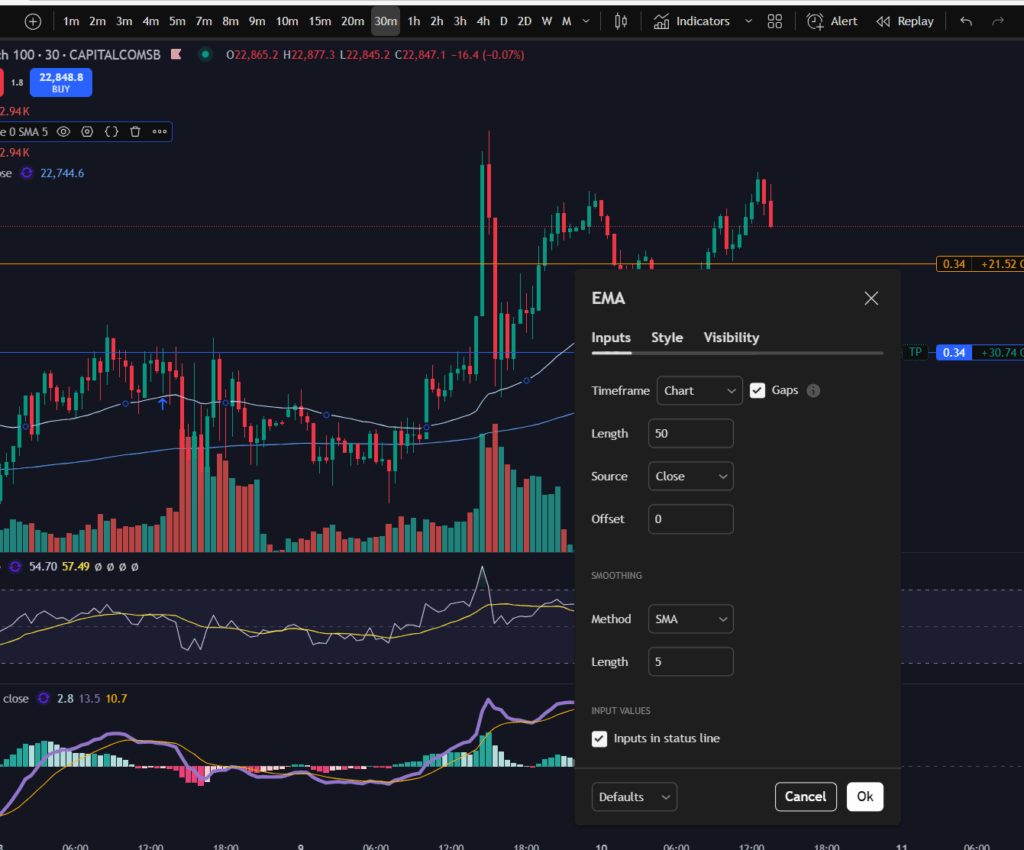
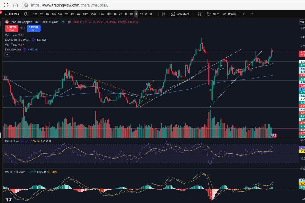
Another important aspect of understanding a stock chart which you will want to become familiar with, is the technical indicators menu. This is where you will find the MACD indicator, the volume, moving averages – any type of indicator you wish to add to your chart. There is a wide variety with Trading View which is another reason I really like the software.

For my own strategy and set up, I use the RSI, the MACD, the volume, and the 50 and 200 period EMA lines (exponential moving averages).

In Trading View, you can find the Technical Indicators menu, here:

Understand my strategy in full: https://www.patreon.com/Traderpro8320

To see my YouTube video explaining this article, please click the following link:

For more great tips on trading the financial markets, please visit my blog:

https://sophiatrades.co.uk

Discount on Trading View:

https://www.tradingview.com/?aff_id=117138

My performance in the live markets:

https://sophiatrades.co.uk/category/my-performance-statistics

Finally, thank you to my existing members on Patreon, and for your likes, comments and subscribes. Happy trading!

Please note any subscriptions taken via my affiliate link with Trading View may result in me earning a small commission.

Has the NASDAQ pull back ended? Trade now?

Has the NASDAQ pull back ended? In this article i’m going to consider the answer to this. I will talk about some signs which ‘could’ indicate that the NASDAQ may have finished pulling back. As with all my technical analysis you are strongly encouraged to do your own due diligence before placing any trades or investments in the markets. Let’s take a look at whether the NASDAQ pull back has ended.

NASDAQ pull back ended? – Recent movements

As I mentioned a day or so ago, the markets in general are in a well needed correction phase. They had pulled back quite a bit per the daily timeframe… Let’s take a look at the NASDAQ per the daily timeframe to get a reminder of where it sits currently. This will help us to decide whether the NASDAQ pull back ended…

NASDAQ pull back ended

For a discount to the chart software I use, and highly recommend, please click the link below!

As you can see above, the NASDAQ had pulled back down to just below the diagonal trend line. It seems like it could be bouncing there… Note the MACD histogram is losing it’s pigmentation and shrinking in size, and this can indicate that the move is running out of steam.

Let’s take a look at the 30 minute timeframe.

Let’s zoom in with the 30 minute timeframe!

NASDAQ pull back ended

I mentioned a day or so, ago, that the market looked like it was forming new highs and lows after the downward move and this trend seems to have continued. As you can see marked above, it seems to be forming a new high and a new low, but I would want to wait to see another MACD cross over for this high/low to be confirmed. You can see my separate blow article, on how to decide where the highs and lows are, here:

Amazing secrets to help you make more money trading – spot a downtrend early! – Trader Pro

So has the market finished its pull back?

Since the markets were very overbought recently, I would want to see continued highs and lows in this way before I decide that the market has turned around. It does look for now, like it’s trying to recover and push up. I’m conscious the US market is not currently open at the time of writing this, so I will be interested to see what happens at market open today. I am also very conscious that the markets are quite choppy currently and this scenario is a repeat of what happened previously, mid-downtrend – see the section to the left of the 30 minute timeframe chart above, where, in a similar way, the price popped up over the EMA lines and started up trending temporarily, only for it to descend further, subsequently. There is a possibility that this will happen again – I will be watching and waiting.

I hope you found this article helpful.

For more great tips on trading the financial markets, please visit my blog:

https://sophiatrades.co.uk

Discount on Trading View:

https://www.tradingview.com/?aff_id=117138

My performance in the live markets:

https://sophiatrades.co.uk/category/my-performance-statistics

Finally, thank you to my existing members on Patreon, and for your likes, comments and subscribes. Happy trading!

Please note any subscriptions taken via my affiliate link with Trading View may result in me earning a small commission.

How to Switch to Dark Mode in Trading View

This is a super quick article to explain how to switch to dark mode in Trading View charts, to reflect the ‘dark mode’ option. This is useful for people who spend a lot of time on screens – it can be more gentle on the eyes using a dark screen. I hope you find this helpful.

Why switch to dark mode in Trading View?

I asked Google what it had to say about this… I personally find it more comfortable, especially in the evenings, so what I found in the answer Google gave me, was interesting.

This seems to be a very personal choice, but if you have clicked on this article, the chances are, you have already decided you need dark mode, so let’s get into it!

How to switch…

You will find that the default is for a chart to have a white background. To switch to dark mode, first go to your usual chart set up and you will see your profile icon in the top left of the screen:

If you don’t yet have trading view, I highly recommend the software. By signing up to them through my link below, you will receive a discount:

You can see here, my charts display a ‘T’ for Trader Pro – the name on my Trading View subscription. If you click on this, you will get the following display/options:

how to switch to dark mode in trading view

As you can see, there is a toggle switch, which can be toggled on or off allowing you to turn ‘dark mode’ on and off very easily.

I hope you found this article helpful!

Understand my strategy in full: https://www.patreon.com/Traderpro8320

For more great tips on trading the financial markets, please visit my blog:

https://sophiatrades.co.uk

Discount on Trading View:

https://www.tradingview.com/?aff_id=117138

My performance in the live markets:

https://sophiatrades.co.uk/category/my-performance-statistics

Finally, thank you to my existing members on Patreon, and for your likes, comments and subscribes. Happy trading!

Please note any subscriptions taken via my affiliate link with Trading View may result in me earning a small commission.

Markets are dropping – how to beat them!

Markets are dropping and in this article we take a look at the recent activity on the NASDAQ and possible technical factors which have triggered this. We hope you find this useful.

Markets are dropping – recent NASDAQ activity

The recent activity on the NASDAQ has been extremely bullish… let’s take a look at the monthly chart:

As you can see, the NASDAQ recently reached all time highs. The RSI was very over extended, and the price had been pushing up for a sustained bull run period. It was about time they pulled back! You can see the history of the RSI indicator above. When uptrending, the RSI purple line above, pulls back and forth at the top of the RSI indicator area. Each time the RSI level reaches the highs it had stretched to before, a pull back happened. This time was no different – we were waiting for it! The pull back currently happening feels large, but in reality, it is small in comparison to the amount the markets have pushed up recently.

Markets are dropping – a view from the Daily Time Frame…

Markets are dropping

As you can see from the daily timeframe above, the pull back happening was almost necessary. The price has pulled back down further than the diagonal trend you can see on the bottom of the pattern above – please see this marked below…

You can see above, that the price as bouncing on a nice diagonal support level on the daily time frame, but within the last couple of days, the price has broken this support level.

The RSI has sunk down quite low on the daily timeframe – as you can see above, but the MACD histogram is still showing dark red bars which are growing in size (meaning the downwards move is not yet running out of steam). We could see lower prices still – it remains to be seen whether the price will start recovering or commence a return back up to where it was.

This evening I can see it has started bouncing around on the 30 minute timeframe:

A view from the 30 minute timeframe:

You can see the downtrend on this 30 minute screen shot in more detail… however, note that the price is currently trying to find support… Note the ‘steps’ I have marked on the chart in terms of the highs or lows… the first three marks counting from the left, were confirming that the 30 minute timeframe was still down trending. However, note that the fourth mark created a ‘higher low’ and the next one reached a ‘higher high’… it may be that the market has started to recover – I will be watching it carefully. My next steps will be to look out for solid signs of support and a turn around on the chart. Once I feel comfortable that the price is recovering, I will be more comfortable to place some more trades… for now, I wait….

I hope you found this article and my technical analysis helpful. If you would like to reach out with any trading questions or analysis questions, I would love to hear from you.

For more great tips and advice on trading the stock market, please visit:

https://sophiatrades.co.uk

To watch me trade live please visit my patreon page here:

https://www.patreon.com/Traderpro8320

Finally, if you would like to receive a discount on the Trading View charting software I use, please click on the relevant link here:

https://www.tradingview.com/?aff_id=117138

Please note any subscriptions taken via my affiliate link with Trading View may result in me earning a small commission.  However, I provide complete transparency on me using Trading View personally – I publish my success on the financial markets via my broker reports and any profits earned were done so by using my own Trading View subscription,  so I genuinely do recommend them and have been using the Trading View charts for many years.

Breaking down my profitable trades on Google for you

In this article I’m going to be breaking down my profitable trades on Google for you. These are in line with my MACD trading strategy which is a multi-timeframe analysis strategy, the details of which can be found linked on this blog and on my Patreon page and You Tube account. I will breakdown my entry and exists and the reasons behind these decisions. I hope you find the article useful.

What strategy to use for making profitable trades on Google?

I recently shared a strategy on my You Tube channel which outlines a flexible, profitable way of placing trades repeatedly on a market. The strategy is especially suited to trading the NASDAQ but I have been applying it to other markets with success. It can be applied to Google to make profitable trades on Google too. You can find the strategy below:

The strategy is based on my original MACD strategy which you can find on my Patreon account, linked below. However, it is now tailored to deal with the Trump tweets and trade wars as well as the other turbulence on the markets. I used to use a stop loss but I no longer control my risk in this way. You can find a video on what I changed to make my trading style more adaptable to the turbulence in the stock markets, here:

So now that I’ve explained which strategy I’m using currently, I’m going to be breaking down my profitable trades on Google for you.

Trades on Google – explained

So as you will know from reviewing my strategy above, the first thing I look for is a market which is ‘uptrending’ on the daily timeframe. I make sure that there is plenty of headroom before it reaches the previous high. Let’s take a look at Google Class C’s daily timeframe chart per Trading View to analyse the profitable trades on google I placed. (To get a discount on Trading View, please see the link below):

Google Class C – Daily Time Frame:

profitable trades on Google

You can see that the previous highs reached in around February 2025 are some way off from the recent prices where I have marked the chart with a red cross. Since there is plenty of scope for the price to come up to previous levels, and the price has been in a nice uptrend since around April – May 2025, I began to look for opportunities on a smaller time frame. It is worth noting that another key item I focus on, on the daily timeframe is the position of the MACD indicator. The MACD indicator was ‘on its way up’ after the MACD and signal lines had crossed over, and the histogram bars were still green. I also look at the RSI indicator. This one was showing that the market was in fact a little overbought when I entered. However, knowing that the market had plenty of scope to come up and given my more flexible trading style outlined in the video above in terms of adapting to turbulent market conditions, I knew I had a good chance of making profit on the stock from this position. I waited for a pull back on the smaller timeframe (30 minute timeframe) – examined below.

Google Class C – 30 Minute Time Frame:

As you can see in the above chart screen shot, I entered the market where the blue arrow is – a perfect entry according to my MACD strategy. The price did indeed go on towards previous highs and this is where I exited. (I actually had two positions on this market when I exited. You can see the preceding blue arrow where I entered for the first time. Unfortunately I missed my exit with that first one and got out of both trades at the red arrow. As per my video shared above, I no longer set profit targets or stop losses habitually. I do set a stop in certain conditions only – when the market has gone into profit and I want to ride a trend.

You can see on the 30 minute timeframe that the RSI was low at the point of entry, the MACD and Signal lines had just made a cross over and I knew from analysis on the daily timeframe that the market had a good chance of coming up further. The market was also making higher highs and higher lows on this 30 minute timeframe which is a crucial check I carry out before entering on the smaller timeframe.

The trade was profitable. I am finding this method of trading with a more flexible approach to risk management, much more beneficial (and less stressful).

I hope you enjoyed this article. I encourage you to carry out your own due diligence before placing any trades but I hope this analysis was of some assistance to you in terms of you understanding some possible approaches to trading.

If you appreciate these free articles it would really help me to finance them and produce more of them, if you are able to make a purchase on my Patreon page by subscribing as a member or purchasing a video – linked below.

Useful links for you:

Understand my strategy in full: https://www.patreon.com/Traderpro8320

For more great tips on trading the financial markets, please visit my blog:

https://sophiatrades.co.uk

Discount on Trading View:

https://www.tradingview.com/?aff_id=117138

My performance in the live markets:

https://sophiatrades.co.uk/category/my-performance-statistics

Finally, thank you to my existing members on Patreon, and for your likes, comments and subscribes. Happy trading!

Please note any subscriptions taken via my affiliate link with Trading View may result in me earning a small commission.

NASDAQ trading strategy that will make you thousands! ££££££

NASDAQ trading strategy that will make you thousands! ££££££

In this article i’m going to talk about a NASDAQ trading strategy which can literally make you thousands!! I’ve been using this strategy on the NASDAQ for the last few months and it has proved to be very successful. I’ve also linked below a video showing you some of my entry and exit points on Trading View. The video explains the strategy but I have outlined it below, too. This strategy builds on my MACD strategy which regular visitors to this site will know me well for. However, I made a few tweaks to take account of the unique personality of the NASDAQ index, and I also made some allowances for Trump’s tweets which have been sending the markets loopy lately! I hope you enjoy this article.

NASDAQ trading strategy – how it works

The NASDAQ trading strategy applies my usual MACD strategy as follows:

  • * Identify a nice uptrend on the daily time frame;
  • * Make sure the price is above the 200 period EMA;
  • * You want to get in per this NASDAQ trading strategy when the market is pushing up per the daily timeframe. To identify this, get in after the MACD and signal lines have made a cross over, ideally from a point below the zero level of the histogram. Ideally the RSI will be low at this point or at least not at a very high/overbought level:
NASDAQ trading strategy
  • *Once the MACD and signal lines have crossed over or are about to cross and go up again on the daily timeframe, you can visit a quicker/lower timeframe to find your entry and exit points, like the 30 minute timeframe.
  • *On the 30 minute timeframe, wait for the price to pop up over the 50 period EMA on the quicker timeframe as in the picture below:
NASDAQ trading strategy
  • *Once the price has popped up over the 50 period EMA, this would be a good place to enter the trade, based on your 30m timeframe and daily timeframe analysis.
  • *You can trail a stop below the latest low of the 30 minute timeframe trend, to scoop as much profit as possible from the move, before the trend reverses.

NASDAQ trading strategy – my recent entries and exits:

I’ve shared below the view from the daily timeframe of my own recent entries and exists using the NASDAQ trading strategy:

NASDAQ trading strategy

You can see i’ve been entering and exiting the market over and over and i’ve made a nice profit in the last few months in this way, not just on the NASDAQ but on other markets too!

In terms of the view from the daily timeframe, some things to watch for include the ‘personality’ of the RSI indicator. I suggest you have this on your chart and watch for the subtle ebs and flows of this indicator up and down to check when the market has likely reached another little peak/trough:

NASDAQ trading strategy

Its’ a bit difficult to show clearly here but you can see the little red arrows I have marked on the direction of the RSI indicator. I got in, each time the RSI had pulled back to a tiny dip position, and got out again when it extended to the top of the RSI channel. You can use the RSI indicator to help you identify the peaks and troughs in this way and to get in and out of the market several times over. Compare the blue and red arrows on the candlesticks above which show my entries and exits, to the flows of the RSI indicator below.

Now let’s look at the entries and exits on the 30 minute timeframe:

Here are some screen shots of the recent entries I made per the 30 minute timeframe view:

NASDAQ trading strategy

Some notes for you on the 30 minute timeframe view to bear in mind while you are applying this NASDAQ trading strategy – my entries and exits were not always perfect! There was one or two occasions where the market pulled back a bit further, after I entered. I prepared another recent article about how Trump’s tweets are affecting the stock market and I talked in that article about how to deal with the turbulent fallout. Here is a link to that video:

Here is the blog article I wrote about adapting my trading style to deal with President Trump’s tweets:

How President Trump is affecting the stock market – Trader Pro

As a result of my adaption to dealing with the markets in this new ‘Trump’ era, I learnt to ‘loosen’ my trading style. The key points I made were that I control my position size and I no longer use a stop loss. (I actually started out not using a stop and then started applying one some time into my trading journey, but now I have reverted back to not using one). This can only work if you control your position size and you are unlikely to get a margin call when the market goes slightly against you! It is not a recommendation to get into huge position sizes and not apply a stop loss.

The NASDAQ can be good for someone learning this NASDAQ trading strategy because it’s an average of some of the top stocks in America. Therefore, they are highly likely to push up overall and the ‘bad news’ of one of the companies on the index, is unlikely to pull the whole index down indefinitely. So… if the market dips a little and I entered at the wrong place/it was not a perfect entry, it’s ok. I wait – confident that I checked the daily timeframe and I was satisfied it is indeed near a low point overall. I wait for it to recover, and then take my profit again.

If the market did not recover for some time after my entry, I am still confident I will not be given a margin call – you can see other blog articles on my website which explain what a margin call actually is, and how to avoid it. If the markets have dipped down so much that they don’t recover for a while, it’s also a good time to stay out of the markets so I will be waiting in any event, and there is no loss for me except the little bit of profit on the portion of my account size which has been trapped/locked into my trade further up on the chart. In this scenario my plan would be to wait for the market to bottom out, and then get back in with another portion of my account, once i’m confident it’s recovering, and make profit all the way back up in the way I have illustrated above. I hope this makes sense to beginners but if you want to reach out and ask for further explanation I would be happy to help!

How do you know that the market had bottomed out after such a large pull back? You wait to see that it’s started making higher highs and higher lows, on the daily timeframe again. Here is a link to an article, showing you how to identify highs and lows properly:

Amazing secrets to help you make more money trading – spot a downtrend early! – Trader Pro

A video which will help you understand the strategy…

I’m sharing a video of the strategy being explained on You Tube which I hope you will find helpful:

I hope you found this NASDAQ trading strategy article helpful!

Understand my strategy in full: https://www.patreon.com/Traderpro8320

For more great tips on trading the financial markets, please visit my blog:

https://sophiatrades.co.uk

Discount on Trading View:

https://www.tradingview.com/?aff_id=117138

My performance in the live markets:

https://sophiatrades.co.uk/category/my-performance-statistics

Finally, thank you to my existing members on Patreon, and for your likes, comments and subscribes. Happy trading!

Please note any subscriptions taken via my affiliate link with Trading View may result in me earning a small commission.

How to use technical indicators in Trading View

In this article i’m going to talk about how to use technical indicators. I will share how you can tailor some of the key indicators in Trading View. Trading View is a trading platform which is fully customisable. The paramaters and settings for the technical indicators you are likely to be using, are fully adjustable. I use Trading View for my own trading, and I feel strongly that it’s an asset to my trading and success in the financial markets. I hope you find this article helpful.

How to use technical indicators – Changing the technical settings

Let’s just jump right into how to use technical indicators in Trading View. With almost all technical indicators in Trading View, we can change the technical settings. Let’s consider the MACD (Moving Average Convergence Divergence) indicator, first.

I selected the MACD line by left clicking until I could see the little circles (in blue below). This meant I had selected the indicator.

Next, click on the little hexagon shape with the circle in the middle, shown here with a red arrow:

Once you click on this, the options menu for the MACD indicator will appear as shown above. You can change the ‘technical settings’ of this indicator by clicking on the ‘Inputs’ tab of this pop up menu:

The settings are set to the ‘defaults’ as shown above, but you can change the length of the periods which control the MACD and signal lines using the input boxes above.

As you probably noticed from the earlier screen shot, you can also change the colours of the MCAD indicator. I like to use Dark Mode on Trading View, so I find it helpful to have a thick mauve line for the MACD indicator as I can see this more easily when using dark mode, especially as it crosses the histogram. If left to the default settings, it can be difficult to see the lines against a light histogram bar background. By the way, the histogram colours can also be changed by changing the drop downs boxes on the ‘Style’ tab of this pop up menu, too:

Once you are happy with your changes, press ‘OK’ on the menu, and the changes will be applied to your chart.

EMA lines

Let’s just look briefly at the EMA lines too. The period over which the average calculation is calculated can be changed in the same way as I described with the MACD indicator – click on the indicator once, to select it. Once you see the blue circles appear, click on the settings again:

How to use technical indicators

Once again, the technical inputs are on the ‘Inputs’ tab of the pop up menu:

How to use technical indicators

You can also change the colour and thickness of the EMA lines.

I hope you found this article helpful. If you would like to see the corresponding video on YouTube, please click on the link below:

For more great tips and advice on trading the stock market, please visit:

https://sophiatrades.co.uk

To watch me trade live please visit my patreon page here:

https://www.patreon.com/Traderpro8320

Finally, if you would like to receive a discount on the Trading View charting software I use, please click on the relevant link here:

https://www.tradingview.com/?aff_id=117138

Please note any subscriptions taken via my affiliate link with Trading View may result in me earning a small commission.  However, I provide complete transparency on me using Trading View personally – I publish my success on the financial markets via my broker reports and any profits earned were done so by using my own Trading View subscription,  so I genuinely do recommend them and have been using the Trading View charts for many years.

How to sort your watchlists in Trading View

How to sort your watchlists in Trading View

In this article I’m going to talk about how to sort your watchlists in Trading View. The platform is highly intuitive and I find it an invaluable resource when filtering markets and finding stocks and commodities to trade. Please read on if you would like to know more and receive a discount on the Trading View platform!

How to sort your watchlists in Trading View

Let’s jump right into how to sort your watchlists in Trading View. I’ve been using the platform Trading View for a number of years. The platform is highly intuitive – you can right click for most things and find the option you want! Let’s take a closer look at how to sort your watchlists in Trading View!

Firstly, where is the watchlist? There is a little icon which looks like a bookmark at the top right hand corner of the screen, here:

How to sort your watchlists

Once you click on this, it will give you your watchlist. If there are no items on your list, you can start adding them by clicking on the ‘+’ icon here:

How to sort your watchlists

You can see, I have renamed my watchlist above as ‘MACD Capital.com’. In order to rename your watchlist, simply click on the drop down list next to the list and it will give you a number of options, including ‘rename’:

When you go to add markets to your watchlist with the ‘+’ icon, you will see the following screen:

The platform defaults to applying a filter for markets listed on Trading View with your own broker (the broker you have logged into the platform with). You can see above, that for me, it has automatically filtered the markets by the ones I can trade through Capital.com. You can remove this filter to see all markets, however.

You can search for markets in the search box and the search is highly intuitive. Searching for ‘Gold’ will give you all markets with ‘Gold’ in the name description. This may sound obvious but I have experienced frustration with other broker accounts (for example, Pepperstone) where you search for a market using ‘Gold’ and nothing comes up! YOu need to know the specific symbol (XAUUSD I believe but don’t quote me on that!).

To add a market to your own watchlist, click the ‘+’ next to the listed item and it will be added to the bottom of your watchlist.

Sorting items in your watchlist in Trading View

There are some really nice features you can use to sort and organise your own watchlists in trading view (and you can have multiple ones). For example, you can drag the markets into the right position using your mouse. You can right click and add subheadings which can then be collapsed or expanded. You can also add coloured flags to particular markets. Please see below screen shot for examples:

To create more than one watchlist in Trading View

You can create multiple watchlists in Trading View and rename them as you wish. Just go to the drop down menu next to your currently viewed list and you will see a ‘create new list’ option there.

Please also see the video tour on our You Tube channel here which you may also find helpful:

How to sort your watchlists in Trading View

I hope you found this article helpful.

For more great tips and advice on trading the stock market, please visit:

https://sophiatrades.co.uk

To watch me trade live please visit my patreon page here:

https://www.patreon.com/Traderpro8320

Finally, if you would like to receive a discount on the Trading View charting software I use, please click on the relevant link here:

https://www.tradingview.com/?aff_id=117138

Please note any subscriptions taken via my affiliate link with Trading View may result in me earning a small commission.  However, I provide complete transparency on me using Trading View personally – I publish my success on the financial markets via my broker reports and any profits earned were done so by using my own Trading View subscription,  so I genuinely do recommend them and have been using the Trading View charts for many years.

Amazing! The Best Trading Platform – Trading View

Amazing! The Best Trading Platform – Trading View

In this article i’m going to talk about my experience of using Trading View as the best trading platform. I have been with this trading platform for a number of years and use the platform to execute all my entries, control my stop losses and analyse the markets. I will outline below the pros and cons of Trading View and my overall verdict on using the platform. I hope you find the article useful.

Best Trading Platform – What is Trading View?

Trading View is a platform which enables you to look at several different types of stock, commodity and other types of charts online. In terms of trading platforms, I have chosen to use and review Trading View as THE BEST trading platform. It can be logged into on the internet from anywhere, via a computer or a tablet or phone. Several different trading brokers are signed up to partner with Trading View meaning you are also able to see your open positions on the platform and move your stop loss if required on the charts.

The platform is fully customisable. It can be viewed in dark or light mode, the colours for the indicators are changable. You can arrange the components on the screen according to your preference, in a very flexible way.

Trading View customisation

The platform can be changed from light to dark mode. Here are some screen shots of how this might look for you by changing these settings:

The moving average indicators can be changed in length and colour. The technical indicators can be repositioned vertically on the chart and swapped around. The platform has just about every type of indicator you can think of available for use. It has everything available to the user that anyone could expect in terms of a best trading platform.

What I absolutely love about Trading View is the ease of use of its watch list. You can add a lot of markets to your watch lists, separate them with customisable headings, give them different coloured flags. The number of things you can do to customise your watchlist in Trading View is endless and I do personally find this feature extremely useful. I’ve copied a snippet below from my own watchlist – these markets are marked as ones in respect of which I am waiting on a MACD cross over. I’ve applied different coloured flags for added filtering/analysis:

Best Trading Platform

As well as the view of the charts being fully customisable and the indicators, you can also customise the alerts – for example, by setting the platform to email you when your chosen situation occurs on the chart. You can choose the type of alert – whether it alerts you once each time the situation happens, or it continues to. Example – should it tell you only once that the MACD and Signal lines have crossed each other? Or once per minute? Or once per bar close? What form should the alert take? Should it play a sound, email you? Should the alert expire after one day, one week?

Trading View – options for connecting a broker account

There are multiple options with Trading View for connecting a broker account. I have several accounts and they are all connected to Trading View. You can easily switch between them on the chart. I find this extremely useful. Most reputable trading brokers are available in a list for connecting, and their review status is given to you so you can see the better performing ones, if you would like to sign up to a new broker.

Best Trading Platform – Using the platform in a practical sense

I have been finding the platform really easy to use and personally, would never move away from using Trading View. It is extremely intuitive. For example, if you want to move your stop loss as a position moves into profit, you can just grab it on the screen and move it with your mouse or phone. You can right click on the chart and find the option you need for most situations.

When you want to add more items to your Trading View watchlist, you can go into the Trading View drive and filter markets based on your own broker.

Trading View – Best Trading Platform – Final Verdict

I absolutely love Trading View. I will never move away from using it. You can see from my You Tube channel and blog articles that I’ve been using it for a number of years for all of my own trading positions and I have found it an invaluable resource in my trading journey.

For more great tips and advice on trading the stock market, please visit:

https://sophiatrades.co.uk

To watch me trade live please visit my patreon page here:

https://www.patreon.com/Traderpro8320

Finally, if you would like to receive a discount on the Trading View charting software I use, please click on the relevant link here:

https://www.tradingview.com/?aff_id=117138

Please note any subscriptions taken via my affiliate link with Trading View may result in me earning a small commission.  However, I provide complete transparency on me using Trading View personally – I publish my success on the financial markets via my broker reports and any profits earned were done so by using my own Trading View subscription,  so I genuinely do recommend them and have been using the Trading View charts for many years.

How President Trump is affecting the stock market

How President Trump is affecting the stock market

Hi guys! It’s been a while because my trading style has changed over the last few months and I’ve really been trying to figure out what i’m comfortable with. I want to address how President Trump is affecting the stock market. In my opinion, leading up the elections in America and beyond during his time in office, the markets have been extremely erratic. This has affected my win rate when applying my usual strategy. Therefore, I have adjusted my approach. More below!

How President Trump is affecting the stock market – how it’s affected my own trading

During the period leading up to the elections, my usual win rate was not materialising in my own trading style and strategy. I started to understand that President Trump is affecting the stock market. As my followers know, I apply a MACD entry across multiple timeframes and get in at the support per the daily timeframe. During the period leading up to the elections, what I was finding was that the charts were indicating a good buy entry for me, but then shortly after entry, the price would come crashing down. This phenomenon has not ceased during the time that President Trump has been in office, and I have heard many other traders confirming that their own strategies have been affected by him being in office. It seems whenever he opens his mouth, the markets either come crashing down, or they start to shoot upwards. This phenomenon is believed by some to be deliberate!

So what have I done about this in my own trading style?

I have adjusted my style to become more ‘loose’ and manage risk in a slightly different way, so as to avoid the chaos which was ensuing as a result of the way in which President Trump is affecting the stock market. I have stopped using a stop loss. (I do not encourage you to trade without a stop loss unless you really know what you are doing!). I enter minimal position sizes until i’m sure that the market is going in the direction I predicted and I increase my position size as it progresses in the right direction. I make use of very little leverage. I am now moving my stop loss to follow the trend upwards on the daily timeframe. Mostly I am doing this on the indices such as the NASDAQ and the S&P 500. I move my stop up below the previous low of the trend, as the position moves into profit and keep doing this. When the market reaches a peak on the daily timeframe, I am very cautious about getting into larger positions and once they start pulling back, I allow them to stop out against the stop loss which, at that point, is in a position of profit.

I have found being more flexible with my trading style is working well for me and is helping me to avoid erratic swings due to news or announcements. I do not close the small positions I enter when they go against me – I just wait for them to start coming up again.

So to summarise:

  • – I enter small positions until i’m sure of direction;
  • – I do not make use of a lot of leverage – if the markets completely go against me, I am aware that I have enough money in my account to not get a margin call in light of the position sizes i’m trading. Even if the market went down by 50% of its value, I would still not get a margin call!
  • -I enter larger positions as the markets move in my favour;
  • -I enter a stop loss on the chart in a position of profit only (or neutral) and continually move it upwards just beneath the previous low of the trend
  • – Once the price reaches the peak area on the daily timeframe in terms of the previous high, I proceed with caution, and if necesary I allow the positions to trigger my stop loss which will be in profit at that point.

I hope you found this useful – even if it’s just knowing that you are not alone in believe your trading outcomes have changed from the way President Trump is affecting the stock market, since around the time of the elections. Please comment if you have found that his term in office has affected yFor more great tips and advice on trading the stock market, please visit:

https://sophiatrades.co.uk

To watch me trade live please visit my patreon page here:

https://www.patreon.com/Traderpro8320

Finally, if you would like to receive a discount on the Trading View charting software I use, please click on the relevant link here:

https://www.tradingview.com/?aff_id=117138

Please note any subscriptions taken via my affiliate link with Trading View may result in me earning a small commission.  However, I provide complete transparency on me using Trading View personally – I publish my success on the financial markets via my broker reports and any profits earned were done so by using my own Trading View subscription,  so I genuinely do recommend them and have been using the Trading View charts for many years.our trading!