Hello. If you are on this page, you are probably looking to increase financial success and stability. You have come to the right place. On this website you will find educational resources which will help you learn how to trade including technical indicators, trading strategies, risk management and recommended charting software. In addition to these helpful resources, I will be posting regular blogs outlining trade setups which you may find helpful. You can find my own trade set up style, here:
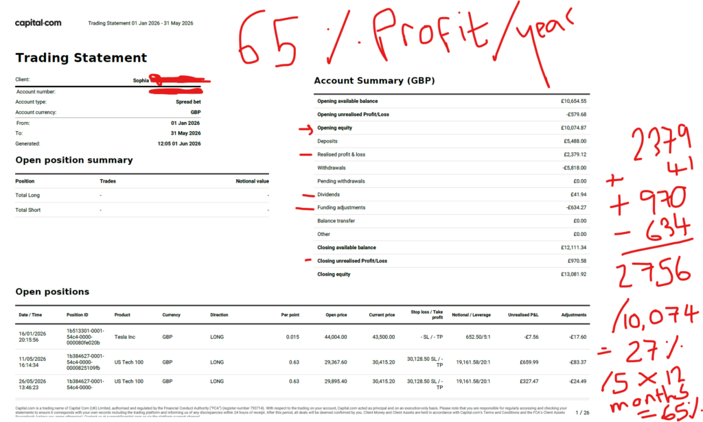
In the interests of being completely transparent with my stock market profit on the financial markets, I am publishing a screen shot here, of my recent success. I hope this gives you some confidence that I am a genuinely successful trader and there is money to be made on the financial markets. I trade with Capital.com. I do not have any affiliation with them.
Over the last few months I have been trading the NASDAQ. This resulted in a profit of over £2.7k. When you gross this up for a year i’m on track for a return of 65% for the year. To understand and learn exactly how i’m doing this, you can join me on my Patreon account, linked below.
I hope you found this article on my recent stock market profit, helpful!
Nothing on this blog should be taken as financial advice or encouragement for you to enter a trade. You are expected to speak to a financial adviser or carry out your own due diligence before entering any positions. Everything on this blog is made for educational purposes and to equip you with the knowledge you need to be able to make your own financial decisions. I am not regulated by the Financial Conduct Authority.
For more great tips and advice on trading the stock market, please visit:
Please note any subscriptions taken via my affiliate link with Trading View may result in me earning a small commission. However, I provide complete transparency on me using Trading View personally – I publish my success on the financial markets via my broker reports and any profits earned were done so by using my own Trading View subscription, so I genuinely do recommend them and have been using the Trading View charts for many years.
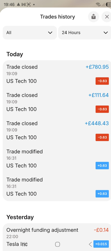
In the interests of being completely transparent with my stock market profit on the financial markets, I am publishing a screen shot here, of my recent success. I hope this gives you some confidence that I am a genuinely successful trader and there is money to be made on the financial markets. I trade with Capital.com. I do not have any affiliation with them.
Over the last couple of weeks I gradually added more to my position size on the NASDAQ and this resulted in a profit of over £1,200. You can see my total profit for the month in a separate blog post. My first entry was made on 11th May 2026. The balance on this account at the start of the year was circa 11k.
I hope you found this article on my recent stock market profit, helpful!
Nothing on this blog should be taken as financial advice or encouragement for you to enter a trade. You are expected to speak to a financial adviser or carry out your own due diligence before entering any positions. Everything on this blog is made for educational purposes and to equip you with the knowledge you need to be able to make your own financial decisions. I am not regulated by the Financial Conduct Authority.
For more great tips and advice on trading the stock market, please visit:
Please note any subscriptions taken via my affiliate link with Trading View may result in me earning a small commission. However, I provide complete transparency on me using Trading View personally – I publish my success on the financial markets via my broker reports and any profits earned were done so by using my own Trading View subscription, so I genuinely do recommend them and have been using the Trading View charts for many years.
In this article i’m going to give you some simple instructions on how to add the Exponential Moving Avearge (EMA) indicator in Trading View. Let’s jump straight into it!
First of all, what is Trading View?
Trading View is a chart package which you can subscribe to. It’s the best one I have ever used. I’m still using it in my own trading – any screen shots I take in the ‘Chart Analysis’ section of my blog, are taken from my Trading View chart package:
Trading View is extremely intuitive as a chart package. You can filter and sort your watchlists in exactly the way you would like to – adding flags, sections – anything that can help with keeping your watchlists organised.
It allows you to log into many different brokers, and I have three different accounts of my own, hooked up on Trading View.
You can set alerts and have it email you when the price reaches a certain position or when particular scenarios occur in relation to your indicators.
I can offer users of my blog, a discount to this amazing software – just click the link below:
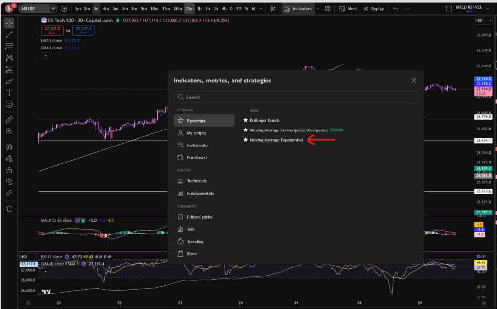
Where is the Exponential Moving Average indicator in this chart package?
You can find the indicators by going to the indicators tab at the top of the charts. When you click on this tab, you will get a list come up of hundreds of different types of indicators. You can find the Exponential Moving Average indicator by typing in the search box, “Exponential Moving Average”. You will see the indicator appear. Note there are many different versions so you want to select the plain default version – people are building their own indicators in there so you want to avoid any that you are not familiar with:
Here is what the plain default indicator looks like:
As you can see, my Exponential Moving Average indicator is in my favourites as this is one of the key indicators I use when implementing my strategy.
Once you have applied this indicator to your chart, you can tailor its settings by following the instructions in a related blog article. Please see the Trading View or Exponential Moving Average sections of the blog:
Nothing on this blog should be taken as financial advice or encouragement for you to enter a trade. You are expected to speak to a financial adviser or carry out your own due diligence before entering any positions. Everything on this blog is made for educational purposes and to equip you with the knowledge you need to be able to make your own financial decisions.
For more great tips and advice on trading the stock market, please visit:
Please note any subscriptions taken via my affiliate link with Trading View may result in me earning a small commission. However, I provide complete transparency on me using Trading View personally – I publish my success on the financial markets via my broker reports and any profits earned were done so by using my own Trading View subscription, so I genuinely do recommend them and have been using the Trading View charts for many years.
In this article i’m going to give you some simple instructions on how to add the Bollinger Bands indicator in Trading View. Let’s jump straight into it!
First of all, what is Trading View?
Trading View is a chart package which you can subscribe to. It’s the best one I have ever used. I’m still using it in my own trading – any screen shots I take in the ‘Chart Analysis’ section of my blog, are taken from my Trading View chart package:
Trading View is extremely intuitive as a chart package. You can filter and sort your watchlists in exactly the way you would like to – adding flags, sections – anything that can help with keeping your watchlists organised.
It allows you to log into many different brokers, and I have three different accounts of my own, hooked up on Trading View.
You can set alerts and have it email you when the price reaches a certain position or when particular scenarios occur in relation to your indicators.
I can offer users of my blog, a discount to this amazing software – just click the link below:
Where is the Bollinger Bands indicator in this chart package?
You can find the indicators by going to the indicators tab at the top of the charts. When you click on this tab, you will get a list come up of hundreds of different types of indicators. You can find the Bollinger Bands indicator by typing in the search box, “Bollinger Band”. You will see the indicator appear. Note there are many different versions so you want to select the plain default version – people are building their own indicators in there so you want to avoid any that you are not familiar with:
Here is what the plain default indicator looks like:
As you can see, my Bollinger Band indicator is in my favourites as this is one of the key indicators I use when implementing my strategy.
Once you have applied this indicator to your chart, you can tailor its settings by following the instructions in a related blog article. Please see the Trading View or Bollinger Bands sections of the blog:
Nothing on this blog should be taken as financial advice or encouragement for you to enter a trade. You are expected to speak to a financial adviser or carry out your own due diligence before entering any positions. Everything on this blog is made for educational purposes and to equip you with the knowledge you need to be able to make your own financial decisions.
For more great tips and advice on trading the stock market, please visit:
Please note any subscriptions taken via my affiliate link with Trading View may result in me earning a small commission. However, I provide complete transparency on me using Trading View personally – I publish my success on the financial markets via my broker reports and any profits earned were done so by using my own Trading View subscription, so I genuinely do recommend them and have been using the Trading View charts for many years.
In this article i’m going to talk about how you can change the MACD settings in Trading View, to suit your trading style and strategy. I’m going to talk about the length of the MACD and signal lines, and the colours of the histogram and the lines. Let’s jump straight into it!
First of all, what is the MACD indicator?
‘MACD’ stands for Moving Average Convergence Divergence. It does what it says on the tin! It’s the consecutive convergence and divergence of two moving averages. I published a separate blog article, explaining how you can use the MACD indicator to make more money in your trading, linked below, so I won’t go into that here. However, I do want to explain to you how you can change the settings on the indicator.
How to change the settings on the MACD indicator in Trading View
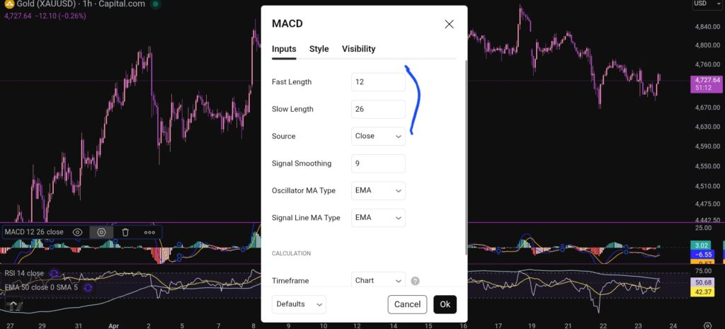
OK, so now i’m going to share with you how you can change the settings on the MACD indicator. To change the length of the moving average lines, tap anywhere on the MACD indicator, and you will see the settings menu come up – it appears on the leeft of the sceen, as shown below:
When you click on the little hexagon shape, it will bring up a menu, as follow:
You want to click next on the ‘inputs’ tab as shown above, and you will see this screen next:
As you can see, you can alter the lengths of the moving averages here by changing the values in the field boxes.
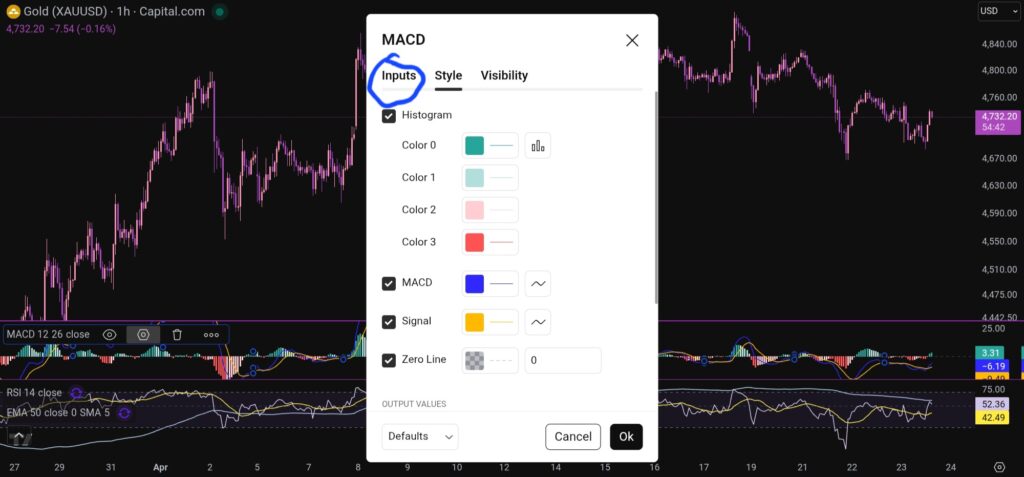
How do you change the colour scheme of the MACD indicator?
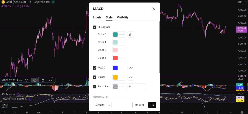
Changing the colour scheme of the MACD indicator in Trading View is just as easy as changing the moving averages. You simply click on settings with the hexagonal shape again, and the first box which comes up, is the menu where you have the option to change the colours of the MACD indicator:
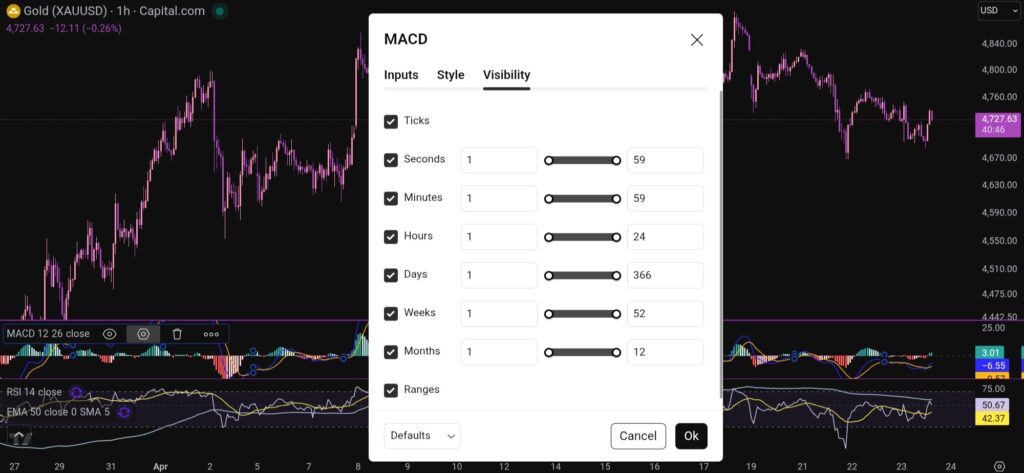
You can also change the visibility of the MACD indicator by clicking on the tab for this, and you will see this menu:
I hope you found this article helpful!
Disclaimer!
Nothing on this blog should be taken as financial advice or encouragement for you to enter a trade. You are expected to speak to a financial adviser or carry out your own due diligence before entering any positions. Everything on this blog is made for educational purposes and to equip you with the knowledge you need to be able to make your own financial decisions.
For more great tips and advice on trading the stock market, please visit:
Please note any subscriptions taken via my affiliate link with Trading View may result in me earning a small commission. However, I provide complete transparency on me using Trading View personally – I publish my success on the financial markets via my broker reports and any profits earned were done so by using my own Trading View subscription, so I genuinely do recommend them and have been using the Trading View charts for many years.
In this article i’m going to have a look at what’s happening on some of the major indices, with a view to answering the question, ‘what are the best stocks to buy now?’. Let’s jump straight into it!
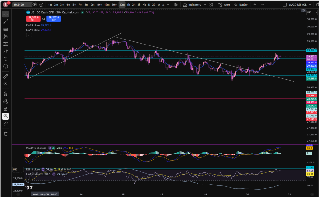
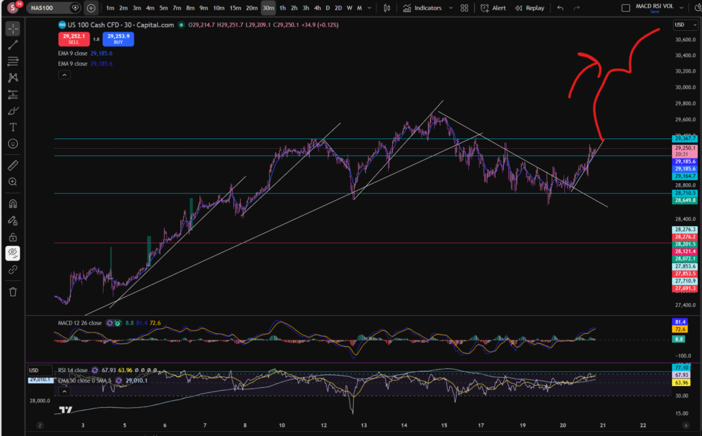
What’s happening on the NASDAQ today – best stocks to buy now
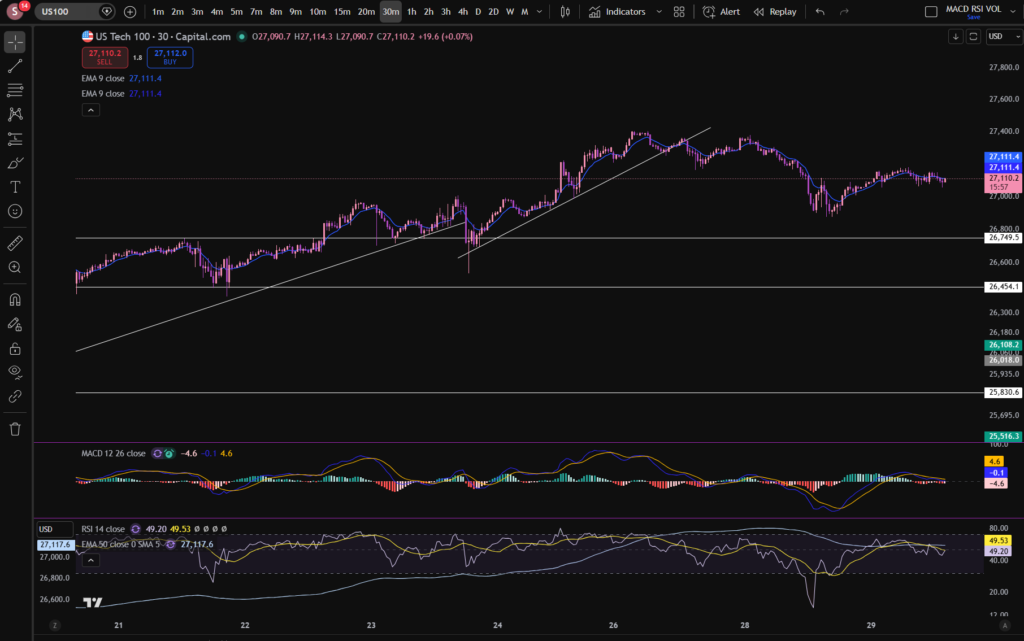
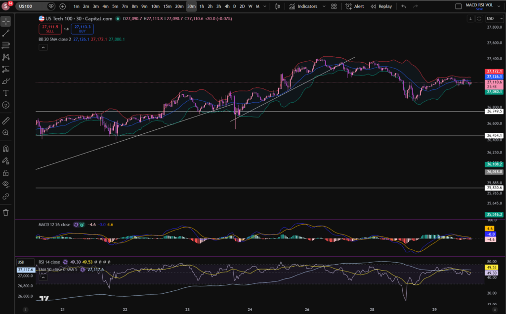
I mentioned a few days ago that the market was downtrending and the old diagonal support had become a resistance. This followed the same pattern, until today, when the market broke through the diagonal resistance line, on the 30 minute timeframe, as you can see, above. The market is now forming a new pattern – let’s mark it on the chart:
As you can see, the price has been bouncing off the diagonal trend line above since earlier today. It does appear to be uptrending again with a new low having formed at a higher price than the previous one.
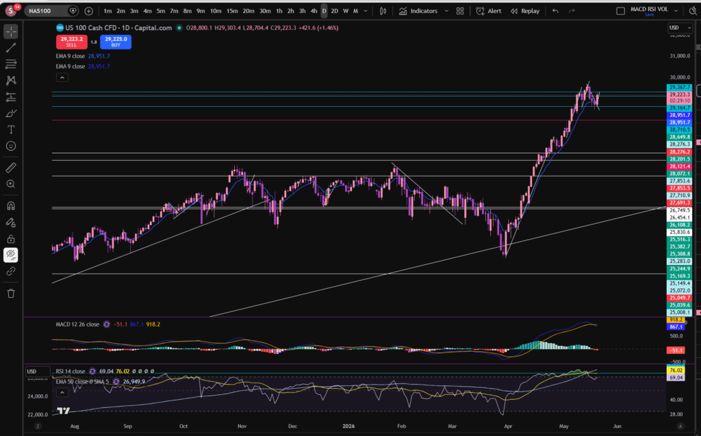
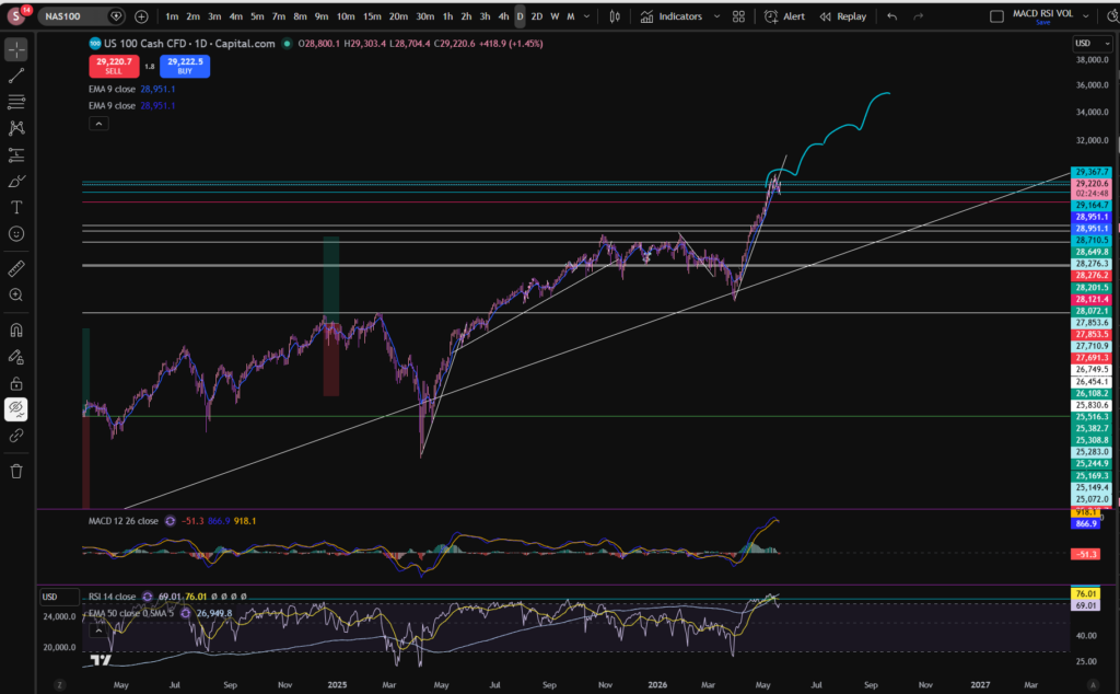
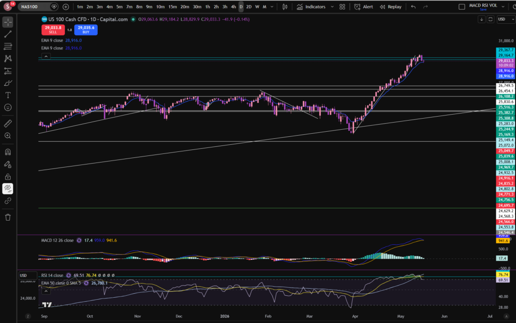
I can’t consider the best stocks to buy now, without also considering the bird’s eye view of the NASDAQ. Let’s look at the daily timeframe:
As you can see on the daily timeframe, the histogram bars have turned red. However, the RSI has pulled back quite a bit from where it peaked, marked above with the turquoise horizontal line. It is not clear to me currently, whether it will keep pushing up again or pull back some more… Ultimately, I think the type of shape such as the one drawn below, would be reasonable, in circumstances where it’s going to keep on pushing up:
You can see it has made this pattern a number of times before, when moving away from the enormous diagonal support which it bounces on from the point of view of the daily/monthly timeframe.
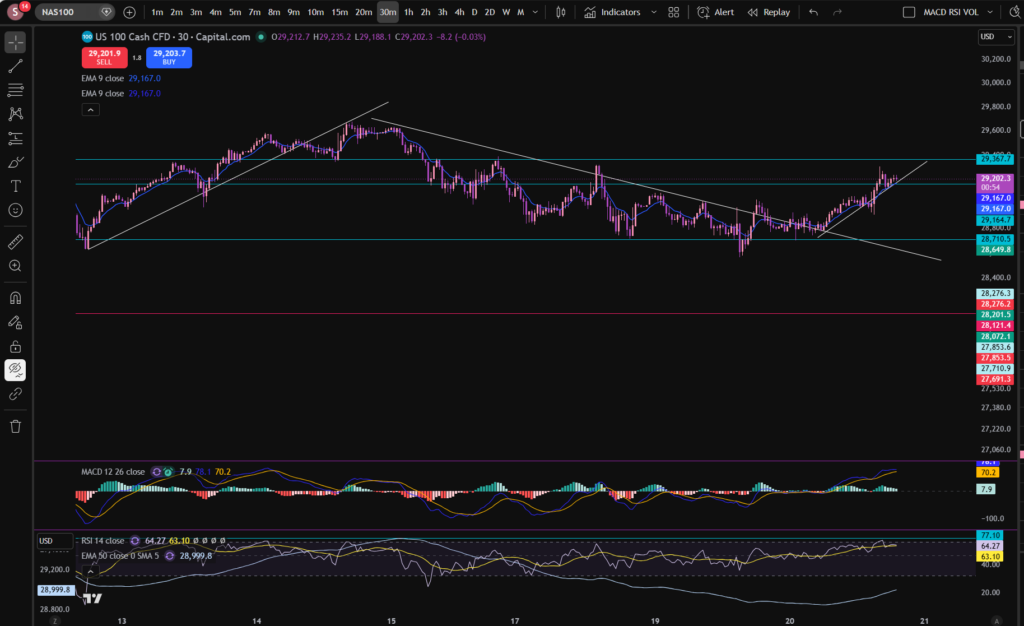
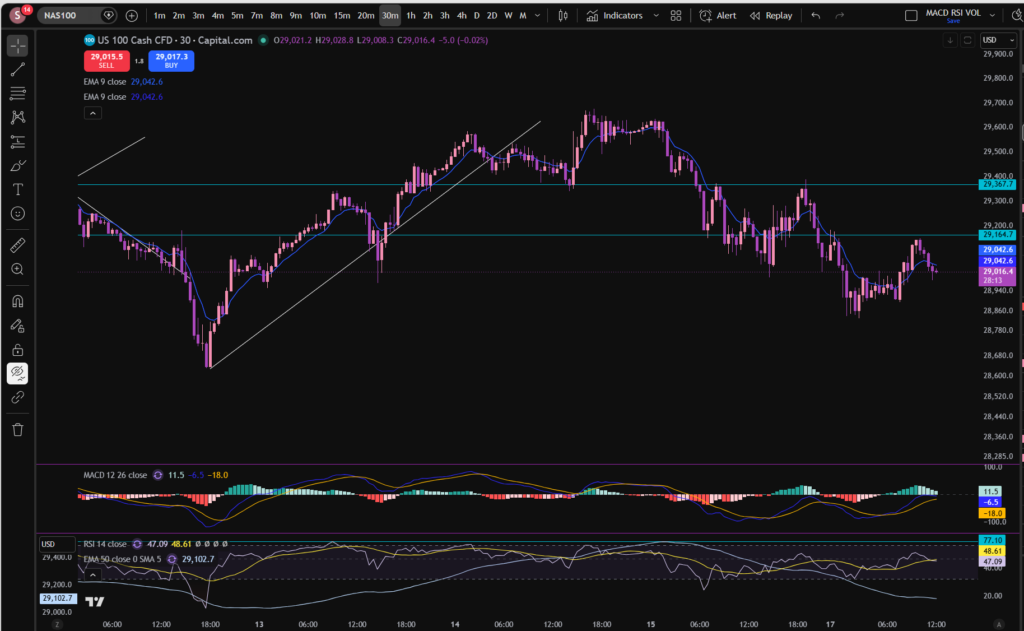
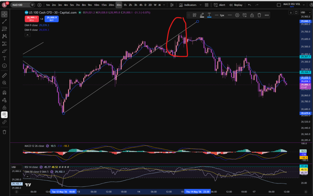
How can we know whether it has finished pulling back? Well… the fact it’s making higher highs and higher lows on the 30 minute timeframe, is a good sign. If it pushes up past the old all time high, this would be another good sign…Let’s take a look at that timeframe again:
Once it starts bumping up above the other previous all time high as illustrated above, this would give me a bit more confidence but i’m always keeping an eye on the bird’s eye view as well, and the RSI indicator, on all timeframes.
As of right now, I think i’m going to wait a little longer…
I hope you found this article on the best stocks to buy now, helpful!
Nothing on this blog should be taken as financial advice or encouragement for you to enter a trade. You are expected to speak to a financial adviser or carry out your own due diligence before entering any positions. Everything on this blog is made for educational purposes and to equip you with the knowledge you need to be able to make your own financial decisions.
For more great tips and advice on trading the stock market, please visit:
Please note any subscriptions taken via my affiliate link with Trading View may result in me earning a small commission. However, I provide complete transparency on me using Trading View personally – I publish my success on the financial markets via my broker reports and any profits earned were done so by using my own Trading View subscription, so I genuinely do recommend them and have been using the Trading View charts for many years.
In this article i’m going to answer the question, how do changes in interest rates affect the stock market. I’m going to focus on decisions by the FEDS but this will equally apply to changes by the Bank of England and other similar organisations. Let’s get straight into it!
How do changes in interest rates affect the stock market – let’s start with the basics!
First of all, when we talk about ‘how do changes in interest rates affect the stock market’, which interest rates do we mean, and who changes them, and why? The interest rates I’m talking about in this article, are the ones set by the institutions such as the Bank of England or the FEDS (Federal Reserve Bank in America). These organisations change the interest rates to try and control the economy and often inflation. They can change spending by businesses and the public by changing the rates. For example, when your mortgage goes up due to a change in rates, you have less disposable income, right? The same is true for businesses – they tend to borrow for business purposes, and this affects how much profit they can retain, reinvest and use to grow. If inflation is spiraling out of control in the economy, these organisations can increase the rates to slow the economy down. Let’s take a look in more detail, at some of these scenarios.
How do changes in interest rates affect the stock market – An increase to rates – the purpose and effect
When the FEDS increase the interest rates, it raises the cost of borrowing for individuals and businesses. Borrowing for mortgages, and business loans become more costly. This has the effect of slowing down the economy and the outflow of this is that inflation is being controlled – which is the purpose. The economy is slowed because of the lack of buying power on the part of the people and businesses who are paying the debts and this results in less sales for businesses and slower economy growth.
The effect on the stock market is that the investors will now be worrying about a lack of growth and they will switch their money out of stocks, into something more steady (but which attracts slower growth) like bonds.
What about a decrease to interest rates?
The opposite is true for a decrease to rates. With a decrease to rates, people and businesses have more disposable income. Businesses are able to make more investment into growing the business which in turn, can make more profit. People can spend more due to the increase in disposable income and they therefore buy more product, being produced by the businesses, and this in turn leads to more growth still.
How can I take advantage of these changes when trading or investing in the stock market?
You can keep track of when interest rate decisions are going to be announced on the Federal Reserve Bank’s website, and the Bank of England’s website, and take note of whether the rate has increased or decreased and, therefore, how this will affect the stocks. I have published a separate page detailing links to the calendars noting the dates on which these organisations will next be making these decisions, here:
Nothing on this blog should be taken as financial advice or encouragement for you to enter a trade. You are expected to speak to a financial adviser or carry out your own due diligence before entering any positions. Everything on this blog is made for educational purposes and to equip you with the knowledge you need to be able to make your own financial decisions.
For more great tips and advice on trading the stock market, please visit:
Please note any subscriptions taken via my affiliate link with Trading View may result in me earning a small commission. However, I provide complete transparency on me using Trading View personally – I publish my success on the financial markets via my broker reports and any profits earned were done so by using my own Trading View subscription, so I genuinely do recommend them and have been using the Trading View charts for many years.
In this article i’m going to consider the best stocks to buy now. I’m going to take you through what’s happening on the markets in general as an initial step, to check whether the markets are suitable for a buy entry, currently. Let’s get straight into it!
Best stocks to buy now – let’s see what’s happening on the NASDAQ index chart, first…
My first step in determining the best stocks to buy now, is to have a look at the high level, bird’s eye view, picture. I’ve grabbed a screen print of the NASDAQ’s daily timeframe chart, using my favourite software tool, Trading View:
OK, as you can see, per the daily timeframe, the MACD indicator’s histogram, looks like it’s shrinking in size, and it’s turned to a very pale green colour. This means the price is losing momentum in the upwards push. If we consider the RSI indicator, the level has pulled back quite a bit from where it was – it’s currently sitting at 69.51 but it had reached a level which has acted as an RSI resistance, previously, at around 77.5 – you can see this level marked in a turquoise colour on the RSI indicator. I added this mark last week when analysing the markets – and it was my suggestion that when it reaches this level, the history is that it has typically pulled back from there. This suggestion is now playing out on the chart – as you can see above. It is important to get a good bird’s eye view, in this way, when considering the best stocks to buy now.
The turquoise lines at the top of the chart marked very close together, were some resistance and support levels I had marked on the chart last week on the 30 minute timeframe. Let’s zoom in and see what’s happening more closely…
As you can see, from around the 15th of May, the market has been strongly pulling back per the 30 minute timeframe. The price broke a diagonal support level which had formed and this became the resistance, here:
Now the price is descending. It looks like the momentum is still strong because even on this 30 minute timeframe, the MACD is just about to cross over to the downside, over the signal line – the histogram is about to turn red. It remains to be seen how long the pull back will go on for. On the daily timeframe, the RSI is now at a level which has previously acted as a support but we will need to see whether it starts to recover or comes down a bit more.
The final timeframe I want to consider, is the monthly timeframe:
I mentioned last week that the price had recently bounced from a long term diagonal support. The MACD histogram here, is dark green and growing although the RSI is still quite high.
When considering best stocks to buy now, I consider these charts very carefully to determine which direction the markets might be headed in, in the short term. Nobody can know the answer for sure, but what would I be wanting to see, before jumping into any trades? I want to see the 30 minute timeframe recovering – making higher highs and higher lows. It is not in this position, currently. Note that any future patterns will form on the lower timeframes first – the smaller timeframes are like a glimpse into the potential future…
Given what’s happening on the NASDAQ and that this in turn actually heavily influences the performance of its constituents and those of the S&P 500, I will be patiently waiting for now. I know this is not what some traders want to hear, especially when they are new to trading. However, one of the biggest lessons you must learn in trading, is when to exercise some restraint. Obviously, what I say here, is relevant to my own personal style of trading – I do not short the markets. I only buy into them.
I hope you found this article helpful on the best stocks to buy now!
Disclaimer!
Nothing on this blog should be taken as financial advice or encouragement for you to enter a trade. You are expected to speak to a financial adviser or carry out your own due diligence before entering any positions. Everything on this blog is made for educational purposes and to equip you with the knowledge you need to be able to make your own financial decisions.
For more great tips and advice on trading the stock market, please visit:
Please note any subscriptions taken via my affiliate link with Trading View may result in me earning a small commission. However, I provide complete transparency on me using Trading View personally – I publish my success on the financial markets via my broker reports and any profits earned were done so by using my own Trading View subscription, so I genuinely do recommend them and have been using the Trading View charts for many years.
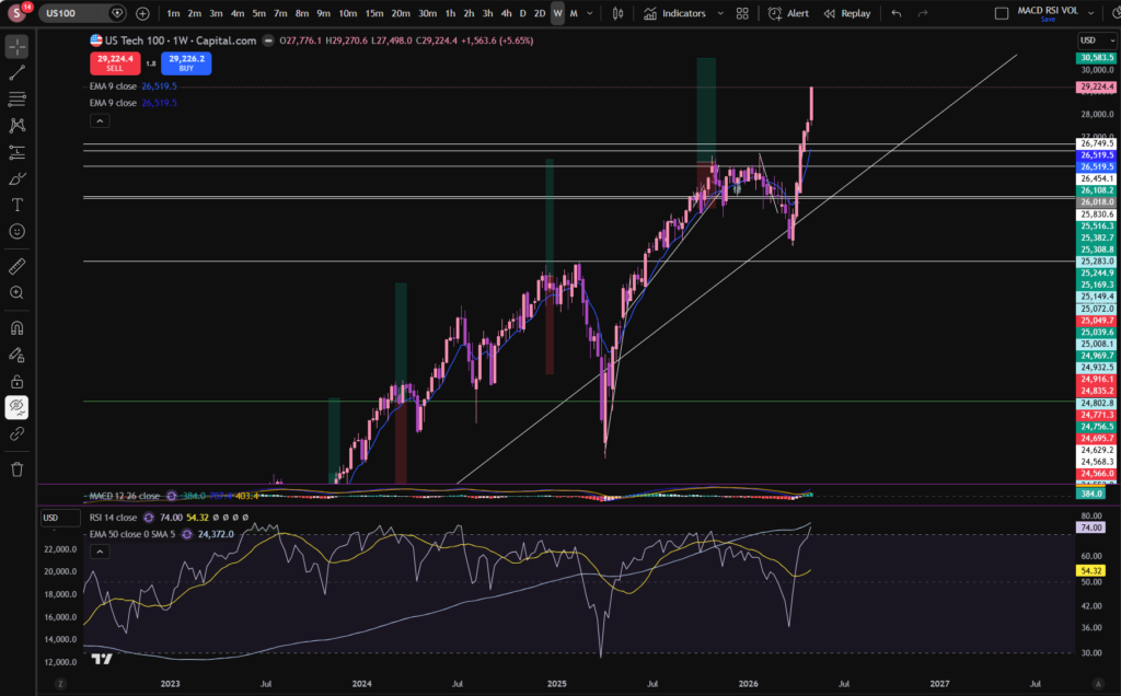
In this article i’m going to consider stocks today by examining what’s been happening on the NASDAQ. As always any chart analysis which is performed is to help you understand how to make your own decisions about where you think the markets might go next. Let’s get straight into it!
Stocks today – NASDAQ
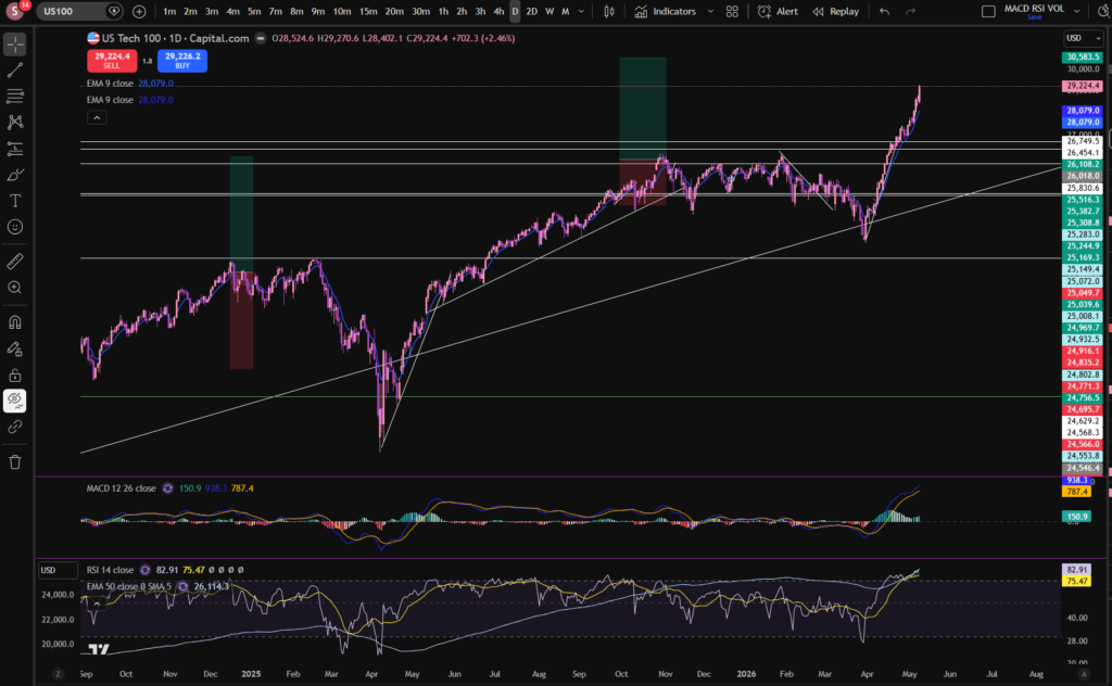
One of the first things I look at when considering stocks today, is I check what’s happening on the birds eye view of the NASDAQ daily timeframe:
As you can see, the NASDAQ index, pushed away from a major diagonal support line in around April. The price has been pushing up strongly since then, but we did experience a little pull back in the last week or so. It’s good when looking at stocks today, to consider the ‘even bigger’ picture, by considering the monthly timeframe, so you can get the diagonal trendline into perspective:
I’ve left a link to a discount to the Trading View chart software I use, above – this is a great tool to help you on your trading journey. I use this software every single day, to analyse stocks today.
It’s good as a technical analysis trader, to switch between different time frames to either zoom in, or out. I have published a separate blog article on this, to help you to understand it in detail. Please see the link below:
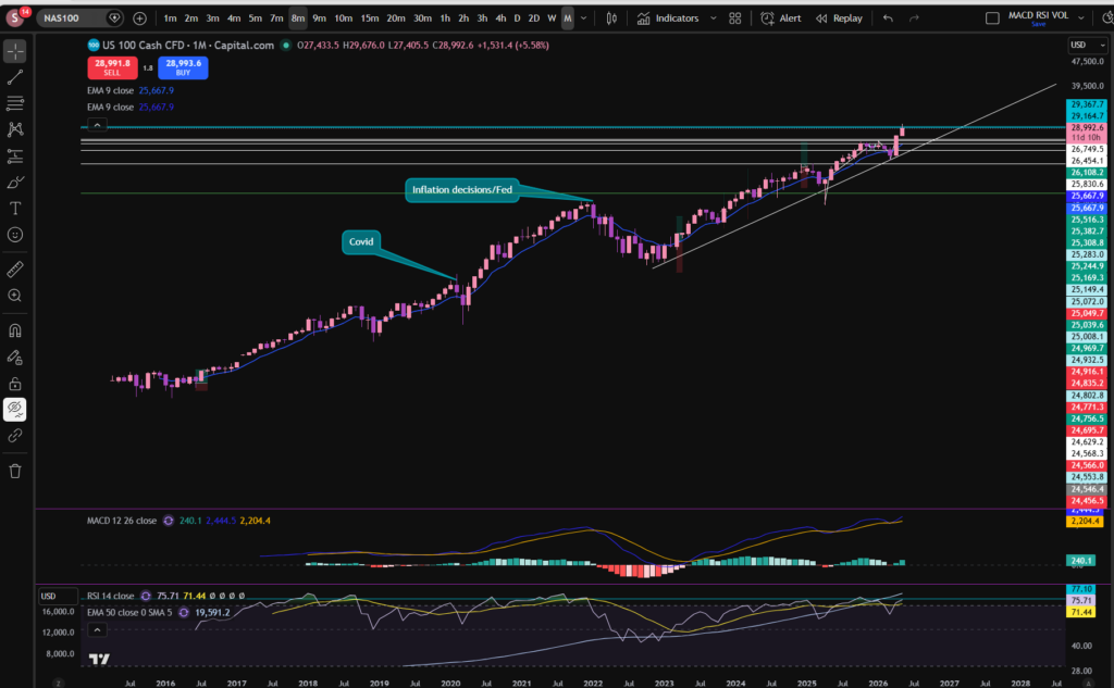
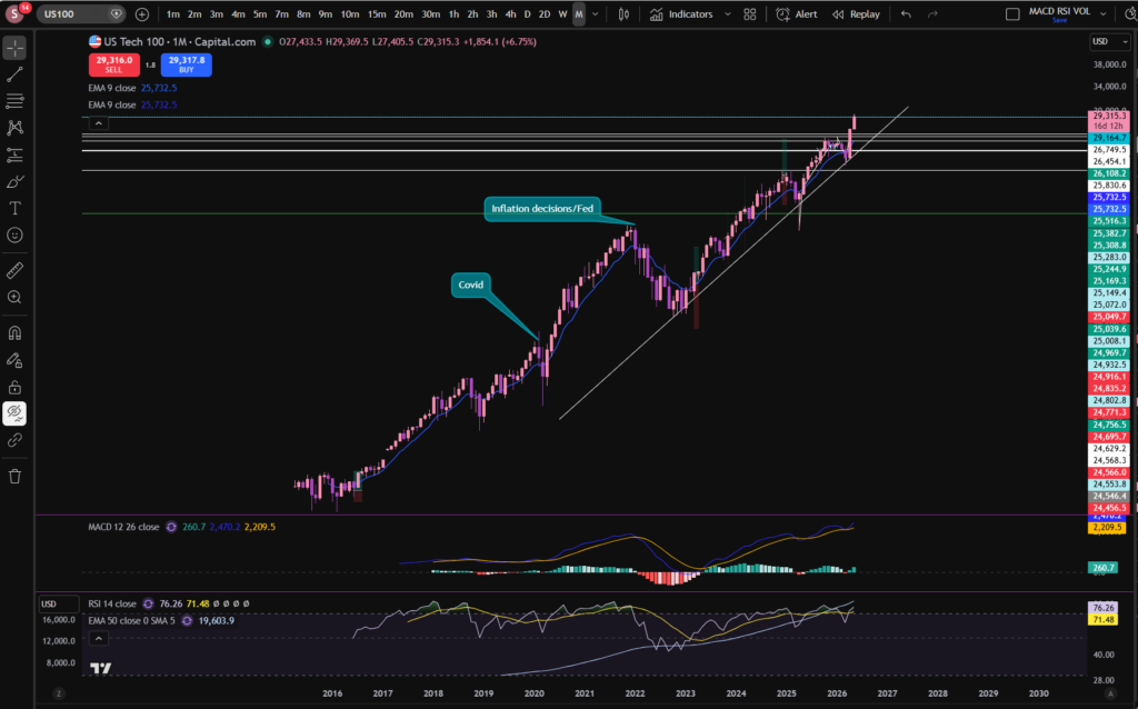
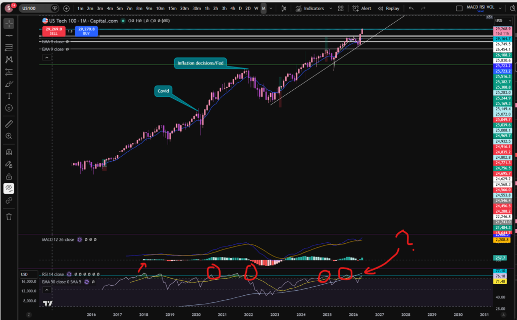
OK, so back to our analysis! As you can see from the above monthly timeframe chart, the price of the NASDAQ has been bouncing, steadily against the diagonal trend line which I marked on the chart, for a long time – this dates back to 2022! Even before that, another trend line can be seen just from looking at the chart, dating back to 2016! This was when it then ended with a large pull back due to the FED’s decisions to increase the interest rates in the US.
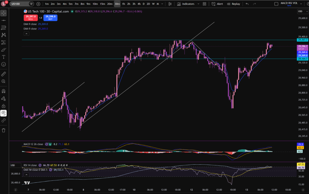
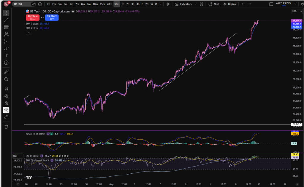
OK, so with all that in mind, you can see that the price has quite recently pushed away from this trend line once again. The RSI is showing as quite high on the monthly timeframe. It looks like the usual pattern of it pushing away from this trend line is that it goes for quite a while, but there are minor ‘price corrections’ along the way where it pulls back to breath. The price did pull back slightly last week on the 30 minute timeframe. Notwithstanding this, the RSI is still quite high on the monthly timeframe. Does it need a bit more of a pull back? The answer to this question, remains to be seen. Let’s take a look at the 30 minute timeframe, to zoom in:
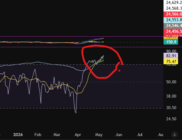
As you can see, we saw a huge gouge down from the point of view of the 30 minute timeframe. However, the price has since pushed up again, strongly. At the current moment, the price has almost recovered to where it was originally, but the RSI on the monthly timeframe is still very high. Let’s consider what typically happens in this scenario on the monthly timeframe:
This is what I love about Trading View. I’ve drawn a line, on the RSI indicator where the price touches and rebounds most of the time. You can see for yourself what typically happens. Now look at where it sits currently? There are some instances where it pushed beyond this line but those do not happen regularly.
So what will happen next? I can’t tell you the answer to this, but perhaps my analysis can help you to decide for yourself?
The idea of this analysis is to set you up to be able to identify patterns yourself in the previous price movements and these patterns can help you to identify best places to trade.
I hope you found this article helpful!
Disclaimer!
Nothing on this blog should be taken as financial advice or encouragement for you to enter a trade. You are expected to speak to a financial adviser or carry out your own due diligence before entering any positions. Everything on this blog is made for educational purposes and to equip you with the knowledge you need to be able to make your own financial decisions.
For more great tips and advice on trading the stock market, please visit:
Please note any subscriptions taken via my affiliate link with Trading View may result in me earning a small commission. However, I provide complete transparency on me using Trading View personally – I publish my success on the financial markets via my broker reports and any profits earned were done so by using my own Trading View subscription, so I genuinely do recommend them and have been using the Trading View charts for many years.
In this article i’m going to take a look at what’s happening with the stocks today, and in particular, on the NASDAQ – since my article a few days ago when I was feeling nervous that the price may pull back. Let’s get straight into seeing what’s happening…
You can see above that the MACD histogram has once again turned dark green following a little pull back we saw last week. The MACD and Signal lines are opening up again, rather than moving towards a cross to the downside. Let’s take a look at what happened on the pull back, per the 30 minute timeframe:
You can see the pull back, here, on the 30 minute timeframe. The price broke the diagonal support. I was waiting to see whether this would form a new structure and start acting as a resistance, going downwards to the bottom right corner of the screen. However, the price reached a low there, and then recovered by reaching a new high once again. So as of right now, after the temporary pull back, the price has recovered to an up trending pattern once again.
I have taken a small position for now, and I may get into more positions, should the market continue to progress. I’m going to be keeping an eye, closely, on the RSI indicator, per the daily timeframe:
At the moment, the RSI is extremely high at 82.91. I’m also conscious of the pattern forming on the weekly timeframe:
The price has pushed away, strongly, from a long term diagonal trend line as you can see above. The last time it did this, it pushed up strongly – almost vertical, and then made more of a sideways bumping motion while continuing to reach higher prices. It is helpful, when considering stocks today, to understand previous patterns. This may not indicate it will repeat the same pattern, however. You should always use your own discernment or allow a professional to take care of your investments, for you.
I hope you found this article on stocks today helpful!
Disclaimer!
Nothing on this blog should be taken as financial advice or encouragement for you to enter a trade. You are expected to speak to a financial adviser or carry out your own due diligence before entering any positions. Everything on this blog is made for educational purposes and to equip you with the knowledge you need to be able to make your own financial decisions.
For more great tips and advice on trading the stock market, please visit:
Please note any subscriptions taken via my affiliate link with Trading View may result in me earning a small commission. However, I provide complete transparency on me using Trading View personally – I publish my success on the financial markets via my broker reports and any profits earned were done so by using my own Trading View subscription, so I genuinely do recommend them and have been using the Trading View charts for many years.
Cookie Consent
We use cookies to improve your experience on our site. By using our site, you consent to cookies.
Used by Google Analytics to determine which links on a page are being clicked
30 seconds
_ga_
ID used to identify users
2 years
_gid
ID used to identify users for 24 hours after last activity
24 hours
_gat
Used to monitor number of Google Analytics server requests when using Google Tag Manager
1 minute
__utmt
Used to monitor number of Google Analytics server requests
10 minutes
__utmb
Used to distinguish new sessions and visits. This cookie is set when the GA.js javascript library is loaded and there is no existing __utmb cookie. The cookie is updated every time data is sent to the Google Analytics server.
30 minutes after last activity
__utmc
Used only with old Urchin versions of Google Analytics and not with GA.js. Was used to distinguish between new sessions and visits at the end of a session.
End of session (browser)
__utmz
Contains information about the traffic source or campaign that directed user to the website. The cookie is set when the GA.js javascript is loaded and updated when data is sent to the Google Anaytics server
6 months after last activity
__utmv
Contains custom information set by the web developer via the _setCustomVar method in Google Analytics. This cookie is updated every time new data is sent to the Google Analytics server.
2 years after last activity
__utmx
Used to determine whether a user is included in an A / B or Multivariate test.
18 months
_gac_
Contains information related to marketing campaigns of the user. These are shared with Google AdWords / Google Ads when the Google Ads and Google Analytics accounts are linked together.
90 days
__utma
ID used to identify users and sessions
2 years after last activity
Marketing cookies are used to follow visitors to websites. The intention is to show ads that are relevant and engaging to the individual user.
A video-sharing platform for users to upload, view, and share videos across various genres and topics.
This cookie is used to play YouTube videos embedded on the website.
2 years
VISITOR_PRIVACY_METADATA
Youtube visitor privacy metadata cookie
180 days
GPS
Registers a unique ID on mobile devices to enable tracking based on geographical GPS location.
1 day
VISITOR_INFO1_LIVE
Tries to estimate the users' bandwidth on pages with integrated YouTube videos. Also used for marketing
179 days
PREF
This cookie stores your preferences and other information, in particular preferred language, how many search results you wish to be shown on your page, and whether or not you wish to have Google’s SafeSearch filter turned on.
10 years from set/ update
YSC
Registers a unique ID to keep statistics of what videos from YouTube the user has seen.
Session
DEVICE_INFO
Used to detect if the visitor has accepted the marketing category in the cookie banner. This cookie is necessary for GDPR-compliance of the website.