In this article i’m going to give you some simple instructions on how to add the Exponential Moving Avearge (EMA) indicator in Trading View. Let’s jump straight into it!
First of all, what is Trading View?
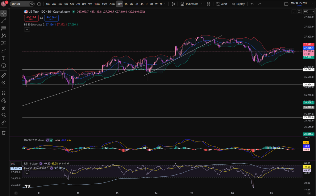
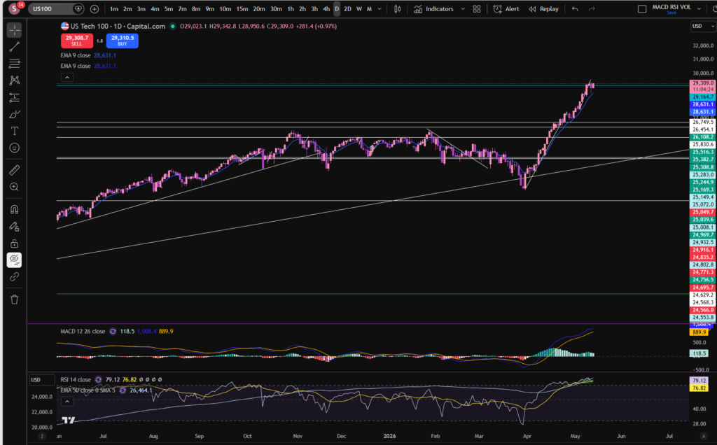
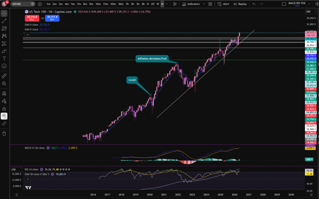
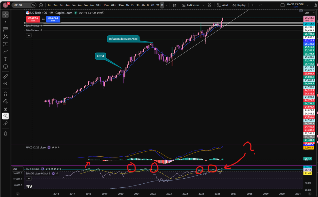
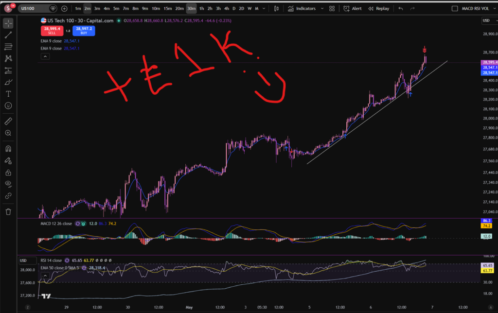
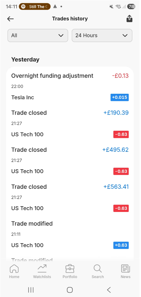
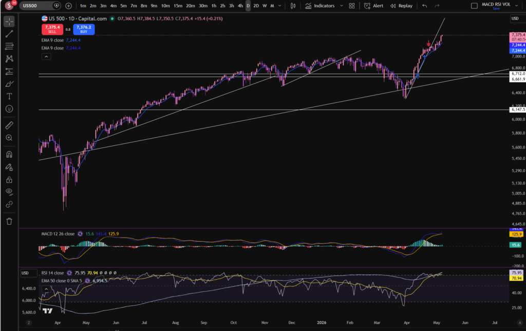
Trading View is a chart package which you can subscribe to. It’s the best one I have ever used. I’m still using it in my own trading – any screen shots I take in the ‘Chart Analysis’ section of my blog, are taken from my Trading View chart package:
Chart analysis – Sophia Trades – Learn how to Trade the Stock Market
Trading View is extremely intuitive as a chart package. You can filter and sort your watchlists in exactly the way you would like to – adding flags, sections – anything that can help with keeping your watchlists organised.
It allows you to log into many different brokers, and I have three different accounts of my own, hooked up on Trading View.
You can set alerts and have it email you when the price reaches a certain position or when particular scenarios occur in relation to your indicators.
I can offer users of my blog, a discount to this amazing software – just click the link below:
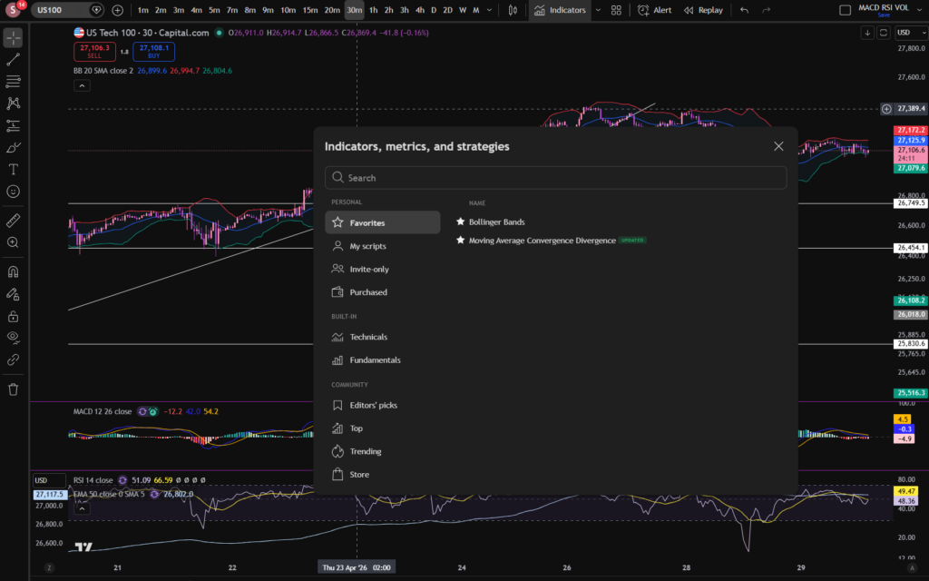
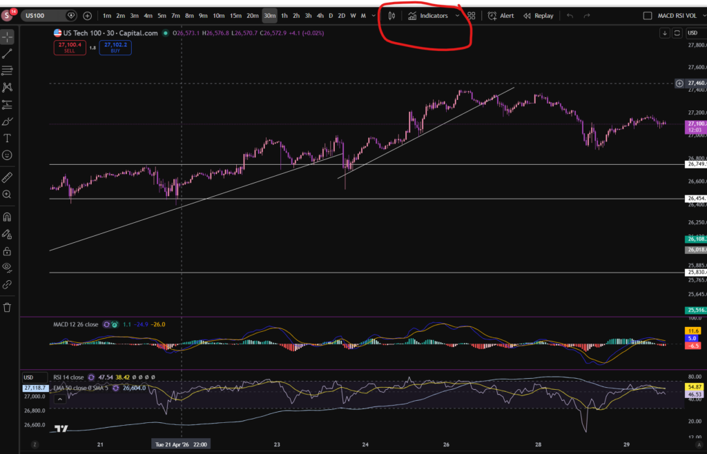
Where is the Exponential Moving Average indicator in this chart package?
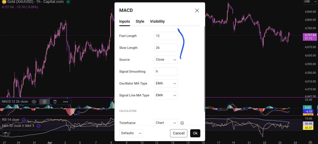
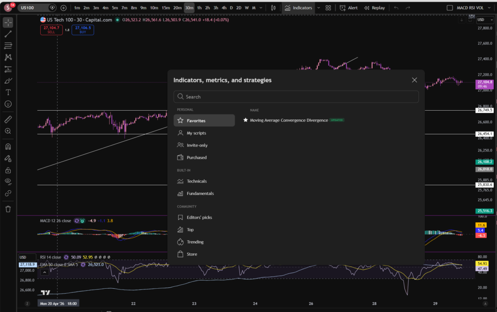
You can find the indicators by going to the indicators tab at the top of the charts. When you click on this tab, you will get a list come up of hundreds of different types of indicators. You can find the Exponential Moving Average indicator by typing in the search box, “Exponential Moving Average”. You will see the indicator appear. Note there are many different versions so you want to select the plain default version – people are building their own indicators in there so you want to avoid any that you are not familiar with:
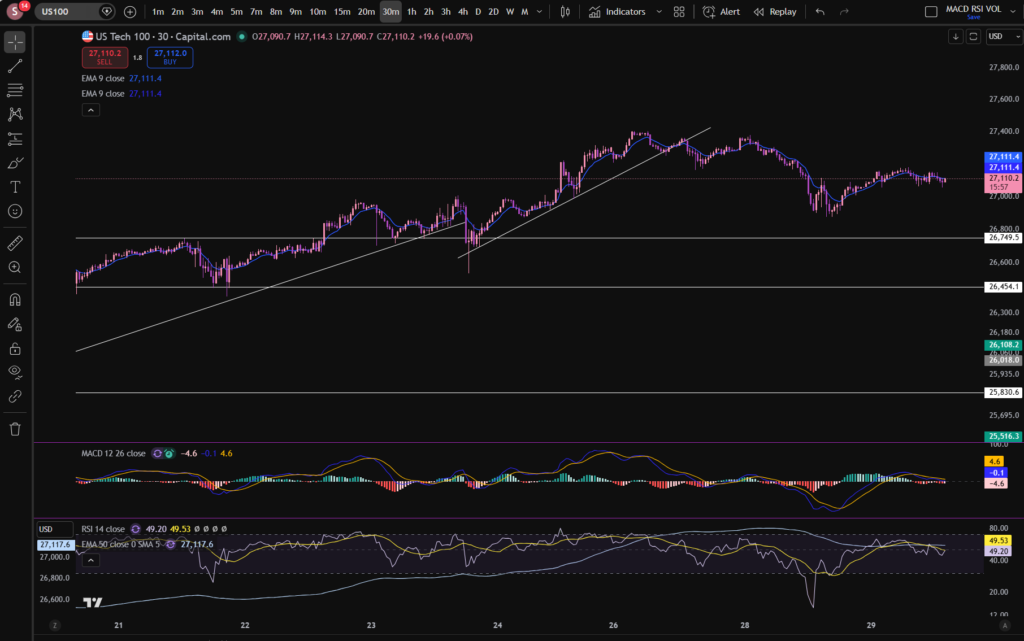
Here is what the plain default indicator looks like:
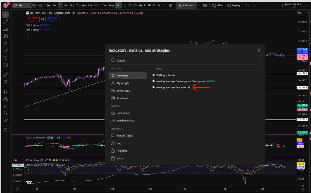
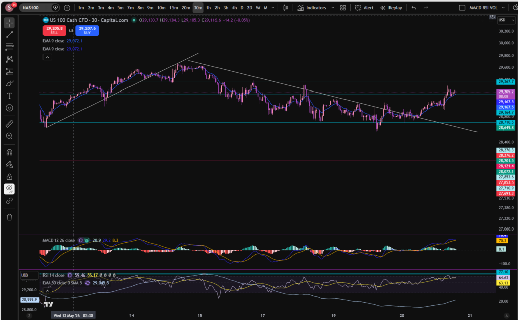
As you can see, my Exponential Moving Average indicator is in my favourites as this is one of the key indicators I use when implementing my strategy.
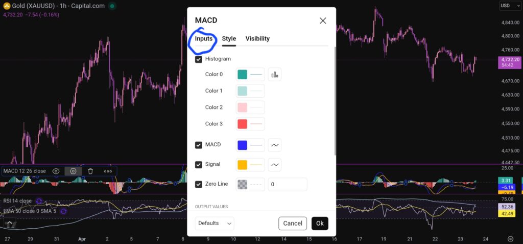
Once you have applied this indicator to your chart, you can tailor its settings by following the instructions in a related blog article. Please see the Trading View or Exponential Moving Average sections of the blog:
Best software reviews – Sophia Trades – Learn how to Trade the Stock Market
Technical indicators – Sophia Trades – Learn how to Trade the Stock Market
I hope you found this article helpful!

Socials:
You Tube:
Patreon:
Disclaimer!
Nothing on this blog should be taken as financial advice or encouragement for you to enter a trade. You are expected to speak to a financial adviser or carry out your own due diligence before entering any positions. Everything on this blog is made for educational purposes and to equip you with the knowledge you need to be able to make your own financial decisions.
For more great tips and advice on trading the stock market, please visit:
https://www.sophiatrades.co.uk
To watch me trade live please visit my patreon page here:
https://www.patreon.com/sophiatrades
Finally, if you would like to receive a discount on the Trading View charting software I use, please click on the relevant link here:
https://www.tradingview.com/?aff_id=117138
Please note any subscriptions taken via my affiliate link with Trading View may result in me earning a small commission. However, I provide complete transparency on me using Trading View personally – I publish my success on the financial markets via my broker reports and any profits earned were done so by using my own Trading View subscription, so I genuinely do recommend them and have been using the Trading View charts for many years.