Markets are dropping and in this article we take a look at the recent activity on the NASDAQ and possible technical factors which have triggered this. We hope you find this useful.
Markets are dropping – recent NASDAQ activity
The recent activity on the NASDAQ has been extremely bullish… let’s take a look at the monthly chart:
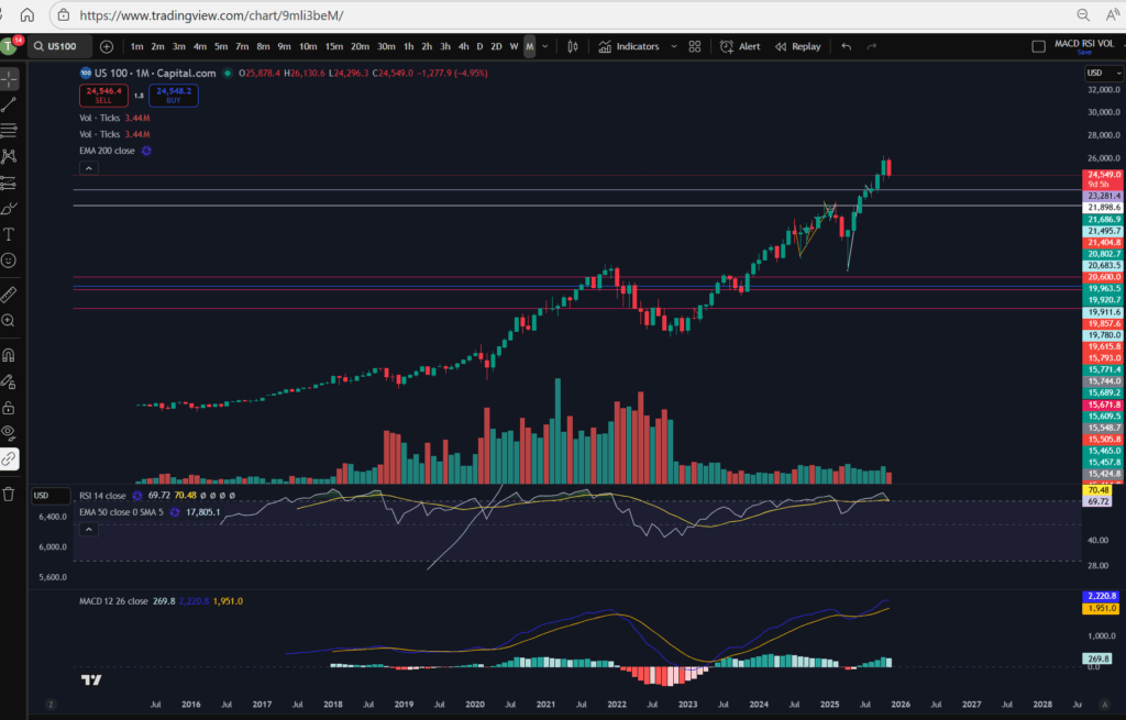
As you can see, the NASDAQ recently reached all time highs. The RSI was very over extended, and the price had been pushing up for a sustained bull run period. It was about time they pulled back! You can see the history of the RSI indicator above. When uptrending, the RSI purple line above, pulls back and forth at the top of the RSI indicator area. Each time the RSI level reaches the highs it had stretched to before, a pull back happened. This time was no different – we were waiting for it! The pull back currently happening feels large, but in reality, it is small in comparison to the amount the markets have pushed up recently.
Markets are dropping – a view from the Daily Time Frame…
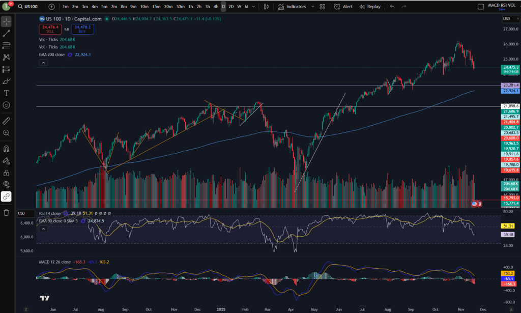
As you can see from the daily timeframe above, the pull back happening was almost necessary. The price has pulled back down further than the diagonal trend you can see on the bottom of the pattern above – please see this marked below…
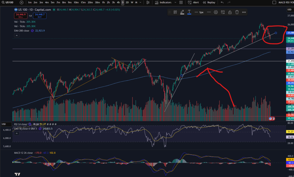
You can see above, that the price as bouncing on a nice diagonal support level on the daily time frame, but within the last couple of days, the price has broken this support level.
The RSI has sunk down quite low on the daily timeframe – as you can see above, but the MACD histogram is still showing dark red bars which are growing in size (meaning the downwards move is not yet running out of steam). We could see lower prices still – it remains to be seen whether the price will start recovering or commence a return back up to where it was.
This evening I can see it has started bouncing around on the 30 minute timeframe:
A view from the 30 minute timeframe:
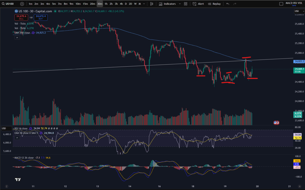
You can see the downtrend on this 30 minute screen shot in more detail… however, note that the price is currently trying to find support… Note the ‘steps’ I have marked on the chart in terms of the highs or lows… the first three marks counting from the left, were confirming that the 30 minute timeframe was still down trending. However, note that the fourth mark created a ‘higher low’ and the next one reached a ‘higher high’… it may be that the market has started to recover – I will be watching it carefully. My next steps will be to look out for solid signs of support and a turn around on the chart. Once I feel comfortable that the price is recovering, I will be more comfortable to place some more trades… for now, I wait….
I hope you found this article and my technical analysis helpful. If you would like to reach out with any trading questions or analysis questions, I would love to hear from you.
For more great tips and advice on trading the stock market, please visit:
To watch me trade live please visit my patreon page here:
https://www.patreon.com/Traderpro8320
Finally, if you would like to receive a discount on the Trading View charting software I use, please click on the relevant link here:
https://www.tradingview.com/?aff_id=117138
Please note any subscriptions taken via my affiliate link with Trading View may result in me earning a small commission. However, I provide complete transparency on me using Trading View personally – I publish my success on the financial markets via my broker reports and any profits earned were done so by using my own Trading View subscription, so I genuinely do recommend them and have been using the Trading View charts for many years.