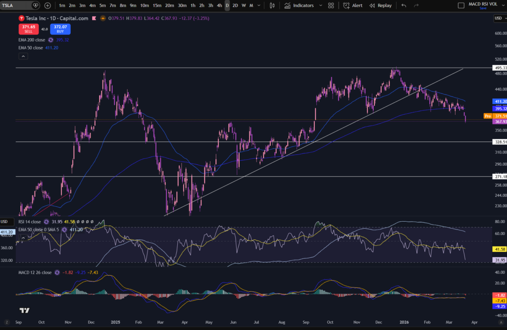
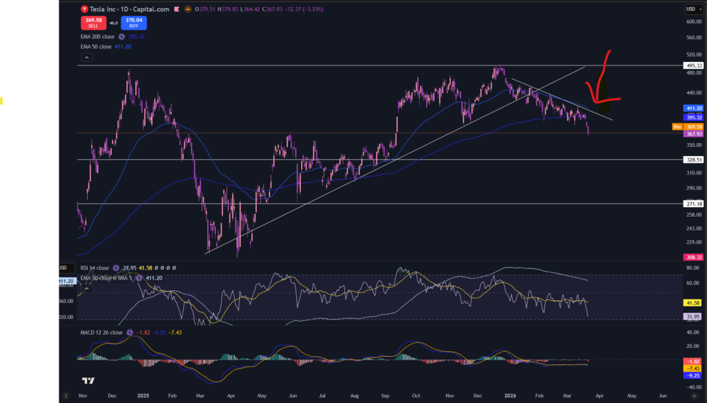
In this article i’m going to consider what’s happening with the stocks today. I will take a look at the NASDAQ, the S&P 500 and the chart for Gold, which can give us an overall good indication of the health of the stock markets. Let’s get started!
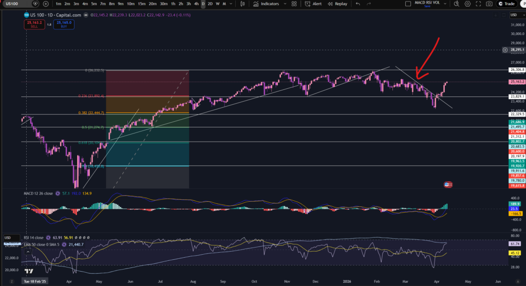
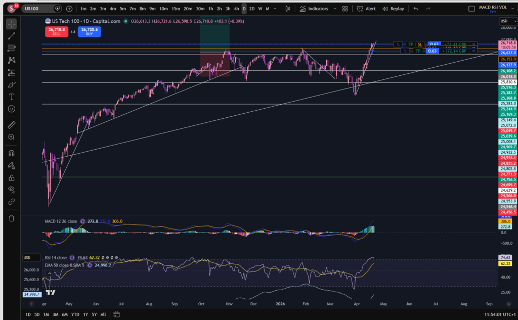
Stocks today – the NASDAQ
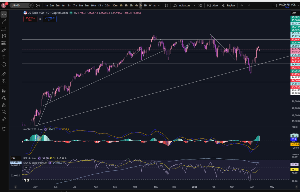
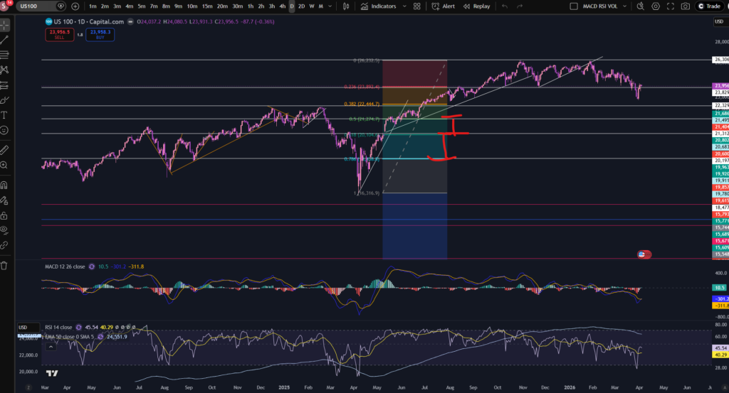
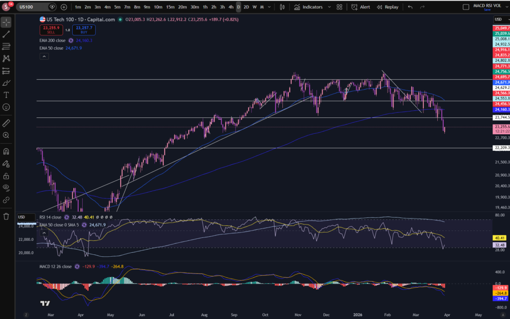
As you can see from the below daily timeframe chart, the NASDAQ recovered to previous highs. This is a good indication that people are starting to have more faith in stocks today. This did coincide with some reassuring announcements from President Trump, about the Iran war:
By the way, I use Trading View chart software which I love. It’s extremely intuitive and helpful – I will never be without it as a trader. You can get a discount by clicking on the button below:
The price is in another uptrend, as can be seen on this 30 minute timeframe:
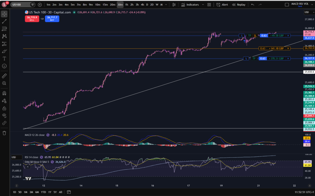
However, it’s worth noting that the MACD’s histogram has turned from dark to light green, and it may be that the upwards push has lost some of its momentum – for now. Let’s take a look at the monthly timeframe:
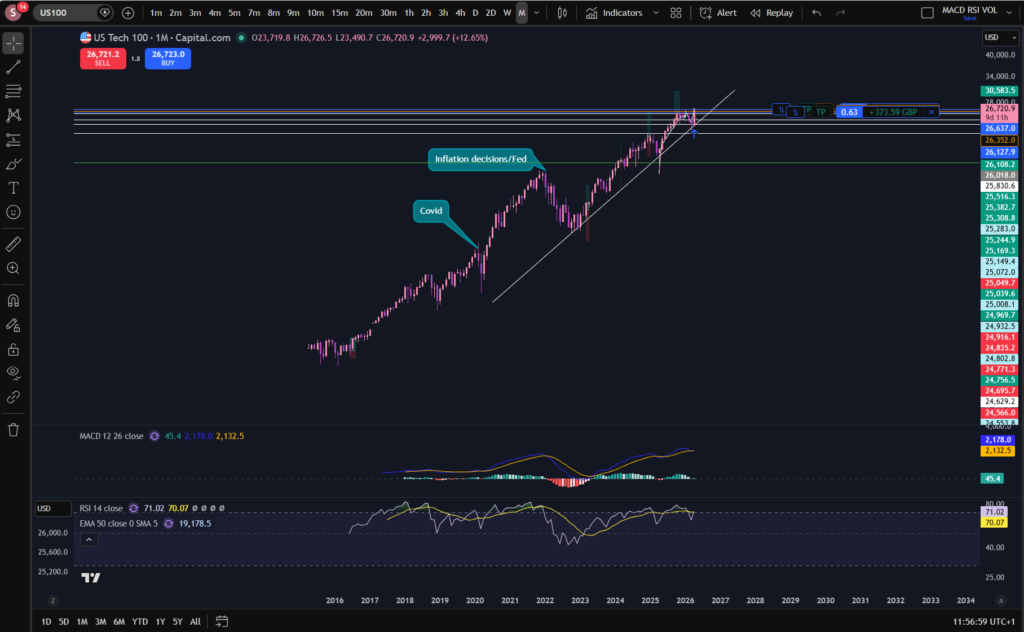
Pay attention to the MACD and signal lines here. They did make a little cross to the downside, showing one tiny, red histogram bar recently, but now it’s showing another dark green, albeit, small, bar. Notice also the ‘bounce’ that appears to have happened on the diagonal trend line of the monthly timeframe above.
Ultimately, it remains to be seen whether the price will continue increasing. It is hoped my technical analysis will empower you to make this decision for yourself. I’m currently sitting in two positions, as you can see. If the markets keep ascending further, I may add to these.
I’m going to prepare a blog article on how I average up, to make more money in trading, soon – so watch this space for that.
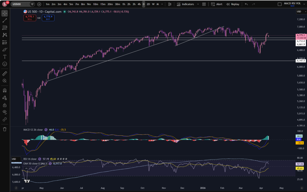
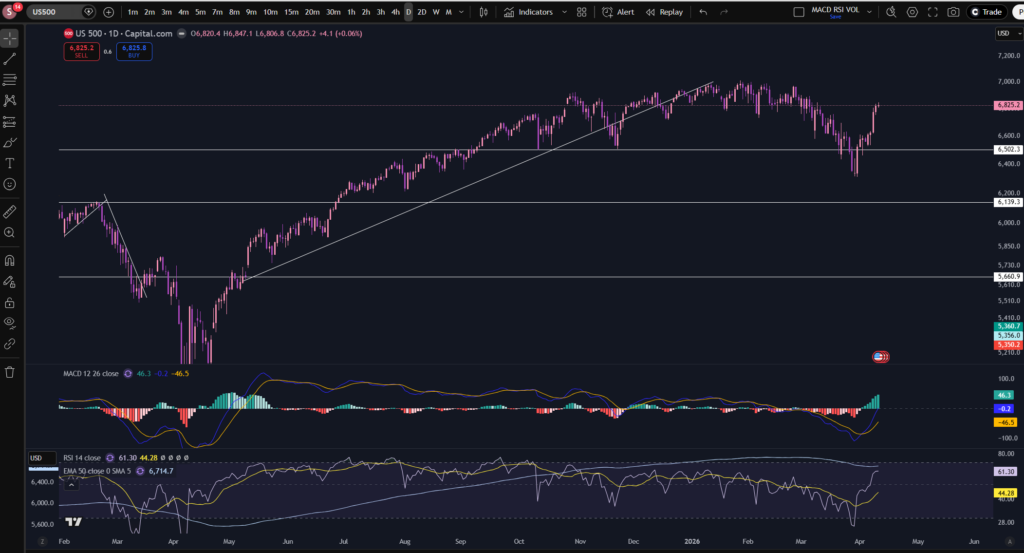
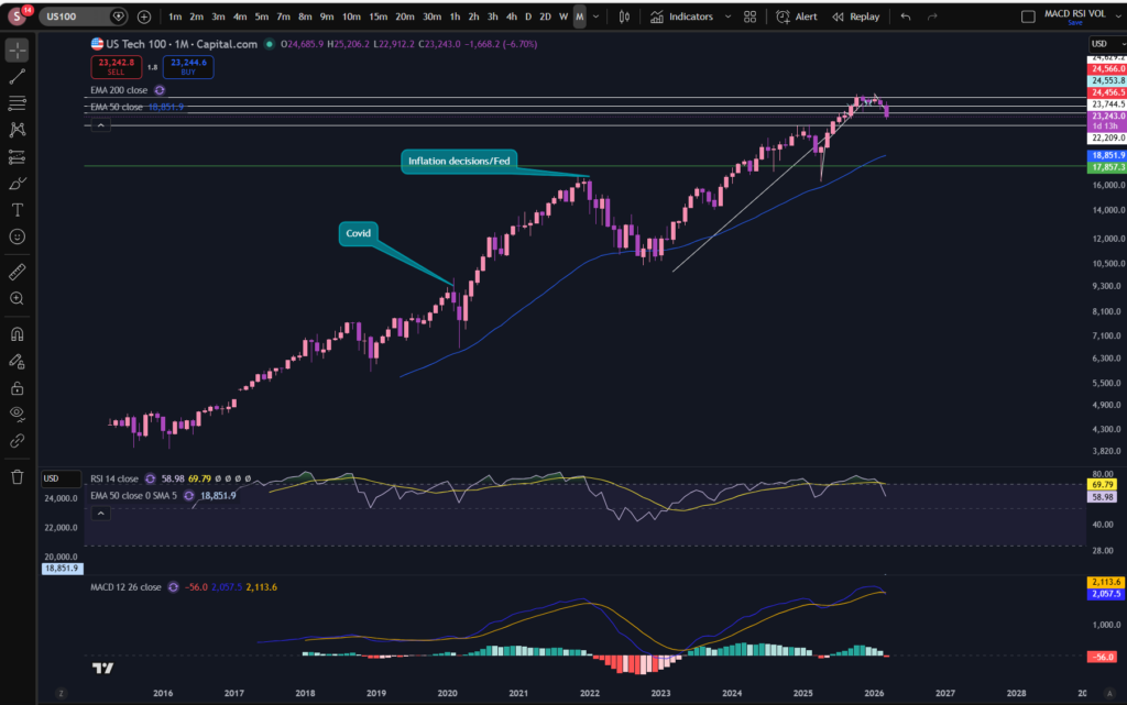
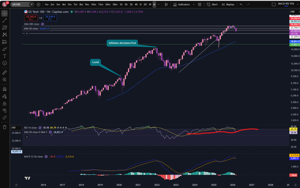
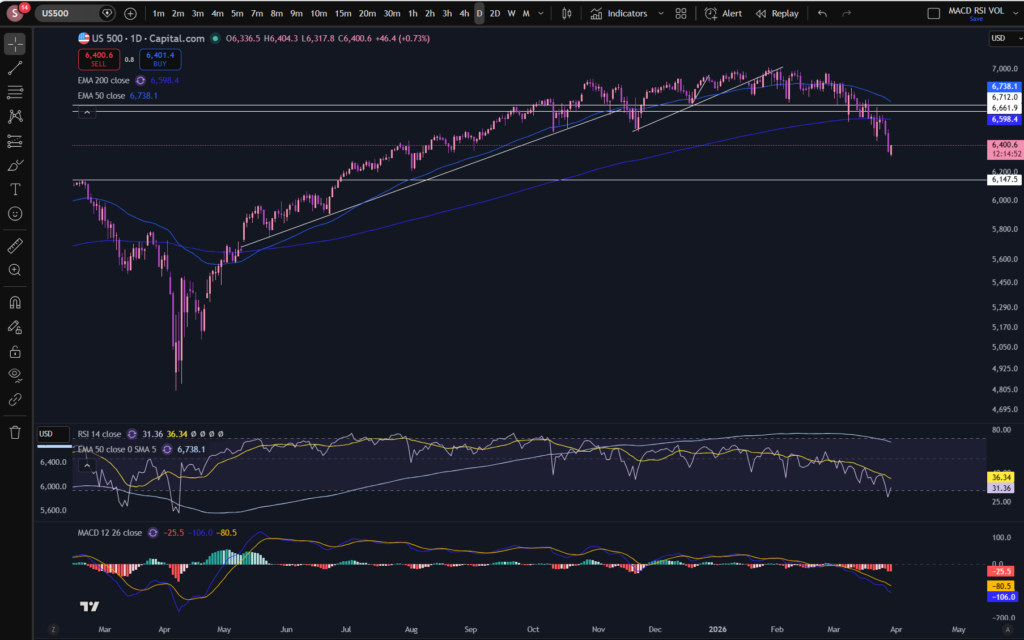
We can’t consider stocks today without taking a look at the S&P 500. Let’s take a look – this can often follow the same sort of pattern as the NASDAQ, since some of its big players are also sitting on the NASDAQ:
S&P 500
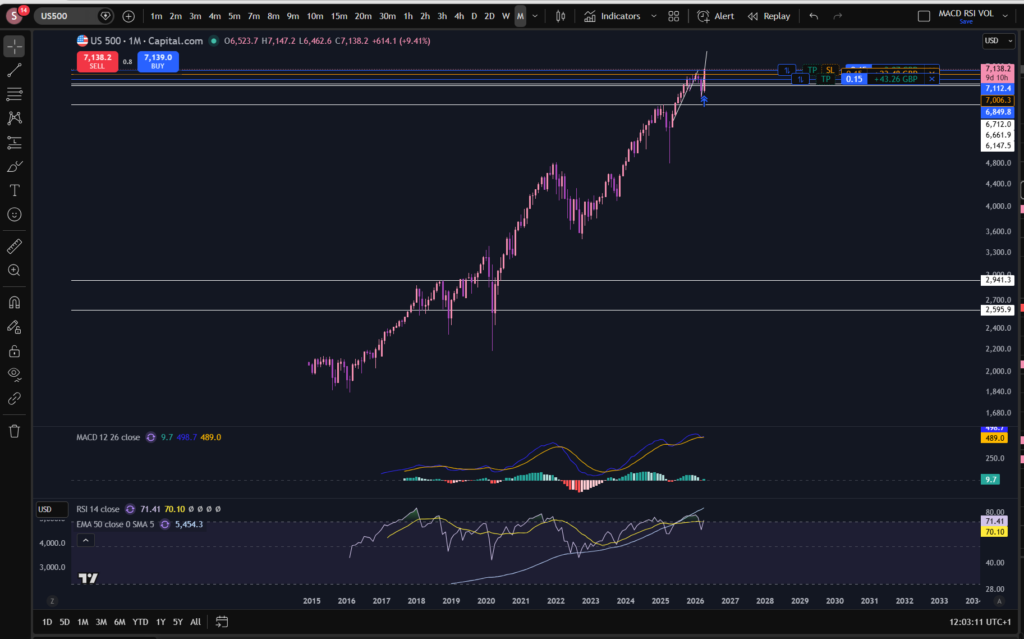
As you can see, we have seen a similar pattern forming on the S&P 500. I’m currently sitting in a couple of smaller positions on this market.
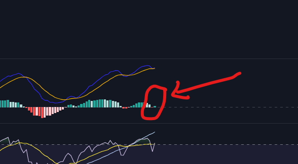
I zoomed in a bit so you can see the small red histogram bar on the monthly timeframe and the fact that, in a similar way to the NASDAQ, this has gone back to showing a small green bar.
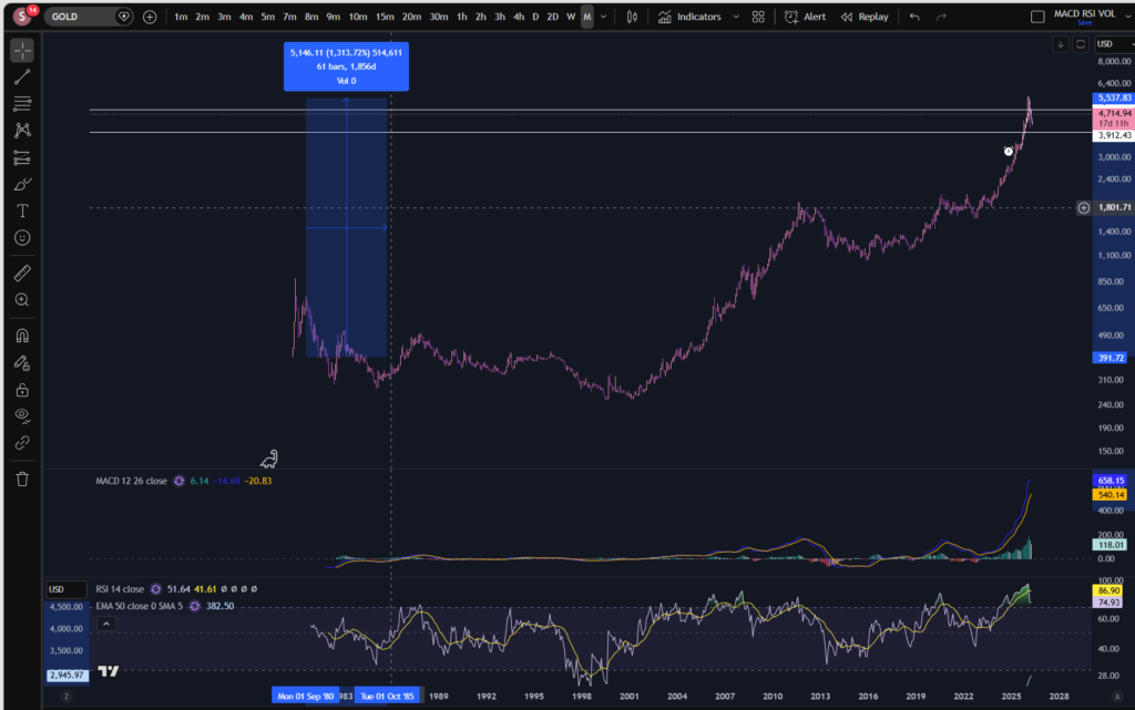
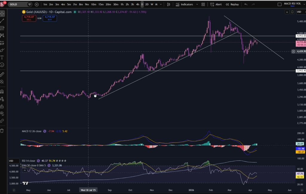
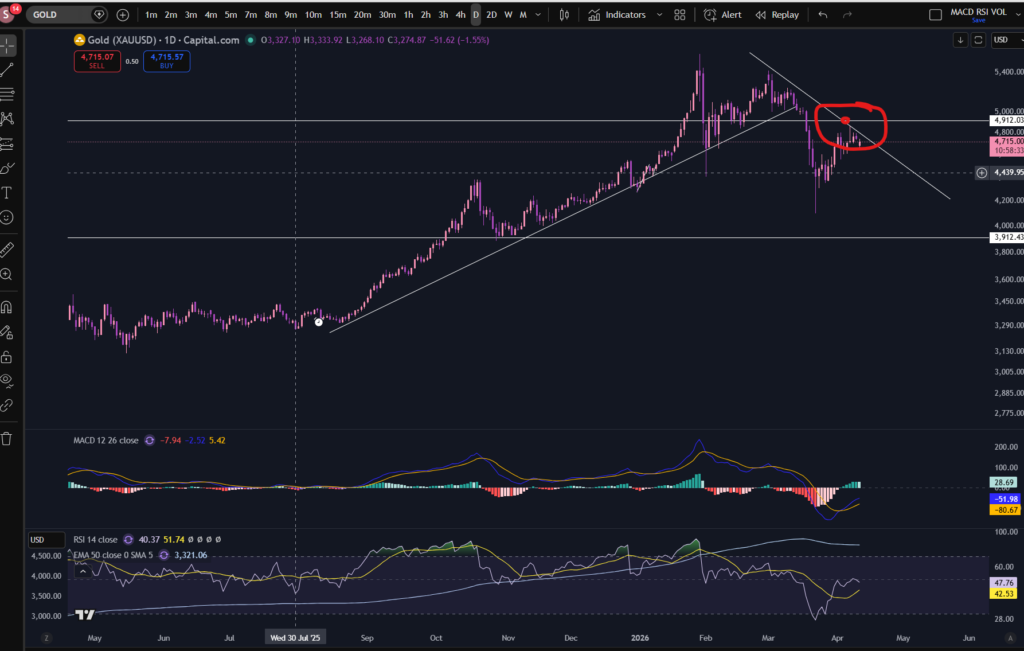
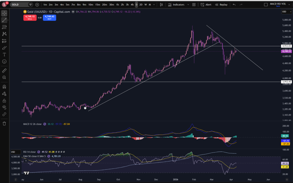
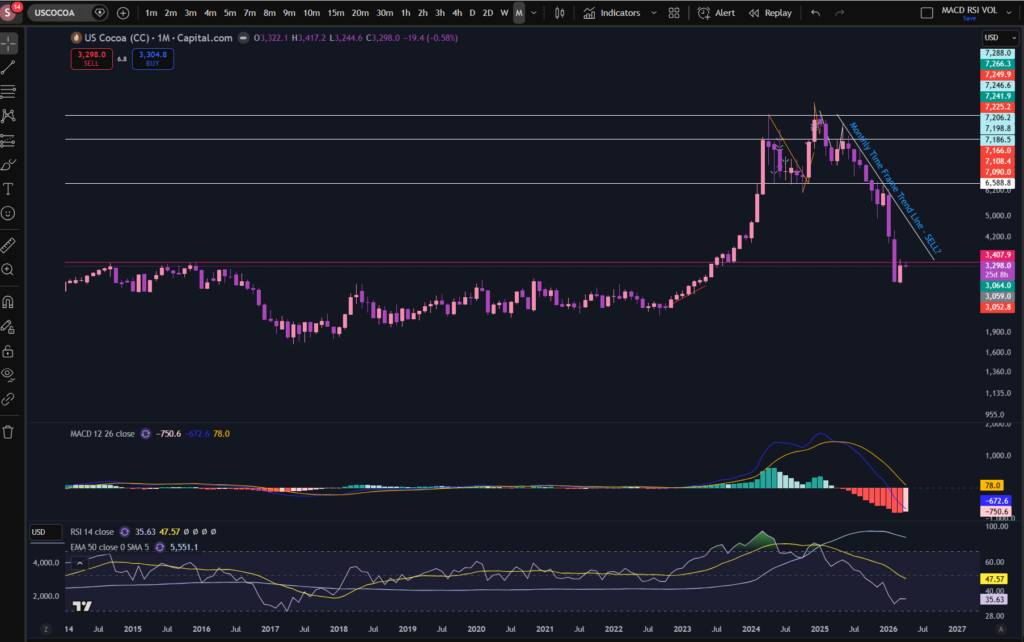
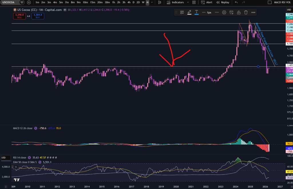
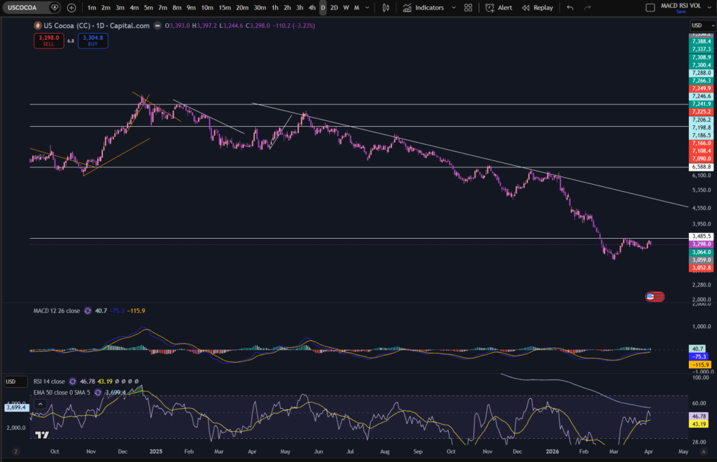
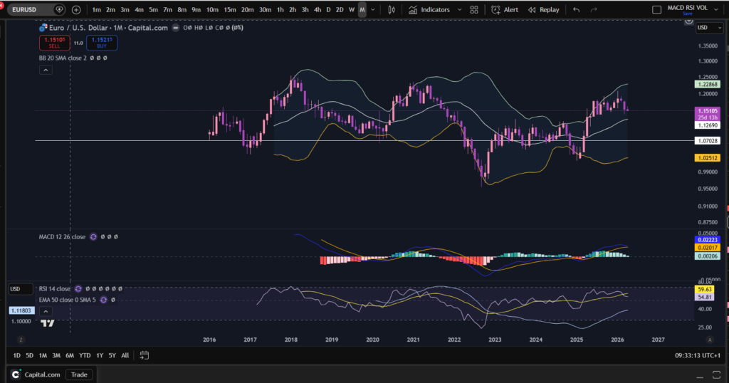
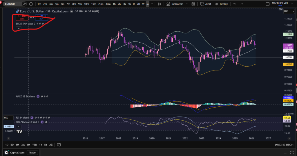
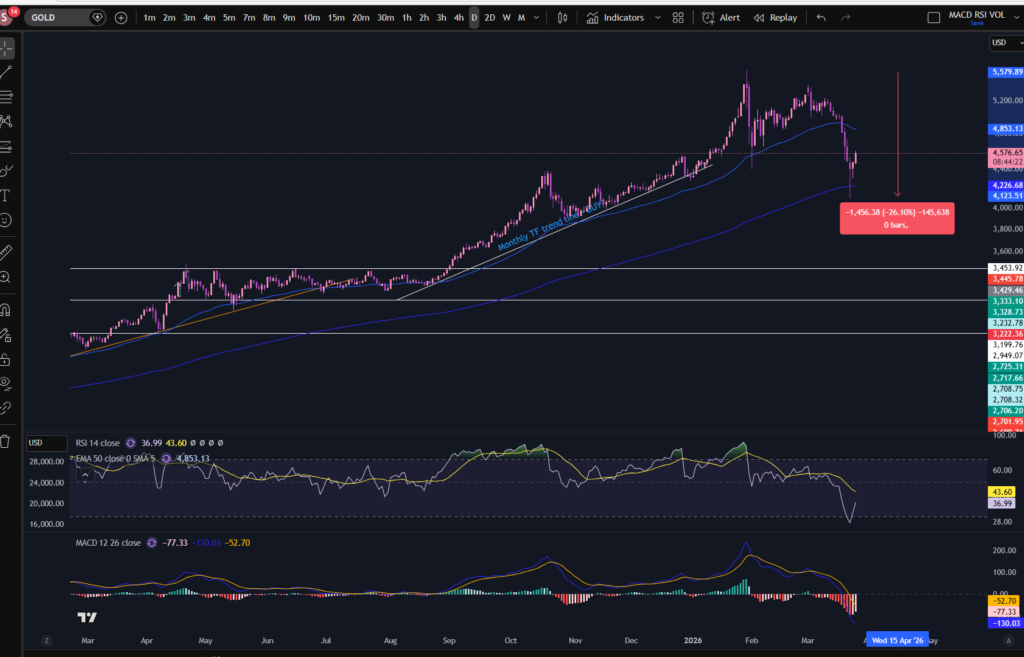
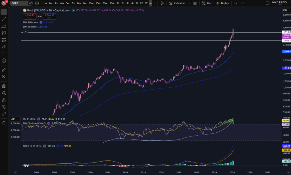
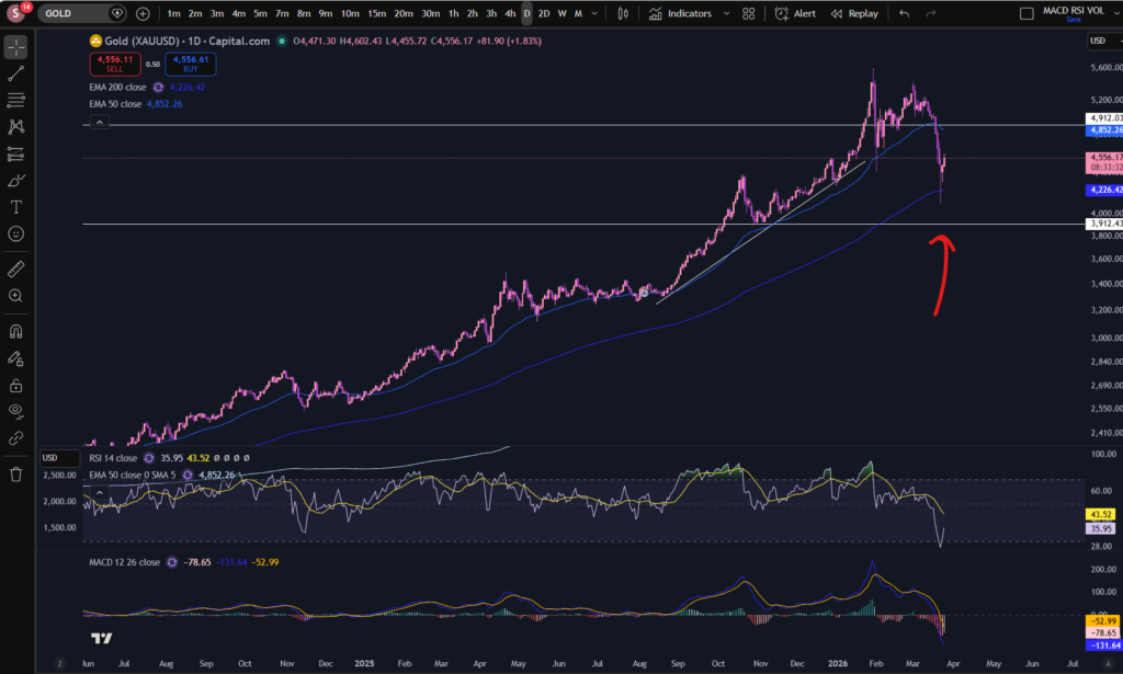
Let’s take a look at Gold, for good measure. As I mentioned, when stocks are rising, Gold often drops in value because people switch their investments into stocks which can provide a higher return:
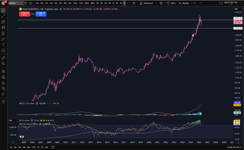
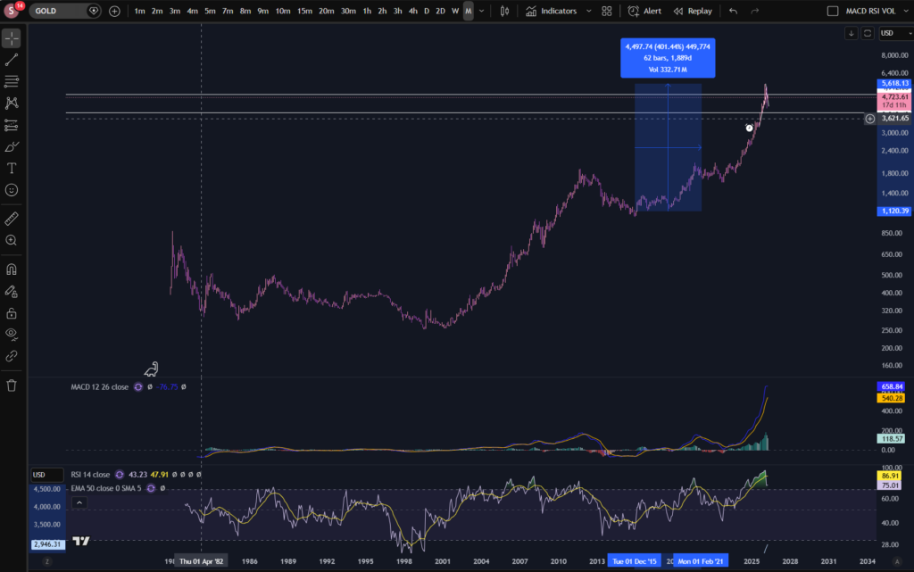
It’s not very clear from the monthly timeframe what is happening here, so I also got a screen shot of the daily timeframe:
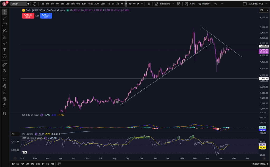
It does look like Gold is now making lower highs and lower lows. The latest ‘high’ appears to still be forming. I will be watching to see if the MACD and signal lines cross over to the downside again, and the price respects the initial diagonal resistance line i’ve drawn on the chart. We will see… Ultimately Gold is not pushing up so it does appear there may be some more confidence in the stocks again. Given the sky high RSI indicator on this market per the monthly timeframe, I will not be adding any funds to it of my own, until I see that it’s offering more of a bargain. I am hoping it will come right down!!
I hope you found this article on stocks today, helpful.
Disclaimer!
Nothing on this blog should be taken as financial advice or encouragement for you to enter a trade. You are expected to speak to a financial adviser or carry out your own due diligence before entering any positions. Everything on this blog is made for educational purposes and to equip you with the knowledge you need to be able to make your own financial decisions.
For more great tips and advice on trading the stock market, please visit:
https://www.sophiatrades.co.uk
To watch me trade live please visit my patreon page here:
https://www.patreon.com/sophiatrades
Finally, if you would like to receive a discount on the Trading View charting software I use, please click on the relevant link here:
https://www.tradingview.com/?aff_id=117138
Please note any subscriptions taken via my affiliate link with Trading View may result in me earning a small commission. However, I provide complete transparency on me using Trading View personally – I publish my success on the financial markets via my broker reports and any profits earned were done so by using my own Trading View subscription, so I genuinely do recommend them and have been using the Trading View charts for many years.