In this article i’m going to talk about something which is paramount to your trading – multiple timeframe analysis. This will blow your mind and change the way you trade forever! Multiple timeframe analysis is essential for new traders to learn – it will change the way you trade and see the markets, forever! Let’s get straight into it…
What is multiple timeframe analysis?
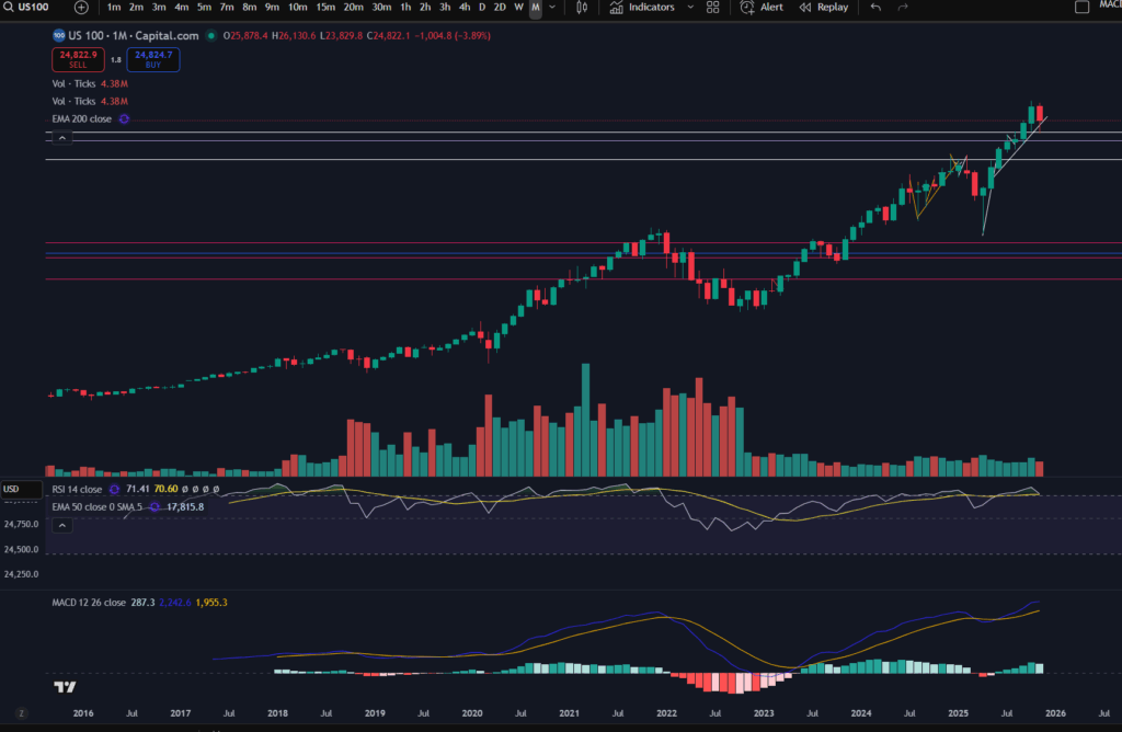
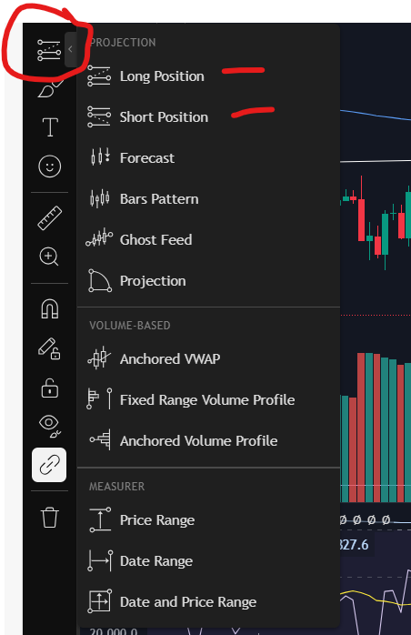
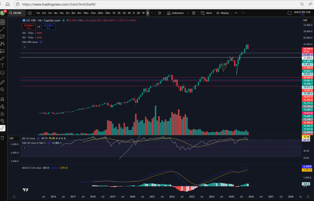
Multiple timeframe analysis is what it says on the tin – undertaking analysis on multiple timeframes to get a clearer idea of what’s happening in the markets. So how does this work, and how can it help you in your trading? The basic premise is that you use ‘larger/higher’ timeframes to get a bird’s eye view of the market – where the price is going long term, what the long term trend is, if there is one. Is it in a range long term? Then you can use the smaller timeframes to ‘zoom in’ and plan and execute your trades with greater precision. Let’s take a look at how this might work. It is common for people to use the ‘daily’ timeframe as their higher timeframe. I personally use this timeframe as a higher timeframe, but note that I also refer to the ‘monthly’ timeframe as another level up, to get an even higher ‘birds eye view’ as compared to the daily.
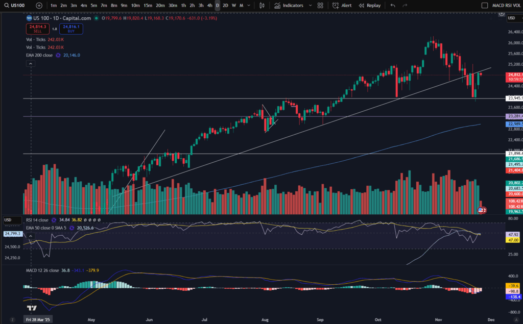
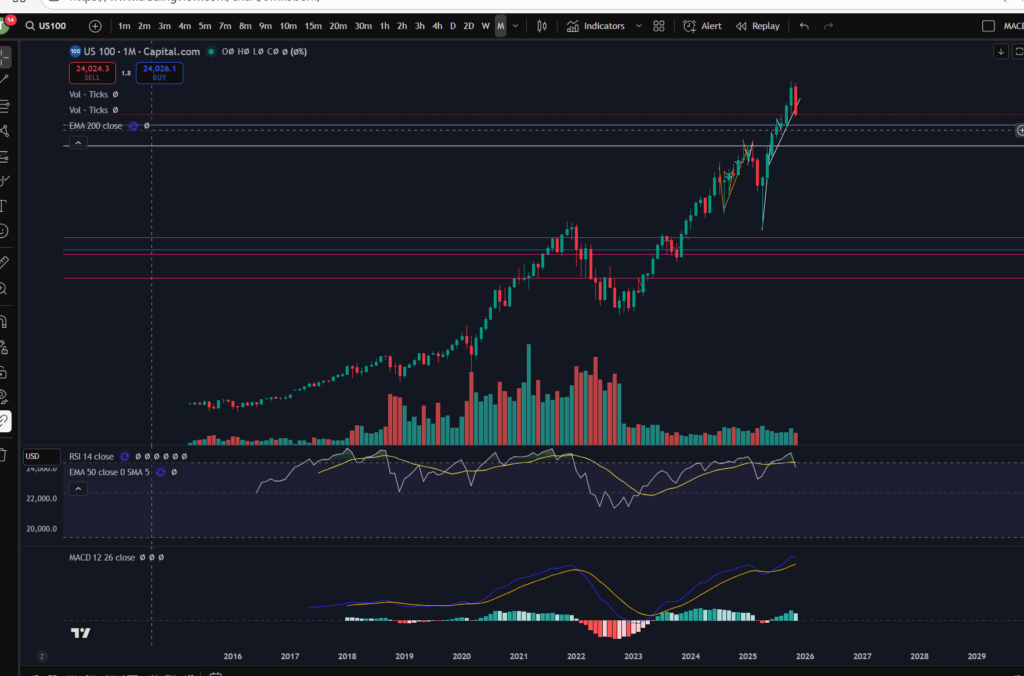
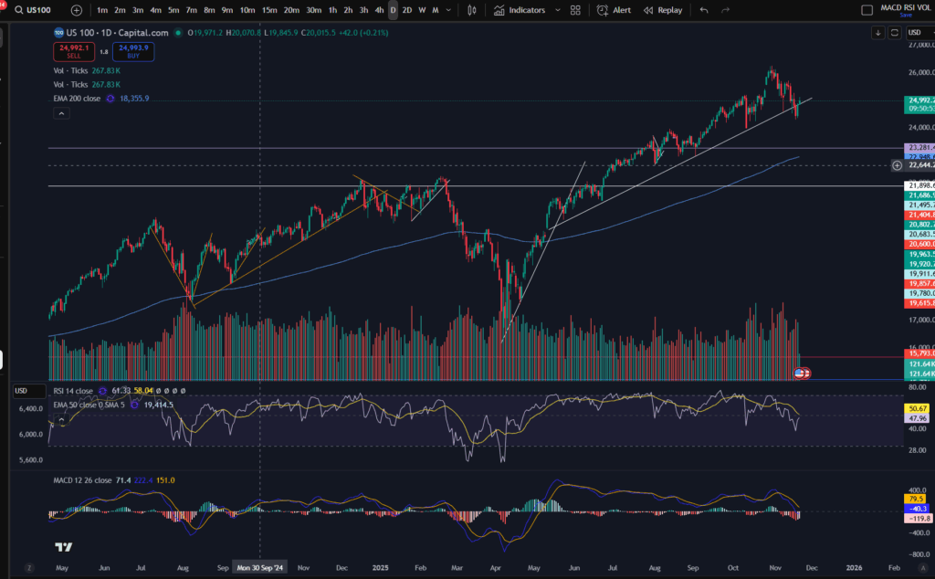
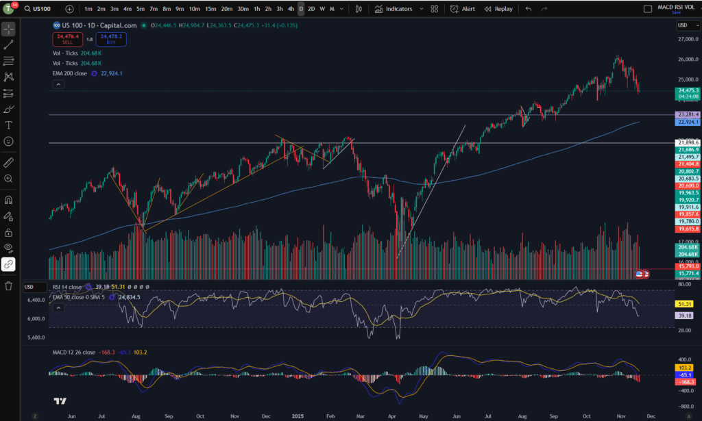
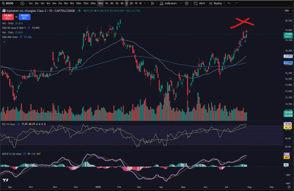
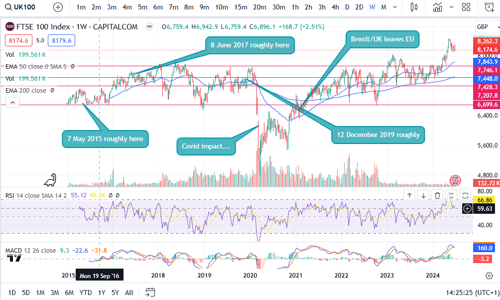
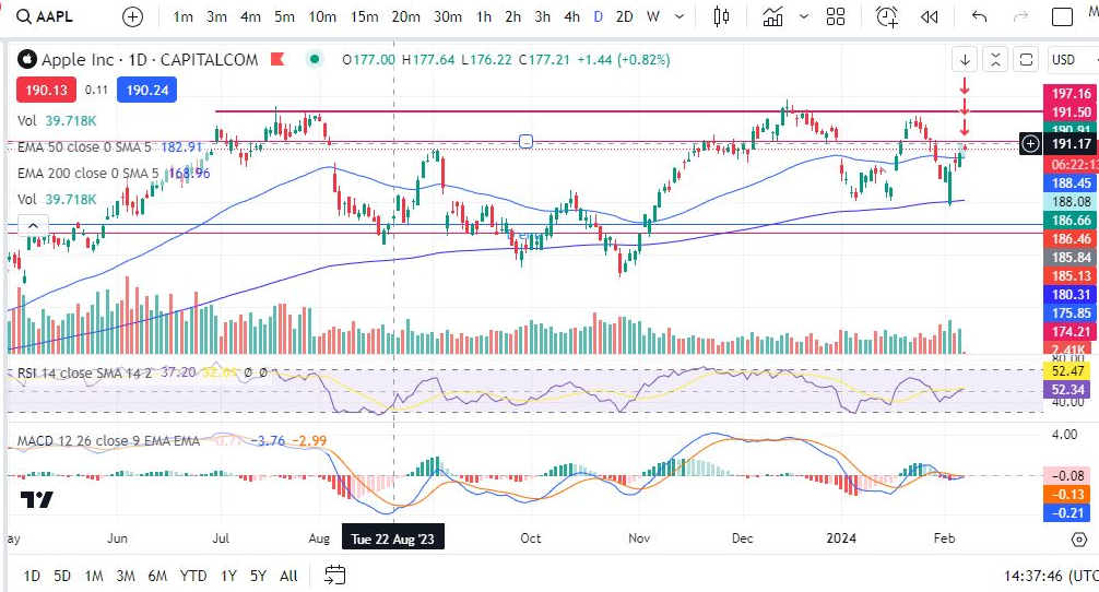
Let’s look at the daily timeframe on the S&P 500 most recently:
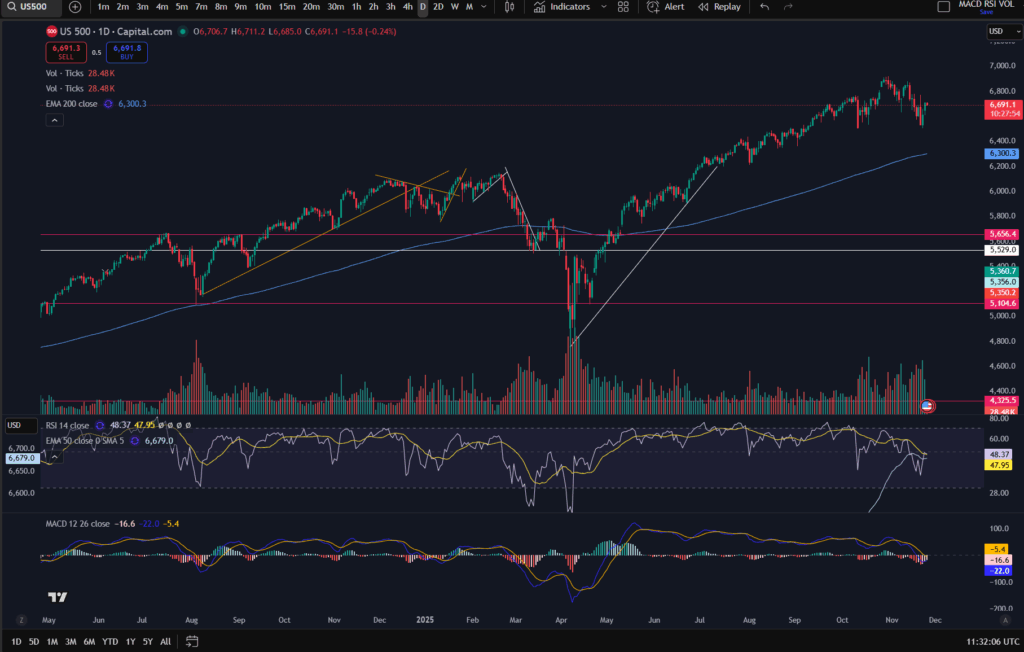
You can use the daily/higher timeframe, to mark major support and resistance levels, as below:
You can see that the price has found a support a few times at the white marked horizontal line on the chart (6,515). (If you think you would benefit from using this chart software, I can offer you a discount, through Trading View – please click the link below):
OK, so back to the chart analysis! Why is marking the higher timeframe in this way, important when using multiple timeframe analysis? The higher the timeframe, the more people, hedge funds, big money etc, are noticing the resistance or support level – which gives it more weight! More people are going to be respecting those levels and being mindful of them. More people will get into the market at the higher timeframe support area – meaning there will be a stronger push up from that level as a result of sheer volume and demand.
So you can use the higher timeframe to plan the general ‘area of interest’ in your trade set up. For information on how to plan trades and where to get started, please see our blog article:
How to create a Trading Plan – make big wins trading – Trader Pro
Once you have got your general ‘area of interest’ per your bird’s eye view, you can then ‘zoom in’ by using a smaller timeframe. The smaller timeframe should be about 4 timeframes away from your bird’s eye view timeframe. For example, I use the daily timeframe as my bird’s eye view, and the 30 minute timeframe to execute trades, currently. I have combined the daily with the 10 minute and this did work for me, as well.
Smaller timeframe analysis – Zooming in!
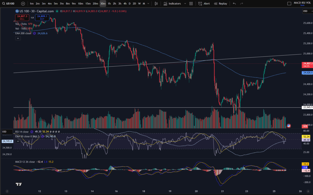
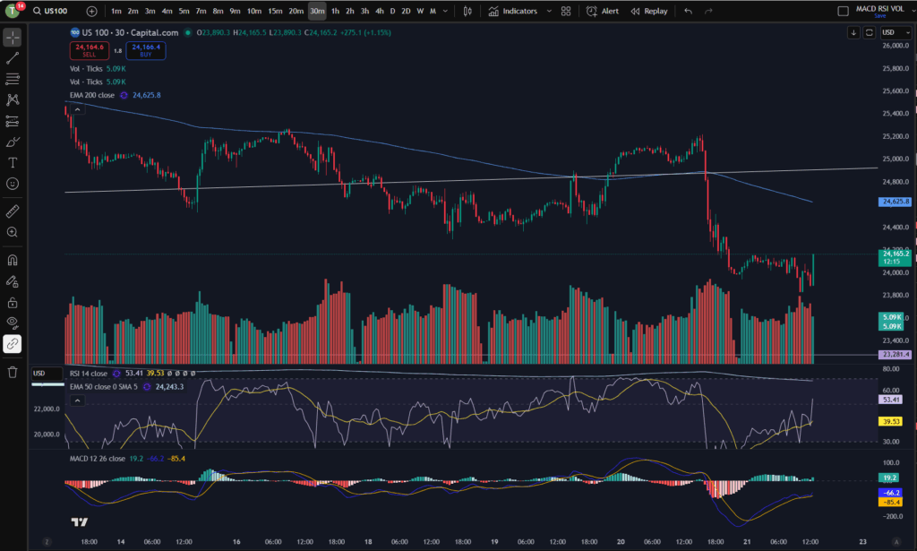
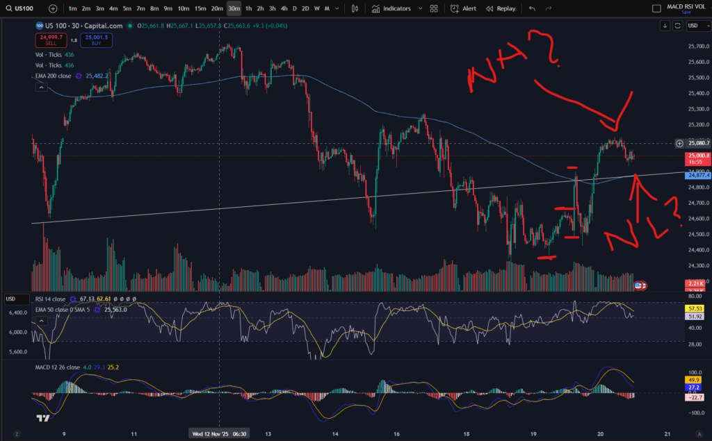
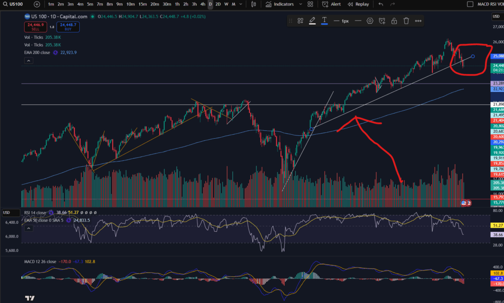
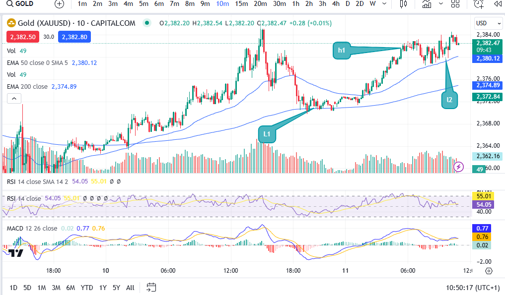
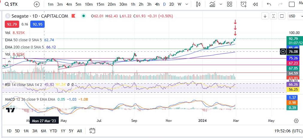
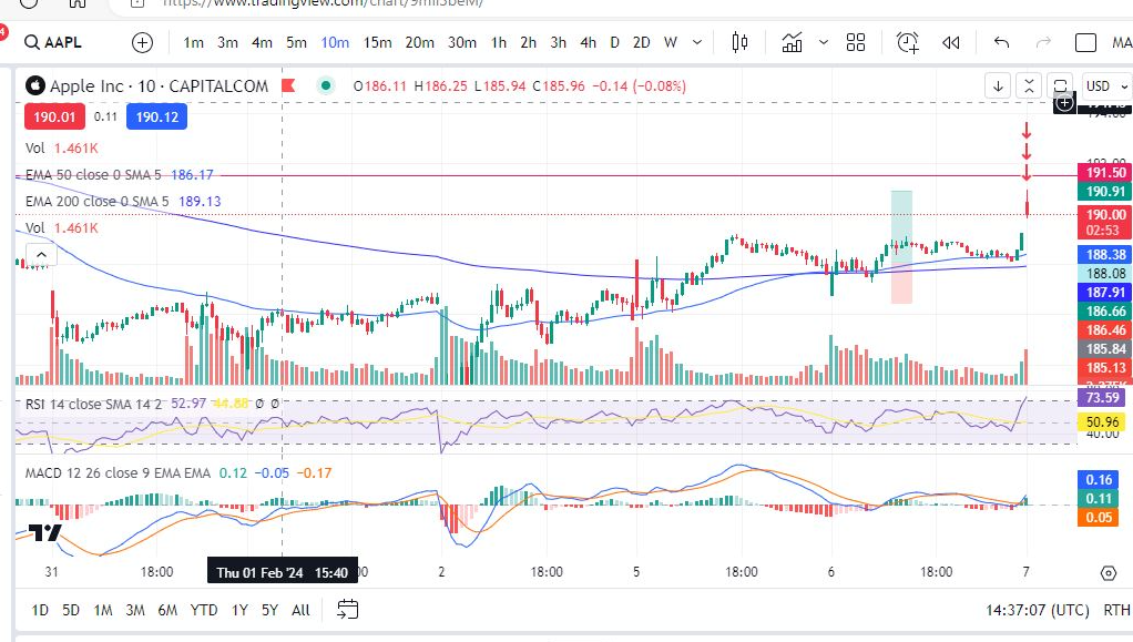
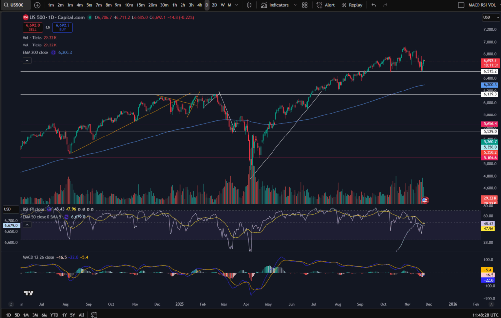
OK, so now that you have your general area of interest per the larger timeframe, you can use the smaller timeframe, under multiple timeframe analysis, to plan how to ‘execute your trade. We established that on the daily timeframe for the S&P 500, there was a general resistance level at around 6,515 price. Let’s say we were just at the red X marked below and we had not gone past this point – we knew that the price typically bounces at this level and we expect it to, because in the past, this area was a resistance, too – see how the price was bumping against it, in mid August on the chart below.
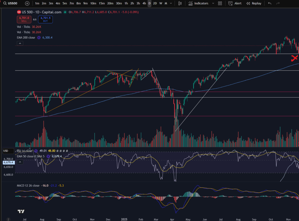
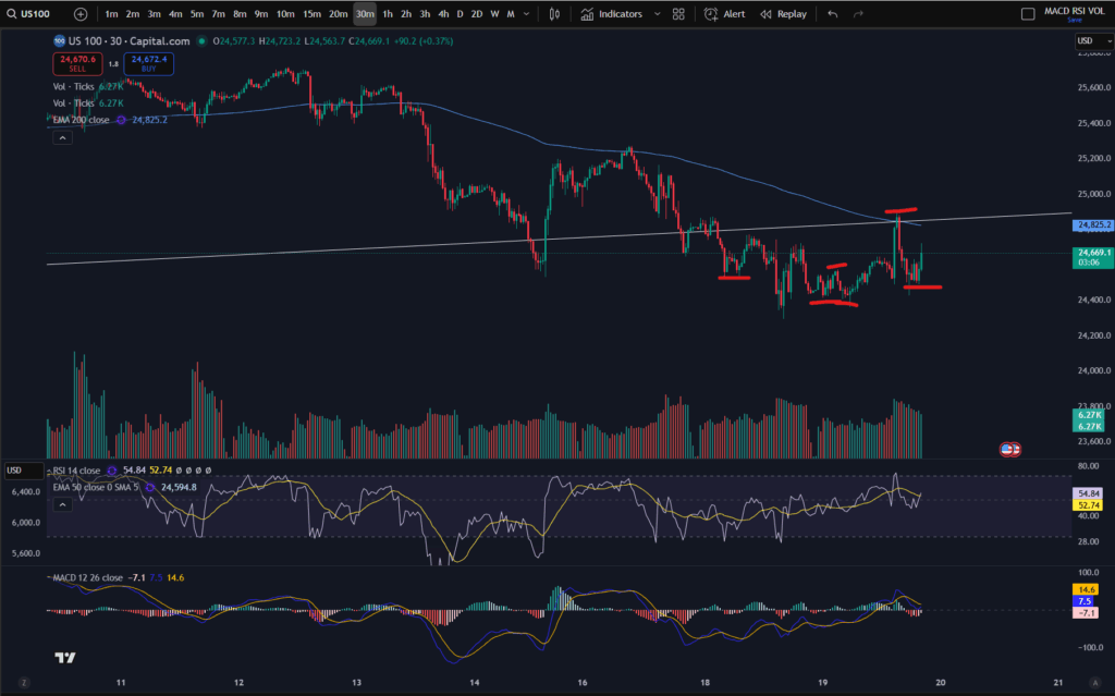
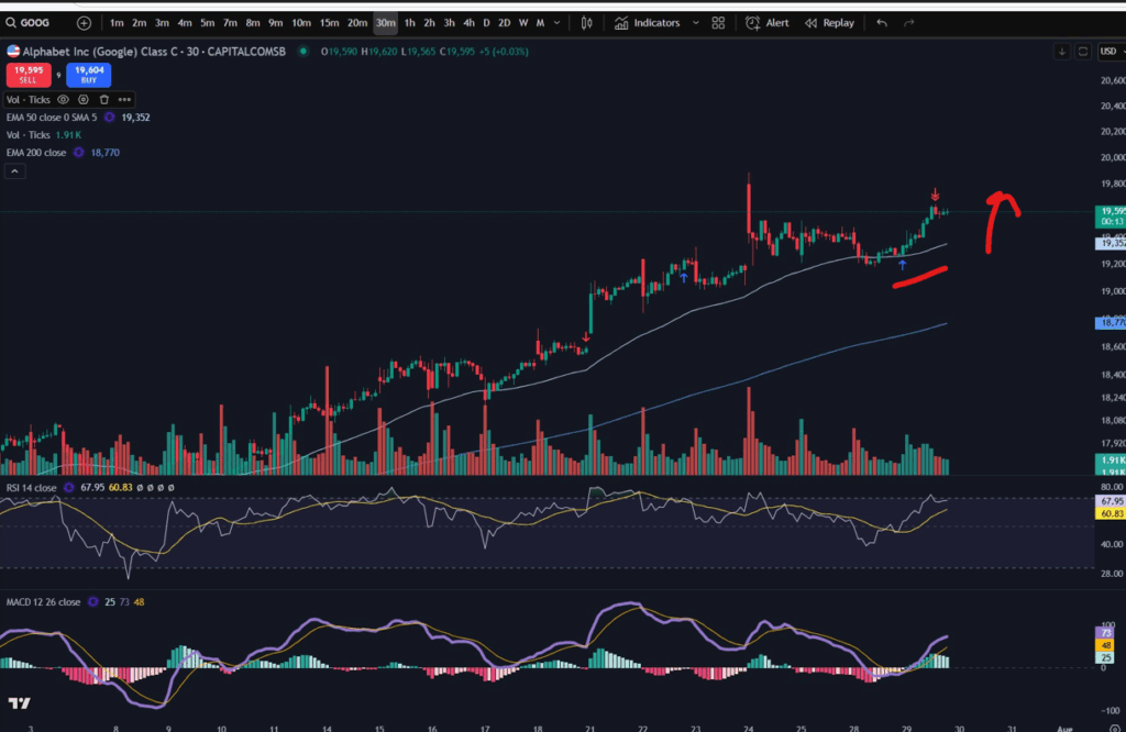
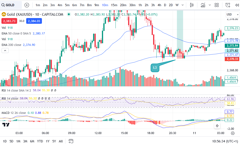
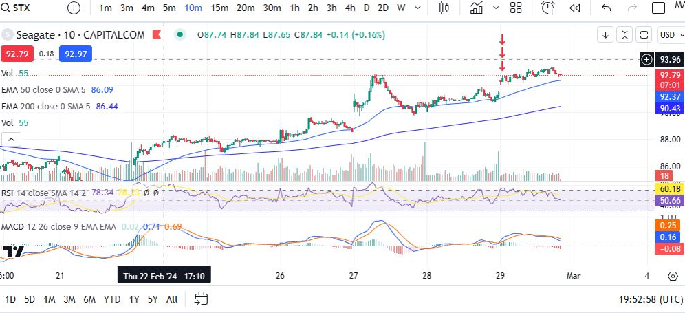
Bearing in mind this is our point of interest, we might want to get into a trade here, at the support. Now let’s take a look at the 30 minute timeframe to plan this possible trade. We are interested in the price at mid November on the 30 minute timeframe. (Usually you will not have to cut off the chart in this way, obviously – i’m just showing you, retrospectively, how you may have planned and executed a trade at this level):
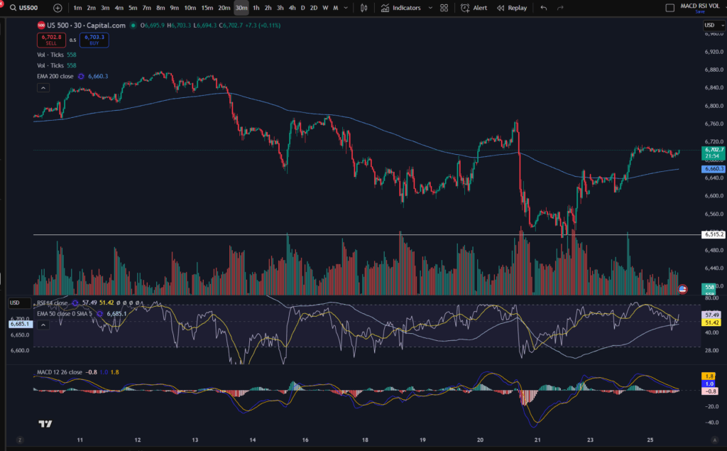
OK, so here we have the zoomed in view of the ‘bounce’ on the daily timeframe. Under my strategy, I would want the price to have popped up over the EMA line before I consider entering a trade. You can see my strategy here:
NASDAQ trading strategy that will make you thousands! ££££££ – Trader Pro
The point of the lower timeframe is that you can see ‘under a microscope’, what’s happening in the market. You can execute your trade at just the right place on the chart, with extra precision.
IMPORTANT NOTE RE ANALYSIS ON THE HIGHER/LOWER TIMEFRAME:
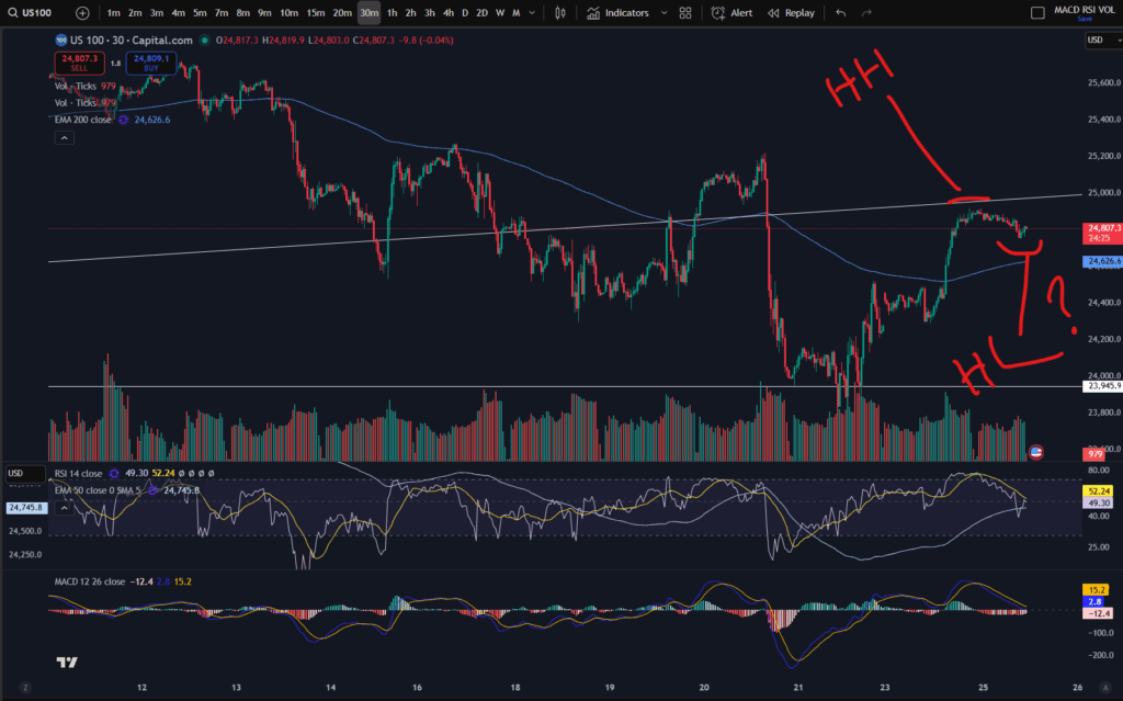
You can check that the market is ‘uptrending’ on the lower timeframe before entering (i.e. making higher highs and higher lows). If it’s not doing this on the lower timeframe, you can be sure, that it won’t do it on the higher timeframe either – note how the ‘patterns’ that form on the lower timeframe, “MAY” trickle through to the higher timeframe, but it’s not certain they will. However, it is a REQUIREMENT for the pattern to appear on the lower timeframe, before it appears on the higher timeframe. You may wish to read this note carefully again, until it sinks in!
Once the price has started uptrending on the lower timeframe and it meets your criteria for trade execution, you can enter the market. You would be unable to see this detail from your bird’s eye view, timeframe.
You plan and execute your trade including the ‘take profit’ and ‘stop loss’ levels per the smaller timeframe, when using multiple timeframe analysis. Do not set a take profit on the daily timeframe. You have to understand that if you put your take profit at the top of a peak on the daily timeframe, it may take weeks to get there, depending on how many days need to go by, to get up there. This is why we plan and execute per the smaller timeframe – each candle is only 30 minutes, or 10 minutes, or whatever you choose to use. So it could take 12 x 10 minutes = 120 minutes to get to your target on the smaller timeframe of 10 minutes. If you waited for 12 candles on the daily timeframe you would be waiting for 12 days!
I hope you found this helpful. I also created a video on my Youtube Channel which you may like to see on multiple timeframe analysis:
Understand my strategy in full: https://www.patreon.com/Traderpro8320
For more great tips on trading the financial markets, please visit my blog:
Discount on Trading View:
https://www.tradingview.com/?aff_id=117138
My performance in the live markets:
https://sophiatrades.co.uk/category/my-performance-statistics
Finally, thank you to my existing members on Patreon, and for your likes, comments and subscribes. Happy trading!
Please note any subscriptions taken via my affiliate link with Trading View may result in me earning a small commission.
Nothing in this video should be taken to constitute financial advice. Although we make observations on the current state of the markets, nothing we suggest should be taken as an indication of what they will do next. You are required to carry out your own due diligence before entering any of the markets.