Stocks today – Everything You Need to Know!

Stocks today – Everything You Need to Know!

In this article i’m going to talk about stocks today – what’s happening on the S&P 500 and the NASDAQ. I just made over £1,000 trading the NASDAQ over the course of the last couple of days. Let’s take a look at how I did it and what the markets are doing now…

OK, so in terms of stocks today, let’s consider the trade I just hopped out of!

stocks today

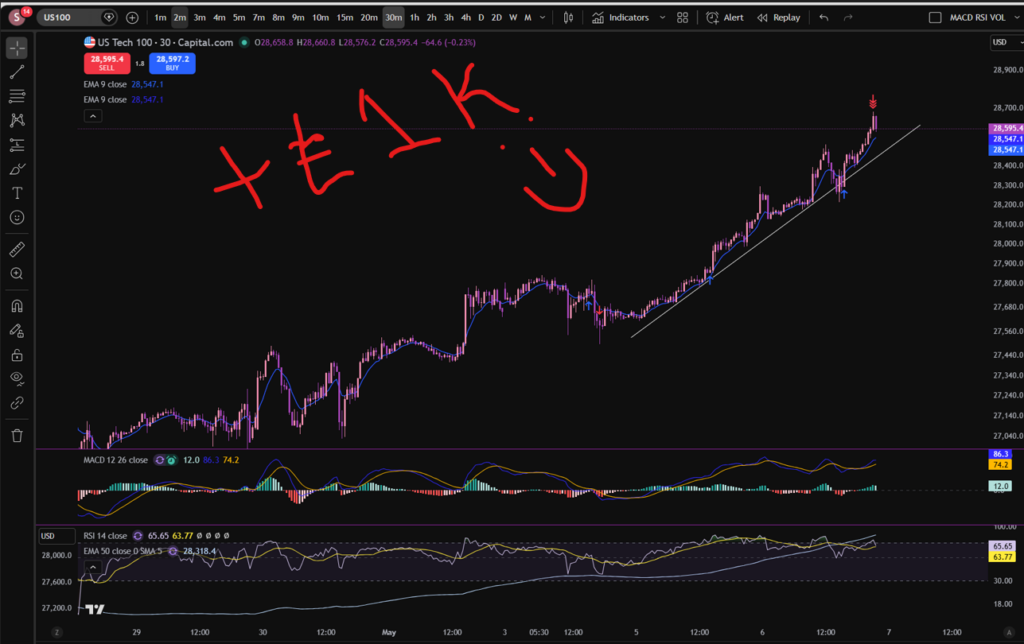
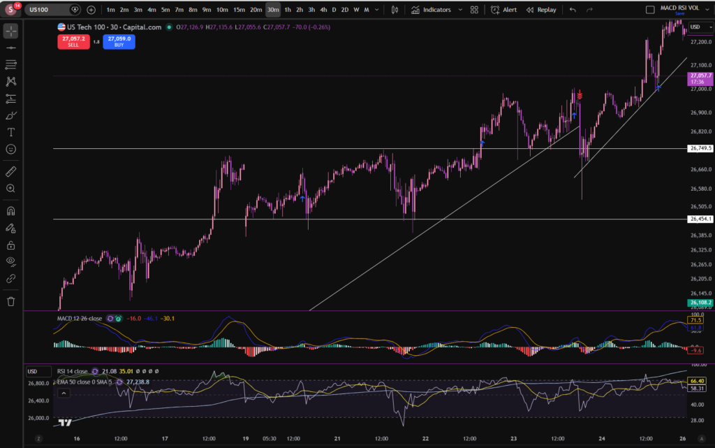
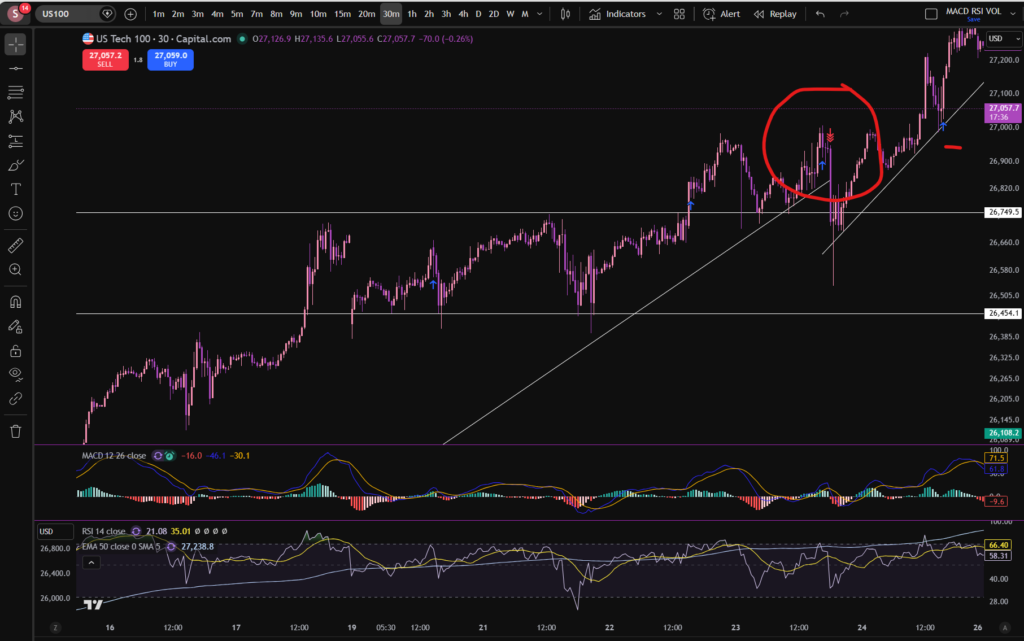
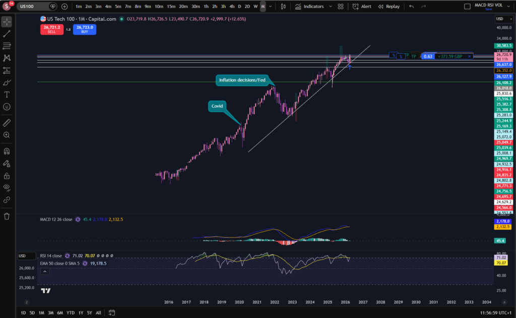
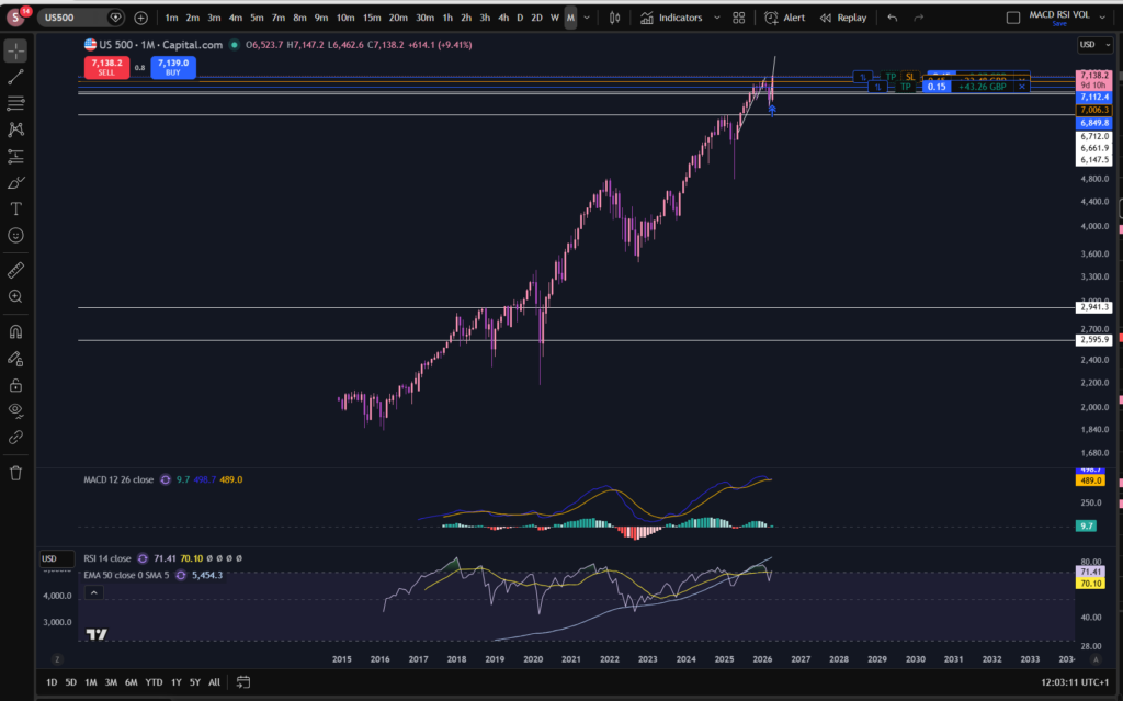
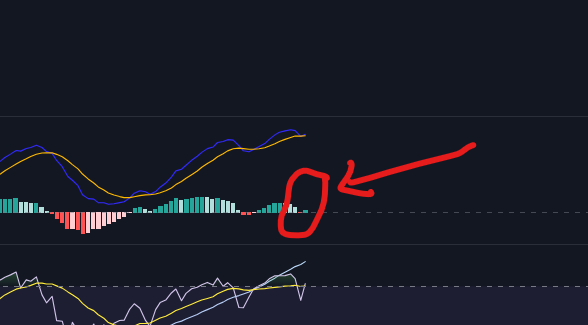
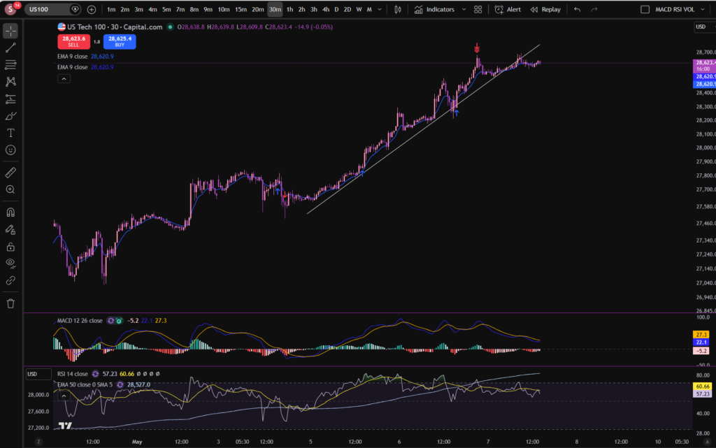
In this trade I entered into several positions as the price increased. You can see where I entered the market. In the end I had averaged up a total of three times before taking all profit off the table. I ended up with over £1,000 from these positions. You can see when I got into the first position on the chart with the blue arrows. This was around the 3rd or 4th of May. I exited them yesterday – see the collection of red arrows at the top of the upwards push. How did I know that the market may start pulling back there? It had sailed away from the diagonal support level I had placed on the chart, and the MACD was starting to lose it’s pigmentation on the histogram. The RSI was quite over extended and I was expecting it to pull back, at least to the diagonal support, but my thoughts were, it could pull back even further as it may have exhausted itself and I had a good chunk of profit sitting on the table which I didn’t want to give back 🙂

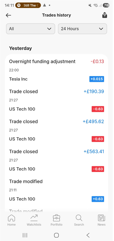
Here are my closed positions per my Capital.com app:

stocks today

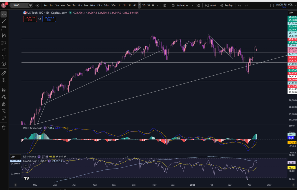
So what is next for the NASDAQ?

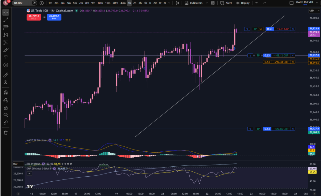
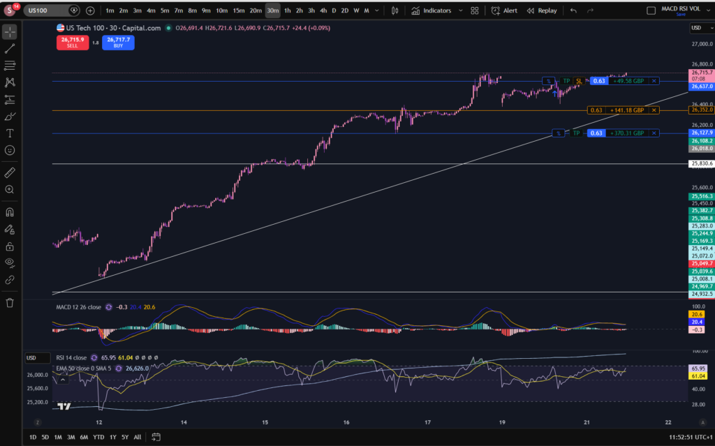
In terms of stocks today and the NASDAQ in particular, I can see the market has started chopping sideways through the diagonal support I drew on the chart, which is not a great sign! It’s possible it could still come up further, but right now, i’m waiting.

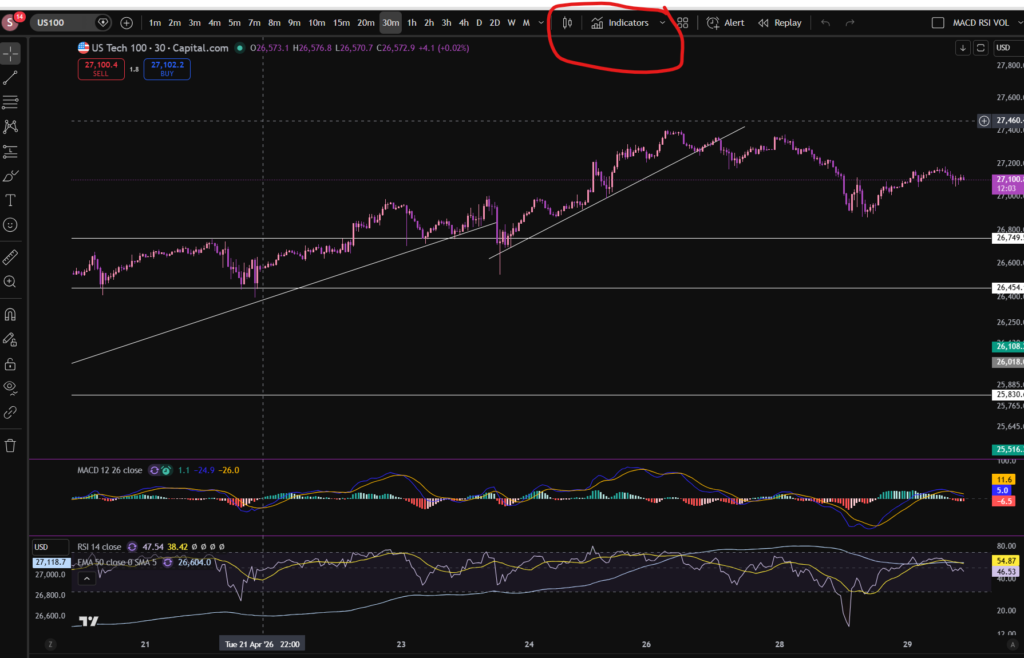
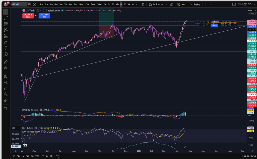
When you become an experienced trader, you sometimes get a ‘smell’ for when the market is peaking… it’s a combination of observations which give you a feeling that you need to jump out of the trades. The indicators, yes, but also your past experience of what they all collectively look like when the market is about to lose some momentum. Let’s take a look at the birds eye view to see if we can see what’s going on, from a higher level:

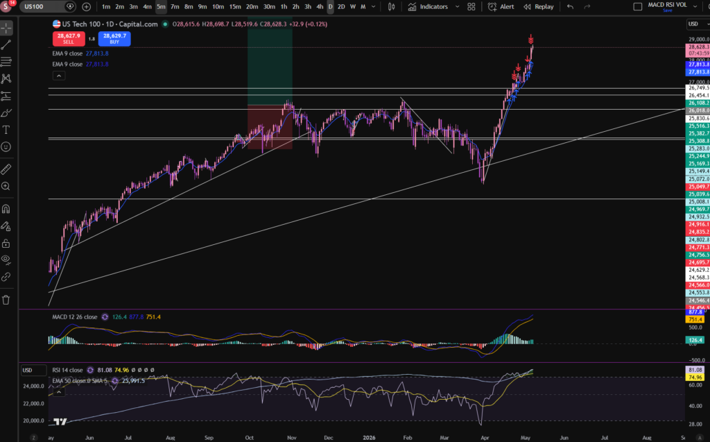
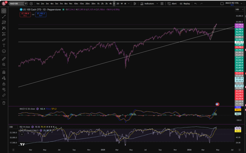
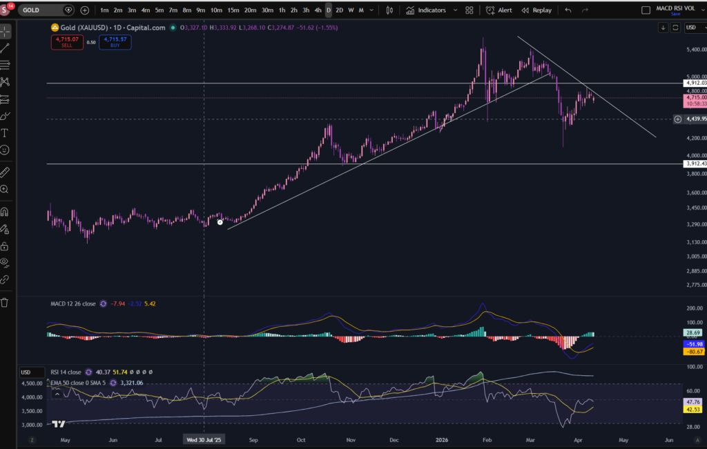
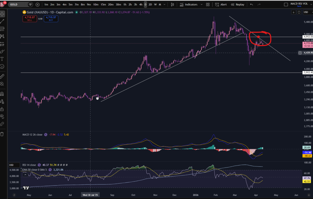
So, as you can see from the daily timeframe, the market has pushed off strongly from a strong long term diagonal support. The RSI is VERY high on this timeframe. Its a possibility that the market may be due a bit of a pull back – take a look at the shape of the previous upwards swing from this trend line. It tends to push up and then bump over in a ‘cloud’ shape rather than sky rocketing to the moon without any let up! So I have this in mind, while i’m waiting and also the fact that it’s chopping through the diagonal trend, now, on the 30 minute timeframe so it’s broken that support as of now.

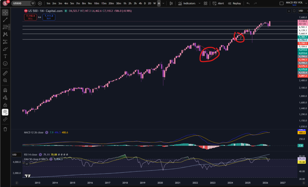
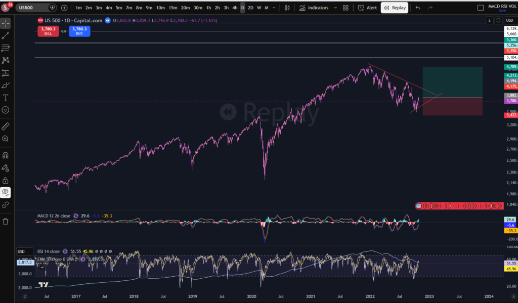
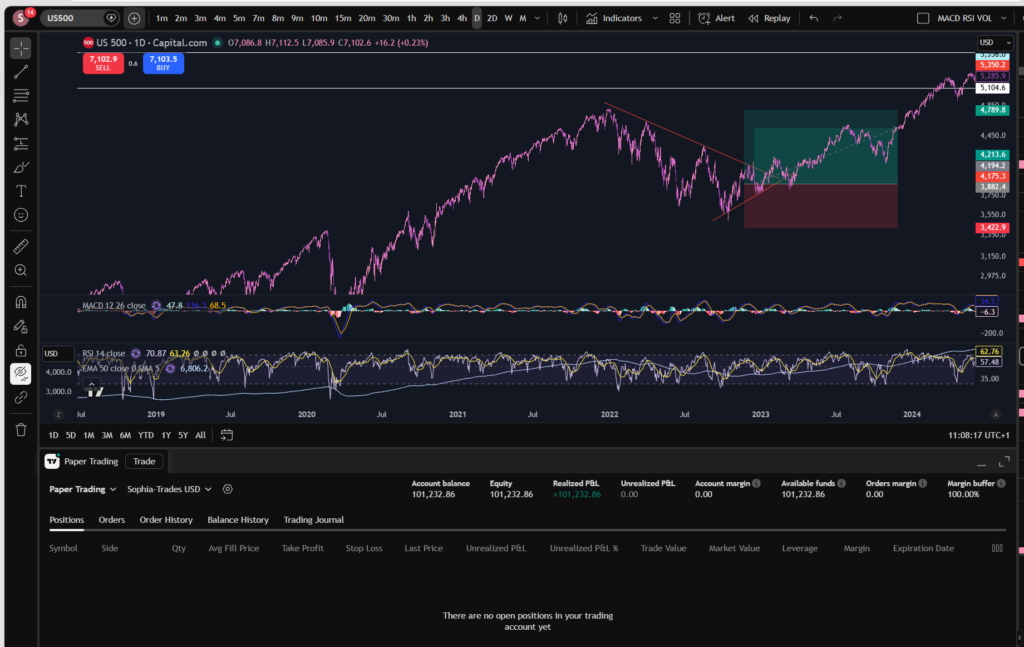
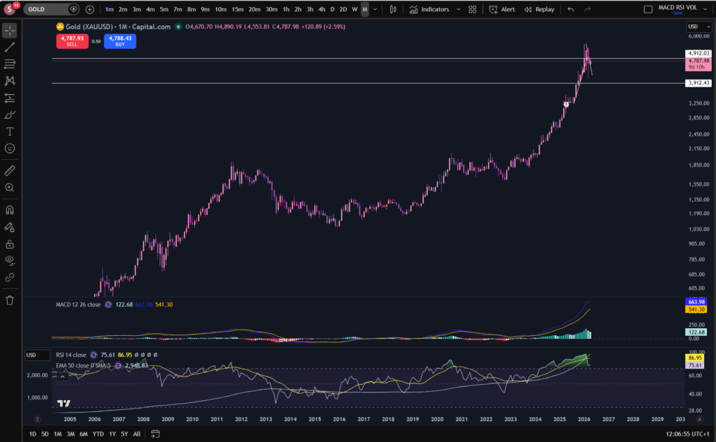
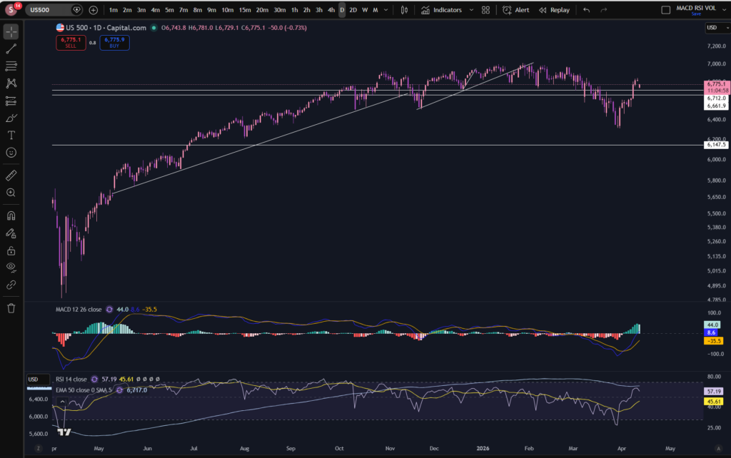
Let’s take a look at the S&P 500 for good measure – we can’t really consider stocks today without looking at this. This is heavily influenced by the NASDAQ so likely it will follow a similar story:

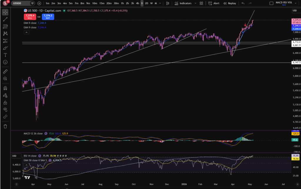
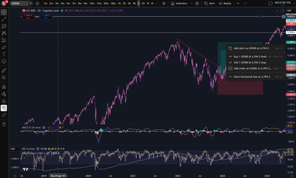
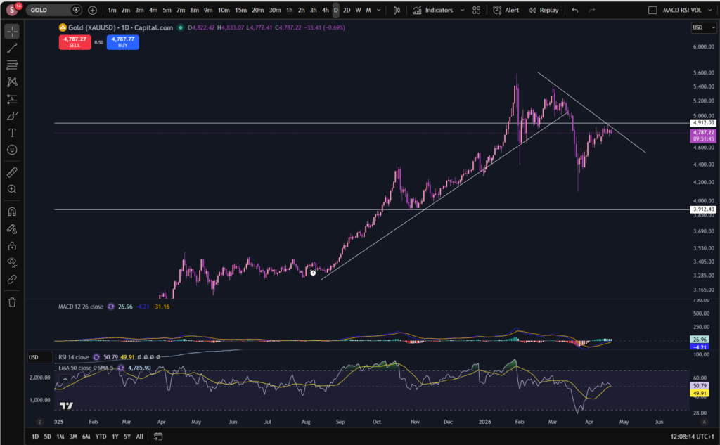
As you can see, a similar story has occurred on the S&P 500… This one looks like it broke through a previous diagonal support. It could be that this support can now be adjusted for a better fit – see below. (Don’t be afraid to readjust your trend lines as the markets play out):

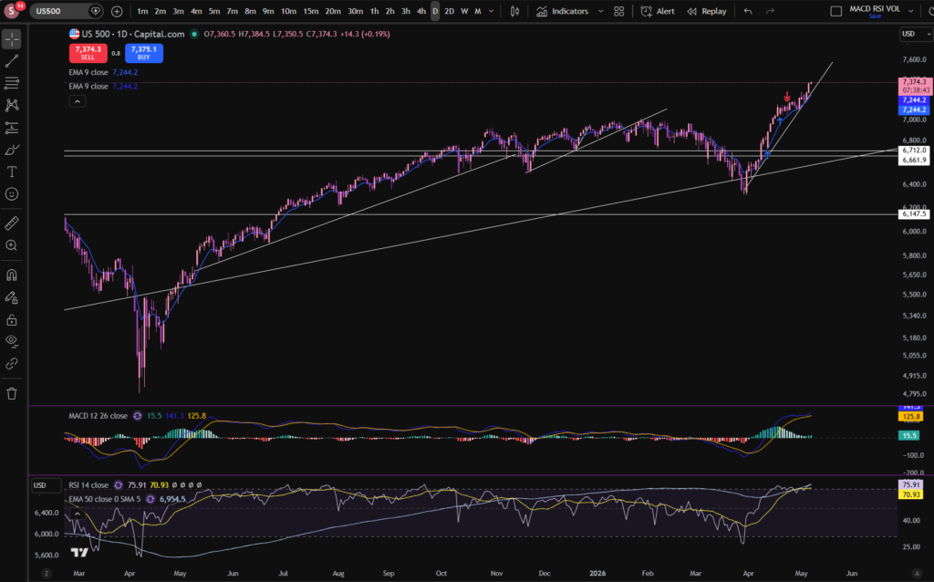
There – that’s better!

This one actually looks more strong than the NASDAQ to me, but obviously you need to decide for yourself before entering any market. Why do I say it looks stronger? The histogram has turned dark green again on the MACD indicator, and it’s just bounced on the readjusted trend line!

I hope you found this article on stocks today helpful!

Disclaimer!

Nothing on this blog should be taken as financial advice or encouragement for you to enter a trade.  You are expected to speak to a financial adviser or carry out your own due diligence before entering any positions.  Everything on this blog is made for educational purposes and to equip you with the knowledge you need to be able to make your own financial decisions.

For more great tips and advice on trading the stock market, please visit:

https://www.sophiatrades.co.uk

To watch me trade live please visit my patreon page here:

https://www.patreon.com/sophiatrades

Finally, if you would like to receive a discount on the Trading View charting software I use, please click on the relevant link here:

https://www.tradingview.com/?aff_id=117138

Please note any subscriptions taken via my affiliate link with Trading View may result in me earning a small commission.  However, I provide complete transparency on me using Trading View personally – I publish my success on the financial markets via my broker reports and any profits earned were done so by using my own Trading View subscription,  so I genuinely do recommend them and have been using the Trading View charts for many years.

How to add the MACD indicator in Trading View

How to add the MACD indicator in Trading View

In this article i’m going to give you some simple instructions on how to add the MACD indicator in Trading View. Let’s jump straight into it!

First of all, what is Trading View?

Trading View is a chart package which you can subscribe to. It’s the best one I have ever used. I’m still using it in my own trading – any screen shots I take in the ‘Chart Analysis’ section of my blog, are taken from my Trading View chart package:

Chart analysis – Sophia Trades – Learn how to Trade the Stock Market

Trading View is extremely intuitive as a chart package. You can filter and sort your watchlists in exactly the way you would like to – adding flags, sections – anything that can help with keeping your watchlists organised.

It allows you to log into many different brokers, and I have three different accounts of my own, hooked up on Trading View.

You can set alerts and have it email you when the price reaches a certain position or when particular scenarios occur in relation to your indicators.

I can offer users of my blog, a discount to this amazing software – just click the link below:

Where is the MACD indicator in this chart package?

You can find the indicators by going to the indicators tab at the top of the charts. When you click on this tab, you will get a list come up of hundreds of different types of indicators. You can find the MACD indicator by typing in the search box, “Moving Average Convergence Divergence”. You will see the indicator appear. Note there are many different versions so you want to select the plain default version – people are building their own indicators in there so you want to avoid any that you are not familiar with:

Trading View

Here is what the plain default indicator looks like:

Trading View

As you can see, my MACD is in my favourites as this is one of the key indicators I use when implementing my strategy.

Once you have applied this indicator to your chart, you can tailor its settings by following the instructions in a related blog article. Please see the Trading View or MACD sections of the blog:

MACD – Sophia Trades – Learn how to Trade the Stock Market

Best software reviews – Sophia Trades – Learn how to Trade the Stock Market

I hope you found this article helpful!

Disclaimer!

Nothing on this blog should be taken as financial advice or encouragement for you to enter a trade.  You are expected to speak to a financial adviser or carry out your own due diligence before entering any positions.  Everything on this blog is made for educational purposes and to equip you with the knowledge you need to be able to make your own financial decisions.

For more great tips and advice on trading the stock market, please visit:

https://www.sophiatrades.co.uk

To watch me trade live please visit my patreon page here:

https://www.patreon.com/sophiatrades

Finally, if you would like to receive a discount on the Trading View charting software I use, please click on the relevant link here:

https://www.tradingview.com/?aff_id=117138

Please note any subscriptions taken via my affiliate link with Trading View may result in me earning a small commission.  However, I provide complete transparency on me using Trading View personally – I publish my success on the financial markets via my broker reports and any profits earned were done so by using my own Trading View subscription,  so I genuinely do recommend them and have been using the Trading View charts for many years.

How to trade stocks – a breakdown of my recent profitable trades

How to trade stocks – a breakdown of my recent profitable trades

I made over £900 on the stock market over the last few days, and I wanted to share with you my entry and exit points so that you can learn from me, how to trade stocks. I’ve been using my usual MACD strategy, which you can find on my Patreon page, but I am also ‘averaging up’ my trades and this is leading me to make significantly more profits in the markets than I had been, previously… Let’s take a look at how I did it…

How to trade stocks – NASDAQ daily timeframe

How to trade stocks

As you can see, the NASDAQ has been in a long term steady uptrend but it had been pulling back per the daily timeframe, since around November! Once I saw that the price bounced near the long term upwards diagonal trendline on the daily timeframe, I found an entry on the 30 minute timeframe. I noted that the price started bouncing on another lower level diagonal trend line per the 30 minute chart, and got into the market near a horizontal support level. It’s best if you can get into the market where it is supported both diagonally and horizontally, but just one type of support can be ok too:

How to trade stocks

I tend to get into the market when the MACD is crossing again, to the upside, at a good support level. I do this now, repeatedly adding more and more to my position as the price increases. At each scoop down, I add another portion. I do this in a very controlled way, keeping an eye on my margin and the potential losses. Averaging up in this way is an important consideration and tool you can use when learning how to trade stocks.

In the above chart screen shot, you can see the first entry I made which ended up in over £500 of profit, and then the second one which took over £200 and the third (over £80). In total I increased my position size, about four times. I don’t have screen shots from the whole time the trade was open to show you, i’m afraid, but I hope you can see the step ups in the market I have made, here.

After the market was starting to cut through the support level on the chart, I took profit from the market, on all my open positions. You can see where I closed them with the little red arrows, here:

I also made another £300 or so this week since I closed these ones, and you can see my subsequent entry, but I’m aware that there will be an FOMC meeting soon and I don’t want to leave open positions on the table while this meeting is starting. I published another blog article yesterday about these meetings and how they can affect your trading, here:

There is an FOMC meeting happening this week! Everything you Need to Know – Sophia Trades – Learn how to Trade the Stock Market

If you are interested in learning to trade stocks and you don’t know where to start, or you are already applying a strategy and you feel you are struggling to get it to work, I can offer you some assistance. I offer one to one, educational consultations, during which I aim to provide some feedback and helpful guidance on how you could improve your strategy and make it successful. Please see the contact section of the blog and reach out if you think this would be of assistance to you.

I hope you found this article on how to trade stocks, helpful!

Disclaimer!

Nothing on this blog should be taken as financial advice or encouragement for you to enter a trade.  You are expected to speak to a financial adviser or carry out your own due diligence before entering any positions.  Everything on this blog is made for educational purposes and to equip you with the knowledge you need to be able to make your own financial decisions.

For more great tips and advice on trading the stock market, please visit:

https://www.sophiatrades.co.uk

To watch me trade live please visit my patreon page here:

https://www.patreon.com/sophiatrades

Finally, if you would like to receive a discount on the Trading View charting software I use, please click on the relevant link here:

https://www.tradingview.com/?aff_id=117138

Please note any subscriptions taken via my affiliate link with Trading View may result in me earning a small commission.  However, I provide complete transparency on me using Trading View personally – I publish my success on the financial markets via my broker reports and any profits earned were done so by using my own Trading View subscription,  so I genuinely do recommend them and have been using the Trading View charts for many years.

There is an FOMC meeting happening this week! Everything you Need to Know

There is an FOMC meeting happening this week! Everything you Need to Know

In this article I’m going to talk about a major FOMC meeting which is happening this week in the US.  This meeting is scheduled for the 28th or 29th April. These types of meetings can affect the stock market – they can cause the price to dramatically increase or drop, during the meeting, depending on what the FEDS say in relation to what they are doing with the interest rates in America.  Let’s jump into it and find out why…

FOMC Meeting

FOMC meeting

Tomorrow will be another FOMC meeting in America.  During these meetings, the Federal Reserve Bank decides whether or not to increase or decrease rates of interest in America. Briefly, when interest rates change, this can have an impact on the stock market.  This is because borrowings are either more or less expensive for businesses and they are able to scale up or down more easily, and their businesses are cheaper or more expensive to run, depending on what they do with the rates, which can either lead to more or less profit being made.  This in turn has an impact on the stock market and the share prices and especially during the FED meeting.  The reason for this is that the stock market investors are factoring in, what they perceive will be the impact of the FED’s decision on the price of the stocks.

There is an FOMC meeting taking place tomorrow.  You can find the details of these types of meetings, here, on a separate page of the blog:Key links for your fundamental analysis – everything you need to know – Sophia Trades – Learn how to Trade the Stock Market

FOMC meeting

If you go to FED calendars on the link above you will see the following screen on their website.  You can see there is a meeting scheduled for 28th to 29th April. 

When we get close to the time of the meeting, the stocks do sort of ‘stagnate’ slightly… I can see that stagnation is happening currently.  I’ve closed out of a few of my major positions while this is happening.  I will be waiting to see what the FEDS say about the interest rates, in the meeting.

If they say the interest rates are going to go down, it may result in the stock prices increasing – even during the meeting.  The opposite is true as well.  You can often literally see the price of the NASDAQ jumping around on the chart, while the FED meeting is going on and while they are taking questions from the reporters.

It will be interesting to see what they decide tomorrow!

I hope you found this article helpful!

Disclaimer!

Nothing on this blog should be taken as financial advice or encouragement for you to enter a trade.  You are expected to speak to a financial adviser or carry out your own due diligence before entering any positions.  Everything on this blog is made for educational purposes and to equip you with the knowledge you need to be able to make your own financial decisions.

For more great tips and advice on trading the stock market, please visit:

https://www.sophiatrades.co.uk

To watch me trade live please visit my patreon page here:

https://www.patreon.com/sophiatrades

Finally, if you would like to receive a discount on the Trading View charting software I use, please click on the relevant link here:

https://www.tradingview.com/?aff_id=117138

Please note any subscriptions taken via my affiliate link with Trading View may result in me earning a small commission.  However, I provide complete transparency on me using Trading View personally – I publish my success on the financial markets via my broker reports and any profits earned were done so by using my own Trading View subscription,  so I genuinely do recommend them and have been using the Trading View charts for many years.

How to change the colour scheme on Trading View

How to change the colour scheme on Trading View

Now that i’m a consistently profitable trader (as you can see below, i’m up £500 on the NASDAQ today, currently), I have time to think about very important issues, such as how to change the colour scheme on Trading View, to some girly pink and purple tones 🙂 As you can see below, I have applied these types of colours to my chart. I’m also using dark mode, which I prepared a separate blog about – linked below. Let’s take a look at how this can be achieved…

change the colour scheme on trading view

How to change the colour scheme on Trading View – first up, dark mode…

As promised above, here is a separate blog post on how you can change your white background to dark mode. This is one of the steps needed when understanding how to change the colour scheme on Trading View, if you want to achieve the dark background in general shown in my own chart settings. This is great for people who get migraines so may be of benefit to you for that reason. I did change mine for this reason but I also like the way it looks now 🙂

Here’s the blog post on changing to dark mode on Trading View:

How to Switch to Dark Mode in Trading View – Sophia Trades – Learn how to Trade the Stock Market

How to change the colour scheme on Trading View – the candles!

To change the colour scheme on Trading View and specifically the candles, you need to right click on the candles themselves, and Trading View will bring up the option table below where you can go in and select different colours. It’s that simple.

change the colour scheme on trading view

How to change the colour of the RSI on Trading View

As with changing the colour of the candles in Trading View, you can also change the colour scheme in Trading View by changing the colours of other indicators, such as the RSI indicator. If you have switched to dark mode, this may be especially important, because the lines on the default settings of particular indicators, will not stand out well, without changing their colour:

change the colour scheme on trading view

Again, you right click and it brings up the options. You can see i’ve selected a pinky purple colour for the RSI indicator, at the top of this screen shot. In fact, many of the indicators are changed in the same way – by right clicking. Trading View is highly intuitive in this way which is what I love about it.

What about the background? Can you change to a completely different colour?

Again, right click the ‘background’ and go to settings. You will find background listed at the top – I have now selected a gradient finish in pink and mauve.

change the colour scheme on trading view

So there you have it! You can completely transform the Trading View platform to suit you own trading style.

I hope you found this article helpful!

Disclaimer!

Nothing on this blog should be taken as financial advice or encouragement for you to enter a trade.  You are expected to speak to a financial adviser or carry out your own due diligence before entering any positions.  Everything on this blog is made for educational purposes and to equip you with the knowledge you need to be able to make your own financial decisions.

For more great tips and advice on trading the stock market, please visit:

https://www.sophiatrades.co.uk

To watch me trade live please visit my patreon page here:

https://www.patreon.com/sophiatrades

Finally, if you would like to receive a discount on the Trading View charting software I use, please click on the relevant link here:

https://www.tradingview.com/?aff_id=117138

Please note any subscriptions taken via my affiliate link with Trading View may result in me earning a small commission.  However, I provide complete transparency on me using Trading View personally – I publish my success on the financial markets via my broker reports and any profits earned were done so by using my own Trading View subscription,  so I genuinely do recommend them and have been using the Trading View charts for many years.

How to Paper Trade on Trading View – Everything you Need to Know

How to Paper Trade on Trading View – Everything you Need to Know

In this article i’m going to explain how to paper trade on Trading View. I’m going to talk about some specific methods you can use which are extremely helpful when you are learning to be a stock market trader. These methods will mean literally zero risk for your portfolio. I will also explain some of the differences which can catch new traders out, once they trade in the live markets and find it feels different to paper trading. Let’s jump straight into it!

First of all, what is paper trading?

In order to understand how to paper trade on Trading View, it’s a good idea to get a firm foundation on what paper trading is, how it is used, its benefits and drawbacks.

Paper trading is used to test a strategy or idea for making money in the stock markets without risk to your funds. You can place ‘paper’ trades, meaning you are not using real money on the trades and then monitor whether they would have been a win or loss. You can accumulate this knowledge by applying the set up rules of your entry and exit points, over and over, to see whether, in the long term, the plan will end up making money. There are different ways to paper trade. It’s referred to as paper trading because some people literally have a note book and note down their planned entry points, and exit points, monitor the price and see whether it goes to target or their proposed stop loss position.

Another way to paper trade, and perhaps an easier way, is to use chart software, such as Trading View.

How to Paper Trade on Trading View

One way of learning how to paper trade on Trading View, is to use the alerts feature and the trade planning tool. Allow me to demonstrate how to paper trade on trading view, using this method… Let’s take the S&P 500 chart in Trading view, on the daily timeframe, as an example:

How to paper trade on trading view

Let’s say your plan is to get into this market when the price dips down on a pull back in an uptrend, and then take profit when it reaches previous highs. I’ve marked on the screen shot above, an example of this. Now, let me show you the trade planning tool which you could use at the point you are planning your trade:

How to paper trade on trading view

You can go to the menu on the left and pick ‘long’ position. This will bring up a little diagram on the chart where you can change its parameters to plan the entry point, take profit and stop loss. I’ve moved the chart across so that we can only see what we would see had we been planning this trade before it reached previous highs. This is what the diagram looks like on the chart:

How to paper trade on trading view

I’ve used the Trading View ‘replay’ tool to take the chart back to the entry position. I will explain the replay tool in a subsequent blog post, so watch out for this. As you can see, i’ve added the trade planning diagram for a long position, to this chart. The middle section where the red meets the green, is where the entry would be according to this type of plan. You would probably want to put a stop below the previous low of the trend, and this is where the red section extends to underneath the entry position. We said this would be a strategy where we take profit at the previous high, so this is where the green section extends to.

Now, what makes Trading View amazing for paper trading, is that you can set alerts at those levels marked with the diagram, as follows:

How to paper trade on trading view

I can’t show you the alert being set in replay mode – it has to be done in the live market. So I right clicked at the top of the green section, and as you can see, it has a + sign with a clock, to set an alert on the chart at the price of 4,794. Once you go to set this alert, you can tell it to email you or notify you via push notifications:

How to paper trade on trading view

You can see i’ve set alerts in the app, via email and it will ping me with a sound when the price crosses 4,794.5.

This is just one very helpful way of planning paper trades using Trading View. There is another way, however.

Trading View Paper Trading Tool

Another way to learn how to paper trade on Trading View, is to use the paper trading tool which is built into the platform. Trading View has got, built into it, a ‘paper trading’ module, accessible at the top right, when you click on Trade. It will bring up a brokers list, and you can either log into your broker account or use the Trading View module, highlighted below.

How to paper trade on trading view

This feature is amazing. It basically records everything in your paper trading for you – like real trades. It will keep a record of your balance and whether it’s growing or not after each trade:

How to paper trade on trading view

It records the history of what has happened in the log below the chart. It shows you open ‘paper positions’ and to get into these, you simply log into paper trading via Trading View, and go to ‘buy’ and the software will execute a ‘paper’ trade for you and it will be sitting in your trade log of open positions. I believe it gives you about 100,000 to spend as starting capital. You can see i’ve got an account balance of 101,232.86 above.

I hope this helped you to understand how to paper trade on Trading View.

If you would like to see my You Tube video on paper trading, please see the linked video, below:

Disclaimer!

Nothing on this blog should be taken as financial advice or encouragement for you to enter a trade.  You are expected to speak to a financial adviser or carry out your own due diligence before entering any positions.  Everything on this blog is made for educational purposes and to equip you with the knowledge you need to be able to make your own financial decisions.

For more great tips and advice on trading the stock market, please visit:

https://www.sophiatrades.co.uk

To watch me trade live please visit my patreon page here:

https://www.patreon.com/sophiatrades

Finally, if you would like to receive a discount on the Trading View charting software I use, please click on the relevant link here:

https://www.tradingview.com/?aff_id=117138

Please note any subscriptions taken via my affiliate link with Trading View may result in me earning a small commission.  However, I provide complete transparency on me using Trading View personally – I publish my success on the financial markets via my broker reports and any profits earned were done so by using my own Trading View subscription,  so I genuinely do recommend them and have been using the Trading View charts for many years.

Stocks Today – Everything you Need to Know

Stocks Today – Everything you Need to Know

In this article i’m going to consider what’s happening with the stocks today. I will take a look at the NASDAQ, the S&P 500 and the chart for Gold, which can give us an overall good indication of the health of the stock markets. Let’s get started!

Stocks today – the NASDAQ

As you can see from the below daily timeframe chart, the NASDAQ recovered to previous highs. This is a good indication that people are starting to have more faith in stocks today. This did coincide with some reassuring announcements from President Trump, about the Iran war:

stocks today

By the way, I use Trading View chart software which I love. It’s extremely intuitive and helpful – I will never be without it as a trader. You can get a discount by clicking on the button below:

The price is in another uptrend, as can be seen on this 30 minute timeframe:

stocks today

However, it’s worth noting that the MACD’s histogram has turned from dark to light green, and it may be that the upwards push has lost some of its momentum – for now. Let’s take a look at the monthly timeframe:

stocks today

Pay attention to the MACD and signal lines here. They did make a little cross to the downside, showing one tiny, red histogram bar recently, but now it’s showing another dark green, albeit, small, bar. Notice also the ‘bounce’ that appears to have happened on the diagonal trend line of the monthly timeframe above.

Ultimately, it remains to be seen whether the price will continue increasing. It is hoped my technical analysis will empower you to make this decision for yourself. I’m currently sitting in two positions, as you can see. If the markets keep ascending further, I may add to these.

I’m going to prepare a blog article on how I average up, to make more money in trading, soon – so watch this space for that.

We can’t consider stocks today without taking a look at the S&P 500. Let’s take a look – this can often follow the same sort of pattern as the NASDAQ, since some of its big players are also sitting on the NASDAQ:

S&P 500

As you can see, we have seen a similar pattern forming on the S&P 500. I’m currently sitting in a couple of smaller positions on this market.

I zoomed in a bit so you can see the small red histogram bar on the monthly timeframe and the fact that, in a similar way to the NASDAQ, this has gone back to showing a small green bar.

Let’s take a look at Gold, for good measure. As I mentioned, when stocks are rising, Gold often drops in value because people switch their investments into stocks which can provide a higher return:

It’s not very clear from the monthly timeframe what is happening here, so I also got a screen shot of the daily timeframe:

It does look like Gold is now making lower highs and lower lows. The latest ‘high’ appears to still be forming. I will be watching to see if the MACD and signal lines cross over to the downside again, and the price respects the initial diagonal resistance line i’ve drawn on the chart. We will see… Ultimately Gold is not pushing up so it does appear there may be some more confidence in the stocks again. Given the sky high RSI indicator on this market per the monthly timeframe, I will not be adding any funds to it of my own, until I see that it’s offering more of a bargain. I am hoping it will come right down!!

I hope you found this article on stocks today, helpful.

Disclaimer!

Nothing on this blog should be taken as financial advice or encouragement for you to enter a trade.  You are expected to speak to a financial adviser or carry out your own due diligence before entering any positions.  Everything on this blog is made for educational purposes and to equip you with the knowledge you need to be able to make your own financial decisions.

For more great tips and advice on trading the stock market, please visit:

https://www.sophiatrades.co.uk

To watch me trade live please visit my patreon page here:

https://www.patreon.com/sophiatrades

Finally, if you would like to receive a discount on the Trading View charting software I use, please click on the relevant link here:

https://www.tradingview.com/?aff_id=117138

Please note any subscriptions taken via my affiliate link with Trading View may result in me earning a small commission.  However, I provide complete transparency on me using Trading View personally – I publish my success on the financial markets via my broker reports and any profits earned were done so by using my own Trading View subscription,  so I genuinely do recommend them and have been using the Trading View charts for many years.

Key links for your fundamental analysis – everything you need to know

Key links for your fundamental analysis – everything you need to know

I’ve listed below some of the key links which you may need in order to understand the markets, depending on your trading style. This is especially important for fundamental analysis I will be adding to this page as time goes on so please keep an eye out for further information which may be relevant for you.

fundamental analysis
  1. Consumer Confidence Index (USA): US Consumer Confidence
  2. Producer Price Index (USA): United States Producer Prices
  3. Federal Reserve Board (USA): The Fed – Inflation (PCE)
  4. Federal Reserve Board (USA) Calendar of scheduled meetings: The Fed – Meeting calendars and information
  5. Bank of England interest rate decision dates Monetary Policy Committee dates for 2026 and 2027 | Bank of England
  6. Companies House in the UK (for downloading companies’ financial statements): Companies House – GOV.UK

Disclaimer!

Nothing on this blog should be taken as financial advice or encouragement for you to enter a trade.  You are expected to speak to a financial adviser or carry out your own due diligence before entering any positions.  Everything on this blog is made for educational purposes and to equip you with the knowledge you need to be able to make your own financial decisions.

For more great tips and advice on trading the stock market, please visit:

https://www.sophiatrades.co.uk

To watch me trade live please visit my patreon page here:

https://www.patreon.com/sophiatrades

Finally, if you would like to receive a discount on the Trading View charting software I use, please click on the relevant link here:

https://www.tradingview.com/?aff_id=117138Please note any subscriptions taken via my affiliate link with Trading View may result in me earning a small commission.  However, I provide complete transparency on me using Trading View personally – I publish my success on the financial markets via my broker reports and any profits earned were done

Gold Price Chart – Everything You Need to Know

Gold Price Chart – Everything You Need to Know

In this article i’m going to talk about the Gold price chart and some of the key aspects of understanding how to trade Gold. We will look at the longer term price action per the chart and its relationship with stocks and confidence in the overall economy. Let’s get straight into it!

Gold Price Chart – relationship to the stocks and general consumer confidence

There is an inverse relationship between consumer confidence and the price of gold. This is because when consumer confidence is low, consumers consider that Gold, a precious metal which is real physical thing and valuable in the real world, is worth investing in. The value of Gold increases slowly and steadily over time, like a slow, steady, ticking clock. Let’s take a look at the monthly timeframe chart to get a view of the long term movements of Gold:

gold price chart

If you would like a discount to the chart software that I use (Trading View), please click the link below:

As you can see on the above chart, dating back to 1980, the price of Gold has climbed slowly to a record high. Over this time, the price increased by 1,313%.

Over the last ten years, the price grew by approximately 400%:

gold price chart

On average, over the ten years this works out to be:

5,618-1120 = 4498 USD

/10 =449 USD per year

This works out to be an annualised return of approximately 13.7%.

When economic growth is strong, consumer confidence is high, and consumers tend to favour higher yielding investments rather than slow and steady. This can cause the price of Gold to dip.

How is the Gold price chart affected by inflation?

If consumer confidence is being driven or influenced by inflation, we may see the Gold price chart prices increasing with a corresponding decline in the relevant currency value.

So is there anything we can use to give us an indication of what levels of consumer confidence are relevant? Yes! We can use the Conference Board’s Consumer Confidence Index (CCI). You can see the website for the CCI here:

US Consumer Confidence

If targets are missed, this can trigger nervousness for the markets and this will likely have a positive impact on the Gold price chart.

What happens to the Gold during a recession?

The price of Gold tends to increase during recessions as consumer confidence tends to be lower. As mentioned above, when consumer confidence is low, people tend to invest their money in Gold as a saver haven until the turbulence has reduced in the stock market.

Gold Price Chart – is there anything else to be aware of?

Although the Gold price chart is typically inversely related to consumer confidence and the stock charts, the correlation is not always perfect, as other factors can be at play, including interest rates, the strength of currency and political events and news around the Globe!

What does the CII Board currently say about what they expect to see in consumer confidence?

As per the CII website, they have published graphs showing that they expect consumer confidence to fall slightly from where it is currently. You can see this graph and data here, under the ‘Present Sitaution and Expectations’ index graph:

US Consumer Confidence

I hope the information published here will help you in your trading journey and in particular help you to decide whether you think the price of Gold will rise, or fall, in the medium to long term.

Disclaimer!

Nothing on this blog should be taken as financial advice or encouragement for you to enter a trade.  You are expected to speak to a financial adviser or carry out your own due diligence before entering any positions.  Everything on this blog is made for educational purposes and to equip you with the knowledge you need to be able to make your own financial decisions.

For more great tips and advice on trading the stock market, please visit:

https://www.sophiatrades.co.uk

To watch me trade live please visit my patreon page here:

https://www.patreon.com/sophiatrades

Finally, if you would like to receive a discount on the Trading View charting software I use, please click on the relevant link here:

https://www.tradingview.com/?aff_id=117138

Please note any subscriptions taken via my affiliate link with Trading View may result in me earning a small commission.  However, I provide complete transparency on me using Trading View personally – I publish my success on the financial markets via my broker reports and any profits earned were done so by using my own Trading View subscription,  so I genuinely do recommend them and have been using the Trading View charts for many years.

Stocks today 13th April 2026 – Everything You Need to Know

Stocks today 13th April 2026 – Everything You Need to Know

In this article i’m going to take a look at stocks today: what’s been happening in the markets since market open. I’m going to consider the overall position of the NASDAQ, the S&P 500 and Gold as these can give a good overall indicator of market direction. Let’s jump straight into it!

Stocks today the NASDAQ

I mentioned yesterday that the NASDAQ had been recovering from it’s recent downwards move, and it had broken through the downward diagonal trend line. Today the market opened with a gap down, but is recovering again with a positive candle:

stocks today

However, note that the MACD indicator histogram bars have slightly shrunk since yesterday and they are getting slightly smaller. We still have market open in the US to come, and that may have a big impact. The RSI is scooping over slightly too. It looks from the above chart, like the momentum for the upwards push has slowed down. It remains to be seen whether this will be reinforced at market open in the US.

Let’s take a quick look at the S&P 500 to see if we see a similar story:

Stocks today – S&P 500

stocks today

As you can see, the S&P 500 is showing a similar story and this is not surprising because it is heavily driven and influenced by the NASDAQ with its top constituents being companies which are also sitting on the NASDAQ.

What’s happening on Gold?

In considering stocks today it is also useful to pay attention to what is happening to the price of Gold. When stocks are increasing due to consumer confidence or confidence in the financial markets in general, the price of Gold tends to pull back. Let’s take a look at the Gold chart:

stocks today

As you can see above, we now have another candle which at the moment, is respecting the downward diagonal resistance line shown on the chart. It seems Gold and the stock markets are indeed showing the relationship we normally see from them… Gold is coming down overall currently and has been since around the beginning of March. It’s worth noting that Gold is also, at another resistance level – the horizonal one. Pushes away from such areas can be stronger where there are two different resistance lines intersecting one another, as shown below. It remains to be seen whether this trend will continue and the resistance levels will be respected.

I hope you found this article helpful. Please check back again for further updates and technical analysis on the current states of the market.

Disclaimer!

Nothing on this blog should be taken as financial advice or encouragement for you to enter a trade.  You are expected to speak to a financial adviser or carry out your own due diligence before entering any positions.  Everything on this blog is made for educational purposes and to equip you with the knowledge you need to be able to make your own financial decisions.

For more great tips and advice on trading the stock market, please visit:

https://www.sophiatrades.co.uk

To watch me trade live please visit my patreon page here:

https://www.patreon.com/sophiatrades

Finally, if you would like to receive a discount on the Trading View charting software I use, please click on the relevant link here:

https://www.tradingview.com/?aff_id=117138

Please note any subscriptions taken via my affiliate link with Trading View may result in me earning a small commission.  However, I provide complete transparency on me using Trading View personally – I publish my success on the financial markets via my broker reports and any profits earned were done so by using my own Trading View subscription,  so I genuinely do recommend them and have been using the Trading View charts for many years.