How to make £100 per day

How to make £100 per day

In this blog article I will discuss how you can make £100 per day as a more passive style of income from your savings by investing your money in the stock market. If it is your goal to make £100 per day, or you want to leave the rate race, please know this is absolutely possible. If you are a mother of small children and you are just sick of the balancing act you are required to do by society in managing a home and earning money, and you are looking for some more flexibility with how you earn money, please know, this is absolutely possible. Stock market traders take profit from the markets every single day – and you can be one of them. However, please note it requires patience, diligence, determination and discipline. If you do not have these qualities i’m afraid to say the stock market may not be for you. If you think you may be a good fit for the stock market and you want to make £100 per day in extra income, please read my helpful plan below. Everything starts with a plan!

How much money do you need, to make £100 per day?

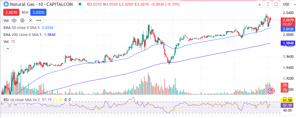
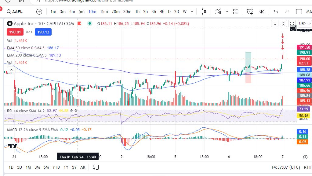
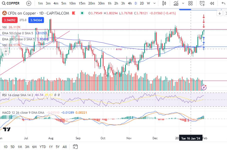
Having a target of making £100 per day is a great goal and may keep you motivated. Traders can make anyting up to about 100% in gains on their capital balances per year. If we work backwards from this, there are 365 days in the year. Lets assume you have been reading Trader Pro blog articles, watching live trading on my Patreon account here:

https://www.patreon.com/Traderpro8320

and you have learnt how to achieve the same win rate and capital growth rate as as Trader Pro, (achieving a 60%/40% profit to loss and roughly a 1.5/1 reward risk ratio. Trader Pro ends up with growth worth about 100% of the capital balance each year. For confirmation and absolute assurance over my win rate, please see the performance stats section of my blog – here, where I publish reports from my broker:

https://sophiatrades.co.uk/category/my-performance-statistics/

I publish the win rate I am achieving each week with Capital.com. I have shared this to provide my readers with confidence. There are many traders on the internet who are advising new and inexperienced traders incorrectly, and leading them to make losses which causes discouragement. (I was misled in this way).

Back to your plan…

So 365 days per year, x £100 = £36,500.

You would need a capital balance of £36,500 to make £100 per day, assuming you achieve 100% growth each year, like Trader Pro. Please note, nobody said this was going to be a get rich quick scheme – investing and wealth creation takes time and patience. If you haven’t read the book ‘Rich Dad, Poor Dad’, you are really encouraged to read this – don’t just take my word for it. You can watch a free audio version of this book on You Tube here:

As Robert Kiyosaki illustrates in his book, the best way to generate wealth is to start NOW and build it gradually. This book literally changed my life, and the way I look at money.

Right! back to your plan for generating £100 per day of income…

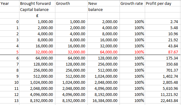
If you need £36,500 to make £100 per day, you may be wondering how long it would take to achieve this level of capital, on a particular starting balance. Please look at the simple excel calculation I have provided you with, below. The calulation below assumes you start with £1,000. This may be achievable for some people, perhaps not so much so, for others. However, the overall direction and power of growth is demonstrated quite clearly below. If you have less than £1,000 to start with, it will take a little longer to get it up and running, but with the £1,000 starting balance, you can be achieving £100 per day within roughly five years. This could be seen as a very healthy retirement income for some people and it’s not that long to wait to retire! According to Forbes, the average UK salary is currently £34,900:

With trading the stock market, you are able to place trades and do this work from anywhere in the world, including a beach in the Maldives. As a little piece of added inspiration, I’ve provided a photo for you…

You are not encouraged to take on debt to achieve a starting capital balance. It is much better if you can put a little bit of money asside to achieve this starting point. The audio book, Rich Dad Poor Dad discusses a lot of things which ‘typical’ people do in society – taking on credit card debt to fund ‘liabilities’. These liabilities include clothes, shoes, your HOUSE… Yes that’s right… you read that correctly – your house is a liability. The definition of an asset is something which will bring you an income. Since your house does not bring in income for you, your house is a constant expense (unless it’s being rented out – but you always need somewhere to live). So a possible way of saving money is to stop spending it on more ‘liabilities’.

So you have an overall goal… what’s next?

If you want to follow this blog and the way Trader Pro makes money, you are encouraged to manage your risk within your trading plan. I have written a separate article about managing risk which is linked here:

https://sophiatrades.co.uk/category/risk-management/

I have also provided an article about preparing a trading plan, here, which you will need:

How to create a Trading Plan – Trader Pro (trader-pro.co.uk)

Once you have your goal, risk management and trading plan in place, all you need is your starting balance – whether that’s £100 or £1,000 and you are well on your way! Good luck.

For more great tips and advice on trading the stock market, please visit:

https://sophiatrades.co.uk/

To watch me trade live please visit my patreon page here:

https://www.patreon.com/Traderpro8320

Finally, if you would like to receive a discount on the Trading View charting software I use, please click on the relevant link here:

https://www.tradingview.com/?aff_id=117138

Risk Management – setting a stop loss? How to make money

Risk Management – setting a stop loss? How to make money

In this article we talk about one of the popular methods of managing risk – setting a stop loss. We talk about how to set it up, when it’s useful but also the disadvantages of using one. We hope you find this useful.

What is a stop loss?

A stop loss is a setting you can apply to your trading account to ‘automatically’ sell the holding when it gets to a particular price level. (You can also sell a portion at a particular price using limit orders, but that is not covered in this article). The stop loss is used to control and limit the risk of a trade. The set up is typically done at the outset of placing the trade. It therefore removes the emotion involved in making a decision at a point when a trade is going against the trader. Stop losses are not guaranteed unless a ‘guaranteed’ stop loss is used, for which an additional premium will likely be payable.

The stop loss can be set from any platform but also Trading View – the charting software we are using.

Typically traders have an idea of where to get in and out of a trade in the event it goes for or against them. The stop loss can therefore be set to coincide with this initial decision.

Advantages

  1. A stop loss removes the emotion of making a decision at a point in time where the markets are against you and you feel stressed and fearful of losing money;
  2. It can be set up at the outset of placing the trade to coincide with the overall plan for the particular trade – and it assists traders in ‘sticking to the plan’;
  3. It will activate when the trader is offline – so if trades are being held overnight, the stop loss will trigger in the event the price starts trending against the trader and it’s reached the trader’s limit.
  4. They are usually quite accurate in terms of where the market sells – they are usually close to or on the stop loss so it really does help to limit risk on trades placed.
  5. A stop can be ‘trailed’ to follow a long trend while leaving the position with room to breath. Please see our other blog articles on the best way to approach this. This will allow the trader to take advantage of profit already on the table and allow the trade to grow even more by always moving the stop to a sensible distance away from current price.
  6. It can be a great way to stick to an overall trading plan for your account by executing small trades and strictly applying a stop when they go against you. See our other blog articles on risk management and position size.

Disadvantages

There are some draw backs to setting a stop loss and these, in the writer’s opinion, should be balanced carefully with the advantages listed above. We have listed some disadvantages below:

  1. The emotion in deciding where to sell is removed. Whilst this can be a good thing, for someone who is learning, trading is very much about discipline and closing positions when they are going against you helps you to build strength and discipline in your trading style. It also forces the trader to ‘focus’ very carefully on what is happening in the market at the time of either closing, or not! For example, is the price making lower lows and lower highs now, or is it consolidating or something else? What is the reason for closing based on the patterns the trader can see on screen? When a stop is set, all of this thinking and learning is removed.
  2. The stop will not always be placed in the ‘best place’… what I mean by this, is that the markets tend to stretch to a particular point and test that point/extreme and then they rebound in the other direction. At the outset of the trade, the trader will not necessarily know where this is. The trade will close with the stop at the ‘arbitrary’ point set at the outset. This may be based on the previous low, but what if the candles go slighly lower than this on a long position, but the point they reach is still higher than the previous low (so the market is still uptrending)? A stop will cause a trader to get out of a trade prematurely/incorrectly.

How to set a stop loss

We have explained how to set a stop loss with the charting platform ‘Trading View’. Please note by signing up through the link below you will receive a unique discount:

https://www.tradingview.com/?aff_id=117138&source=TraderProBlog

However, please also note that as stated above, the stop can be set on any platform.

In Trading View, when placing an order to buy, you would have clikced on the ‘buy’ button here:

Next, you will see the following screen:

Stop loss

You would need to decide, based on your trade set up at the oustset, where you think you would sell in the event the market goes against you, or in your favour. We can help you learn how to make this decision at other articles posted on our blog:

Trader Pro – Trading strategies for success in the financial markets (trader-pro.co.uk)

Click the box next to ‘stop loss’ and enter the price at which you wish to sell in the Price box. You can, at the same time, set a ‘take profit’ price in the same way.

Once your stop is set, it will show on your trading view chart as a red horizontal line with the loss value attached. This can be moved easily (although this is not encouraged unless you are trailing a stop or following a long trend!).

Does Trader Pro use a stop loss?

The golden question… the answer to this is no, not now. I feel like my trading improved tenfold when I decided to stop using a stop loss, for the reason listed above related to ‘learning’ from what is happening on screen and not allowing the software to close the trade for you at an arbitrary amount. The person responsible for Trader Pro has got a lot of discipline, however, and this can be something which is genetic and which a person can posess even from a young age. Trading without a stop loss, where the trader has got little to no discipline is not enouraged and could be dangerous.

We hope you enjoyed this article. You may find it helpful to use it in conjunction with our other blog posts on risk management for an overall trading strategy.


Nothing on this blog should be taken as financial advice or encouragement for you to enter a trade.  You are expected to speak to a financial adviser or carry out your own due diligence before entering any positions.  Everything on this blog is made for educational purposes and to equip you with the knowledge you need to be able to make your own financial decisions.

For more great tips and advice on trading the stock market, please visit:

https://sophiatrades.co.uk

To watch me trade live please visit my patreon page here:

https://www.patreon.com/Traderpro8320

Finally, if you would like to receive a discount on the Trading View charting software I use, please click on the relevant link here:

https://www.tradingview.com/?aff_id=117138

Please note any subscriptions taken via my affiliate link with Trading View may result in me earning a small commission.  However, I provide complete transparency on me using Trading View personally – I publish my success on the financial markets via my broker reports and any profits earned were done so by using my own Trading View subscription,  so I genuinely do recommend them and have been using the Trading View charts for many years.

The Volume Indicator – how to make money

The Volume Indicator – how to make money

In this blog we discuss the volume indicator. This is an essential indicator for most successful traders. It will give you an insight into genuine market moves, where the big money is, and help you avoid false entry signals. We hope this will be helpful to you on your trading journey!

What is the Volume indicator?

The volume indicator is an indicator which can show you the quantity of trades placed in a market over a given time interval (the volume of trades placed). In relation to futures or options, the indicator will display the number of contracts which have been bought or sold over the interval.

We provide below, a picture of the volume indicator on the NASDAQ. You can see that with the strong moves up or down in price, the volume is closely connected – it is in fact the volume which causes the price to rise or fall. Note what is happening to the price in the picture below, within the red highlighted areas.

Volume indicator

How can the volume indicator help you in trading?

Sometimes the market makers can cause a price to move without any genuine money behind the move. This can lead to traders entering into trades which look ok on the face of it, but which then don’t end up going anywhere or the price falls back down to where it was. If you see a price move higher but there is no volume, be ware. This may end up being a losing trade. The same is true for shorting the market – be ware of any price movements which are not supported or substantiated by a move in volume.

The volume indicator can also signal to you when the market move is becoming weak or exhausted. If you can see a sharp rise in volume together with a sharp increase in price, this can sometimes represent traders who got in as the market was becoming exhausted and it can mean the number of buyers is now depleted.

Volume can also be used to confirm whether or not the price is consolidating. If the price is ticking along without much volume between a price ‘range’ it maybe that the price is building up some momentum, like a stretched rubber band, and at some point soon, it will break out of the channel and make new highs or lows. You can use the volume indicator to help you avoid ‘false’ breakouts. If the price has broken out without supporting volume, it is likely that the breakout is a false one.

Volume indicators to choose from

There are a number of volume indicators to choose from. This article simply refers to the ‘Volume’ indicator – it can be found on the Trading View charts by searching ‘Volume’.

We hope this article will help you avoid some false break outs and identify some big moves in your favour. Happy trading!

We hope this helped! For more great tips and trading set ups visit our other blog pages at Trader Pro – Trading strategies for success in the financial markets (trader-pro.co.uk)

If you would like to use the charting software above, we highly recommend Trading View to you. Use the following link and you may receive a discount on your subscription: https://www.tradingview.com/?aff_id=117138&source=TraderProBlog

Please note any subscriptions taken via my affiliate link with Trading View may result in me earning a small commission.  However, I provide complete transparency on me using Trading View personally – I publish my success on the financial markets via my broker reports and any profits earned were done so by using my own Trading View subscription,  so I genuinely do recommend them and have been using the Trading View charts for many years

The Simple and Exponential Moving Average – How to make money

The Simple and Exponential Moving Average – How to make money

The moving average indicator is used by professional and beginner traders the world over. They are an extremely useful weapon to have in your arsenal. Moving averages can give you a clear indication of whether the market is trending up, down or sideways and they can also be used as entry and exit points. We discuss the different types of moving averages and their uses below.

Moving averages – what are they?

Moving averages are what they sound to be – a line on your chart depicting the average of the price movement over a specified time interval.

There are many different types of moving average indicators, but two of the most popular ones include the Simple Moving Average and the Exponential Moving Average.

The Simple Moving Average (“SMA”)

The Simple Moving Average gives equal weight to each of the points in the time interval. It is a lagging indicator seeing as it follows the movement of the price.

The Exponential Moving Average (“EMA”)

The Exponential Moving Average places greater weight on the most recent points in the moving average line. It is a lagging indicator seeing as it follows the movement of the price.

How can moving averages be used to make more money in trading?

Moving averages can be used as great indicators to find entry or exit points.

Moving Average lower time frame entry points

For example, when entering a trade on a larger time frame, you may wish to zoom in, on a smaller time frame, and consider waiting for the price to jump up over the 50 period exponential moving average. This can indicate that the price has started to trend up. Conversely, if you are entering a trade on a larger time frame chart you may wish to see what the price is doing in relation to the moving average, on a smaller time frame – if the price is still below the moving average, it might be a sign to wait a while.

Moving Average indicators – Golden Cross / Death Cross

The moving averages themselves can be used as indicators in conjunction with other moving averages. For example, a common setting is to have two moving averages, one with a period of 50 and the other with a period of 200. If the price has been down trending for a while, at the point where the 50 period moving average crosses up over the 200 period average, this can indicate a good entry point. This is known as the Golden Cross.

Similarly, for the opposite situation, when the 50 period moving average crosses below the 200 period moving average, this is known as the Death Cross.

The Golden / Death Cross can indicate the start of a long down or up trend. They can be good indicators to use when riding a trend and trying to understand when the trend is going to come to an end. Lets take a look at some examples:

Golden Cross Moving Average entry signal
Golden Cross entry signal

This is a recent picture of the 4 hour timeframe on the Nasdaq – the prices have begun to recover from the war in Ukraine – it remains to be seen whether they will continue to trend upwards – they could make another downturn and newer lows yet – however, this will much depend on the FEDS and any further interest rate hikes.

However, what can be seen here is that the 50 period EMA has now crossed up over the 50 period EMA. If the prices remain on the road to recovery/a bull market, the EMAs would be unlikely to cross back the other way, for a very long time. Similarly, in the chart below, you can see the start of the downtrend when the war in Ukraine began… This was in 2022 – you can see the 50 period EMA remained below the 200 period EMA for the whole time since then.

Death Cross - War in Ukraine - Moving Average indicator
Death Cross – war in Ukraine

Using the Moving Average for general trend direction

In addition to the above entry or exit signals, the moving averages can be used to understand very clearly, what direction the market is moving in. If the prices are above the SMA or EMA, the market is up trending. If they are below the SMA or EMA, the market is down trending. If they are crisscrossing up and down over the moving average, caution should be taken when using a trend following indicator or strategy because the price is likely consolidating between two points.

So we hope you enjoyed this information and that it helps you understand direction and some good entry or exit points for your trading. Happy trading!

We hope this helped! For more great tips and trading set ups visit our other blog pages at Trader Pro – Trading strategies for success in the financial markets (trader-pro.co.uk)

If you would like to use the charting software above, we highly recommend Trading View to you. Use the following link and you may receive a discount on your subscription: https://www.tradingview.com/?aff_id=117138&source=TraderProBlog

Please note any subscriptions taken via my affiliate link with Trading View may result in me earning a small commission.  However, I provide complete transparency on me using Trading View personally – I publish my success on the financial markets via my broker reports and any profits earned were done so by using my own Trading View subscription,  so I genuinely do recommend them and have been using the Trading View charts for many years.

How to use MACD – The Moving Average Convergence Divergence to make more money

How to use MACD – The Moving Average Convergence Divergence to make more money

The MACD – Moving Average Convergence Divergence (hereafter referred to as ‘MACD’) is an extremely useful and very popular, indicator. It can help you to identify good entry and exit points and whether the market is over or undervalued as well as much more. There is a lot to this indicator. We discuss some of its more broad uses below.

MACD – The Moving Average Convergence Divergence – what exactly is it?

The MACD is a lagging indicator which is used for momentum and trend following trading strategies. It broadly displays two lines – the Signal line and the MACD line, which interact with each other by crossing over each other, intermittently. The indicator also displays a histogram which can be used to determine the strength of a given move in one direction or another, as well as an early indication of whether or not a buy or sell signal (MACD/Signal lines crossing (more below)), is about to happen. These components and uses are discussed in detail below.

MACD – The Moving Average Convergence Divergence – The ‘MACD’ line

The MACD line shows the interaction between two exponential moving averages. The settings for these averages can be tailored on the chart software. It is displayed by the software as the difference between the two moving averages, as set by the user. The default settings are a ’26 period EMA’ and a ’12 period EMA’ (EMA = “Exponential Moving Average”), and the default colour is blue (using Trading View software).

The MACD line can be used to identify whether a move is nearly at its end. For example, if the candles on the chart have reached a new high, but the MACD line did not, it can indicate that the move is running out of steam and a reversal may happen soon . This is referred to as ‘divergence’ – a divergence between the candles/price and the MACD line movements. Caution should be taken when attempting to use the indicator for entry points in this scenario. See the picture below. The candles reached a higher high (HH), but the MACD reached a lower high (LH). Following this, the price steeply declined . This was at the end of a long upward trend and it is within a trend that it is likely this cross over indicator would be used. Care should therefore be taken before entry, to check that there is no divergence in this way between price and the MACD line.

MACD – The Moving Average Convergence Divergence – The ‘Signal’ line

The signal line is a nine day EMA of the MACD line. The default colour of this line is orange.

When the signal line crosses the MACD line, it can indicate that the price is going to move higher or lower from an oversold or overbought level. See the example below. The signal line crossed the MACD line at a dip in the price and following this, the price trended higher. This is used by many traders, when taken with other confirmations, as a good entry signal. The writer uses this indicator the most, in trading set ups. The use of the indicator in this way is meant to identify good entry points on trends. Therefore, it should not be used as an entry signal when the price is consolidating between two very obvious levels.

The ”Histogram’

When the data in the histogram is above the baseline (positive), it means that the MACD is higher than it’s nine day average, meaning that the price has recently seen an increase or upwards momentum. The opposite is true for the opposite scenario – if the data is below the zero line on the histogram, it indicates that there has been some recent downward momentum. This can be seen on the chart below, where there was a strong upwards push and the histogram went from negative (red) to positive (green).

The histogram can be used to determine if a cross over is anticipated when it forms divergences. These divergences can be seen with reference to the peaks and troughs in the histogram and the MACD line. For example, if the MACD line creates a lower low, and the Histogram data displays a higher low. This is displayed, by way of example, on the chart below. You can see that the histogram made a higher low (see movements in red circle), but the blue MACD line, had reached a lower low. Following this, the MACD and Signal line crossed over and the price moved significantly higher. You can watch for the opposite scenario if you are waiting to short the market – a higher high on the MACD line, but a lower high on the histogram. This can indicate the MACD and signal lines are about to cross for a downward move. The histogram pattern can be in the form of peaks and troughs for the higher lows etc, or a slanted pattern where there is no dip in the histogram – it is just more smooth looking!

MACD

Identifying overbought and oversold levels

As you can see in the chart picture above, the MACD indicator tends to broadly follow the shape of the RSI indicator (‘Relative Strength Index’). If you are not familiar with the RSI indicator, broadly, the price is overbought when it reaches the top part of the indicator (roughly anything over the value of ’70’ would be overbought). The opposite is true when it reaches the bottom part (say, below 30). Unlike the RSI indicator, the MACD is not adjusted for each market so that it displays ‘comparative information’. What is meant by this, is that on Palladium above, the value at overbought levels, on the RSI indicator, will always be roughly ‘over 70’. The same will be true for any other market displayed on the chart when using the RSI. However, the MACD indicator does not provide equivalent values/it does not keep the ‘overbought’ value the same between different markets. Instead, you can use the ‘shape’ of the MACD and signal lines to understand when the price is either overbought or oversold for the market you are viewing in particular, with reference to the highest peaks and troughs of the MACD and signal lines.

For more secrets on using the MACD indicator, please see our other blog articles here:

and here:

https://sophiatrades.co.uk/category/technical-indicators/macd-technical-indicators

We hope this information on how you can use the MACD indicator in your trading strategies and setups, has been useful. Keep an eye out for our blogs which we will use to display trade set ups including the use of this indicator.

We hope this helped! For more great tips and trading set ups visit our other blog pages at Trader Pro – Trading strategies for success in the financial markets (trader-pro.co.uk)

If you would like to use the charting software above, we highly recommend Trading View to you. Use the following link and you may receive a discount on your subscription: https://www.tradingview.com/?aff_id=117138&source=TraderProBlog

Japanese Candlesticks to make money – Tweezer Tops and Bottoms

Japanese Candlesticks to make money – Tweezer Tops and Bottoms

As well as providing a general and succinct set of data about the price at a given interval (see our Japanese Candlesticks Introduction page: Japanese Candlesticks – an introduction – Trader Pro (trader-pro.co.uk)), Japanese candles can also be used in conjunction with other indicators to identify good times to enter or exit trades. The first we consider are tweezer tops and bottoms. As the name suggests, Japanese candlesticks – tweezer patterns look a lot like pairs of tweezers either facing upwards or downwards. These are explained below with some examples on the chart together with what they are likely to mean/what they can predict is going to happen next.

Tweezer bottoms

Tweezer bottoms appear on the chart as identified in the screen shot below. They can appear at the end of a down trend and signify a possible change in direction. On a practical level, they represent a struggle between the bulls and bears where the price was pushed all the way down to form a long bottom wick (to a very specific limit) and then it recovered and the bulls took back control, pushing the price back up again. Another one with the same pattern (where the price was pushed to the same price level, and it then came back up), creates the ‘tweezer top’ shape. The bears were unable to push the price below the level seen in the tweezer bottoms. See the screen shot below. This happened twice in short succession before the price started trending in the upwards direction.

japanese candlesticks

Japanese candlesticks – Tweezer Tops

The same is true for candles which appear in the same way, but reversed. These are called tweezer tops. See the example below where the price reached the same high in two candles next to each other before the price was pushed back down in a new trend/direction. As a minimum you would need two candles but there could be more which test the same level either with tweezer tops or bottoms.

Japanese candlesticks

We hope this explains this very useful candlestick pattern. Now that you are familiar with this pattern you will start to notice it when you are waiting for a reversal and when taken with other indicators/criteria, it could be a good entry point (or exit) depending on the direction of the trade.

We hope this helped! For more great tips and trading set ups visit our other blog pages at Trader Pro – Trading strategies for success in the financial markets (trader-pro.co.uk)

If you would like to use the charting software above, we highly recommend Trading View to you. Use the following link and you may receive a discount on your subscription: https://www.tradingview.com/?aff_id=117138&source=TraderProBlog

Please note any subscriptions taken via my affiliate link with Trading View may result in me earning a small commission.  However, I provide complete transparency on me using Trading View personally – I publish my success on the financial markets via my broker reports and any profits earned were done so by using my own Trading View subscription,  so I genuinely do recommend them and have been using the Trading View charts for many years.

Learn how to trade and make money with Sophia Trades

Hello. If you are on this page, you are probably looking to increase financial success and stability. You have come to the right place. On this website you will find educational resources which will help you learn how to trade including technical indicators, trading strategies, risk management and recommended charting software. In addition to these helpful resources, I will be posting regular blogs outlining trade setups which you may find helpful. You can find my own trade set up style, here:

My trade set up/Watch me | Collection from Sophia-Trades | 1 post | Patreon

Happy trading!

Please note, I do not offer the following services on this blog:

  • – Telling you where to enter or exit trades;
  • – Offer copy trading;
  • – Give you financial advice;
  • – Tell you which investments to make.

I want to encourage and teach you how to carry out your own due diligence, and make your own informed decisions.

Please note, if what you are reading or listening to, has no connection to my brand heart logo above, it’s not me.

For great tips and advice on trading the stock market, please visit:

https://sophiatrades.co.uk/

Finally, if you would like to receive a discount on the Trading View charting software I use, please click on the relevant link here:

https://www.tradingview.com/?aff_id=117138

The Relative Strength Index (RSI Indicator) – how to make money

In this blog article I will share with you a detailed description of what the RSI indicator is, how it works and how you can use it to assist you in achieving success in the financial markets.

What is the RSI Indicator?

The RSI indicator is a type of momentum indicator. It measures speed and the size of a market’s recent fluctuations in price. It can be used to evaluate under or oversold buying/selling opportunities. The indicator is an oscillator and has a scale of zero to 100.

How is the RSI indicator used?

As well as showing the user when a market is overbought or oversold, it can also tell the user whether a market is likely to have trend reversal or pull back. It can be used as a buy or sell signal. Typically if the readings on the RSI indicator are abovev70, this would indicate that the market is ‘overbought’ and it is not at that moment, presenting a ‘good deal’. If the readings are below 30, this indicates that the market is oversold (a bargain). When the readings are above 70, this might be a good time to exit a trade in a buy position, or wait until the price drops before entering one. When the RSI is below 30, this could be a good time for getting into a trade.

The RSI can also indicate whether the market is either uptrending or downtrending. The indicator may remain in the overbought teritory for a long time while the market is in an uptrend, and the opposite is true for downtrends.

The RSI indicator can be used to spot reversals. If the RSI is unable to reach 70 on a number of consecutive attempts during an uptrend, and then drops below 30, this could indicate that the trend is losing its strength and the price may reverse to lower levels.

How does the RSI indicator work?

The RSI indicator compares a market’s strength on intervals when prices go up to the market’s strength on intervals when the prices go down. The result of this comparison is an indication of how the market may perform in the future.

The RSI is calculated as follows:

The standard number of intervals used to calculate the RSI is 14.

Drawbacks

Despite being extremely useful, the RSI can give misleading signals when markets are either in a strong uptrend or downtrend. For example, if the market is uptrending, the RSI may not fall to near the 30 area at all… To combat this, the trader could ‘adjust’ his/her view in this scenario to note where the RSI falls to (which level) when it is at a low on the trend in an uptrend and vice versa.

The indicator works best in long term trends. It is however, most useful in an oscilatting market.

Lets take a look at some examples:

RSI indicator

You can see in the chart for Natural Gas above, that each time the RSI falls below 30, this corresponds to a subsequent period of growth and the trend goes on to reach higher highs. Similarly when the RSI is especially high (see thepeak where the RSI extended beyond the purple area), this was followed by a sharp downwards move.

We hope you found this article helpful.

For a discount on the charting software I use, Trading View, please click on the following link:

https://www.tradingview.com/?aff_id=117138

To watch me trade the markets, please click on the following link:

https://patreon.com/Traderpro8320?utm_medium=unknown&utm_source=join_link&utm_campaign=creatorshare_creator&utm_content=co

For more great tips and advice on trading the financial markets, please see our other blog posts at:

https://sophiatrades.co.uk/

Please note any subscriptions taken via my affiliate link with Trading View may result in me earning a small commission.  However, I provide complete transparency on me using Trading View personally – I publish my success on the financial markets via my broker reports and any profits earned were done so by using my own Trading View subscription,  so I genuinely do recommend them and have been using the Trading View charts for many years.

Some recent profitable trades – how to make money

Some recent profitable trades – how to make money

In this blog post I cover a couple of recent profitable trades placed. I will break down my entry and exit points. I hope you find this useful!

Seagate

Recent profitable trades

I first looked for an entry on the daily timeframe. The MACD had just made a cross over. The market was in an uptrend. The RSI was not too high. Next I checked the ten minute timeframe for an entry point:

Same thing again – looking for an entry on the MACD indicator where the MACD and signal are about to cross and ideally they are below the histogram. In this case They were low on the histogram but not quite below the zero line. The RSI had taken a dip. I set my target for the previous hight of the trend.

Recent profitable trades – Apple

Looking foran entry point, the MACDhad crossed over, was below the histogram zero level and the RSI was low. I then checked the 10m timeframe for an entry point:

The MACD had just made a cross over. Iset my target for a bit higher than the previous high. The RSI was low and the market had started to uptrend (above the 200 period EMA). Sure enough the trade reached its target!

Copper

Again, I checked that the MACD was in a good place on the daily timeframe. I also checked whether I would have enough room to reach a decent profit target before hitting the resistance level marked on the chart with the red line above.

Then I checked the ten minute timeframe for an entry point:

I set the profit target on this one for just below the red resistance level marked on the daily timeframe. I waited for a MACD cross over and the trade reached its target shortly after.

For more great tips and advice on trading the stock market, please visit:

https://sophiatrades.co.uk

To watch me trade live please visit my patreon page here:

https://www.patreon.com/Traderpro8320

Finally, if you would like to receive a discount on the Trading View charting software I use, please click on the relevant link here:

https://www.tradingview.com/?aff_id=117138

Please note any subscriptions taken via my affiliate link with Trading View may result in me earning a small commission.  However, I provide complete transparency on me using Trading View personally – I publish my success on the financial markets via my broker reports and any profits earned were done so by using my own Trading View subscription,  so I genuinely do recommend them and have been using the Trading View charts for many years.

Make more money with Japanese Candlesticks – an Introduction

Japanese candlesticks can be used to create trading strategies themselves or to just help you understand the direction and activity on the chart. We examine below, the structure of a candle stick and what it means, the different types of candle sticks you might see on a stock trading chart, and how you can use the candlesticks as indicators of market sentiment.

Japanese Candlesticks and timeframes

A new candle is formed on the chart every ‘n’ minutes/hours/days/etc, depending on what chart timeframe the chart is set to. For example, in the chart below, the timeframe setting is ‘D’ for ‘one day’ – so each day another candle completes its formation. As you can see below, there are many timeframe settings. Switching between them will change the candles so that a candle appears at each interval selected.

japanese candlesticks

Structure of Japanese Candle Sticks

An example of a Japanese candlestick is shown above.

The most obvious thing to say about these is that they look like candles – but each part tells you something about what is happening to the price, as follows:

  • – Upper wick – this element shows you the highest price level which the instrument reached within the timeframe applicable to the candles.
  • – Lower wick – conversely, the lower wick shows you the lowest price reached within the time interval.
  • – Candle body – the top part of the candle will show you either the closing price, or the opening price, depending on whether the candle is red, or green (sometimes substituted for blue). Broadly, if your trade is predicting the price to rise, green or blue candles are good news, red ones are bad, and vice versa. You can see on the chart above that when the price is rising, the candles are mostly green.

The purpose of using candle sticks is to provide a quick and visual indication of what is happening to the price.

There are a few special types of candles which are easy to spot and which have extra meaning. These are discussed on our Japanese Candlestick Patterns pages linked below:

Shooting star/Hanged man:

Tweezer tops and bottoms:

We hope this helped! For more great tips and trading set ups visit our other blog pages at Trader Pro – Trading strategies for success in the financial markets (trader-pro.co.uk)

If you would like to use the charting software above, we highly recommend Trading View to you. Use the following link and you may receive a discount on your subscription: https://www.tradingview.com/?aff_id=117138&source=TraderProBlog

To watch me trade live, please visit my Patreon page here:

https://www.patreon.com/Traderpro8320

Please note any subscriptions taken via my affiliate link with Trading View may result in me earning a small commission.  However, I provide complete transparency on me using Trading View personally – I publish my success on the financial markets via my broker reports and any profits earned were done so by using my own Trading View subscription,  so I genuinely do recommend them and have been using the Trading View charts for many years.