In this article i’m going to talk about how you can change the MACD settings in Trading View, to suit your trading style and strategy. I’m going to talk about the length of the MACD and signal lines, and the colours of the histogram and the lines. Let’s jump straight into it!
First of all, what is the MACD indicator?
‘MACD’ stands for Moving Average Convergence Divergence. It does what it says on the tin! It’s the consecutive convergence and divergence of two moving averages. I published a separate blog article, explaining how you can use the MACD indicator to make more money in your trading, linked below, so I won’t go into that here. However, I do want to explain to you how you can change the settings on the indicator.
How to change the settings on the MACD indicator in Trading View
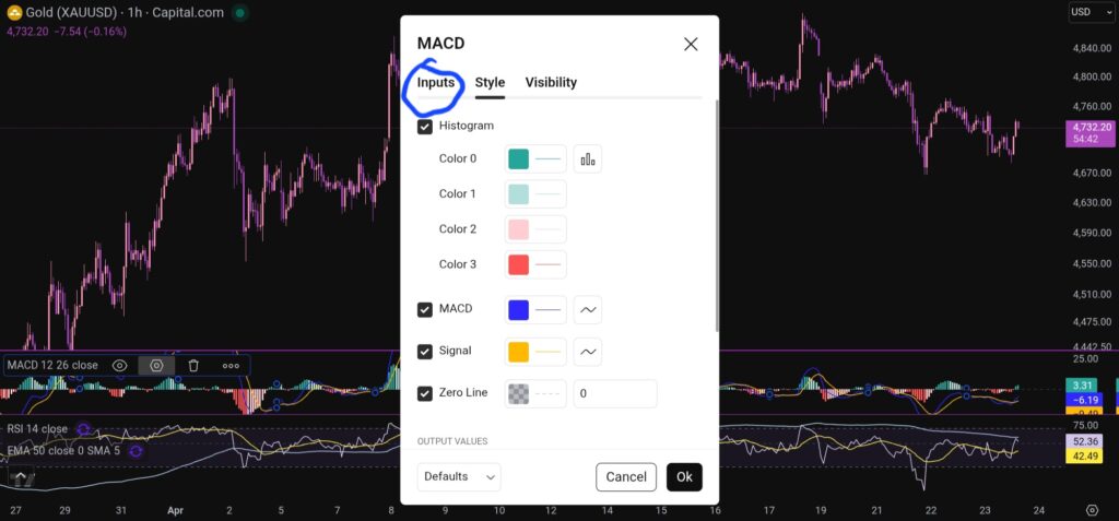
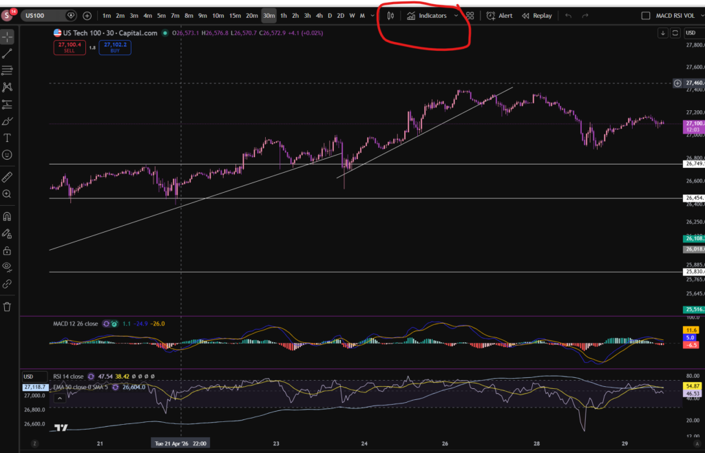
OK, so now i’m going to share with you how you can change the settings on the MACD indicator. To change the length of the moving average lines, tap anywhere on the MACD indicator, and you will see the settings menu come up – it appears on the leeft of the sceen, as shown below:
When you click on the little hexagon shape, it will bring up a menu, as follow:
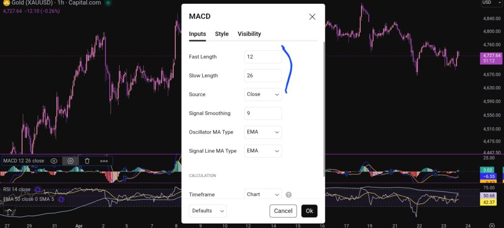
You want to click next on the ‘inputs’ tab as shown above, and you will see this screen next:
As you can see, you can alter the lengths of the moving averages here by changing the values in the field boxes.
How do you change the colour scheme of the MACD indicator?
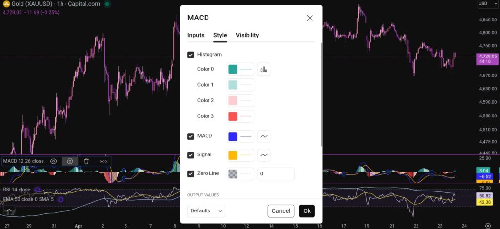
Changing the colour scheme of the MACD indicator in Trading View is just as easy as changing the moving averages. You simply click on settings with the hexagonal shape again, and the first box which comes up, is the menu where you have the option to change the colours of the MACD indicator:
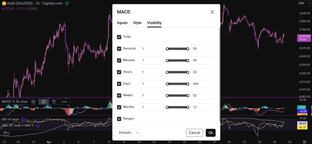
You can also change the visibility of the MACD indicator by clicking on the tab for this, and you will see this menu:
I hope you found this article helpful!
Disclaimer!
Nothing on this blog should be taken as financial advice or encouragement for you to enter a trade. You are expected to speak to a financial adviser or carry out your own due diligence before entering any positions. Everything on this blog is made for educational purposes and to equip you with the knowledge you need to be able to make your own financial decisions.
For more great tips and advice on trading the stock market, please visit:
Please note any subscriptions taken via my affiliate link with Trading View may result in me earning a small commission. However, I provide complete transparency on me using Trading View personally – I publish my success on the financial markets via my broker reports and any profits earned were done so by using my own Trading View subscription, so I genuinely do recommend them and have been using the Trading View charts for many years.
In this article i’m going to give you some simple instructions on how to add the MACD indicator in Trading View. Let’s jump straight into it!
First of all, what is Trading View?
Trading View is a chart package which you can subscribe to. It’s the best one I have ever used. I’m still using it in my own trading – any screen shots I take in the ‘Chart Analysis’ section of my blog, are taken from my Trading View chart package:
Trading View is extremely intuitive as a chart package. You can filter and sort your watchlists in exactly the way you would like to – adding flags, sections – anything that can help with keeping your watchlists organised.
It allows you to log into many different brokers, and I have three different accounts of my own, hooked up on Trading View.
You can set alerts and have it email you when the price reaches a certain position or when particular scenarios occur in relation to your indicators.
I can offer users of my blog, a discount to this amazing software – just click the link below:
Where is the MACD indicator in this chart package?
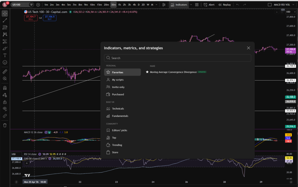
You can find the indicators by going to the indicators tab at the top of the charts. When you click on this tab, you will get a list come up of hundreds of different types of indicators. You can find the MACD indicator by typing in the search box, “Moving Average Convergence Divergence”. You will see the indicator appear. Note there are many different versions so you want to select the plain default version – people are building their own indicators in there so you want to avoid any that you are not familiar with:
Here is what the plain default indicator looks like:
As you can see, my MACD is in my favourites as this is one of the key indicators I use when implementing my strategy.
Once you have applied this indicator to your chart, you can tailor its settings by following the instructions in a related blog article. Please see the Trading View or MACD sections of the blog:
Nothing on this blog should be taken as financial advice or encouragement for you to enter a trade. You are expected to speak to a financial adviser or carry out your own due diligence before entering any positions. Everything on this blog is made for educational purposes and to equip you with the knowledge you need to be able to make your own financial decisions.
For more great tips and advice on trading the stock market, please visit:
Please note any subscriptions taken via my affiliate link with Trading View may result in me earning a small commission. However, I provide complete transparency on me using Trading View personally – I publish my success on the financial markets via my broker reports and any profits earned were done so by using my own Trading View subscription, so I genuinely do recommend them and have been using the Trading View charts for many years.
In this article I’m going to share with you some MACD secrets on how you can use the MACD indicator in a really practical way to make more money trading. You will not likely find these useful, very simple and practical tricks discussed anywhere! If you are intrigued please read on!
MACD Secrets… First, what is the MACD indicator?
The MACD indicator stands for Moving Average Convergence Divergence. We discussed in detail the technical side of how this indicator works in one of our other blog posts. You can read the technical detail here:
OK. So now you know what the MACD is, how can you use it in a practical way to make even more money when you are trading?
MACD tips which other traders don’t tell you…
The first MACD secrets we would like to share with you, is how to use the MACD to help you avoid taking losses when an uptrending market is starting to change direction and it’s running out of steam. We discussed how this can be done by noting the swings high or low of the MACD indicator, and whether or not the market is making higher highs based on these, in this article:
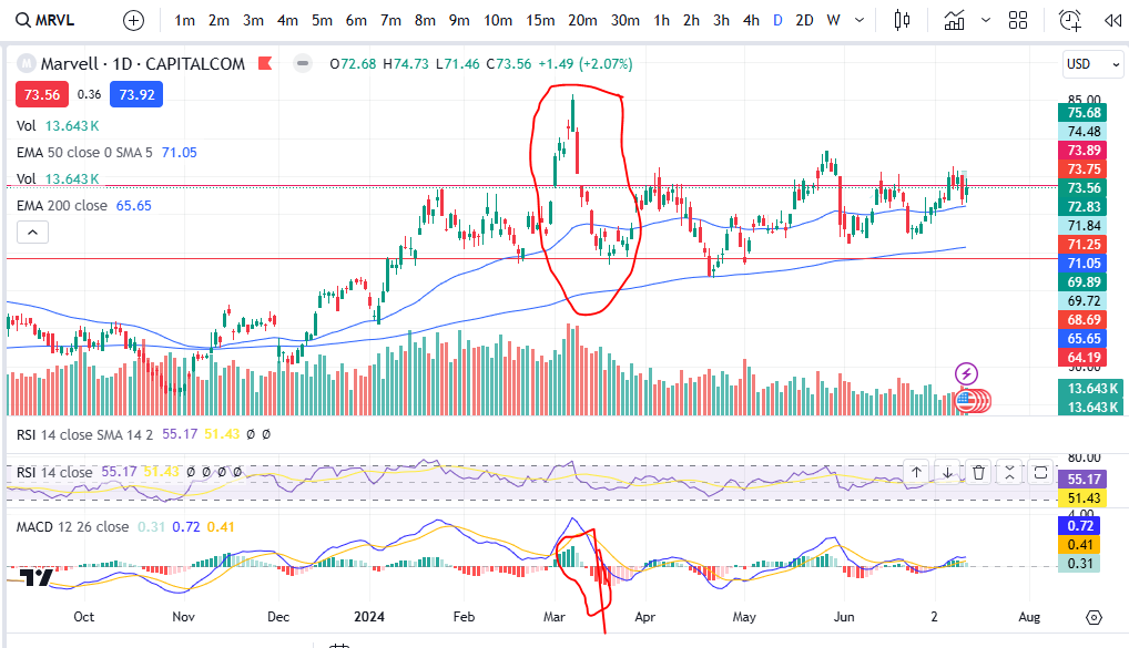
So how else can you use the MACD? What other MACD secrets are there to share? The MACD can show you the strength of momentum. Let’s take the histogram bars as an example… when the histogram bars are growing in size, it means the market is either increasing strongly or decreasing strongly in price. Also, when the histogram bars turn from dark green or dark red to light green or light red, it means the market’s price is losing it’s strength in which ever way it has been travelling… let’s take a look at some examples:
For a discount on the charting software used (Trading View), please click here:
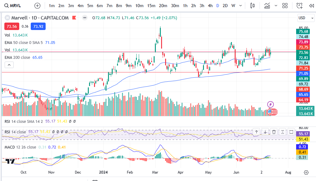
I’ve provided the example of Marvel above. As you can see, the MACD histogram bars are dark green usually straight after a cross over, which is why this indicator can be used to spot an entry signal after a cross over below the zero line of the histogram, but after the cross over, how do you know whether the market is losing it’s strength? Note the colour change of the histogram bars on the above chart and then compare that to the price action above:
I’ve circled an example – you can see when the histogram started turning light green, the market’s price started dropping like a brick. On this occasion the indicator was slightly ‘lagging’ but you can see other examples where there was an early warning before the market dropped! See the example below:
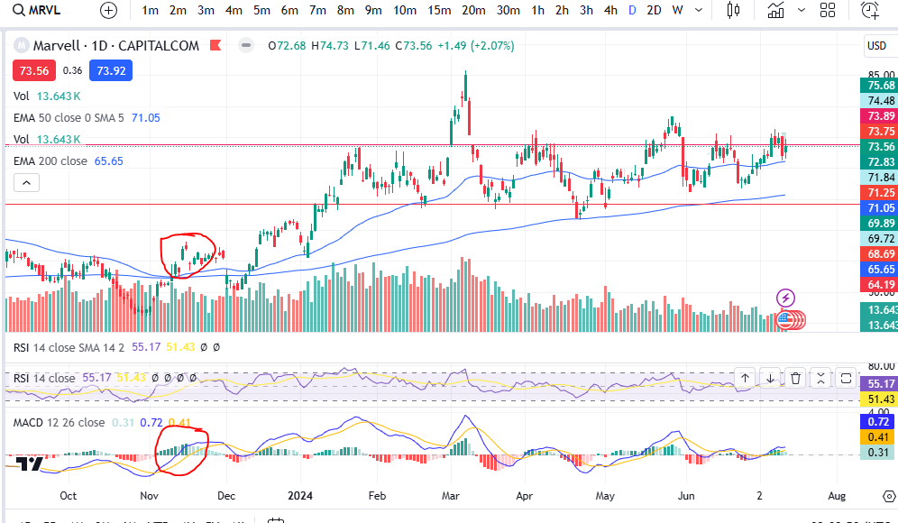
You can see the colour of the histogram bars were flicking on and off from dark to light green – a warning sign! Then what followed? The upwards move completely lost it’s strength and the market started making a pull back.
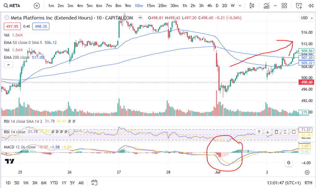
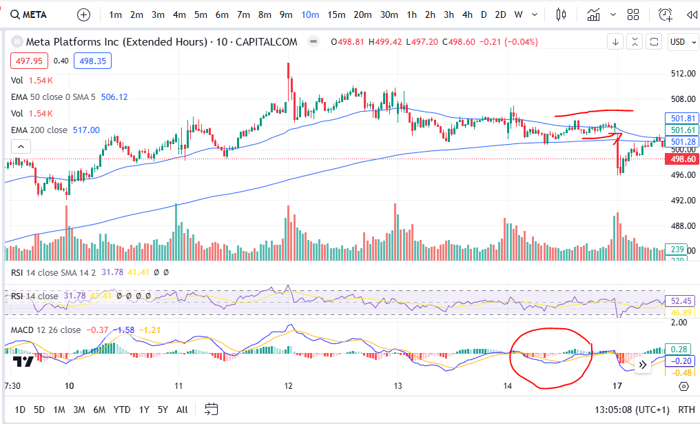
Another way you can use the MACD to tell you what the market is likely to do, is by looking at the shape of the MACD cross over. If the shape of the MACD and Signal lines going into the cross over are such that they are almost at a vertical angle, this can be a really good indication that the price is going to move quickly in the direction of your choice… if the cross over is happening with a gradual ‘sliding’ ‘converging’ of the two lines this can be less fruitful. Let’s take a look at some examples:
As you can see in this example on Meta Platforms, the blue MACD line scooped under in such a way that it had a lot of momentum and the price pushed significantly higher after this on the chart. Let’s look at the opposite situation:
As you can see here, the price movements are almost flat after the cross over circled above- the MACD and Signal lines were very closed up after the cross and before the cross – and the price movement following the cross was insignificant. Indeed, the price actually took a nose dive shortly after this area on the chart! The momentum for the price to go up was weak and exhausted.
Once you get the hang of spotting these very practical MACD secrets, they really can help you in understanding the markets. We hope you found this article helpful.
For more great tips and advice on trading the stock market, please visit:
Please note any subscriptions taken via my affiliate link with Trading View may result in me earning a small commission. However, I provide complete transparency on me using Trading View personally – I publish my success on the financial markets via my broker reports and any profits earned were done so by using my own Trading View subscription, so I genuinely do recommend them and have been using the Trading View charts for many years.
In this article I’m going to show you how to spot a downtrend early and identify whether or not a market is still genuinely uptrending. The first thing you look at is whether or not the price is floating above the 200 period EMA – sure, but how do you know if it’s started to downtrend, inspite of this? I share this secret below.
Spot a downtrend early – the highs and lows of the trend
The highs and lows of a trend really are the trader’s bread and butter. Without identifying these there are multiple things that can go wrong with the trading set up. New traders should really slow right down and take some time to identify these – they are critical to success. You will make a lot more money trading by spotting the highs and lows and avoiding bad entries where the market has just started to reverse to the downside.
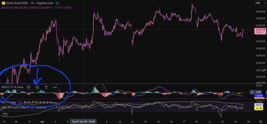
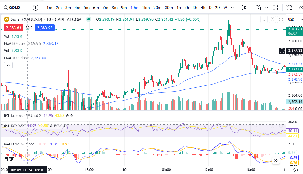
Let’s take a look at some examples. Let’s consider the market of Gold as an example, on the 10 minute timeframe… take a brief look at the chart below, and try to decide whether it’s uptrending based on recent activity, before continuing to read on…….. did you do it?
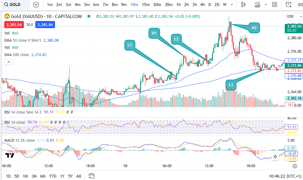
OK, let’s consider my answer to this question. It’s above the 200 period EMA – GREAT! However, let’s now look at the highs and lows. You can check exactly where the highs and lows are and use these to spot a downtrend early, on the basis of the ‘swings’ of the MACD indicator and this is one of the practical ways the MACD can really help you in your trading – aside from giving you entry signals:
As you can see, at first glance the market does look like it’s now uptrending, but when you look closely, low 3 is now lower than low 2. In an uptrending market, the market makes ‘higher highs’ and ‘higher lows’. The pattern of uptrend has been anialated at the point of low 3. It starts again at that point – you can wait and see if it starts making higher highs and higher lows from that point onwards… a bit like this:
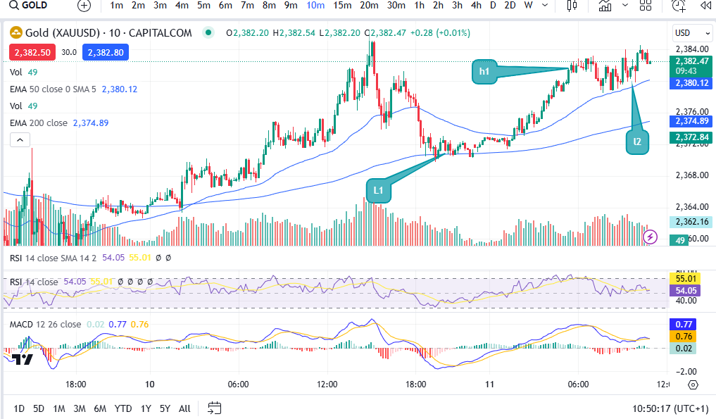
OK, so the pattern has started again at the original ‘low 3’ which I now refer to as low 1. As you can see it did go on to make higher lows again at low 2 in the above chart. You need the confirmation of it forming new highs and lows before placing a trade!
How this can help or hinder your strategy
Let’s consider what this could have done to your trade set up and win rate and profits/losses, if you ignored this break of pattern…
Let’s say you wanted to get in at the MACD cross over as your entry signal. (To understand more about this please see my strategy that I teach on Patreon, here:
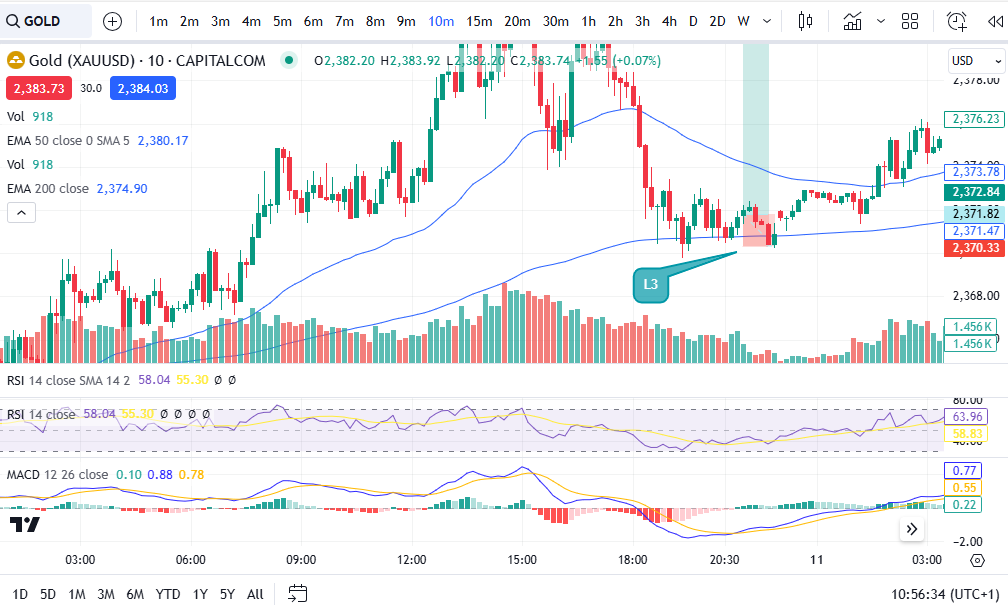
Let’s further suppose that you entered the market at the MACD cross over at the low which was previously referred to as low 3, here:
You set your stop just below the low of the trend at the level which is shown in line with the bottom of the trade set up diagram applied (2370.33). As you can see, because the market was making lower highs, it went on to chop down into the stop loss before recovering. This loss would have been something that could have been completely avoided had the trader taken the time to spot a downtrend forming by identifying the highs and lows. Consistency in the pattern is key, before entering the market!
I have seen this help me avoid bad entries on many, many occasions. It does mean that you end up ‘avoiding’ placing trades and you place fewer trades, but with trading, less is more!! You will make more money trading, by placing fewer trades.
I hope you found this article helpful.
For more great tips and advice on trading the stock market, please visit:
Please note any subscriptions taken via my affiliate link with Trading View may result in me earning a small commission. However, I provide complete transparency on me using Trading View personally – I publish my success on the financial markets via my broker reports and any profits earned were done so by using my own Trading View subscription, so I genuinely do recommend them and have been using the Trading View charts for many years.
The MACD – Moving Average Convergence Divergence (hereafter referred to as ‘MACD’) is an extremely useful and very popular, indicator. It can help you to identify good entry and exit points and whether the market is over or undervalued as well as much more. There is a lot to this indicator. We discuss some of its more broad uses below.
MACD – The Moving Average Convergence Divergence – what exactly is it?
The MACD is a lagging indicator which is used for momentum and trend following trading strategies. It broadly displays two lines – the Signal line and the MACD line, which interact with each other by crossing over each other, intermittently. The indicator also displays a histogram which can be used to determine the strength of a given move in one direction or another, as well as an early indication of whether or not a buy or sell signal (MACD/Signal lines crossing (more below)), is about to happen. These components and uses are discussed in detail below.
MACD – The Moving Average Convergence Divergence – The ‘MACD’ line
The MACD line shows the interaction between two exponential moving averages. The settings for these averages can be tailored on the chart software. It is displayed by the software as the difference between the two moving averages, as set by the user. The default settings are a ’26 period EMA’ and a ’12 period EMA’ (EMA = “Exponential Moving Average”), and the default colour is blue (using Trading View software).
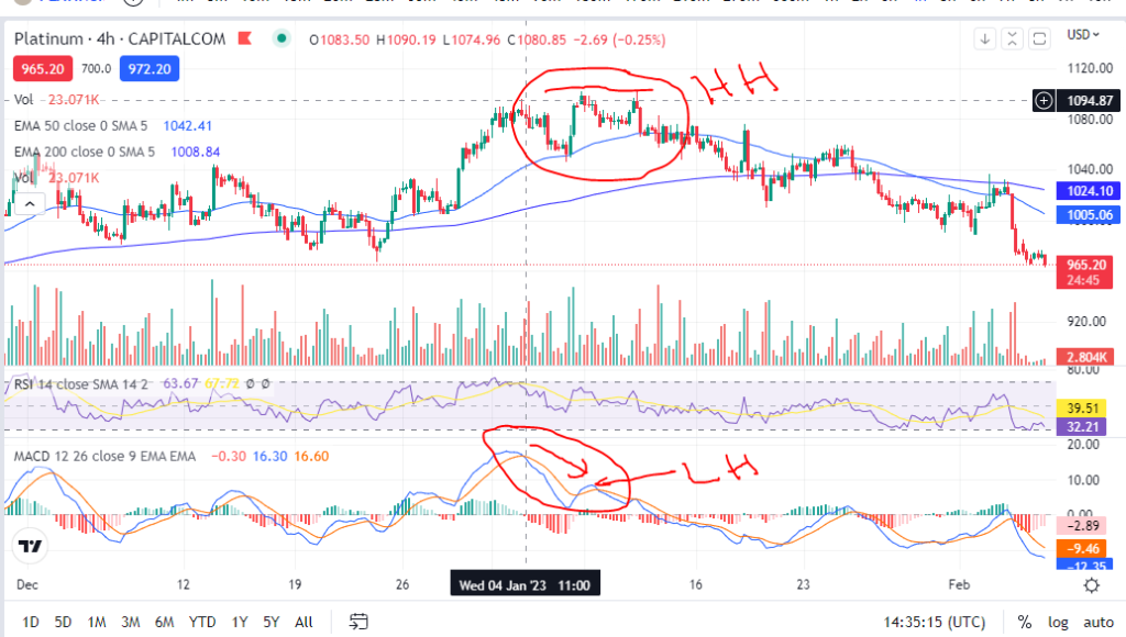
The MACD line can be used to identify whether a move is nearly at its end. For example, if the candles on the chart have reached a new high, but the MACD line did not, it can indicate that the move is running out of steam and a reversal may happen soon . This is referred to as ‘divergence’ – a divergence between the candles/price and the MACD line movements. Caution should be taken when attempting to use the indicator for entry points in this scenario. See the picture below. The candles reached a higher high (HH), but the MACD reached a lower high (LH). Following this, the price steeply declined . This was at the end of a long upward trend and it is within a trend that it is likely this cross over indicator would be used. Care should therefore be taken before entry, to check that there is no divergence in this way between price and the MACD line.
MACD – The Moving Average Convergence Divergence – The ‘Signal’ line
The signal line is a nine day EMA of the MACD line. The default colour of this line is orange.
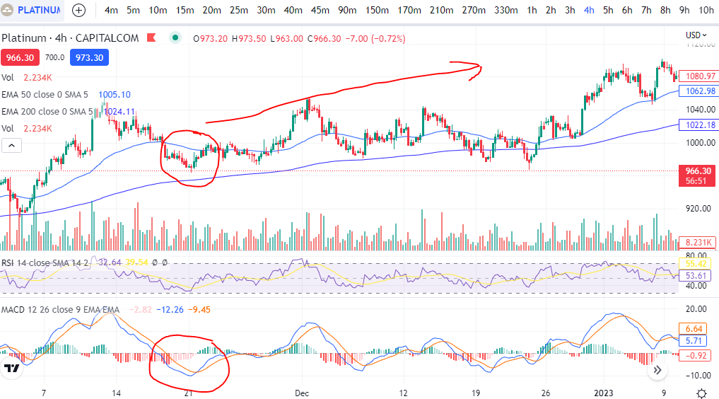
When the signal line crosses the MACD line, it can indicate that the price is going to move higher or lower from an oversold or overbought level. See the example below. The signal line crossed the MACD line at a dip in the price and following this, the price trended higher. This is used by many traders, when taken with other confirmations, as a good entry signal. The writer uses this indicator the most, in trading set ups. The use of the indicator in this way is meant to identify good entry points on trends. Therefore, it should not be used as an entry signal when the price is consolidating between two very obvious levels.
The ”Histogram’
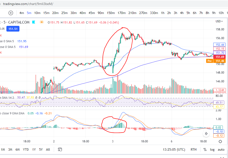
When the data in the histogram is above the baseline (positive), it means that the MACD is higher than it’s nine day average, meaning that the price has recently seen an increase or upwards momentum. The opposite is true for the opposite scenario – if the data is below the zero line on the histogram, it indicates that there has been some recent downward momentum. This can be seen on the chart below, where there was a strong upwards push and the histogram went from negative (red) to positive (green).
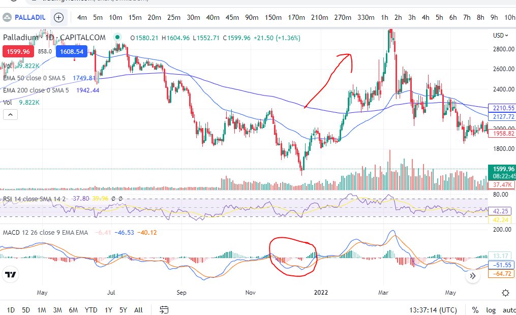
The histogram can be used to determine if a cross over is anticipated when it forms divergences. These divergences can be seen with reference to the peaks and troughs in the histogram and the MACD line. For example, if the MACD line creates a lower low, and the Histogram data displays a higher low. This is displayed, by way of example, on the chart below. You can see that the histogram made a higher low (see movements in red circle), but the blue MACD line, had reached a lower low. Following this, the MACD and Signal line crossed over and the price moved significantly higher. You can watch for the opposite scenario if you are waiting to short the market – a higher high on the MACD line, but a lower high on the histogram. This can indicate the MACD and signal lines are about to cross for a downward move. The histogram pattern can be in the form of peaks and troughs for the higher lows etc, or a slanted pattern where there is no dip in the histogram – it is just more smooth looking!
Identifying overbought and oversold levels
As you can see in the chart picture above, the MACD indicator tends to broadly follow the shape of the RSI indicator (‘Relative Strength Index’). If you are not familiar with the RSI indicator, broadly, the price is overbought when it reaches the top part of the indicator (roughly anything over the value of ’70’ would be overbought). The opposite is true when it reaches the bottom part (say, below 30). Unlike the RSI indicator, the MACD is not adjusted for each market so that it displays ‘comparative information’. What is meant by this, is that on Palladium above, the value at overbought levels, on the RSI indicator, will always be roughly ‘over 70’. The same will be true for any other market displayed on the chart when using the RSI. However, the MACD indicator does not provide equivalent values/it does not keep the ‘overbought’ value the same between different markets. Instead, you can use the ‘shape’ of the MACD and signal lines to understand when the price is either overbought or oversold for the market you are viewing in particular, with reference to the highest peaks and troughs of the MACD and signal lines.
For more secrets on using the MACD indicator, please see our other blog articles here:
We hope this information on how you can use the MACD indicator in your trading strategies and setups, has been useful. Keep an eye out for our blogs which we will use to display trade set ups including the use of this indicator.
Used by Google Analytics to determine which links on a page are being clicked
30 seconds
_ga_
ID used to identify users
2 years
_gid
ID used to identify users for 24 hours after last activity
24 hours
_gat
Used to monitor number of Google Analytics server requests when using Google Tag Manager
1 minute
__utmt
Used to monitor number of Google Analytics server requests
10 minutes
__utmb
Used to distinguish new sessions and visits. This cookie is set when the GA.js javascript library is loaded and there is no existing __utmb cookie. The cookie is updated every time data is sent to the Google Analytics server.
30 minutes after last activity
__utmc
Used only with old Urchin versions of Google Analytics and not with GA.js. Was used to distinguish between new sessions and visits at the end of a session.
End of session (browser)
__utmz
Contains information about the traffic source or campaign that directed user to the website. The cookie is set when the GA.js javascript is loaded and updated when data is sent to the Google Anaytics server
6 months after last activity
__utmv
Contains custom information set by the web developer via the _setCustomVar method in Google Analytics. This cookie is updated every time new data is sent to the Google Analytics server.
2 years after last activity
__utmx
Used to determine whether a user is included in an A / B or Multivariate test.
18 months
_gac_
Contains information related to marketing campaigns of the user. These are shared with Google AdWords / Google Ads when the Google Ads and Google Analytics accounts are linked together.
90 days
__utma
ID used to identify users and sessions
2 years after last activity
Marketing cookies are used to follow visitors to websites. The intention is to show ads that are relevant and engaging to the individual user.
A video-sharing platform for users to upload, view, and share videos across various genres and topics.
This cookie is used to play YouTube videos embedded on the website.
2 years
VISITOR_PRIVACY_METADATA
Youtube visitor privacy metadata cookie
180 days
GPS
Registers a unique ID on mobile devices to enable tracking based on geographical GPS location.
1 day
VISITOR_INFO1_LIVE
Tries to estimate the users' bandwidth on pages with integrated YouTube videos. Also used for marketing
179 days
PREF
This cookie stores your preferences and other information, in particular preferred language, how many search results you wish to be shown on your page, and whether or not you wish to have Google’s SafeSearch filter turned on.
10 years from set/ update
YSC
Registers a unique ID to keep statistics of what videos from YouTube the user has seen.
Session
DEVICE_INFO
Used to detect if the visitor has accepted the marketing category in the cookie banner. This cookie is necessary for GDPR-compliance of the website.