How to trail a stop to make big profits trading

How to trail a stop to make big profits trading

In this article i’m going to talk about how you can trail a stop loss to make even more profit when trading the stock market. I’m going to take you through the different types of manual trailing stops you can use, and the types of scenarios they might be useful in. Let’s get straight into it!

How to trail a stop loss – what do we mean by trailing a stop?

When you ‘trail a stop loss’, it means you follow the price at a safe distance, with a stop loss – you move your stop slowly to mimic the price increases on the chart so that if the price descends, you will not lose the profit on the table you have already earned. However, it allows scope for the price to increase further and in this way, you can make profit out of long trends! What’s not to love?

To understand stop losses and risk management, please see our other article, here:

Risk Management – setting a stop loss? How to make money – Trader Pro

Please also see our YouTube video, here, on managing risk:

How to trail a stop loss – the manual way

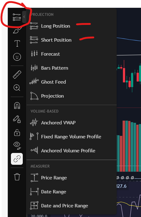
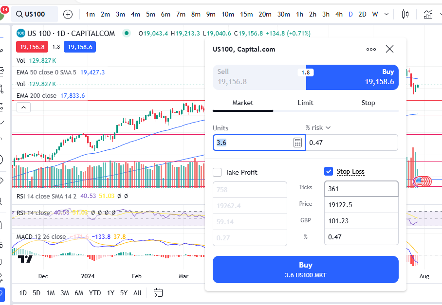
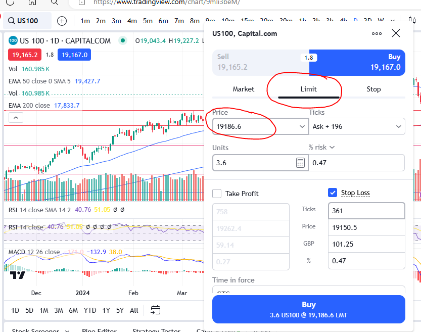
There are some automatic ways to trail a stop but please note, they are not covered by this article. I’m going to share with you, how I trail a stop manually here. There are different scenarios which would help me to decide how ‘closely’ to trail a stop. This would depend on how much leverage i’m using, whether I have profit on the table, how far I think the price will go and how much room I believe it needs to breath and fluctuate if I’m trying to catch a long trend.

The way I trail a stop is to look for a support – the support could be either a candle (to trail a stop closely), a low on a trend (perhaps to try and trail a trend for a long time), a support line (either diagonal or horizontal) – you could also use this latter type for long trends and breakouts. I would keep my stop at the most recent support and move it manually once the price moves up into a new zone/level.

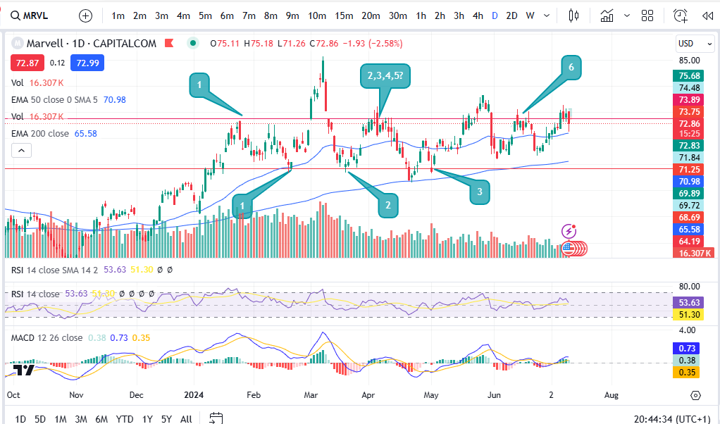
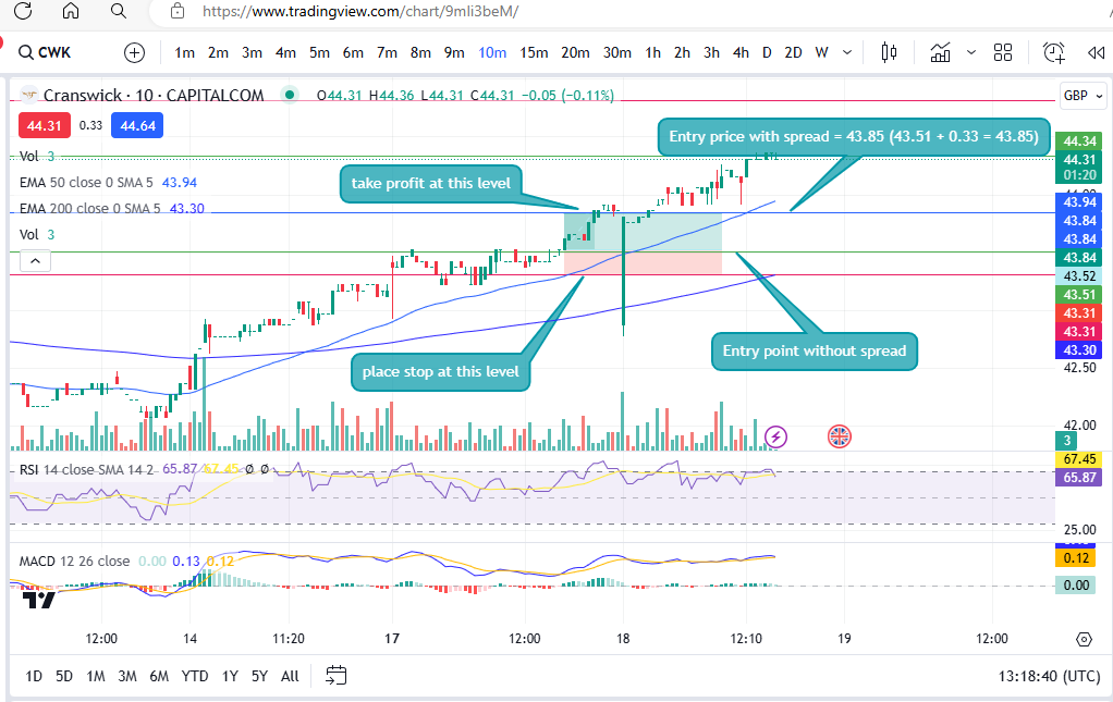
For scenarios where i’ve made a little trade, the price has gone near my target, and I believe there is a chance it could grow a little more, but I don’t want to risk the profit i’ve made already, I would trail a stop very closely, using the candles. This is the type of scenario where I would not be looking to catch a long trend with the trailing stop. Let’s look at an example…

Trailing a stop closely using candles

trail a stop

To get a discount to the Trading View software that I use, please click the link below:

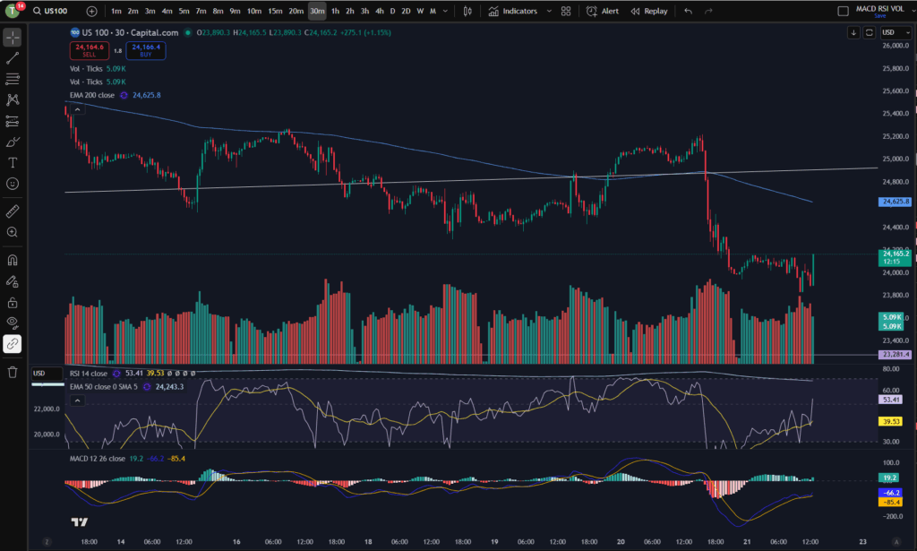
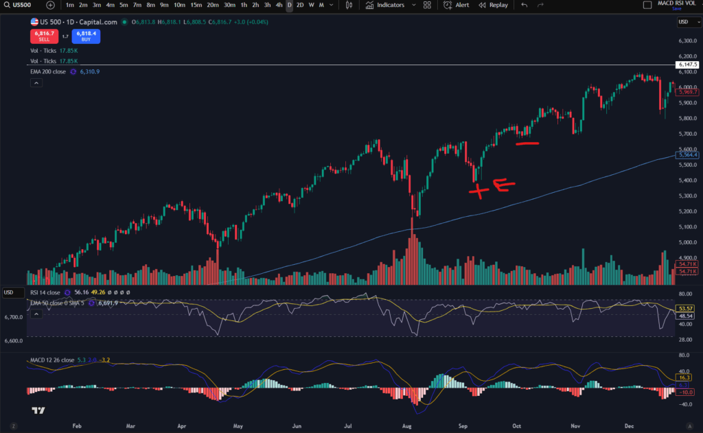
Let’s say you entered the market in the above trend where i’ve marked a + sign and ‘E’. Your initial intention was to take profit near the previous high so you’ve got some profit on the table, but the market is showing no sign of resistance and you are tempted to see if it will keep going…. you can trail a stop underneath one of the red/lowest candles where it has breathed/pulled back slightly. If you placed a stop where i’ve marked the next red line/marker on the chart, the price did indeed carry on going up further until it pulled back again… at this point you could have taken profit off the table. Alternatively, after the initial stop position, if I were in such a trade, I might be tempted to move it up again, just under the next red candle – marked below:

trail a stop

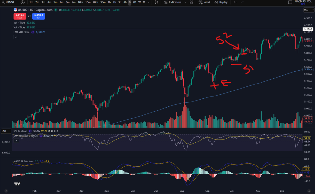
You can see in the chart above, where I have marked ‘S2’ that this was anther red/low candle and it tried to push up further after this, but it then pulled back down. You would have got stopped out at this level which is a nice bit of profit over and above your original target!

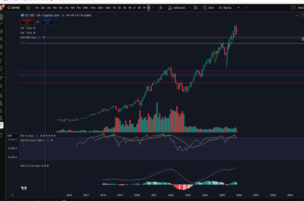
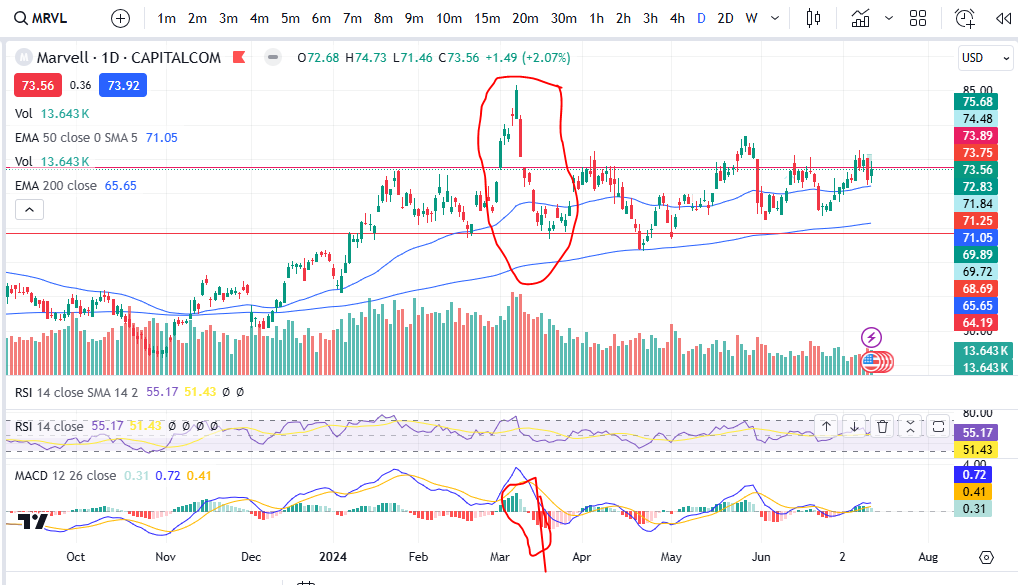
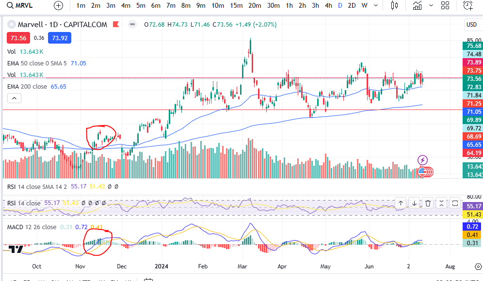
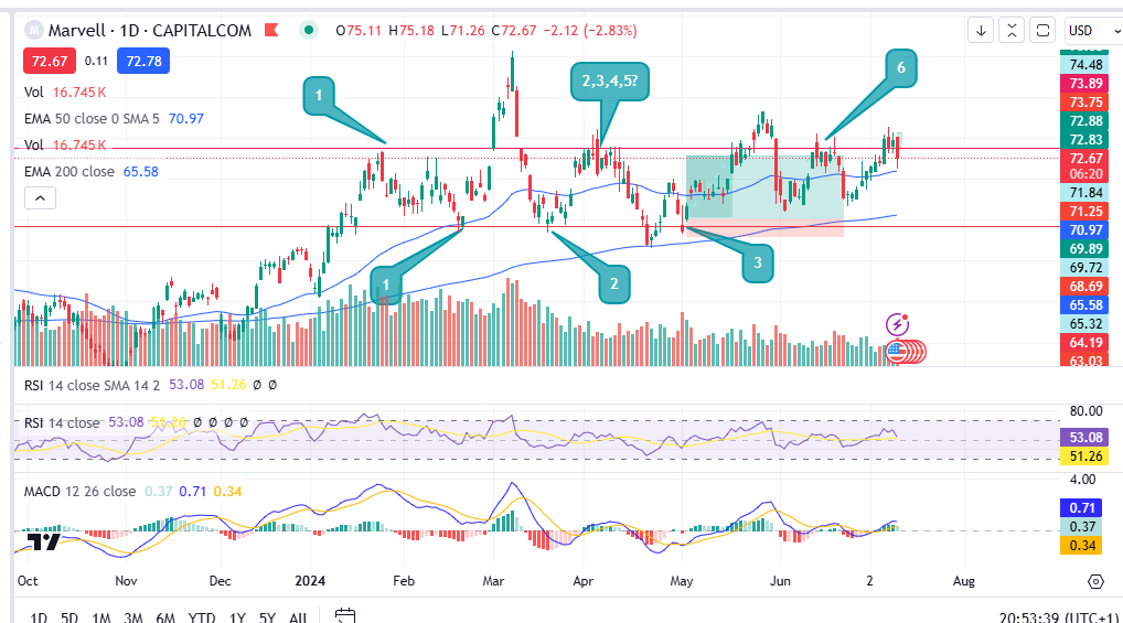
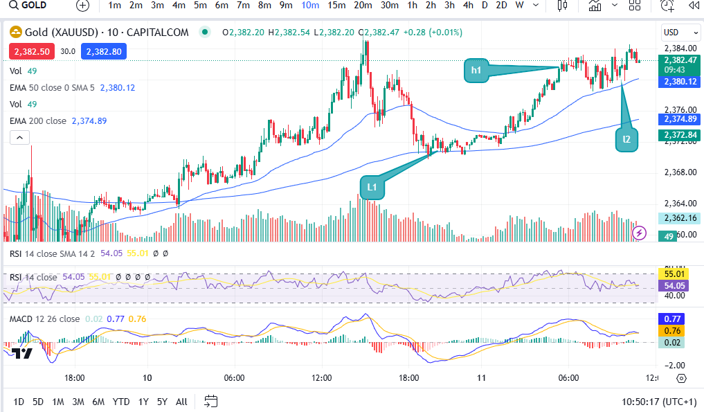
Trailing a stop on long trends

For trailing a long trend, I would instead use the highs and lows of the trend, or diagonal/horizonal support and resistance lines. Let’s take a look at how this could work:

trail a stop

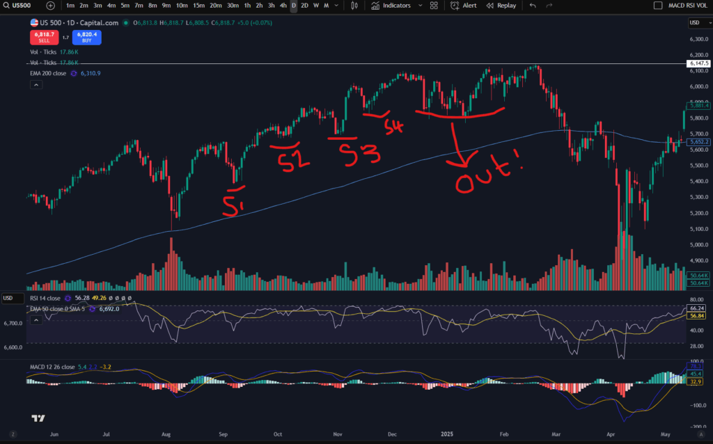
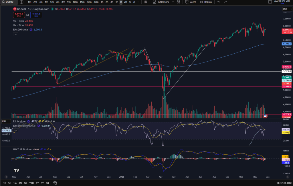
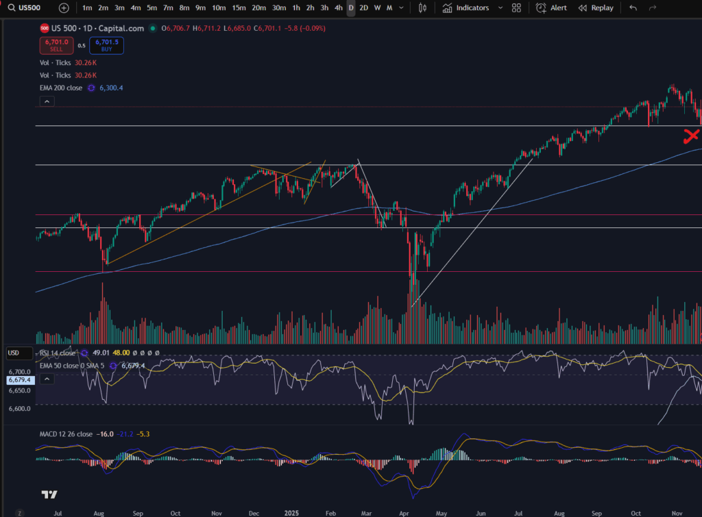
OK, so as you can see in the above chart, i’ve marked out where your stop loss would be moved to manually – every time the trend makes a higher low the stop is moved. I use the MACD indicator to tell me where the highs and lows are in a trend. If you would like to understand this more, please see the following article:

Amazing secrets to help you make more money trading – spot a downtrend early! – Trader Pro

Also please see my video on this:

Back to the chart! So you can see that you would have been able to ride this trend up to just before it crashed down and you would have scooped a large amount of profit from the market. You can see that the stop position ‘4’ would have stopped you out in this trade because shortly afterwards the price fell back down to this level.

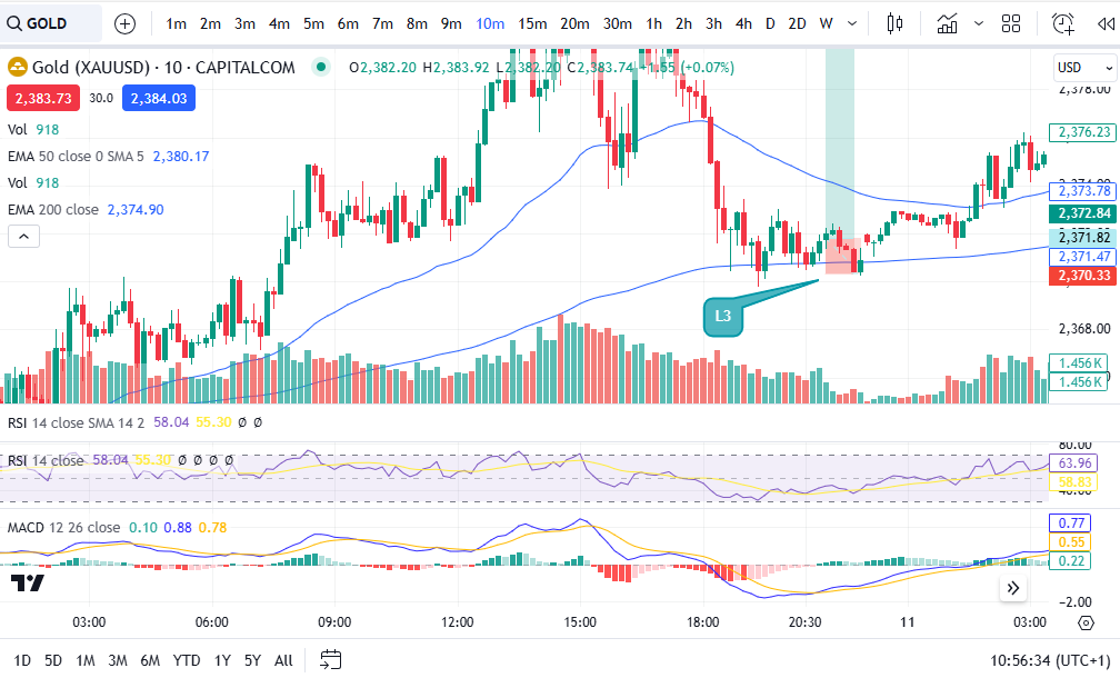
Trailing a stop in horizontal steps of resistance and support

In the same way as you can trail a stop in a diagonal movement, you can also trail it in a horizontal step up movement. If you have got support and resistance lines drawn on your chart, you can move the stop up just under the last support level, every time the price pops up into a new zone. For information on understanding how to draw support and resistance levels, please see this article:

Support and Resistance – how to make more money trading – Trader Pro

Let’s take a look at what this looks like on the chart:

trail a stop

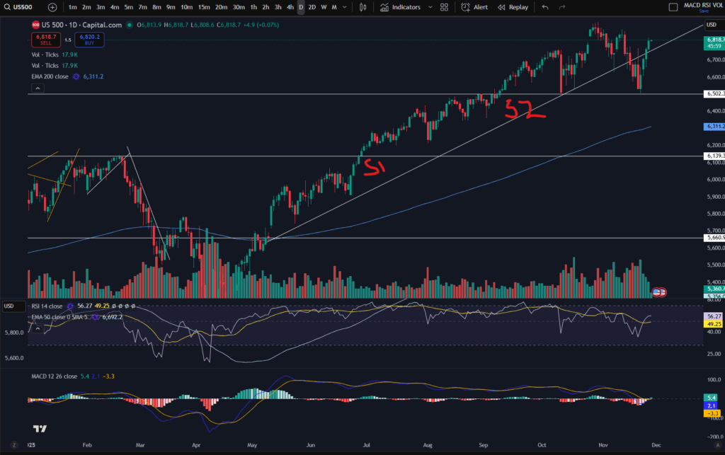
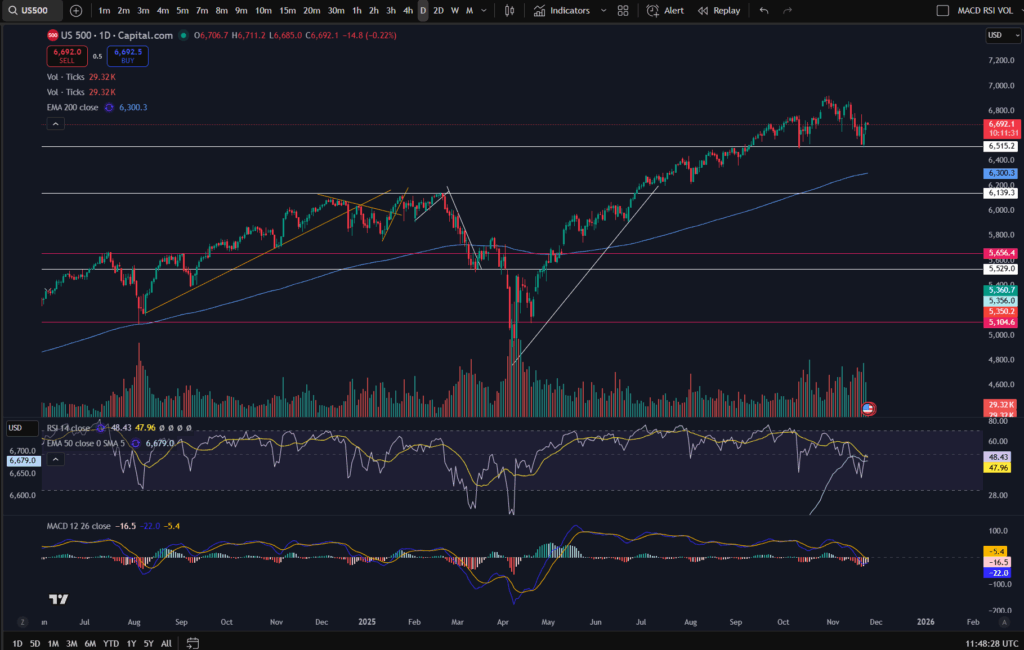
As you can see, there are major support and resistance levels marked on this chart in white. I’ve added S1 and S2 as suggested places to which the stop loss could be moved, as the price pushes up through these stepped levels.

I hope this helped you understand how you can trail a stop loss and take even more profit from the market. I’ve also shared below my video on this in case you find it easier to digest:

Understand my strategy in full: https://www.patreon.com/Traderpro8320

For more great tips on trading the financial markets, please visit my blog:

https://sophiatrades.co.uk

Discount on Trading View:

https://www.tradingview.com/?aff_id=117138

My performance in the live markets:

https://sophiatrades.co.uk/category/my-performance-statistics

Finally, thank you to my existing members on Patreon, and for your likes, comments and subscribes. Happy trading!

Please note any subscriptions taken via my affiliate link with Trading View may result in me earning a small commission.

Multiple Timeframe Analysis – mind blowing knowledge that will change everything!

Multiple Timeframe Analysis – mind blowing knowledge that will change everything!

In this article i’m going to talk about something which is paramount to your trading – multiple timeframe analysis. This will blow your mind and change the way you trade forever! Multiple timeframe analysis is essential for new traders to learn – it will change the way you trade and see the markets, forever! Let’s get straight into it…

What is multiple timeframe analysis?

Multiple timeframe analysis is what it says on the tin – undertaking analysis on multiple timeframes to get a clearer idea of what’s happening in the markets. So how does this work, and how can it help you in your trading? The basic premise is that you use ‘larger/higher’ timeframes to get a bird’s eye view of the market – where the price is going long term, what the long term trend is, if there is one. Is it in a range long term? Then you can use the smaller timeframes to ‘zoom in’ and plan and execute your trades with greater precision. Let’s take a look at how this might work. It is common for people to use the ‘daily’ timeframe as their higher timeframe. I personally use this timeframe as a higher timeframe, but note that I also refer to the ‘monthly’ timeframe as another level up, to get an even higher ‘birds eye view’ as compared to the daily.

Let’s look at the daily timeframe on the S&P 500 most recently:

multiple timeframe analysis

You can use the daily/higher timeframe, to mark major support and resistance levels, as below:

multiple timeframe analysis

You can see that the price has found a support a few times at the white marked horizontal line on the chart (6,515). (If you think you would benefit from using this chart software, I can offer you a discount, through Trading View – please click the link below):

OK, so back to the chart analysis! Why is marking the higher timeframe in this way, important when using multiple timeframe analysis? The higher the timeframe, the more people, hedge funds, big money etc, are noticing the resistance or support level – which gives it more weight! More people are going to be respecting those levels and being mindful of them. More people will get into the market at the higher timeframe support area – meaning there will be a stronger push up from that level as a result of sheer volume and demand.

So you can use the higher timeframe to plan the general ‘area of interest’ in your trade set up. For information on how to plan trades and where to get started, please see our blog article:

How to create a Trading Plan – make big wins trading – Trader Pro

Once you have got your general ‘area of interest’ per your bird’s eye view, you can then ‘zoom in’ by using a smaller timeframe. The smaller timeframe should be about 4 timeframes away from your bird’s eye view timeframe. For example, I use the daily timeframe as my bird’s eye view, and the 30 minute timeframe to execute trades, currently. I have combined the daily with the 10 minute and this did work for me, as well.

Smaller timeframe analysis – Zooming in!

OK, so now that you have your general area of interest per the larger timeframe, you can use the smaller timeframe, under multiple timeframe analysis, to plan how to ‘execute your trade. We established that on the daily timeframe for the S&P 500, there was a general resistance level at around 6,515 price. Let’s say we were just at the red X marked below and we had not gone past this point – we knew that the price typically bounces at this level and we expect it to, because in the past, this area was a resistance, too – see how the price was bumping against it, in mid August on the chart below.

multiple timeframe analysis

Bearing in mind this is our point of interest, we might want to get into a trade here, at the support. Now let’s take a look at the 30 minute timeframe to plan this possible trade. We are interested in the price at mid November on the 30 minute timeframe. (Usually you will not have to cut off the chart in this way, obviously – i’m just showing you, retrospectively, how you may have planned and executed a trade at this level):

multiple timeframe analysis

OK, so here we have the zoomed in view of the ‘bounce’ on the daily timeframe. Under my strategy, I would want the price to have popped up over the EMA line before I consider entering a trade. You can see my strategy here:

NASDAQ trading strategy that will make you thousands! ££££££ – Trader Pro

The point of the lower timeframe is that you can see ‘under a microscope’, what’s happening in the market. You can execute your trade at just the right place on the chart, with extra precision.

You plan and execute your trade including the ‘take profit’ and ‘stop loss’ levels per the smaller timeframe, when using multiple timeframe analysis. Do not set a take profit on the daily timeframe. You have to understand that if you put your take profit at the top of a peak on the daily timeframe, it may take weeks to get there, depending on how many days need to go by, to get up there. This is why we plan and execute per the smaller timeframe – each candle is only 30 minutes, or 10 minutes, or whatever you choose to use. So it could take 12 x 10 minutes = 120 minutes to get to your target on the smaller timeframe of 10 minutes. If you waited for 12 candles on the daily timeframe you would be waiting for 12 days!

I hope you found this helpful. I also created a video on my Youtube Channel which you may like to see on multiple timeframe analysis:

Understand my strategy in full: https://www.patreon.com/Traderpro8320

For more great tips on trading the financial markets, please visit my blog:

https://sophiatrades.co.uk

Discount on Trading View:

https://www.tradingview.com/?aff_id=117138

My performance in the live markets:

https://sophiatrades.co.uk/category/my-performance-statistics

Finally, thank you to my existing members on Patreon, and for your likes, comments and subscribes. Happy trading!

Please note any subscriptions taken via my affiliate link with Trading View may result in me earning a small commission.

Nothing in this video should be taken to constitute financial advice. Although we make observations on the current state of the markets, nothing we suggest should be taken as an indication of what they will do next. You are required to carry out your own due diligence before entering any of the markets.

Understanding a stock chart – valuable knowledge for beginner traders

In this article i’m going to help you with understanding a stock chart, and share some tips which may help beginner traders navigate the chart’s features. This will take the beginner trader through the basic foundation of what appears on the chart, normally by default.

Understanding a stock chart – price movements

The default position you will likely find when you first look at any stock chart is that the ‘price’ movements are shown with ‘Candlesticks’. This is key to understanding a stock chart. Let’s take a look…

Understanding a stock chart

If you would like a discount to the ‘Trading View’ software which I use and highly recommend, please click the button below:

Each green or red candlestick shape you see on the chart, represents the price movement within one interval of time. The interval is determined by the ‘time interval’ buttons selected on the chart. As you can see on the above screen shot, ‘M’ is highlighted in the ribbon at the top – what this means is that this is a ‘monthly chart’ – each candlestick represents the price movements within one month’s period. I’ve posted separate articles on understanding candlesticks, which you will find here:

Make more money with Japanese Candlesticks – an Introduction – Trader Pro

The basic premise of candlesticks is that if they are green, it means the price closed higher in the interval, and if they are red, the price closed lower within the interval.

You can also understand more about the pattern formations of these, here:

Japanese Candlesticks – Trader Pro

The price ‘level’ is normally displayed down the right hand side of the chart. You can see here, that the price range is 23,281 USD to 26,000 USD.

You will need to pay careful attention to which ‘price’ is being displayed… is it the price inclusive of the spread for example, or does it not include the spread? When I was a new trader, this used to catch me out – the stop loss would sometimes be triggered when the price seemingly did not go there on the chart!? It’s because the price displayed on the chart did not include the spread so the gap which was covered with the spread seemed like a mystery to me, and almost felt like broker manipulation. I understand more now.

If you check the settings in your chart carefully, you will find a setting to tell the chart to either include the spread, or not. Your wish with this, may change depending on what you are doing on the chart! If you are setting an order to ‘buy’ at a particular price, you may want to include the spread in the settings…

Understanding a stock chart – Time intervals

Each chart will have a couple of ribbons of time intervals – probably along the top and also the bottom. One of these ribbons allows you to select alternative time intervals to be displayed, as mentioned above. When these are clicked, you can toggle between for example, the ‘daily’ timeframe, and the 4 hour time frames. The daily timeframe will show you candlestick price movements, with each one representing the movement within one day, and the four hour will likewise, show you the movements for each four hours that have occurred. The other ribbon shows you the relevant tie that the price movements occurred – so you can see on the above chart, that the time spans from the year 2016 to 2029 (no candles formed yet as this is in the future at the time of writing this article).

Deal tickets

You can bring up a ‘deal ticket’ or ‘order ticket’ by clicking on the Buy or Sell buttons at the top of the screen. The value indicated on the button, is the buy or sell price and the ‘spread’ sits in between these values as below:

You do need to understand the spread, and I have linked another article below, which gives you an understanding of this:

Understanding the spread – Trader Pro

In short, the spread is the bit of price, in between the buy and sell values and it’s the ‘cut’ that the broker takes from the market.

The different types of deal tickets and orders you can place in the market, will be covered in another article.

Toolbar

You will see somewhere on your chart, a toolbar with different symbols on it. On Trading View, this is down the left hand side of the screen:

This gives you various different tools for drawing symbols and diagrams on your chart. You can draw ‘support and resistance’ lines including horizontal and diagonal ones. You can also measure price and time interval values with the ‘ruler’ shown. It’s got a zoom in/out function. You can make notes and keep them pinned to the chart indefinitely.

You can also plan trade set ups in terms of where you will enter, take profit or take a loss, with this icon:

Technical indicators

Another important aspect of understanding a stock chart which you will want to become familiar with, is the technical indicators menu. This is where you will find the MACD indicator, the volume, moving averages – any type of indicator you wish to add to your chart. There is a wide variety with Trading View which is another reason I really like the software.

For my own strategy and set up, I use the RSI, the MACD, the volume, and the 50 and 200 period EMA lines (exponential moving averages).

In Trading View, you can find the Technical Indicators menu, here:

Understand my strategy in full: https://www.patreon.com/Traderpro8320

To see my YouTube video explaining this article, please click the following link:

For more great tips on trading the financial markets, please visit my blog:

https://sophiatrades.co.uk

Discount on Trading View:

https://www.tradingview.com/?aff_id=117138

My performance in the live markets:

https://sophiatrades.co.uk/category/my-performance-statistics

Finally, thank you to my existing members on Patreon, and for your likes, comments and subscribes. Happy trading!

Please note any subscriptions taken via my affiliate link with Trading View may result in me earning a small commission.

Make more money trading – how to enter a trade step by step

In this article I’m going to explain in simple detail how to enter a trade in a margin spread betting or CFD account. I will explain how to enter a market order, set a stop loss and take profit/limit/target. I hope you find this helpful.

How to enter a trade

Entering a trade is quite simple but it should really tie up very well to your overall trading plan and strategy including your plan of managing risk. You can find articles on these on our blog here:

Right… getting back to how to enter a trade…if the above articles make sense to you, you can then choose to enter the market according to your strategy on your entry signal by opening up a deal ticket ‘market order’. A market order is an order which lets you enter the market immediately at whatever ‘buy’ price is displayed on your screen/chart. Let’s take a look:

First, I selected the blue ‘buy’ button. I use Trading View but you should find that your broker account is displayed/arranged in a similar way. This brings up a deal ticket and you can see the default is that it opens on the ‘market’ order tab – see the ‘Market’ heading circled and the number of units you are about to purchase. You will want to fix your stop and then control your number of units afterwards – see below. This is so that you can fix the amount you lose on each trade to be exactly the same, regardless of market and trade set up. I produced a video explaining this on Patreon, here:

https://www.patreon.com/posts/how-to-control-104741853?utm_medium=clipboard_copy&utm_source=copyLink&utm_campaign=postshare_creator&utm_content=join_link

How to set a stop and limit/take profit

As stated above, it’s best to set a stop loss first. You should be aware of what ‘price’ you want your trade to exit the market at, should it go against you. See the section above on how to enter a trade. You can add this ‘price’ level to the trading view platform in the stop loss ‘price’ box, here:

In the above screen shot you can see that the ‘price’ level option is available for you to input a number. What you might find with some brokers, however, is that you need to choose an arbitrary ‘points away’ value and then adjust this on the chart by pulling the stop up or down on the chat, until it reaches the correct price according to your trade set up/strategy and plan. This was explained in my video on Patreon linked here:

https://www.patreon.com/posts/how-to-control-104741853?utm_medium=clipboard_copy&utm_source=copyLink&utm_campaign=postshare_creator&utm_content=join_link

Once you have set your stop price, you should be controlling the ‘quantity’/number of portions of the market you want to open. This should be etched up or down until you get to the required stop loss ‘value’:

In this example, I have controlled the number of portions to be such that the value I lose on the above deal ticket would be no more than £100. Note that this is not always perfect – you cannot always fix it exactly to the number you want. The closest I could get this on this example was £101.23 rather than £100. This is ok – such a small difference in stop value will not have an impact on your win rate or the success overall, of the strategy.

Once you have set your stop loss and chosen the quantity, you can then set your limit in terms of price. As with the stop, some brokers will force you to choose a ‘points away’ value and then you may need to adjust this line on the chart to pull your limit/take profit target to the correct position.

Once your stop, quantity and limit have been set, you are good to go, and you can just click buy/enter.

I hope all of the above makes sense, and it’s clear how to enter a trade, but if you are stuck, please do reach out and I would be glad to help!

Entering the market at a chosen price

You can also enter a trade with a ‘limit’ order at a specific price. This will allow you to only enter the market at a given price, and if the market does not reach this required price, you will not enter. This will be exactly the same as the steps above but you will start by entering the ‘price’ at which you wish to enter the market, on a ‘Limit Order’ ticket, into the relevant box:

How to enter a trade

Once you have chosen the limit order and entered your limit price, the other steps will be the same as above for a market order.

I hope you found this article helpful.

For more great tips and advice on trading the stock market, please visit:

https://sophiatrades.co.uk

To watch me trade live please visit my Patreon page here:

https://www.patreon.com/Traderpro8320

Finally, if you would like to receive a discount on the Trading View charting software I use, please click on the relevant link here:

https://www.tradingview.com/?aff_id=117138

Please note any subscriptions taken via my affiliate link with Trading View may result in me earning a small commission.  However, I provide complete transparency on me using Trading View personally – I publish my success on the financial markets via my broker reports and any profits earned were done so by using my own Trading View subscription,  so I genuinely do recommend them and have been using the Trading View charts for many years.

MACD secrets to help you make more money trading

MACD secrets to help you make more money trading

In this article I’m going to share with you some MACD secrets on how you can use the MACD indicator in a really practical way to make more money trading. You will not likely find these useful, very simple and practical tricks discussed anywhere! If you are intrigued please read on!

MACD Secrets… First, what is the MACD indicator?

The MACD indicator stands for Moving Average Convergence Divergence. We discussed in detail the technical side of how this indicator works in one of our other blog posts. You can read the technical detail here:

OK. So now you know what the MACD is, how can you use it in a practical way to make even more money when you are trading?

MACD tips which other traders don’t tell you…

The first MACD secrets we would like to share with you, is how to use the MACD to help you avoid taking losses when an uptrending market is starting to change direction and it’s running out of steam. We discussed how this can be done by noting the swings high or low of the MACD indicator, and whether or not the market is making higher highs based on these, in this article:

So how else can you use the MACD? What other MACD secrets are there to share? The MACD can show you the strength of momentum. Let’s take the histogram bars as an example… when the histogram bars are growing in size, it means the market is either increasing strongly or decreasing strongly in price. Also, when the histogram bars turn from dark green or dark red to light green or light red, it means the market’s price is losing it’s strength in which ever way it has been travelling… let’s take a look at some examples:

For a discount on the charting software used (Trading View), please click here:

https://www.tradingview.com/?aff_id=117138

I’ve provided the example of Marvel above. As you can see, the MACD histogram bars are dark green usually straight after a cross over, which is why this indicator can be used to spot an entry signal after a cross over below the zero line of the histogram, but after the cross over, how do you know whether the market is losing it’s strength? Note the colour change of the histogram bars on the above chart and then compare that to the price action above:

I’ve circled an example – you can see when the histogram started turning light green, the market’s price started dropping like a brick. On this occasion the indicator was slightly ‘lagging’ but you can see other examples where there was an early warning before the market dropped! See the example below:

You can see the colour of the histogram bars were flicking on and off from dark to light green – a warning sign! Then what followed? The upwards move completely lost it’s strength and the market started making a pull back.

Another way you can use the MACD to tell you what the market is likely to do, is by looking at the shape of the MACD cross over. If the shape of the MACD and Signal lines going into the cross over are such that they are almost at a vertical angle, this can be a really good indication that the price is going to move quickly in the direction of your choice… if the cross over is happening with a gradual ‘sliding’ ‘converging’ of the two lines this can be less fruitful. Let’s take a look at some examples:

As you can see in this example on Meta Platforms, the blue MACD line scooped under in such a way that it had a lot of momentum and the price pushed significantly higher after this on the chart. Let’s look at the opposite situation:

MACD secrets

As you can see here, the price movements are almost flat after the cross over circled above- the MACD and Signal lines were very closed up after the cross and before the cross – and the price movement following the cross was insignificant. Indeed, the price actually took a nose dive shortly after this area on the chart! The momentum for the price to go up was weak and exhausted.

Once you get the hang of spotting these very practical MACD secrets, they really can help you in understanding the markets. We hope you found this article helpful.

For more great tips and advice on trading the stock market, please visit:

https://sophiatrades.co.uk

To watch me trade live please visit my patreon page here:

https://www.patreon.com/Traderpro8320

Finally, if you would like to receive a discount on the Trading View charting software I use, please click on the relevant link here:

https://www.tradingview.com/?aff_id=117138

Please note any subscriptions taken via my affiliate link with Trading View may result in me earning a small commission.  However, I provide complete transparency on me using Trading View personally – I publish my success on the financial markets via my broker reports and any profits earned were done so by using my own Trading View subscription,  so I genuinely do recommend them and have been using the Trading View charts for many years.

Support and Resistance – how to make more money trading

Support and Resistance – how to make more money trading

In this article I’m going to explain what support and resistance is, how it affects the markets and how you can use it to make more money in your trading. All traders have got knowledge about support and resistance, and they use this knowledge frequently when placing trades on the market – it would be suicide to attempt trading without it! So let’s get started in understanding it!

What is support and resistance?

Support and resistance refers to areas which are particular zones of a financial chart where the price tends to touch the area and then rebound away from it. These areas are where there tends to be a lot of buying and selling pressure. Let’s take a look at some examples:

OK… So I’ve given you the example of the chart of Marvell. (If you would like a discount on the chart software I use, please click here):

https://www.tradingview.com/?aff_id=117138

As you can see on the chart, the price tends to touch the red lines and then rebound away. It has done this several times (numbered with the chat bubbles). When the price gets to around 71.25, the price tends to react at this level and push up from there. The opposite is true for the red line at the top of the price movements which is around 73.69.

So why does the price move in this way?

The answer is that many sellers including hedge funds and institutional investors, are aware that the price historically has reached such a level as a limit to the extent to which it can stretch before rebounding. Sellers and buyers are aware of these historical levels – and they then reinforce them by buying and selling at these levels even more, which creates something similar to a self fulfilling prophecy.

For example, if historically on the chart it can be noted that the price always moves up after it falls to the 71.25 level, many buyers will be watching and waiting for the price to reach this level before they place a buy order. They know there is a strong probability that the price will increase from this area. This in turn leads to more buying pressure and volume, creating the movement again away from the area – and so a pattern is formed after some time where this happens repeatedly. This leads me on to discuss the ‘usefulness’ of support and resistance in trading.

So how can support and resistance be used in trading?

If you can see historically that the price tends to move upwards after it touches a particular point on the chart, you can make a note of this and wait patiently for the price to enter the ‘support’ zone. The area will be called a support if there is a lot of buying pressure there. Likewise, the area is referred to as a ‘resistance’ when there is a lot of selling pressure at the area. Once the price has entered the support zone, the buyer can place a buy order and wait for the price to ascend upwards in line with the historical movements. The movement upwards from a support is not guaranteed but it will have a strong probability to move upwards from that spot.

The same is true for placing a sell order at a resistance level. A seller can place an order there and wait for the price to descend towards a profit target.

The stop losses can be set to the other side of the support/resistance zone, as so:

The stop loss would be placed where the bottom of the red zone is on the trade set up diagram above. The target could be set for the upper resistance area/line. This would apply the opposite way for a sell at the top line with the stop loss being placed above the top red line and the profit target being placed at the bottom red line.

As well as taking profit at these types of zones, some traders also place ‘break out’ trades. Break out trades work on the basis of the event of the price breaking through a strong support or resistance level. If this happens the price tends to move far and quickly beyond the level. Some break out traders achieve a 4:1 reward risk ratio for example. To understand risk management, please see my other article here:

How do you identify and draw these lines on the charts?

When ‘identifying’ support and resistance zones, you want to go to the daily time frame and zoom out as far as you can go, to see the greatest amount of historical price movement on the screen. Then take note of any really obvious levels. If you are squinting to see whether a level is present or not, it’s not! It needs to jump out at you and be really obvious. You want the price to have touched the level and rebounded at least three times but preferably more. The greater number of times it has touched the level and rebounded away, the better! I shared a video on my Patreon channel on how to draw support and resistance, here:

https://www.patreon.com/posts/support-and-102073984

You can select some tools on most charts to apply horizontal or diagonal lines to a chart (support and resistance can happen diagonally too but these are less strong than the horizontal lines) – you can see them in Trading View in the menu on the left here:

support and resistance

Also note that the most recent activity is the most important activity. Be sure to observe any recently formed support and resistance lines as well as really old ones.

Another thing to be aware of is that when the price busts through one of these zones, let’s say a resistance level, this resistance will then likely become a support for the higher prices – meaning it will in future touch it and go up, whereas previously it was touching the level and rebounding down.

I hope you found this article helpful.

For more great tips and advice on trading the stock market, please visit:

https://sophiatrades.co.uk

To watch me trade live please visit my patreon page here:

https://www.patreon.com/Traderpro8320

Finally, if you would like to receive a discount on the Trading View charting software I use, please click on the relevant link here:

https://www.tradingview.com/?aff_id=117138

Please note any subscriptions taken via my affiliate link with Trading View may result in me earning a small commission.  However, I provide complete transparency on me using Trading View personally – I publish my success on the financial markets via my broker reports and any profits earned were done so by using my own Trading View subscription,  so I genuinely do recommend them and have been using the Trading View charts for many years.

Amazing secrets to help you make more money trading – spot a downtrend early!

In this article I’m going to show you how to spot a downtrend early and identify whether or not a market is still genuinely uptrending. The first thing you look at is whether or not the price is floating above the 200 period EMA – sure, but how do you know if it’s started to downtrend, inspite of this? I share this secret below.

Spot a downtrend early – the highs and lows of the trend

The highs and lows of a trend really are the trader’s bread and butter. Without identifying these there are multiple things that can go wrong with the trading set up. New traders should really slow right down and take some time to identify these – they are critical to success. You will make a lot more money trading by spotting the highs and lows and avoiding bad entries where the market has just started to reverse to the downside.

Let’s take a look at some examples. Let’s consider the market of Gold as an example, on the 10 minute timeframe… take a brief look at the chart below, and try to decide whether it’s uptrending based on recent activity, before continuing to read on…….. did you do it?

OK, let’s consider my answer to this question. It’s above the 200 period EMA – GREAT! However, let’s now look at the highs and lows. You can check exactly where the highs and lows are and use these to spot a downtrend early, on the basis of the ‘swings’ of the MACD indicator and this is one of the practical ways the MACD can really help you in your trading – aside from giving you entry signals:

As you can see, at first glance the market does look like it’s now uptrending, but when you look closely, low 3 is now lower than low 2. In an uptrending market, the market makes ‘higher highs’ and ‘higher lows’. The pattern of uptrend has been anialated at the point of low 3. It starts again at that point – you can wait and see if it starts making higher highs and higher lows from that point onwards… a bit like this:

OK, so the pattern has started again at the original ‘low 3’ which I now refer to as low 1. As you can see it did go on to make higher lows again at low 2 in the above chart. You need the confirmation of it forming new highs and lows before placing a trade!

How this can help or hinder your strategy

Let’s consider what this could have done to your trade set up and win rate and profits/losses, if you ignored this break of pattern…

Let’s say you wanted to get in at the MACD cross over as your entry signal. (To understand more about this please see my strategy that I teach on Patreon, here:

https://www.patreon.com/collection/485557?view=expanded

You can also see my other article about how the MACD indicator works, and what it does, here:

Let’s further suppose that you entered the market at the MACD cross over at the low which was previously referred to as low 3, here:

SPOT A DOWNTREND

You set your stop just below the low of the trend at the level which is shown in line with the bottom of the trade set up diagram applied (2370.33). As you can see, because the market was making lower highs, it went on to chop down into the stop loss before recovering. This loss would have been something that could have been completely avoided had the trader taken the time to spot a downtrend forming by identifying the highs and lows. Consistency in the pattern is key, before entering the market!

I have seen this help me avoid bad entries on many, many occasions. It does mean that you end up ‘avoiding’ placing trades and you place fewer trades, but with trading, less is more!! You will make more money trading, by placing fewer trades.

I hope you found this article helpful.

For more great tips and advice on trading the stock market, please visit:

https://sophiatrades.co.uk

To watch me trade live please visit my patreon page here:

https://www.patreon.com/Traderpro8320

Finally, if you would like to receive a discount on the Trading View charting software I use, please click on the relevant link here:

https://www.tradingview.com/?aff_id=117138

Please note any subscriptions taken via my affiliate link with Trading View may result in me earning a small commission.  However, I provide complete transparency on me using Trading View personally – I publish my success on the financial markets via my broker reports and any profits earned were done so by using my own Trading View subscription,  so I genuinely do recommend them and have been using the Trading View charts for many years.

How to control emotion when trading to make more money

In this article we discuss how a stock market trader can control emotion when trading. Trading can be very emotional but we provide the secrets on how to control emotion while trading, and these secrets are absolutely critical to becoming a successful stock market trader.

How to control emotion when trading – which emotions are at play?

The stock market is driven, basically, by a whole boat load of people placing orders to buy or sell. These people are filled with emotion but two emotions in particular are at play, when trading. The emotions at play are FEAR and GREED. Here are some examples of how the emotions of fear and greed can affect a trader when s/he is trading:

  • When entering a trade, the trader can get in too early (greed);
  • When exiting a trade, the trader can exit too late (greed);
  • When entering a trade the trader can miss out on the entry (fear);
  • When entering a trade, the trader can close too early (fear);
  • When looking for a market to enter, the trader can ‘stretch’ their entry criteria to markets which do not really meet the original criteria thereby allowing the trader to enter trades on markets they wouldn’t have entered without the emotion attached (greed);
  • When the trader has taken a few losses in a row, the trader can become fearful of the next trade and this can affect logical decision making (fear);
  • When the trader has taken a few profits in a row the trader could become complacent and start ‘overtrading’ (greed).

As you can see, there are a number of scenarios where the trader can be affected by these two emtions. So how do traders control emotion when trading?

How to control emotion when trading (fear and greed) – which trades to place?

The first step in how to control emotion when trading, which every new trader should be aware of is that he/she should be looking to place the same types of trades over, and over and over again. Types might include breakout trades, buy the dip etc. By placing the same types of trades over and over, the trader will slowly but surely develop confidence in his/her strategy, or be clear that what the trader is doing, is not working statistically. The trader will be acquiring very unique statistical data to do with the trader’s own personal trading style. S/he can gather information about how many losses or profits to expect in a row before it switches the other way – thereby keeping the trader calm when they know in the long run, the strategy is profitable overall. (If the strategy turns out to be unprofitable, keeping statistical data gathered on the same types of trades empowers the trader to acknowledge, accept and move on from something which is undeniably, not working – perhaps to try a different approach -but this should only be done when the particular strategy has been given a fair chance). A trader should look to place 30 + trades on a particular strategy to see the win rate. The win rate can fluctuate wildly at the outset because the population of trades is not large enough for the win rate to have any meaning. The writer has found that after about 30 trades this starts to settle down and with 100 trades the trader can really be sure of the win rate of what he/she is doing.

Second but just as important – Risk Management!

Another crucial step to controlling emotion when trading is to practice good risk management. We have provided a key article here on this:

A trader will find that if they are controlling risk effectively, this effectively keeps their emotions more ‘caged’ than the scenario where risk is not being managed effectively. For eg. when combined with the point above about placing the same types of trades and understanding the strategy being applied on a statistical basis, when the risk on each trade is low, the trader will not be worried about taking four losses in a row in the same way they would if they were risking half of their capital balance on each trade! They would soon be out of the game in this second scenario and would probably give up and start smashing their computer (not unheard of in the writer’s experience).

The writer believes these two single items can help any trader manage their emotions successfully. We hope you found this article helpful.

For more great tips and advice on trading the stock market, please visit:

https://sophiatrades.co.uk

To watch me trade live please visit my patreon page here:

https://www.patreon.com/Traderpro8320

Finally, if you would like to receive a discount on the Trading View charting software I use, please click on the relevant link here:

https://www.tradingview.com/?aff_id=117138

Please note any subscriptions taken via my affiliate link with Trading View may result in me earning a small commission.  However, I provide complete transparency on me using Trading View personally – I publish my success on the financial markets via my broker reports and any profits earned were done so by using my own Trading View subscription,  so I genuinely do recommend them and have been using the Trading View charts for many years.

New traders fail to make money – WHY?

In this article I discuss why most traders fail to make money on the stock market. The percentages of people who succeed against those who fail are striking – some brokers report it can be as low as just 3 – 5% of people succeeding. In this article we take a look at some of the key reasons people fail to make money in trading the stock market.

#1 Reason traders fail to make money – risk management

New traders probably get sick of hearing about risk management but it really is critical to success. That is why we have listed this as the number one reason new traders fail to make money. Many of them tend to have poor risk management and they blow up their account within a few trades. Experienced traders know very well that in order to asssess whether a strategy is working or not, you would need to place in excess of 30 trades but probably more like 100 trades, and that even good traders can take four losses in a row before going back to making profit. So how does this affect a new trader? Some new traders will risk half of their account size (or the whole thing) on their first few trades… what if they get four losses in a row at this point? They may decide that the strategy doesn’t work, their broker is a crook, etc etc. They will have run out of money and they give up. It is essential to have a great plan in place for risk management. Luckily for you, you can get information about what this may look like, here:

https://sophiatrades.co.uk/category/risk-management

# 2 – Reasons traders fail to make money – not accepting a loss

This is the second reason we have listed for new traders failing to make money in the stock market. They do not have the discipline to close trades when they are going against them. Probably the single item which distinguises a trader from an investor is that traders tend to cut off losses quickly and allow the ‘good seeds’ to grow. This results in far more profit than can be made by holding on to bad positions. However, the new trader is afraid, and does not close losses quickly enough. This can result in his/her losses amounting to more than the profits made or if they have not closed the trade at all, their margin requirement is now blocking them from placing further trades on what would be profitable positions elsewhere…They have in their heads visions of themselves driving Ferraris a few weeks after starting their trading learning journey!

# 3 – Getting into wrong trades and placing too many trades

I’ve put these two together because they are related to each other… new traders tend to place a lot of trades on bad positions. They are still learning, and they haven’t yet discovered how much patience and waiting is in fact involved in becoming a consistently profitable trader. They have in their minds, movies about wall street and people shouting “buy buy buy” and they enter the markets over and over again in what I refer to as a ‘new trader frenzie’. They do not do their technical analysis properly prior to entering each position and they are ‘rushing’ to make money rather than rushing to ‘learn’ how to trade.

# 4 – Not sticking to one type of strategy

New traders tend to place lots of different types of trades including breakouts, buying the dip, shorting the markets – these are all great ideas but they do not get to a point where they understand their statistical success rates. They have no idea how successful each thing is before moving on to the next one! Successful traders understand you need to place 30 – 100 trades on one type of strategy to understand how that strategy is performing. Constantly switching will not give the new trader the information they need. They will have no idea how many profits or losses in a row to expect because by the time they have received one loss, they have canned that strategy and started trying something new. Consistency and patience is key in becoming successful. There is another point to this which is extremely important – the new trader does not become better with practice as they would by sticking to the same strategy because their mind is all over the place and they don’t remember or start to learn, what to look for when entering a ‘buy the dip’ – they have switched strategy before noticing anything about the profit or loss they just made on the prior ‘buy the dip’ trade.

I hope you found this article helpful. If you are a new trader and you would like some guidance on how to get started in a profitable consistent way, please see the article we published here, about how you can work towards making £100 per day:

For more great tips and advice on trading the stock market, please visit:

https://sophiatrades.co.uk

To watch me trade live please visit my patreon page here:

https://www.patreon.com/Traderpro8320

Finally, if you would like to receive a discount on the Trading View charting software I use, please click on the relevant link here:

https://www.tradingview.com/?aff_id=117138

How to avoid losing money with the spread

In this article I’m going to talk about how to avoid losing money with the spread and how it can affect your trading. It can block you from getting into trades if you are not careful, cause you to hit your stop more easily, and it may even result in you feeling frustrated with your broker, if you are not aware of what is likely to happen in advance and you have less of an understanding about the spread than an experienced stock market trader.

How the spread can affect your trading – How to avoid losing money with the spread

avoid losing money with the spread

In short, the spread is the number in between the price to buy or sell. It is the ‘margin’ of profit which the broker makes between the buyers and the sellers. Since it is controlled by the broker, it is possible for the broker to change the spread at any moment “according to the risk in the market”… I put that last part in inverted commas because it does allow the broker to manipulate if they choose to and it is very difficult for the regulators to regulate this… New traders can feel like the price has been moved ‘deliberately’ to hit their stop, especially where it goes on to reach their original target and it was just because of the spread, that the trade was a losing trade.

Avoid losing money with the spread – Who needs to worry about the spread?

The spread is something which day traders need to be especially concerned with. It should not affect people who trade the higher timeframes so much but they should at least be aware of how it is possible for the spread to affect a trade. Why does it affect the smaller time frames more? This is because it represents a larger portion of the proft target/where you want your position to move from and to on the smaller timeframes. On the larger timeframes, like the daily timeframe, the spread will seem insignificant.

Does the spread cause you to lose trades? How to avoid losing money with the spread

Yes and no! It does for newer traders because they are not aware necessarily of what it is, or how it can affect their trades. It can for day traders too – especially if they are unware of it or they are not paying it the attention it deserves. It shouldn’t do for people who trade the daily timeframe so much – but it depends on the size of the spread and this is unique to each market!

Lets take a look at how the spread can affect trade set ups

Let me give you some examples… I have deliberately picked a stock with a large spread. I have chosen a small timeframe trade set up to illustrate how it can affect you… Consider the trade set up below. I typically like to enter a market after a MACD cross over. I like to take profit at the previous high (or at 1.5 x my risk) and set a stop at the previous low. Let’s take a look at how you can avoid losing money with the spread in relation to trade set ups:

As you can see in the above picture, the planned entry would have been at 43.51 and this would have left plenty of room to make a profit up to the target price of 43.84. The risk to reward ratio on that set up without the spread would have been quite good (you can see the place I would have set my stop and that the stop distance is a lot smaller than the profit target distance). However, once you add in the spread, on entering the market, your entry price would bump up to where you wanted to put your profit target. It has completly anialiated your trade set up. At that point you could proceed with the trade, and end up risking more than you will win, or you could exit the trade in a loss (because you have just effectively paid for the spread – to the tune of where the chart has bumped you upto!).

Can the spread affect your win rate?

In a word, yes. The chances of you hitting your target can be affected by the spread. It depends a bit on how you have set your chart – is your chart showing you the price ‘inclusive of the spread’ for a sell order, or the price exclusive of the spread? Lets take a look at what can go wrong with this and how you can avoid losing money with the spread specifically in relation to win rate:

Using Cranswick again as the example, lets say you wanted to sell at the price of 43.90 but your chart is showing you the price excluding the spread. It may not be obvious to a new trader that the price may never get to their target, because they would need to reduce the target by the spread to make sure it will get there before hitting resistance and coming back down. In the example above, while the normal (exclusive of spread) chart is showing the price is at 43.90 the position held with the broker will only show that the price is at 43.52 so the trader may find him/herself in a position where the price never ends up reaching the target and it’s possible it will go back down from there and hit the trader’s stop. This can therefore affect the trader’s win rate! At this point, some new traders will be extremely upset and frustrated with their broker because they do not understand how the spread works or how to set up their charts properly! What was planned to be a profitable trade, will end up being a losing trade, simply because the spread was not taken into consideration.

So what can you do to combat these problems with how the spread affects your trading?

In short, you can avoid losing money with the spread by making sure you are aware of where the spread inclusive price is before making decisions, you can set your charts to show you the price inclusive of the spread, whether that’s a buy or sell (you may need to keep switching between the two, so show the ‘buy inclusive price’ at entry, and then when you are waiting to sell, change the chart to show you the ‘sell inclusive price’) but you would in any event, need to be aware of the distance of the spread in general, before placing the trade, so you can analyse whether or not the cost is just too great and whether it will completly anialate your trade setup or not!

Another way to combat the spread is to simply avoid markets where the spread is high! I delieberately chose Cranswick to illustrate these examples because I know that the spread is high on this market. However, you could probably safely trade one of the more popular markets, even as a day trader on the smaller timeframes, without getting into too much difficulty – for example, markets like Apple, Microsoft.

Also know that the spread moves around at times of genuine volatility – such as during interest rate hike decisions being made in FED/bank meetings, major news etc. It may be a good idea to avoid trading markets with higher spreads at these times because the fluctuations will make the spread even worse on all markets.

I hope you found this article on how to avoid losing money with the spread, helpful.

For more great tips and advice on trading the stock market, please visit:

https://sophiatrades.co.uk

To watch me trade live please visit my patreon page here:

https://www.patreon.com/Traderpro8320

Finally, if you would like to receive a discount on the Trading View charting software I use, please click on the relevant link here:

https://www.tradingview.com/?aff_id=117138