As well as providing a general and succinct set of data about the price at a given interval (see our Japanese Candlesticks Introduction page: Japanese Candlesticks – an introduction – Trader Pro (trader-pro.co.uk)), Japanese candles can also be used in conjunction with other indicators to identify good times to enter or exit trades. The first we consider are tweezer tops and bottoms. As the name suggests, Japanese candlesticks – tweezer patterns look a lot like pairs of tweezers either facing upwards or downwards. These are explained below with some examples on the chart together with what they are likely to mean/what they can predict is going to happen next.
Tweezer bottoms
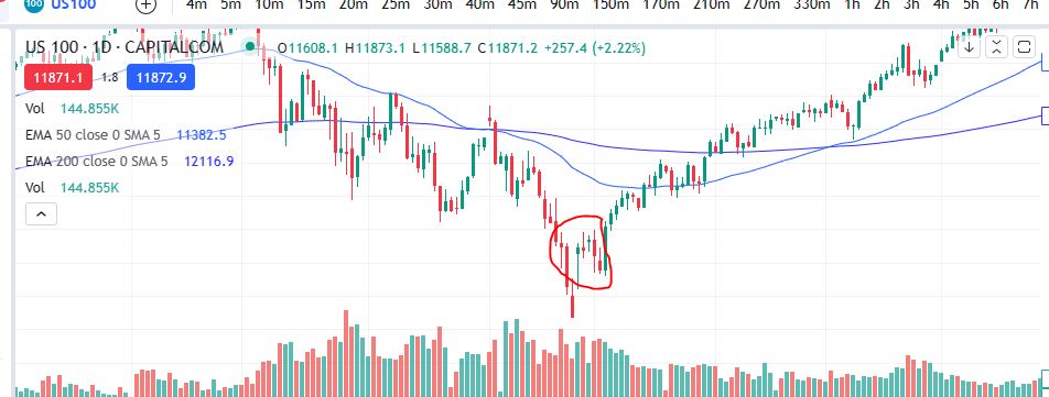
Tweezer bottoms appear on the chart as identified in the screen shot below. They can appear at the end of a down trend and signify a possible change in direction. On a practical level, they represent a struggle between the bulls and bears where the price was pushed all the way down to form a long bottom wick (to a very specific limit) and then it recovered and the bulls took back control, pushing the price back up again. Another one with the same pattern (where the price was pushed to the same price level, and it then came back up), creates the ‘tweezer top’ shape. The bears were unable to push the price below the level seen in the tweezer bottoms. See the screen shot below. This happened twice in short succession before the price started trending in the upwards direction.
Japanese candlesticks – Tweezer Tops
The same is true for candles which appear in the same way, but reversed. These are called tweezer tops. See the example below where the price reached the same high in two candles next to each other before the price was pushed back down in a new trend/direction. As a minimum you would need two candles but there could be more which test the same level either with tweezer tops or bottoms.
We hope this explains this very useful candlestick pattern. Now that you are familiar with this pattern you will start to notice it when you are waiting for a reversal and when taken with other indicators/criteria, it could be a good entry point (or exit) depending on the direction of the trade.
Please note any subscriptions taken via my affiliate link with Trading View may result in me earning a small commission. However, I provide complete transparency on me using Trading View personally – I publish my success on the financial markets via my broker reports and any profits earned were done so by using my own Trading View subscription, so I genuinely do recommend them and have been using the Trading View charts for many years.
In this article I will share with you what a trading plan is, and give you examples of what this might look like. I will also explain to you how to create your own trading plan. I hope you find this useful.
What is a Trading Plan?
A trading plan is a plan of how to make money from the financial markets by trading – sounds obvious! There are a few components to this (which complement/feed into each other), as follows:
Risk management
A trading strategy
Risk to reward ratio
I discuss each of these aspects of the overall trading plan, below.
Trading Plan: Risk management
I have provided a detailed article on risk management here:
In short, you want to control the value of your money at risk on each trade by restricting the value to a predetermined level and by keeping this value consistent for each trade placed. In the examples provided in my risk management article, I talk about limiting risk to £100 per day as an example. It is crucial that this element of your trading is ‘under control’ as otherwise you will likely fail to become consistently profitable. By limiting your risk to 1% of your capital balance, your emotions will remain calm and your reward to risk ratio can be analysed and understood more easily. Also, keeping the amount at risk consistent between trades placed, will be an essential part of your trading strategy / it is necessary to do this for your strategy to work. (More below). Please consider the article I published on risk management, very carefully and incorporate this into your Trading Plan.
Trading Strategy
A trading strategy is the plan of how you will find and execute trades. It’s the type of trade opportunity you will look for when considering the markets. Traders can either be technical traders or fundamendal traders. Technical traders place trades by considering the price action taking place on the charts. Fundamental traders consider the market’s detailed financials by looking at financial statements, PE ratios, return on investment ratios etc. Although my professional career started as a chartered accountant, and I have the ability to understand the fundamentals of a company when considering its financial statements etc, I do not trade using fundamental data. I only trade based on what is happening on the charts and price action. Either approach can work. However, this blog is tailored towards helping you understand technical analysis (analysing the charts) and this type of trading style in particular.
Within the technical analysis you may look for particular set ups/patterns to appear on the chart. When you see the pattern you are looking for, you would then execute a trade, while controling/limiting your risk to £100 (or whatever value you choose) in the event the trade goes against you, per the risk management plan. You would typically look to make a bit more than your ‘at risk’ value whenever you make a profit.
There are many different types of trading strategies based on technical analysis which work. You may have found one already and you have come here to understand how the strategy fits into an overall trading plan. Or perhaps you are completely new to trading and you need to start at the beginning. Many traders use different types of indicators to signal to them where to enter a market or exit. This will be a key part of their trading strategy. For example, some traders like to use Bollinger bands. I have provided a screen shot below of what these look like:
I do not use this strategy (not for any other reason other than I haven’t learnt to use it yet and traders typically find a niche and stick to what they know). Some traders would use this indicator to enter the market at a particular place within the blue bands and aim to exit at the top of the bands to get a profit and they might set their stop loss or exit the trade in a loss scenario, near the bottom of the bands. This is just one type of example of how the indicators can be used to plan entry and exit points.
In my own trading style, I use a ‘buy the dip’ strategy. I achieve a 60% win rate with this strategy and I get roughly a 1.5:1 reward risk ratio (more below). If you would like to see how my strategy works, please visit my Patreon page here:
You can learn about different strategies from traders on You Tube and see what suits you best. I would advise you to ensure you can trust the person teaching you. There are many people on the internet which lead new inexperienced traders into losing money! I used to be one of these. I provide assurance over what I write in my blog articles by publishing my win rate, as confirmed in reports from my broker. I also publish my weekly profits and losses. Please see this section of my blog:
Once you have found a strategy that you believe works and you can trust, you want to make sure that it has a good risk to reward ratio, and that the risk to reward ratio works with the overall win rate – more below. You should have an idea of the win rate of the strategy you want to follow from the person who taught you the strategy. As I said above, in my buy the dip strategy , the win rate is roughly 60%.
Risk to Reward Ratio
What is risk to reward ratio? This ratio is the ratio of profit to loss when you are controlling your trades in accordance with what is discussed on the risk management page of this blog. The risk to reward ratio can vary between trading strategies. For example, a ‘break out’ strategy can achieve high reward to risk ratios. (I’m not a break out trader so I could not advise you of the win rate of these types of strategies). In the trading strategy I teach on Patreon, the reward to risk ratio is roughly 1.5:1, respectively. This means, for every trade I place, I look to make, lets say, either £100 as a loss or £150 as a profit.
It is the combination of risk to reward ratio as well as your win rate, which will determine whether or not the overall strategy works and is profitable. Here is an example based on the strategy I follow personally:
Every 10 trades placed will, on average, have the following outcome:
6 will be profitable – with a value of £900 (60% x 10 trades x £150 profit = £900)
4 will be losses – with a value of £400 (40% x 10 trades x £100 loss = £400)
Therefore over the course of 10 trades, I would expect to make circa £500 with this strategy.
As explained in the risk management article, the level of risk will be set by your account balance size… (typically 1% of your entire balance) but it is the ratio of profit to loss and the win rate which are important and these can be applied to any account size.
Lets consider an example with a great reward risk ratio but a poor win rate:
Win rate: 20%
Reward/risk ratio: 4:1
Every 10 trades placed will, on average, have the following outcome:
2 will be profitable – with a value of £800 (20% x 10 trades x ££400 profit = £800)
8 will be losses – with a value of £800 (80% x 10 trades x £100 loss = £800)
Therefore over the course of 10 trades, I would expect to make nothing with this strategy.
I hope you can see how the combination of win rate with reward to risk ratio works and there is an imperative connection/dependency between these two factors and that they, when combined in the right way, will allow you to make profit.
So, once you have got a plan in place for risk management, and a trading strategy which combines win rate with risk to reward ratio to make profit, you will have your overall Trading Plan.
I hope you found this useful. If you have any questions please send me a message via the blog contact page. I do try to answer all queries if I can.
Please note any subscriptions taken via my affiliate link with Trading View may result in me earning a small commission. However, I provide complete transparency on me using Trading View personally – I publish my success on the financial markets via my broker reports and any profits earned were done so by using my own Trading View subscription, so I genuinely do recommend them and have been using the Trading View charts for many years.
In this blog article I will share with you a detailed description of what the RSI indicator is, how it works and how you can use it to assist you in achieving success in the financial markets.
What is the RSI Indicator?
The RSI indicator is a type of momentum indicator. It measures speed and the size of a market’s recent fluctuations in price. It can be used to evaluate under or oversold buying/selling opportunities. The indicator is an oscillator and has a scale of zero to 100.
How is the RSI indicator used?
As well as showing the user when a market is overbought or oversold, it can also tell the user whether a market is likely to have trend reversal or pull back. It can be used as a buy or sell signal. Typically if the readings on the RSI indicator are abovev70, this would indicate that the market is ‘overbought’ and it is not at that moment, presenting a ‘good deal’. If the readings are below 30, this indicates that the market is oversold (a bargain). When the readings are above 70, this might be a good time to exit a trade in a buy position, or wait until the price drops before entering one. When the RSI is below 30, this could be a good time for getting into a trade.
The RSI can also indicate whether the market is either uptrending or downtrending. The indicator may remain in the overbought teritory for a long time while the market is in an uptrend, and the opposite is true for downtrends.
The RSI indicator can be used to spot reversals. If the RSI is unable to reach 70 on a number of consecutive attempts during an uptrend, and then drops below 30, this could indicate that the trend is losing its strength and the price may reverse to lower levels.
How does the RSI indicator work?
The RSI indicator compares a market’s strength on intervals when prices go up to the market’s strength on intervals when the prices go down. The result of this comparison is an indication of how the market may perform in the future.
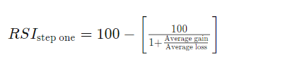
The RSI is calculated as follows:
The standard number of intervals used to calculate the RSI is 14.
Drawbacks
Despite being extremely useful, the RSI can give misleading signals when markets are either in a strong uptrend or downtrend. For example, if the market is uptrending, the RSI may not fall to near the 30 area at all… To combat this, the trader could ‘adjust’ his/her view in this scenario to note where the RSI falls to (which level) when it is at a low on the trend in an uptrend and vice versa.
The indicator works best in long term trends. It is however, most useful in an oscilatting market.
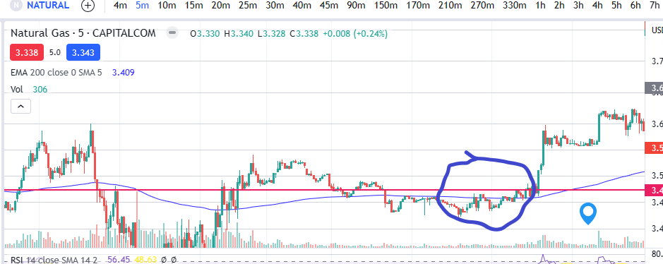
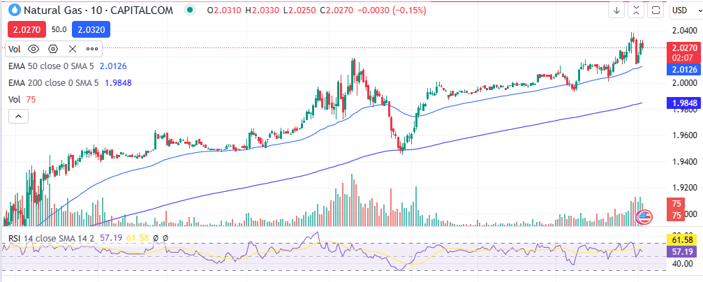
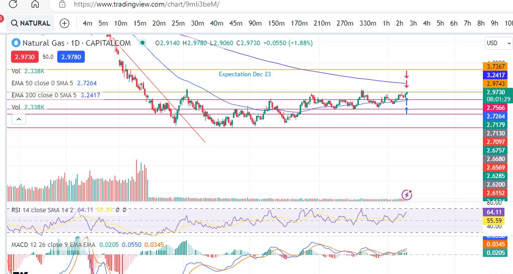
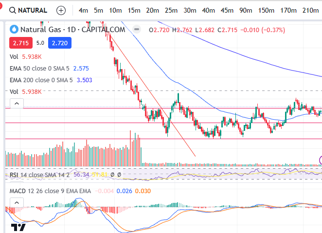
Lets take a look at some examples:
You can see in the chart for Natural Gas above, that each time the RSI falls below 30, this corresponds to a subsequent period of growth and the trend goes on to reach higher highs. Similarly when the RSI is especially high (see thepeak where the RSI extended beyond the purple area), this was followed by a sharp downwards move.
We hope you found this article helpful.
For a discount on the charting software I use, Trading View, please click on the following link:
Please note any subscriptions taken via my affiliate link with Trading View may result in me earning a small commission. However, I provide complete transparency on me using Trading View personally – I publish my success on the financial markets via my broker reports and any profits earned were done so by using my own Trading View subscription, so I genuinely do recommend them and have been using the Trading View charts for many years.
In this blog post I cover a couple of recent profitable trades placed. I will break down my entry and exit points. I hope you find this useful!
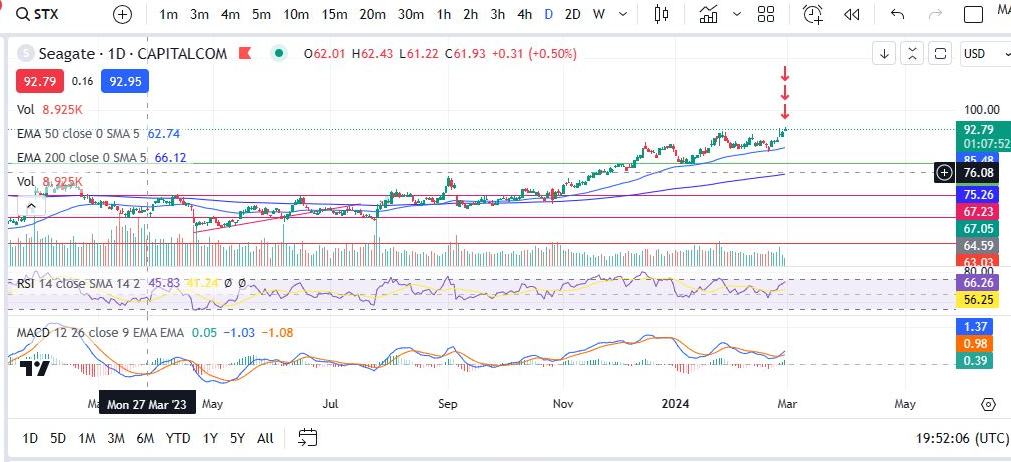
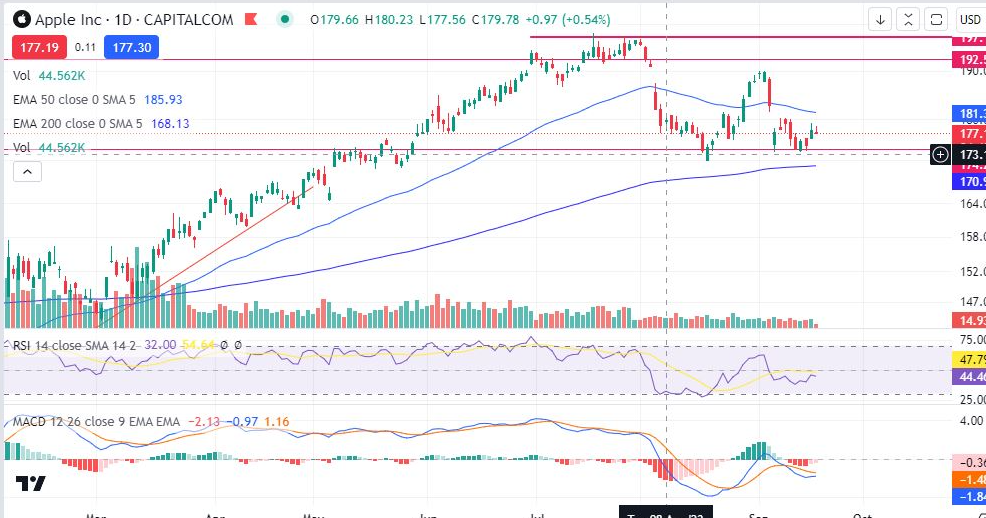
Seagate
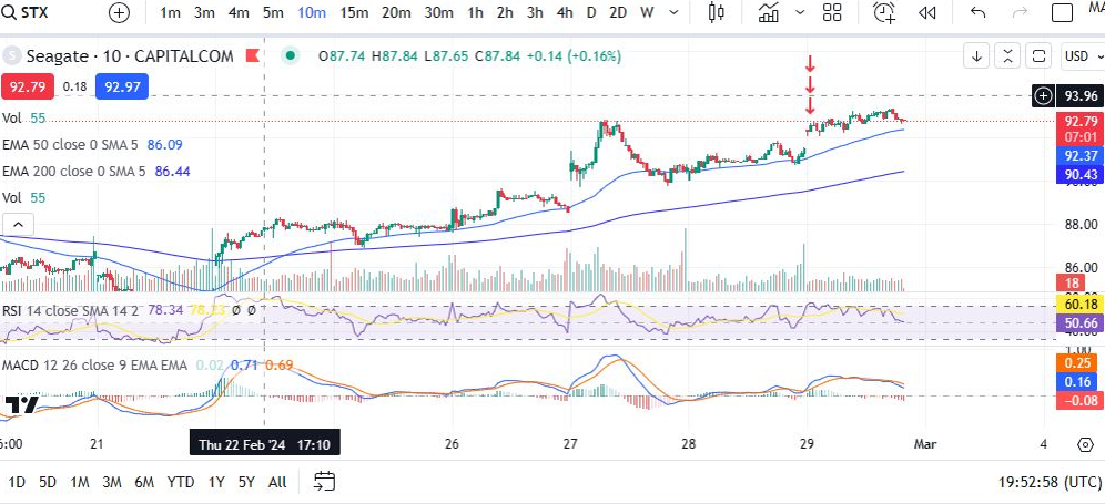
I first looked for an entry on the daily timeframe. The MACD had just made a cross over. The market was in an uptrend. The RSI was not too high. Next I checked the ten minute timeframe for an entry point:
Same thing again – looking for an entry on the MACD indicator where the MACD and signal are about to cross and ideally they are below the histogram. In this case They were low on the histogram but not quite below the zero line. The RSI had taken a dip. I set my target for the previous hight of the trend.
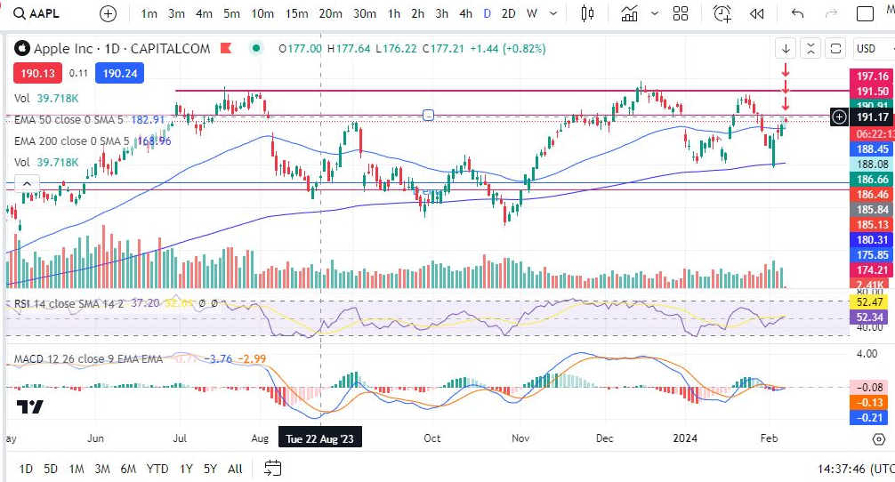
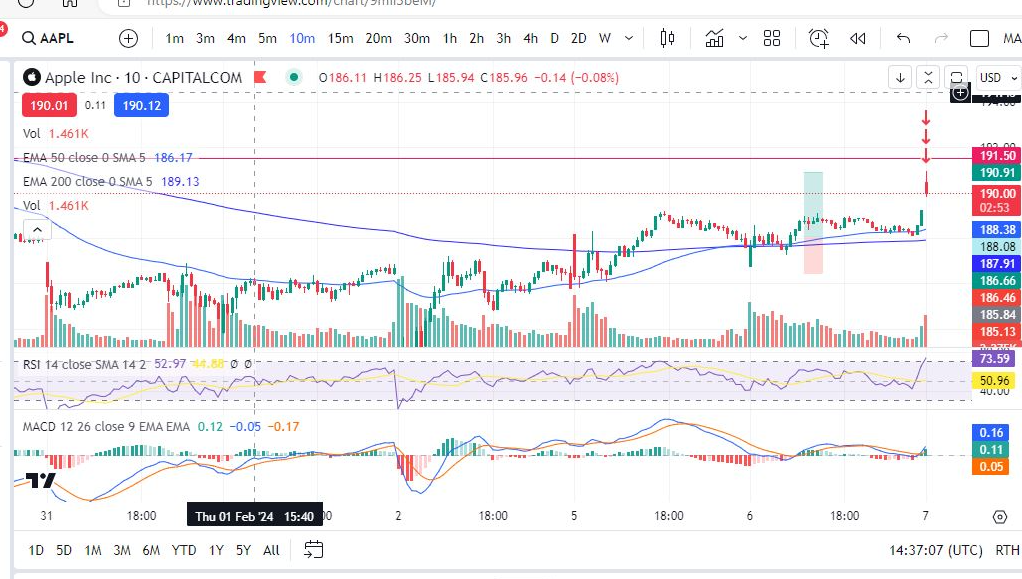
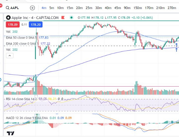
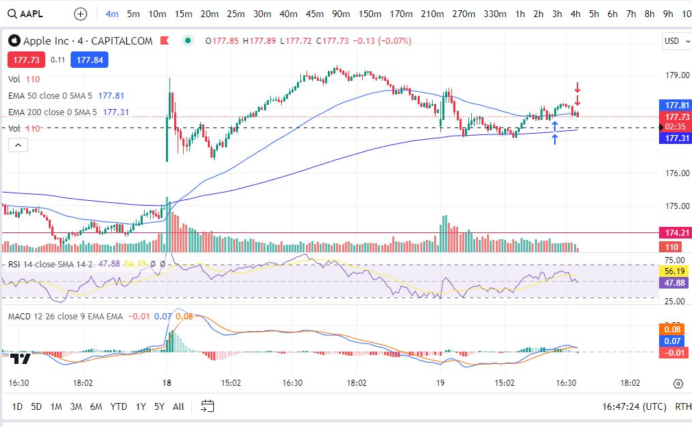
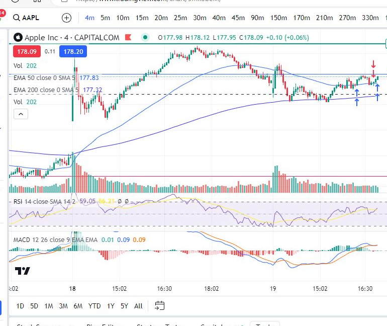
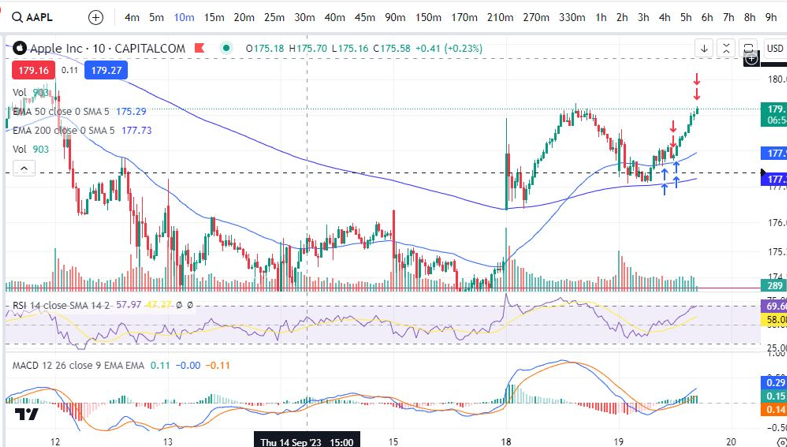
Recent profitable trades – Apple
Looking foran entry point, the MACDhad crossed over, was below the histogram zero level and the RSI was low. I then checked the 10m timeframe for an entry point:
The MACD had just made a cross over. Iset my target for a bit higher than the previous high. The RSI was low and the market had started to uptrend (above the 200 period EMA). Sure enough the trade reached its target!
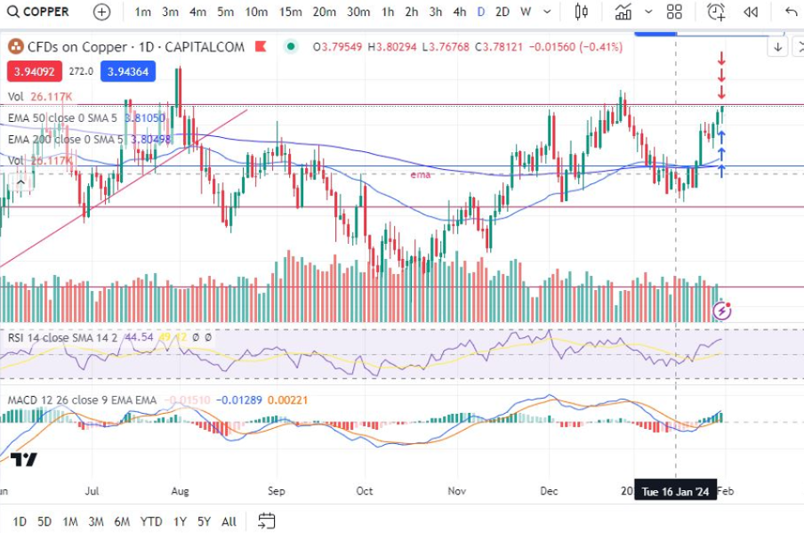
Copper
Again, I checked that the MACD was in a good place on the daily timeframe. I also checked whether I would have enough room to reach a decent profit target before hitting the resistance level marked on the chart with the red line above.
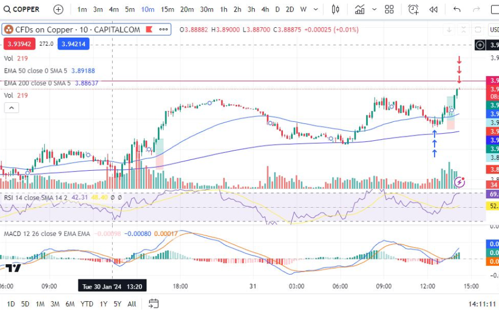
Then I checked the ten minute timeframe for an entry point:
I set the profit target on this one for just below the red resistance level marked on the daily timeframe. I waited for a MACD cross over and the trade reached its target shortly after.
For more great tips and advice on trading the stock market, please visit:
Please note any subscriptions taken via my affiliate link with Trading View may result in me earning a small commission. However, I provide complete transparency on me using Trading View personally – I publish my success on the financial markets via my broker reports and any profits earned were done so by using my own Trading View subscription, so I genuinely do recommend them and have been using the Trading View charts for many years.
Japanese candlesticks can be used to create trading strategies themselves or to just help you understand the direction and activity on the chart. We examine below, the structure of a candle stick and what it means, the different types of candle sticks you might see on a stock trading chart, and how you can use the candlesticks as indicators of market sentiment.
Japanese Candlesticks and timeframes
A new candle is formed on the chart every ‘n’ minutes/hours/days/etc, depending on what chart timeframe the chart is set to. For example, in the chart below, the timeframe setting is ‘D’ for ‘one day’ – so each day another candle completes its formation. As you can see below, there are many timeframe settings. Switching between them will change the candles so that a candle appears at each interval selected.
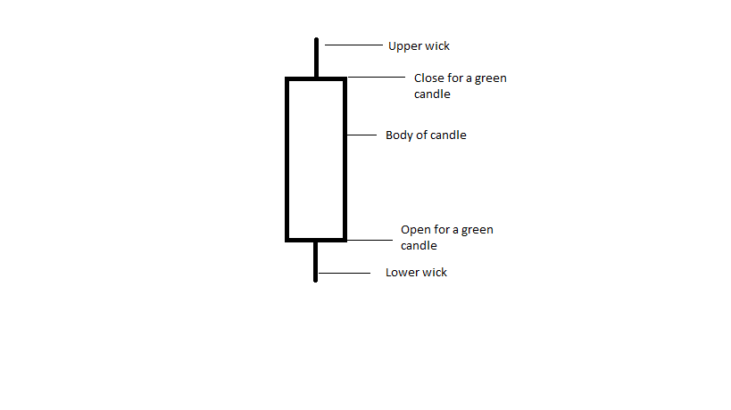
Structure of Japanese Candle Sticks
An example of a Japanese candlestick is shown above.
The most obvious thing to say about these is that they look like candles – but each part tells you something about what is happening to the price, as follows:
– Upper wick – this element shows you the highest price level which the instrument reached within the timeframe applicable to the candles.
– Lower wick – conversely, the lower wick shows you the lowest price reached within the time interval.
– Candle body – the top part of the candle will show you either the closing price, or the opening price, depending on whether the candle is red, or green (sometimes substituted for blue). Broadly, if your trade is predicting the price to rise, green or blue candles are good news, red ones are bad, and vice versa. You can see on the chart above that when the price is rising, the candles are mostly green.
The purpose of using candle sticks is to provide a quick and visual indication of what is happening to the price.
There are a few special types of candles which are easy to spot and which have extra meaning. These are discussed on our Japanese Candlestick Patterns pages linked below:
Please note any subscriptions taken via my affiliate link with Trading View may result in me earning a small commission. However, I provide complete transparency on me using Trading View personally – I publish my success on the financial markets via my broker reports and any profits earned were done so by using my own Trading View subscription, so I genuinely do recommend them and have been using the Trading View charts for many years.
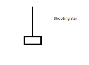
Another very useful candlestick pattern which any professional trader will be aware of, is the shooting star & hammer/hanging man. These are patterns which form from a single candlestick and can indicate that a reversal or new trend is about to start. We discuss these Japanese candlestick patterns below with some chart examples.
The shooting star is formed by a single candle with a long upper wick and a very short or non existent lower wick. A picture of this type of candle is below.
Candlestick pattern – Shooting Star
The pattern is formed when there has been one last push/attempt by the bears to raise prices higher, but they failed and the closing price closed below, or very close, to the opening price.
Now let’s look at some examples on the charts:
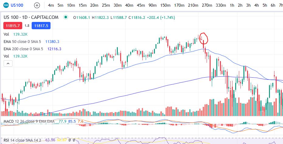
You can see on this NASDAQ chart that the price was in a nice uptrend, until the shooting star appeared. Prices quickly descended from that point onwards.
How can you use the Japanese Candlestick pattern – Shooting Star in technical analysis?
If you are in a long position, waiting for prices to move higher and the shooting star candlestick pattern appears on the chart, it may, when taken with other indicators, indicate a good time to take profit off the table.
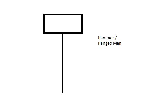
Japanese Candlestick Pattern – Hammer/Hanged Man
The Hammer/Hanged Man is the opposite of the shooting star. A picture of this type of candlestick pattern is below.
Japanese Candlestick Pattern – Hammer/Hanged Man
As in the case of the Shooting Star, the Hammer/Hanged Man candlestick pattern is formed when the sellers tried to push the price lower, but failed, and it closed very close to where it started. It can indicate a reversal of a downtrend/beginning of an uptrend.
Now lets take a look at some examples on the charts:
Hammer/Hanged Man candlestick pattern
You can see in the NASDAQ chart above that the price reached a low point and then the hammer/hanged man formed. The bulls took control – the candle is green in this instance so price was pushed all the way down the lower wick but came all the way back up again and closed higher than the candle’s opening spot. Following this, the price reversed in a strong uptrend pattern.
How can you use the Hammer/Hanged man in technical analysis?
If you are looking for an entry point or are waiting for a reversal, this candlestick pattern, when taken with other indicators, could give you a good entry point.
We hope this was useful. You are likely to see a great deal of these candlestick patterns on the charts – we hope you are able to make good use of them in becoming more profitable.
I wanted to share three different trade set ups with you – one which was a nice profit, another where the set up failed to progress in line with my intended entry plan and another where I am currently waiting to see if I should jump in… here goes!
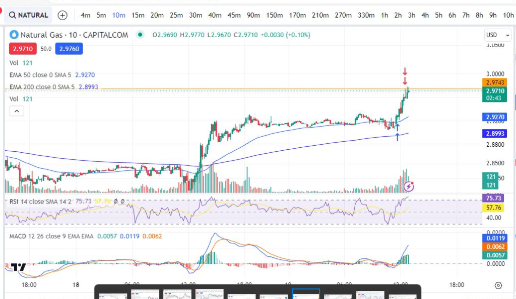
Trade set ups – The profit maker: Natural Gas 19/09/2023
Here’s the daily chart screen shot – anyone familiar with my trading style will be aware that the daily time frame is the bible to me. You can see below that the market is slowly trending up… It was about to reach a ceiling in that it would soon touch / bump into the resistance lines on the daily timeframe – and potentially come back down. I made sure there was enough room to get a small trade in before it reached the orange line at around 2.9730:
Here it is again, this time on the ten minute timeframe:
You can see the markers with this timeframe of where I jumped in and out of the trade. My stop area would be below the moving average/lowest price most recently to the entry point.
The orange horizontal line is where I had marked exactly where the daily timeframe ceiling exists – so that I can see it on the smaller timeframes. By ceiling I am referring to the orange resistance line, mentioned above. Indeed you can see from how the trade played out, that the price did start to see resistance at that level.
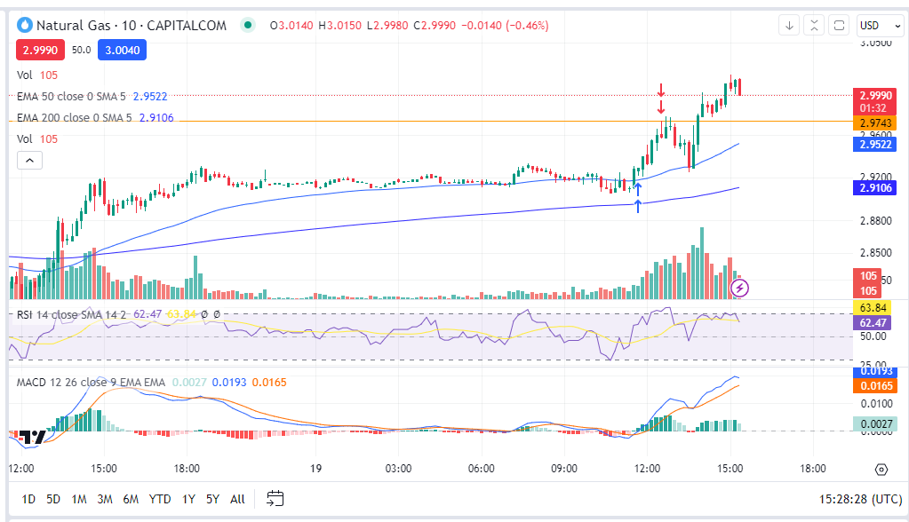
Here’s a subsequent snapshot – you can see, as I predicted, the price fell back down from the orange line before going on to make new highs. This made a nice little profit. I’ve been trading the 10 minute timeframes most recently which i’ve started to enjoy. Some traders check the timeframes above the smaller ones like 1 hour, 4 hours etc but mostly I find I can make profit by just using the daily timeframe as my higher reference point.
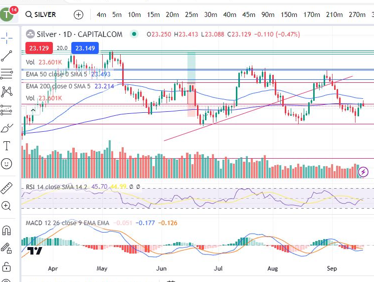
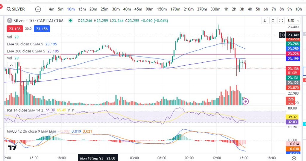
Trade set ups – Silver 19/09/2023
I’m sharing the daily and ten minute timeframes below again. On this one, I was waiting for the price to come down to the red horizontal line (at around 23.226), a major support area marked on the daily timeframe. Unfortunately, the price sailed straight down through this line so I abandoned my plan to jump in:
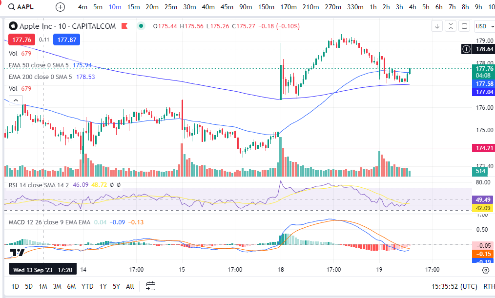
The trade set up which I was waiting on… ZZZZZZZZZZ ZZZZZ – Apple trade set up 19/09/2023
Here’s a trade set up I was waiting on:
The price looked like it was bouncing at a recent major support level on the daily timeframe – if the MACD cross over happened on the 10 minute timeframe, I wanted to jump in…
Trade set ups – Apple – how it played out!
OK… so this one was really interesting for a beginner trying to learn. I actually got in and out of this twice based on what was happening on the chart… let me explain!
In the above chart screen shot you can see I entered the trade. My intention was to get out at the previous high on the ten minute timeframe. Everything was looking ok at this point. Then this happened:
It started to make a little bump over on the four minute timeframe. The MACD had crossed to the downside. It could have just been a healthy pull back. However, with the miniscule and red candles being formed since entry, I felt nervous enough to jump out again!
After this the price started to recover and show signs of a strong push up/it was bouncing/finding support at the EMA line:
I jumped back in. You can see the two different entry points and my first exit above. NB: there are two arrows on each entry/exit because I run two different parallel versions of my trading concurrently – this is not important… I just don’t want beginners to become confused.
Finally, the price reached my original target at around the previous high on the ten minute timeframe… BOOM!
A couple of takeaway points can be made from this trade set up and the way it played out:
You should not be afraid to jump out of a trade if you feel uncomfortable with how it is unfolding – you can always get back in!
Sometimes the markets do not behave immediately the way you would like them to – patience is key.
Please note any subscriptions taken via my affiliate link with Trading View may result in me earning a small commission. However, I provide complete transparency on me using Trading View personally – I publish my success on the financial markets via my broker reports and any profits earned were done so by using my own Trading View subscription, so I genuinely do recommend them and have been using the Trading View charts for many years.
Lets take a look at some of the opportunities Trader Pro took advantage of. Below you will find the breakdown and thought process behind some recent profitable trades. Enjoy!
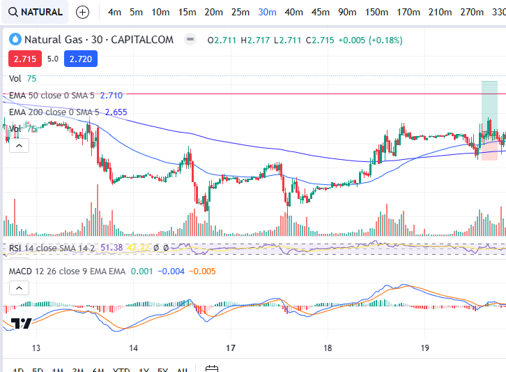
Natural Gas – 30m timeframe – recent profitable trades
Natural Gas is starting to creep up after much time of consolidation. See the daily timeframe chart below. Here’s what the chart looked like before I jumped into my trade:
The trading timeframe I used was the 30 minute timeframe. You can see on the daily chart that the price hit a new high and then came back down to the 50 period EMA and started to find support. This is where I was looking to get in – with a profit target around the red resistance level noted on the chart above.
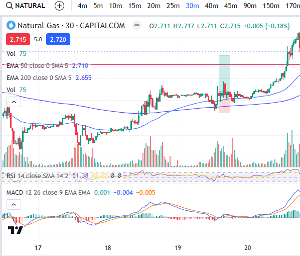
Now lets take a look at the 30 minute timeframe:
I entered the trade as per the trade diagram above. The MACD was just crossing over, the RSI had reached a low point, the price was trading above the 50 period EMA. Profit target for around the resistance level as noted with the red horizontal line on the chart (per daily timeframe).
Lets see what happened next:
As you can see, as predicted, the price rose to the resistance level and burst through it. It became overbought at that point and began to lose momentum. I had exited by this point.
As previously, I like to share the reports from my trading platform so that you know these are genuine trades which were placed by Trader Pro. Lets take a look at my exit per my trading reports:
I hope you enjoyed this blog post and that it helps goes some way to helping you understand multiple timeframe analysis and how to view the markets and identify opportunities taking all the different factors into account – timeframes, entry indicators, other useful information – how overbought or oversold a market is etc, where to set the profit target and stop loss.
Please note any subscriptions taken via my affiliate link with Trading View may result in me earning a small commission. However, I provide complete transparency on me using Trading View personally – I publish my success on the financial markets via my broker reports and any profits earned were done so by using my own Trading View subscription, so I genuinely do recommend them and have been using the Trading View charts for many years.
Hello. If you are on this page, you are probably looking to increase financial success and stability. You have come to the right place. On this website you will find educational resources which will help you learn how to trade including technical indicators, trading strategies, risk management and recommended charting software. In addition to these helpful resources, I will be posting regular blogs outlining trade setups which you may find helpful. You can find my own trade set up style, here:
Used by Google Analytics to determine which links on a page are being clicked
30 seconds
_ga_
ID used to identify users
2 years
_gid
ID used to identify users for 24 hours after last activity
24 hours
_gat
Used to monitor number of Google Analytics server requests when using Google Tag Manager
1 minute
__utmt
Used to monitor number of Google Analytics server requests
10 minutes
__utmb
Used to distinguish new sessions and visits. This cookie is set when the GA.js javascript library is loaded and there is no existing __utmb cookie. The cookie is updated every time data is sent to the Google Analytics server.
30 minutes after last activity
__utmc
Used only with old Urchin versions of Google Analytics and not with GA.js. Was used to distinguish between new sessions and visits at the end of a session.
End of session (browser)
__utmz
Contains information about the traffic source or campaign that directed user to the website. The cookie is set when the GA.js javascript is loaded and updated when data is sent to the Google Anaytics server
6 months after last activity
__utmv
Contains custom information set by the web developer via the _setCustomVar method in Google Analytics. This cookie is updated every time new data is sent to the Google Analytics server.
2 years after last activity
__utmx
Used to determine whether a user is included in an A / B or Multivariate test.
18 months
_gac_
Contains information related to marketing campaigns of the user. These are shared with Google AdWords / Google Ads when the Google Ads and Google Analytics accounts are linked together.
90 days
__utma
ID used to identify users and sessions
2 years after last activity
Marketing cookies are used to follow visitors to websites. The intention is to show ads that are relevant and engaging to the individual user.
A video-sharing platform for users to upload, view, and share videos across various genres and topics.
This cookie is used to play YouTube videos embedded on the website.
2 years
VISITOR_PRIVACY_METADATA
Youtube visitor privacy metadata cookie
180 days
GPS
Registers a unique ID on mobile devices to enable tracking based on geographical GPS location.
1 day
VISITOR_INFO1_LIVE
Tries to estimate the users' bandwidth on pages with integrated YouTube videos. Also used for marketing
179 days
PREF
This cookie stores your preferences and other information, in particular preferred language, how many search results you wish to be shown on your page, and whether or not you wish to have Google’s SafeSearch filter turned on.
10 years from set/ update
YSC
Registers a unique ID to keep statistics of what videos from YouTube the user has seen.
Session
DEVICE_INFO
Used to detect if the visitor has accepted the marketing category in the cookie banner. This cookie is necessary for GDPR-compliance of the website.